Login Form With Light Button in HTML and CSS
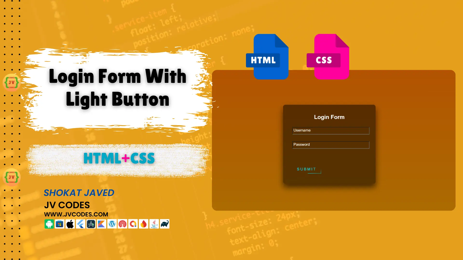
This Login Form With Light Button in HTML and CSS tutorial is perfect if you are interested in developing a basic login form to your website.
It is easy to implement and customize, thus suitable for entry-level designers as well as experts. It is recommended to integrate this form into your web site to enhance the appearance of the login page.
Here I’ll explain how to setup a login form along with a light, aesthetically appealing button design and the source will be provided free of cost.
GitHub Source: Login Form With Light Button
Features
- Customization – It is very easy to customize according to needs.
- Compatibility – This form is made to be compatible with any particular CMS that you may be currently using, be it WordPress, Joomla and many more.
- Clean Code – The code written is clear and commenting has been done to ensure that even after several months or years.
Technologies Used
- HTML (Hypertext Markup Language)
- CSS (Cascading Style Sheets)
Video Tutorial
Steps to Build Form
- Project Folder: When beginning a new project, the first step typically taken is to make a new folder to hold all project files.
- Make index.html: Within the folder structure, make an HTML file index.html containing the form.
- Create style.css: Make another CSS file within the same file directory to style the form and button.
- Copy & Paste: To add life to your login form, copy and paste the following codes into these files.
HTML
Here is the HTML code for your index.html file:
<!DOCTYPE html>
<html lang="en">
<head>
    <meta charset="UTF-8">
    <meta http-equiv="X-UA-Compatible" content="IE=edge">
    <meta name="viewport" content="width=device-width, initial-scale=1.0">
    <title>Login Form with Light Button | JV Codes</title>
    <link rel="stylesheet" href="style.css">
</head>
<body>
    <div class="login-box">
        <h2>Login Form</h2>
        <form action="">
            <div class="user-box">
                <input type="text" required>
                <label for="">Username</label>
            </div>
            <div class="user-box">
                <input type="password" required>
                <label for="">Password</label>
            </div>
            <a href="">
                <span></span>
                <span></span>
                <span></span>
                <span></span>Submit
            </a>
        </form>
    </div>
</body>
</html>
CSS
Here is the complete code for style.css file to style the form:
html {
    height: 100%;
}

body {
    margin: 0;
    padding: 0;
    font-family: sans-serif;
    background: linear-gradient(#b45101, #aa6f01);
}

.login-box {
    position: absolute;
    top: 50%;
    left: 50%;
    width: 400px;
    padding: 40px;
    transform: translate(-50%, -50%);
    background: rgba(0, 0, 0, 0.5);
    box-sizing: border-box;
    box-shadow: 0 15px 25px rgba(0, 0, 0, 0.6);
    border-radius: 10px;
}

.login-box h2 {
    margin: 0 0 30px;
    padding: 0;
    color: #ffffff;
    text-align: center;
}

.login-box .user-box {
    position: relative;
}

.login-box .user-box input {
    width: 100%;
    padding: 5px;
    font-size: 16px;
    color: #ffffff;
    margin-bottom: 30px;
    outline: none;
    background: transparent;
}

.login-box .user-box label {
    position: absolute;
    top: 0;
    left: 0;
    padding: 5px;
    font-size: 16px;
    color: #fff;
    pointer-events: none;
    transition: 0.5s;
}

.login-box .user-box input:focus~label,
.login-box .user-box input:valid~label {
    top: -20px;
    left: 0;
    color: #03d8f4;
    font-size: 12px;
}

.login-box form a {
    position: relative;
    display: inline-block;
    padding: 10px 20px;
    color: #03d8f4;
    font-size: 16px;
    text-decoration: none;
    text-transform: uppercase;
    overflow: hidden;
    transition: 0.5s;
    margin-top: 40px;
    letter-spacing: 4px;
}

.login-box a:hover {
    background: #03d8f4;
    color: #fff;
    border-radius: 5px;
    box-shadow: 0 0 5px #03d8f4, 0 0 25px #03d8f4, 0 0 50px #03d8f4, 0 0 100px #03d8f4;
}

.login-box a span {
    position: absolute;
    display: block;
}

.login-box a span:nth-child(1) {
    top: 0;
    left: -100%;
    width: 100%;
    height: 2px;
    background: linear-gradient(90deg, transparent, #03d8f4);
    animation: btn-anim1 1s linear infinite;
}

@keyframes btn-anim1 {
    0% {
        left: -100%;
    }
    50%,
    100% {
        left: 100%;
    }
}

.login-box a span:nth-child(2) {
    top: -100%;
    right: 0;
    width: 2px;
    height: 100%;
    background: linear-gradient(180deg, transparent, #03d8f4);
    animation: btn-anim2 1s linear infinite;
    animation-delay: 0.25s;
}

@keyframes btn-anim2 {
    0% {
        top: -100%;
    }
    50%,
    100% {
        top: 100%;
    }
}

.login-box a span:nth-child(3) {
    bottom: 0;
    right: 100%;
    width: 100%;
    height: 2px;
    background: linear-gradient(270deg, transparent, #03d8f4);
    animation: btn-anim3 1s linear infinite;
    animation-delay: 0.5s;
}

@keyframes btn-anim3 {
    0% {
        right: -100%;
    }
    50%,
    100% {
        right: 100%;
    }
}

.login-box a span:nth-child(4) {
    bottom: -100%;
    left: 0;
    width: 2px;
    height: 100%;
    background: linear-gradient(360deg, transparent, #03d8f4);
    animation: btn-anim4 1s linear infinite;
    animation-delay: 0.75s;
}

@keyframes btn-anim4 {
    0% {
        bottom: -100%;
    }
    50%,
    100% {
        bottom: 100%;
    }
}
Download Source Code
You can download this source code from the button below. The Login Form with Light Button in HTML and CSS presented here is under the Creative Commons, which means it can be used on your site without restriction.
Conclusion
Here is source code which can be embedded on your site to enable users to be able to login with a form that is stylish yet very useful.
Find helpful resources by contributing credits to the JV Source Codes are in a position to support other users.
Lastly do not forget to subscribe to the channel for more tutorials. If you have any questions, don’t hesitate to leave your comment under this post, and I will gladly assist you!


