3d Facebook Button with Profile Popup Using HTML and CSS (Free Source Code)
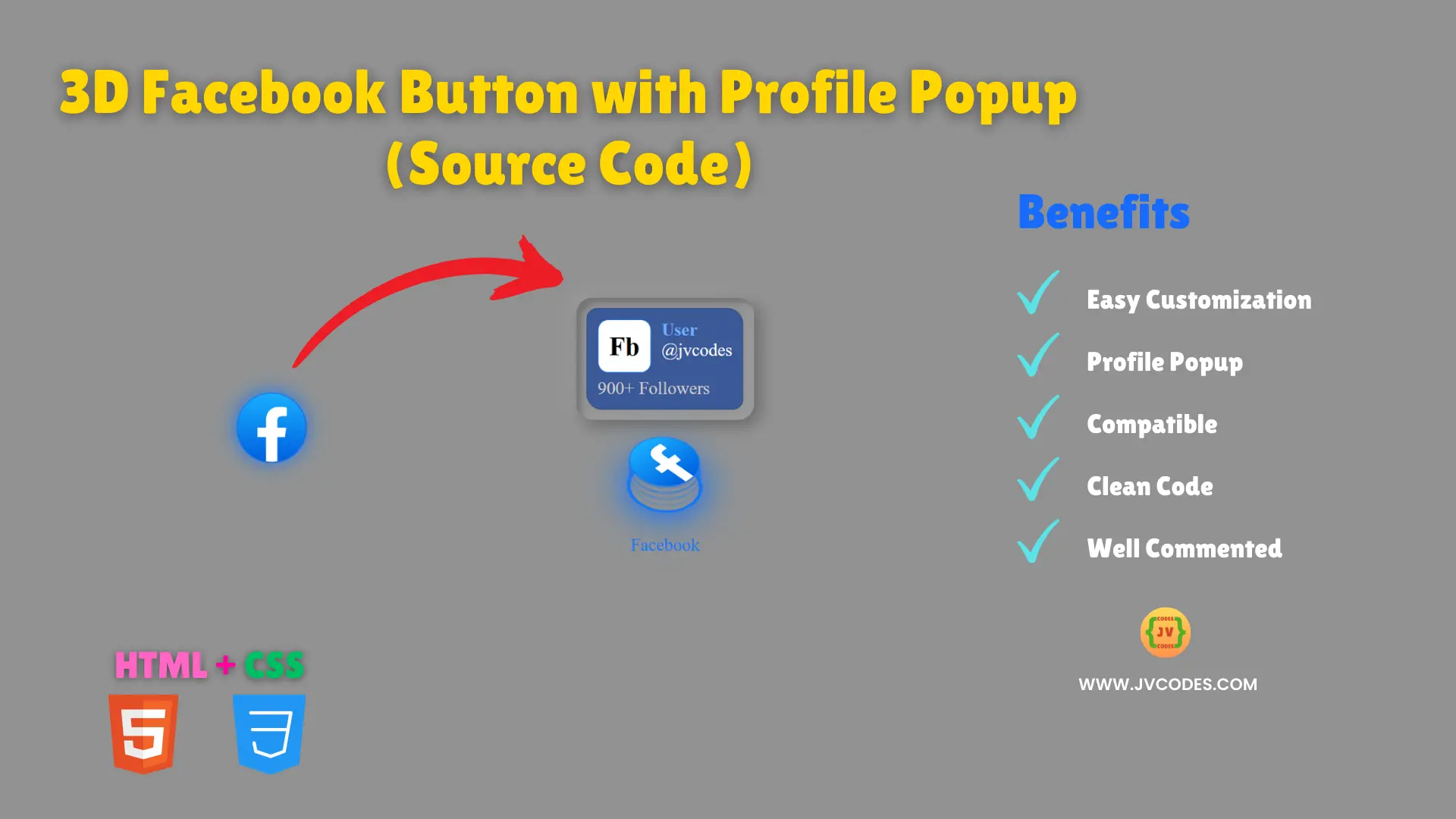
Looking for an interesting addition that could spice up your website and make it more engaging – try this 3D Facebook Button with Profile Popup Using HTML and CSS.
This is a beauty of a button now, a modern button that has a 3D hover effect; and on hover, the profile pop up appears above the button. As you can see, its GUI contains the profile name and the number of followers making it a perfect add-on to highlight social media profiles.
The primary significance of this button is to improve the user interactivity while at the same time maintaining the beauty of your website.
Further, the source code is developed with proper standard coding environment which makes easy for implementation and modification.
GitHub Source: 3d Facebook Button with Profile Popup
Features
- Animation on Hover: The button glows when placed on the mouse and it is enhanced by a 3D flipping effect.
- Responsive: It has excellent adaptability whether the client is a desktop or a mobile device.
- Easy to Customize: Most of the elements used here are customizable, such as colors, text, and layout.
- Compatibility: Completely compatible with all current browsers.
- Clean Code: The code base of this button is clean and well-documented, which helps the reader understand the code.
Technologies Used
- HTML (Hypertext Markup Language)
- CSS (Cascading Style Sheets)
Recommended for You
- Social Media Icons with Dual Tooltips
- Square Social Media Buttons
- Circular Social Media Buttons
- Responsive Portfolio Design for Content Writer
- Responsive Portfolio Website Design for Web Developer
Video Tutorial
For your convenience copy and paste the code in your project!
HTML
Here is the HTML code for your index.html file:
<!DOCTYPE html>
<!--
======================================================
This code is developed by Shokat Javed at JV Codes
Website: www.jvcodes.com
Get Millions of Free Web UI Source Codes!
======================================================
-->
<html lang="en">
<head>
    <meta charset="UTF-8">
    <meta name="viewport" content="width=device-width, initial-scale=1.0">
    <title>3d Facebook Button with Popup</title>
    <link rel="stylesheet" href="style.css">
</head>
<body>
  <div class="tooltip-container">
  <div class="tooltip">
    <div class="profile">
      <div class="user">
        <div class="img">Fb</div>
        <div class="details">
          <div class="name">User</div>
          <div class="username">@jvcodes</div>
        </div>
      </div>
      <div class="about">900+ Followers</div>
    </div>
  </div>
  <div class="text">
    <a class="icon" href="#">
      <div class="layer">
        <span></span>
        <span></span>
        <span></span>
        <span></span>
        <span class="facebookSVG">
          <svg
            viewBox="0 0 40 40"
            xml:space="preserve"
            xmlns="http://www.w3.org/2000/svg"
          >
            <linearGradient
              gradientUnits="userSpaceOnUse"
              gradientTransform="matrix(40 0 0 -39.7778 11115.001 16212.334)"
              y2="407.5726"
              y1="406.6018"
              x2="-277.375"
              x1="-277.375"
              id="a"
            >
              <stop stop-color="#0062e0" offset="0"></stop>
              <stop stop-color="#19afff" offset="1"></stop>
            </linearGradient>
            <path
              d="M16.7 39.8C7.2 38.1 0 29.9 0 20 0 9 9 0 20 0s20 9 20 20c0 9.9-7.2 18.1-16.7 19.8l-1.1-.9h-4.4l-1.1.9z"
              fill="url(#a)"
            ></path>
            <path
              d="m27.8 25.6.9-5.6h-5.3v-3.9c0-1.6.6-2.8 3-2.8H29V8.2c-1.4-.2-3-.4-4.4-.4-4.6 0-7.8 2.8-7.8 7.8V20h-5v5.6h5v14.1c1.1.2 2.2.3 3.3.3 1.1 0 2.2-.1 3.3-.3V25.6h4.4z"
              fill="#fff"
            ></path>
          </svg>
        </span>
      </div>
      <div class="text">Facebook</div>
    </a>
  </div>
</div>
</body>
</html>
CSS
Here is the complete code for style.css file to style the 3d Facebook button:
/*
=====================================================
This code is developed by Shokat Javed at JV Codes
Website: www.jvcodes.com
Get Millions of Free Web UI Source Codes!
=====================================================
*/
body {
    background-color: #f0f8ff;
    display: flex;
    justify-content: center;
    align-items: center;
    height: 100vh;
    background-color: #929292;
}

.tooltip-container {
    position: relative;
    cursor: pointer;
    transition: all 0.2s;
    font-size: 17px;
    border-radius: 10px;
  }

  .tooltip {
    position: absolute;
    top: 0;
    left: 50%;
    transform: translateX(-50%);
    padding: 10px;
    opacity: 0;
    pointer-events: none;
    transition: all 0.3s;
    border-radius: 15px;
    box-shadow: inset 5px 5px 5px rgba(0, 0, 0, 0.2),
      inset -5px -5px 15px rgba(255, 255, 255, 0.1),
      5px 5px 15px rgba(0, 0, 0, 0.3), -5px -5px 15px rgba(255, 255, 255, 0.1);
  }

  .profile {
    background: #3b5998;
    border-radius: 10px 15px;
    padding: 10px;
    border: 1px solid #29487d;
  }

  .tooltip-container:hover .tooltip {
    top: -150px;
    opacity: 1;
    visibility: visible;
    pointer-events: auto;
  }

  .icon {
    text-decoration: none;
    color: #fff;
    display: block;
    position: relative;
  }
  .icon .layer {
    width: 55px;
    height: 55px;
    border: 3px solid #1877f2;
    border-radius: 50%;
    transition: transform 0.3s, border 0.3s ease, box-shadow 0.3s ease;
    box-shadow: 0 0 15px rgba(24, 119, 242, 0.7), 0 0 20px rgba(24, 119, 242, 0.5);
  }

  .icon:hover .layer {
    transform: rotate(-35deg) skew(20deg);
    box-shadow: 0 0 30px rgba(24, 119, 242, 1), 0 0 40px rgba(24, 119, 242, 0.7);
  }

  .layer span {
    position: absolute;
    top: 0;
    left: 0;
    height: 100%;
    width: 100%;
    border: 1px solid #fff;
    border-radius: 50%;
    transition: all 0.3s;
  }

  .layer span,
  .text {
    color: #1877f2;
    border-color: #1877f2;
  }

  .icon:hover .layer span {
    box-shadow: -1px 1px 3px #1877f2;
  }

  .icon .text {
    position: absolute;
    left: 50%;
    bottom: -5px;
    opacity: 0;
    font-weight: 500;
    transform: translateX(-50%);
    transition: bottom 0.3s ease, opacity 0.3s ease;
  }

  .icon:hover .text {
    bottom: -35px;
    opacity: 1;
  }

  .icon:hover .layer span:nth-child(1) {
    opacity: 0.2;
  }

  .icon:hover .layer span:nth-child(2) {
    opacity: 0.4;
    transform: translate(5px, -5px);
  }

  .icon:hover .layer span:nth-child(3) {
    opacity: 0.6;
    transform: translate(10px, -10px);
  }

  .icon:hover .layer span:nth-child(4) {
    opacity: 0.8;
    transform: translate(15px, -15px);
  }

  .icon:hover .layer span:nth-child(5) {
    opacity: 1;
    transform: translate(20px, -20px);
  }

  .facebookSVG {
    font-size: 25px;
    display: flex;
    align-items: center;
    justify-content: center;
    background: #1877f2;
    border-radius: 50%;
    background: linear-gradient(
      45deg,
      #1877f2 0%,
      #3b5998 25%,
      #1877f2 50%,
      #3b5998 75%,
      #1877f2 100%
    );
  }

  .user {
    display: flex;
    gap: 10px;
  }

  .img {
    width: 50px;
    height: 50px;
    font-size: 25px;
    font-weight: 700;
    border: 1px solid #1877f2;
    border-radius: 10px;
    display: flex;
    align-items: center;
    justify-content: center;
    background: #fff;
  }

  .name {
    font-size: 17px;
    font-weight: 700;
    color: #71afff;
  }

  .details {
    display: flex;
    flex-direction: column;
    gap: 0;
    color: #fff;
  }

  .about {
    color: #ccc;
    padding-top: 5px;
  }
Download Source Code
If you want the whole source file of this 3D Facebook Button with Profile Popup, click on the button below. The original code is released under no license so there are no copyrights issues when using the code on your projects.
Conclusion
This 3D Facebook Button with Profile Popup Using HTML and CSS is one of the most useful and stylish additions to any site. Please do not forget to provide reference to JV Source Codes by linking to this site for a link back.
Stay tuned for other great source codes and instruction. In case of any problem, you can also use the comments section below and I will be glad to help you!

