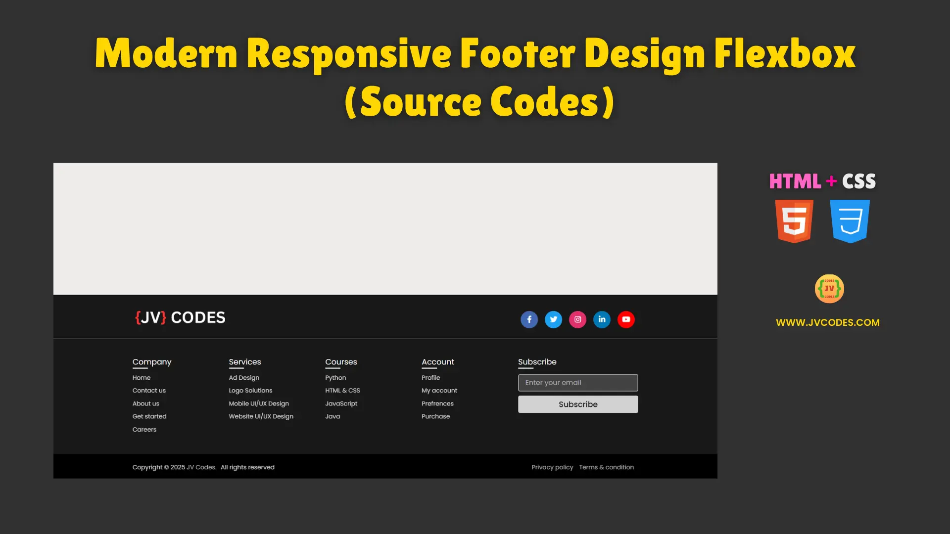
Modern Responsive Footer Design Flexbox Using HTML and CSS (Free Source Code)
A footer is an important part of any website, as it contains the navigation options and some key links to essential sections of a website with branding information.
In this article, I am going to give you free source code of a Modern Responsive Footer Design Flexbox Using HTML and CSS.
All the code practices good programming principles and is also entirely mobile friendly so that users can enjoy the same user experience regardless of the device they are using.
GitHub Source: Modern Responsive Footer Design Flexbox
What does the website footer mean?
A website footer is a horizontal bar that can be found at the bottom of a website, and includes information such as links, contact details, social networking buttons, copyright information and any additional logo.
It assists a user to quickly find through necessary web pages and offers direct access to a company or support information.
Types of Footers
- Simple Footer: It holds simple details like; Copyright text and few links at the least.
- Informational Footer: It has submenus namely; about, services, contact, and social media buttons.
- Interactive Footer: It includes functionality such as newsletter subscription, chat, or dynamic blocks.
How do I make a fully responsive footer in HTML and CSS?
Having a fully responsive footer in html and css would require using flexbox or a grid layout of the footer that can change when the size of the view port is changed.
Media queries should be used to make the styles for the mobile version, tablet, and desktop. Proper padding, margins, and font sizes used will make the page neat thus making it easy for users to go through.
Features
- Fully Responsive: The design of the footer is also responsive and looks great on all devices; mobile, tablet, and desktop.
- Clean and Modern Design: The structure and layout helps in giving a more professional appearance with a good structure of the content body.
- Flexbox-Based Layout: Code is quite collaborative with CSS to adjust and align the content using Flexbox.
- Easy Integration: This code is easily usable and you can simply copy and paste it in your project.
Technologies Used
- HTML (Hypertext Markup Language)
- CSS (Cascading Style Sheets)
Recommended for You
- Responsive Simple Website Footer Section
- Neomorphic Portfolio Design for Android App Developers
- 10 Free Responsive Image Sliders
- Tic Tac Toe Game Using JavaScript
Video Tutorial
Steps to Build a Responsive Footer Section
This footer is used to construct in any project, the HTML and CSS code that is provided below can be copied and pasted into the files of your project. The page contains headings with the description of the company, the set of useful links, and contacts; the usage of HTML tables and CSS helps to achieve responsiveness and stylish look.
Modern responsive footer design flexbox using HTML and CSS can make your website have an appropriate and professionally built footer section to improve the user experience.
HTML
Here is the HTML code for your index.html file:
<!DOCTYPE html>
<!-- Developed by JV Codes | www.youtube.com/@jvcodes -->
<html lang="en" dir="ltr">
<head>
<meta charset="UTF-8">
<title> Modern Responsive Footer Section | JV Codes </title>
<link rel="stylesheet" href="style.css">
<!-- Fontawesome CDN Link -->
<link rel="stylesheet" href="https://cdnjs.cloudflare.com/ajax/libs/font-awesome/5.15.2/css/all.min.css"/>
<meta name="viewport" content="width=device-width, initial-scale=1.0">
</head>
<body>
<footer>
<div class="content">
<div class="top">
<div class="logo-details">
<img class="cs-logo-img" loading="lazy" decoding="async" src="https://jvcodes.com/wp-content/uploads/2024/08/logo.gif" alt="logo" height="44">
</div>
<div class="media-icons">
<a href="#"><i class="fab fa-facebook-f"></i></a>
<a href="#"><i class="fab fa-twitter"></i></a>
<a href="#"><i class="fab fa-instagram"></i></a>
<a href="#"><i class="fab fa-linkedin-in"></i></a>
<a href="#"><i class="fab fa-youtube"></i></a>
</div>
</div>
<div class="link-boxes">
<ul class="box">
<li class="link_name">Company</li>
<li><a href="#">Home</a></li>
<li><a href="#">Contact us</a></li>
<li><a href="#">About us</a></li>
<li><a href="#">Get started</a></li>
<li><a href="#">Careers</a></li>
</ul>
<ul class="box">
<li class="link_name">Services</li>
<li><a href="#">Ad Design</a></li>
<li><a href="#">Logo Solutions</a></li>
<li><a href="#">Mobile UI/UX Design</a></li>
<li><a href="#">Website UI/UX Design</a></li>
</ul>
<ul class="box">
<li class="link_name">Courses</li>
<li><a href="#">Python</a></li>
<li><a href="#">HTML & CSS</a></li>
<li><a href="#">JavaScript</a></li>
<li><a href="#">Java</a></li>
</ul>
<ul class="box">
<li class="link_name">Account</li>
<li><a href="#">Profile</a></li>
<li><a href="#">My account</a></li>
<li><a href="#">Prefrences</a></li>
<li><a href="#">Purchase</a></li>
</ul>
<ul class="box input-box">
<li class="link_name">Subscribe</li>
<li><input type="text" placeholder="Enter your email"></li>
<li><input type="button" value="Subscribe"></li>
</ul>
</div>
</div>
<div class="bottom-details">
<div class="bottom_text">
<span class="copyright_text">Copyright © 2025 <a href="https://jvcodes.com/">JV Codes.</a>All rights reserved</span>
<span class="policy_terms">
<a href="#">Privacy policy</a>
<a href="#">Terms & condition</a>
</span>
</div>
</div>
</footer>
</body>
</html>
CSS
Here is the complete code for style.css file to style the responsive footer section:
/* Google Font CDN Link */
@import url('https://fonts.googleapis.com/css2?family=Poppins:wght@200;300;400;500;600;700&display=swap');
*{
  margin: 0;
  padding: 0;
  box-sizing: border-box;
  font-family: "Poppins" , sans-serif;
}
body{
  min-height: 100vh;
  width: 100%;
  background: #EEECEB;
}
footer{
  position: fixed;
  background: #181818;
  width: 100%;
  bottom: 0;
  left: 0;
}

footer::before{
  content: '';
  position: absolute;
  left: 0;
  top: 100px;
  height: 1px;
  width: 100%;
  background: #AFAFB6;
}
footer .content{
  max-width: 1250px;
  margin: auto;
  padding: 30px 40px 40px 40px;
}

footer .content .top{
  display: flex;
  align-items: center;
  justify-content: space-between;
  margin-bottom: 50px;
}
.content .top .logo-details{
  color: #fff;
  font-size: 30px;
}
.content .top .media-icons{
  display: flex;
}

.content .top .media-icons a{
  height: 40px;
  width: 40px;
  margin: 0 8px;
  border-radius: 50%;
  text-align: center;
  line-height: 40px;
  color: #fff;
  font-size: 17px;
  text-decoration: none;
  transition: all 0.4s ease;
}
.top .media-icons a:nth-child(1){
  background: #4267B2;
}
.top .media-icons a:nth-child(1):hover{
  color: #4267B2;
  background: #fff;
}
.top .media-icons a:nth-child(2){
  background: #1DA1F2;
}
.top .media-icons a:nth-child(2):hover{
  color: #1DA1F2;
  background: #fff;
}
.top .media-icons a:nth-child(3){
  background: #E1306C;
}
.top .media-icons a:nth-child(3):hover{
  color: #E1306C;
  background: #fff;
}
.top .media-icons a:nth-child(4){
  background: #0077B5;
}
.top .media-icons a:nth-child(4):hover{
  color: #0077B5;
  background: #fff;
}
.top .media-icons a:nth-child(5){
  background: #FF0000;
}
.top .media-icons a:nth-child(5):hover{
  color: #FF0000;
  background: #fff;
}

footer .content .link-boxes{
  width: 100%;
  display: flex;
  justify-content: space-between;
}
footer .content .link-boxes .box{
  width: calc(100% / 5 - 10px);
}
.content .link-boxes .box .link_name{
  color: #fff;
  font-size: 18px;
  font-weight: 400;
  margin-bottom: 10px;
  position: relative;
}
.link-boxes .box .link_name::before{
  content: '';
  position: absolute;
  left: 0;
  bottom: -2px;
  height: 2px;
  width: 35px;
  background: #fff;
}
.content .link-boxes .box li{
  margin: 6px 0;
  list-style: none;
}
.content .link-boxes .box li a{
  color: #fff;
  font-size: 14px;
  font-weight: 400;
  text-decoration: none;
  opacity: 0.8;
  transition: all 0.4s ease
}
.content .link-boxes .box li a:hover{
  opacity: 1;
  text-decoration: underline;
}
.content .link-boxes .input-box{
  margin-right: 55px;
}
.link-boxes .input-box input{
  height: 40px;
  width: calc(100% + 55px);
  outline: none;
  border: 2px solid #AFAFB6;
  background: #424242;
  border-radius: 4px;
  padding: 0 15px;
  font-size: 15px;
  color: #fff;
  margin-top: 5px;
}
.link-boxes .input-box input::placeholder{
  color: #AFAFB6;
  font-size: 16px;
}
.link-boxes .input-box input[type="button"]{
  background: #fff;
  color: #222222;
  border: none;
  font-size: 18px;
  font-weight: 500;
  margin: 4px 0;
  opacity: 0.8;
  cursor: pointer;
  transition: all 0.4s ease;
}
.input-box input[type="button"]:hover{
  opacity: 1;
}
footer .bottom-details{
  width: 100%;
  background: #000000;
}
footer .bottom-details .bottom_text{
  max-width: 1250px;
  margin: auto;
  padding: 20px 40px;
  display: flex;
  justify-content: space-between;
}
.bottom-details .bottom_text span,
.bottom-details .bottom_text a{
  font-size: 14px;
  font-weight: 400;
  color: #fff;
  opacity: 0.8;
  text-decoration: none;
}
.bottom-details .bottom_text a:hover{
  opacity: 1;
  text-decoration: underline;
}
.bottom-details .bottom_text a{
  margin-right: 10px;
}

@media (max-width: 900px) {
  footer .content .link-boxes{
    flex-wrap: wrap;
  }
  footer .content .link-boxes .input-box{
    width: 40%;
    margin-top: 10px;
  }
}
@media (max-width: 700px){
  footer{
    position: relative;
  }
  .content .top .logo-details{
    font-size: 26px;
  }
  .content .top .media-icons a{
    height: 35px;
    width: 35px;
    font-size: 14px;
    line-height: 35px;
  }
  footer .content .link-boxes .box{
    width: calc(100% / 3 - 10px);
  }
  footer .content .link-boxes .input-box{
    width: 60%;
  }
  .bottom-details .bottom_text span,
  .bottom-details .bottom_text a{
    font-size: 12px;
  }
}
@media (max-width: 520px){
  footer::before{
    top: 145px;
  }
  footer .content .top{
    flex-direction: column;
  }
  .content .top .media-icons{
    margin-top: 16px;
  }
  footer .content .link-boxes .box{
    width: calc(100% / 2 - 10px);
  }
  footer .content .link-boxes .input-box{
    width: 100%;
  }
}
Download Source Code
This source code is available for free and you can integrate it in your projects, whether for public or commercial uses, without violating any copyright. Now it’s time to hit the button below to download the files and integrate them into your website seamlessly.
Conclusion
Implement this Modern Responsive Footer Design Flexbox in your website to design the footer of your site. Not only will it brighten up the look of your website but also improve the overall value of the portfolio.
If you find this useful, do not hesitate to link back to JV Source Codes for a worthwhile backlink. Lastly, do not forget to click on the subscribe button to be updated with all our free resources. If anything is unclear to you, please, ask in the comments section; I will definitely respond! 🚀