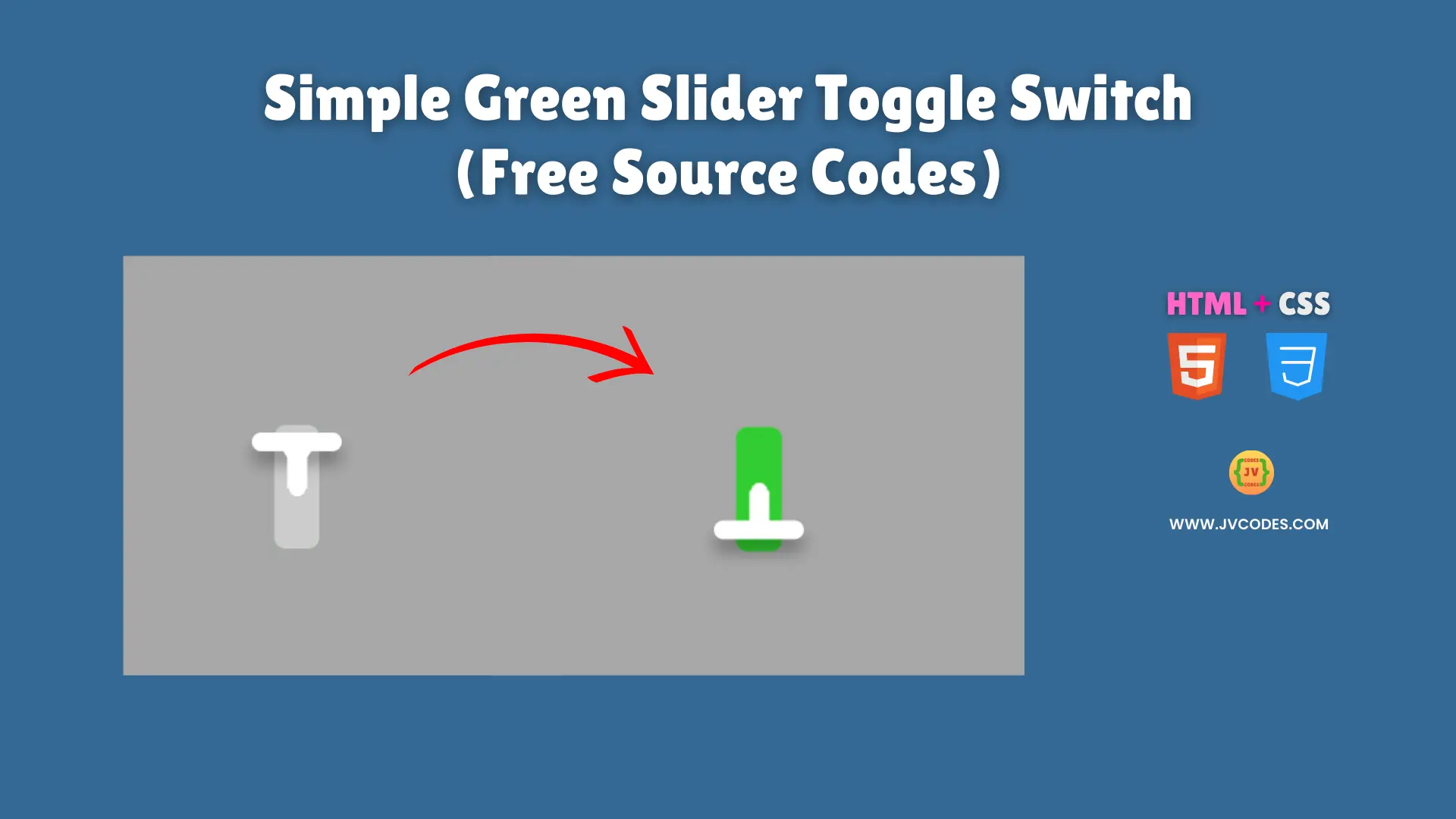
Simple Green Slider Toggle Switch Using HTML and CSS (Free Source Code)
A simple Green Slider Toggle Switch (HTML, CSS) is a modern stylish element that will help you to make your website’s user interface more vibrant and appealing.
This toggle switch is smooth moving switch with a glowing green touch when used. I will give you the free source code that follows good programming practices such that it can be easily integrated and will perform well in your projects.
GitHub Source: Simple Green Slider Toggle Switch
Features
- Modern Website Aesthetics: This switch has a clean and minimal design that can be perfectly incorporated into the website aesthetics of almost any modern website collection or CMS.
- Smooth Animation: Slide nicely and offers clear visual feedback while toggling on and off.
- Support for the device: Works perfectly well on desktops, tablets and mobiles.
- Easy to Change: You can change the colors, sizes and shadows, ensuring they fit your brand style and website design.
Technologies Used
- HTML (Hypertext Markup Language)
- CSS (Cascading Style Sheets)
Recommended for You
- Animated Robot Toggle Switch
- Retro-Style Power Toggle Switch
- Modern Toggle Switch with Sun & Moon Animation
- Hero Section with Snowfall Effect
- QR Code Scanner or Reader
Video Tutorial

Steps to Build Toggle Switch
It’s easy to build Simple Green Slider Toggle Switch with HTML and CSS. Copy the provided HTML to your webpage, and past CSS to your stylesheet. You are able to customize size, color, etc. as fits. It is simple to use plug and play method that enables you to quickly and easily add a smooth toggle to your website, while not needing extra libraries and complex set ups.
HTML
Here is the HTML code for your index.html file:
<!DOCTYPE html>
<!-- Developed by Shokat Javed available at www.jvcodes.com -->
<html lang="en">
<head>
    <meta charset="UTF-8">
    <meta name="viewport" content="width=device-width, initial-scale=1.0">
    <title>Simple Green Slider Toggle Switch - JV Codes</title>
    <link rel="stylesheet" href="style.css">
</head>
<body>
  <label class="switch">
    <input type="checkbox" class="chk">
    <span class="slider"></span>
  </label>
</body>
</html>
CSS
Here is the complete code for style.css file to style the Toggle Switch:
body {
    margin: 0;
    display: flex;
    justify-content: center;
    align-items: center;
    min-height: 100vh;
    background-color: #a8a8a8;
  }

/* From Uiverse.io by Praashoo7 */
/* The switch - the box around the slider */
.switch {
  font-size: 17px;
  position: relative;
  display: inline-block;
  width: 1.2em;
  height: 3.3em;
}

/* Hide default HTML checkbox */
.switch .chk {
  opacity: 0;
  width: 0;
  height: 0;
}

/* The slider */
.slider {
  position: absolute;
  cursor: pointer;
  top: 0;
  left: 0;
  right: 0;
  bottom: 0;
  background-color: #ccc;
  transition: .4s;
  border-radius: 5px;
}

.slider:before {
  position: absolute;
  content: "";
  height: .5em;
  width: 2.4em;
  border-radius: 5px;
  left: -0.6em;
  top: 0.2em;
  background-color: white;
  box-shadow: 0 6px 7px rgba(0,0,0,0.3);
  transition: .4s;
}

.slider:before, .slider:after {
  content: "";
  display: block;
}

.slider:after {
  background: linear-gradient(transparent 50%, rgba(255, 255, 255, 0.15) 0) 0 50% / 50% 100%,
		repeating-linear-gradient(90deg,rgb(255, 255, 255) 0,rgb(255, 255, 255),rgb(255, 255, 255) 20%,rgb(255, 255, 255) 20%,rgb(255, 255, 255) 40%) 0 50% / 50% 100%,
		radial-gradient(circle at 50% 50%,rgb(255, 255, 255) 25%, transparent 26%);
  background-repeat: no-repeat;
  border: 0.25em solid transparent;
  border-left: 0.4em solid #ffffff;
  border-right: 0 solid transparent;
  transition: border-left-color 0.1s 0.3s ease-out, transform 0.3s ease-out;
  transform: translateX(-22.5%) rotate(90deg);
  transform-origin: 25% 50%;
  position: relative;
  top: 0.5em;
  left: 0.55em;
  width: 2em;
  height: 1em;
  box-sizing: border-box;
}

.chk:checked + .slider {
  background-color: limegreen;
}

.chk:focus + .slider {
  box-shadow: 0 0 1px limegreen;
}

.chk:checked + .slider:before {
  transform: translateY(2.3em);
}

.chk:checked + .slider:after {
  transform: rotateZ(90deg) rotateY(180deg) translateY(0.45em) translateX(-1.4em);
}
Download Source Code
There is free source code you can download via the button below without any copyright restrictions. This ready-to-use code can be used in both of your personal and commercial projects.
Conclusion
This code should be implemented in most of your websites to enhance the user experience and highlight your development talent.
Make sure to link back to JV Source Codes, place the freebie to your blog or website, subscribe and grab more free resources I have and if you have any questions or problems, feel free to leave your comment here and I’d gladly reply to you.