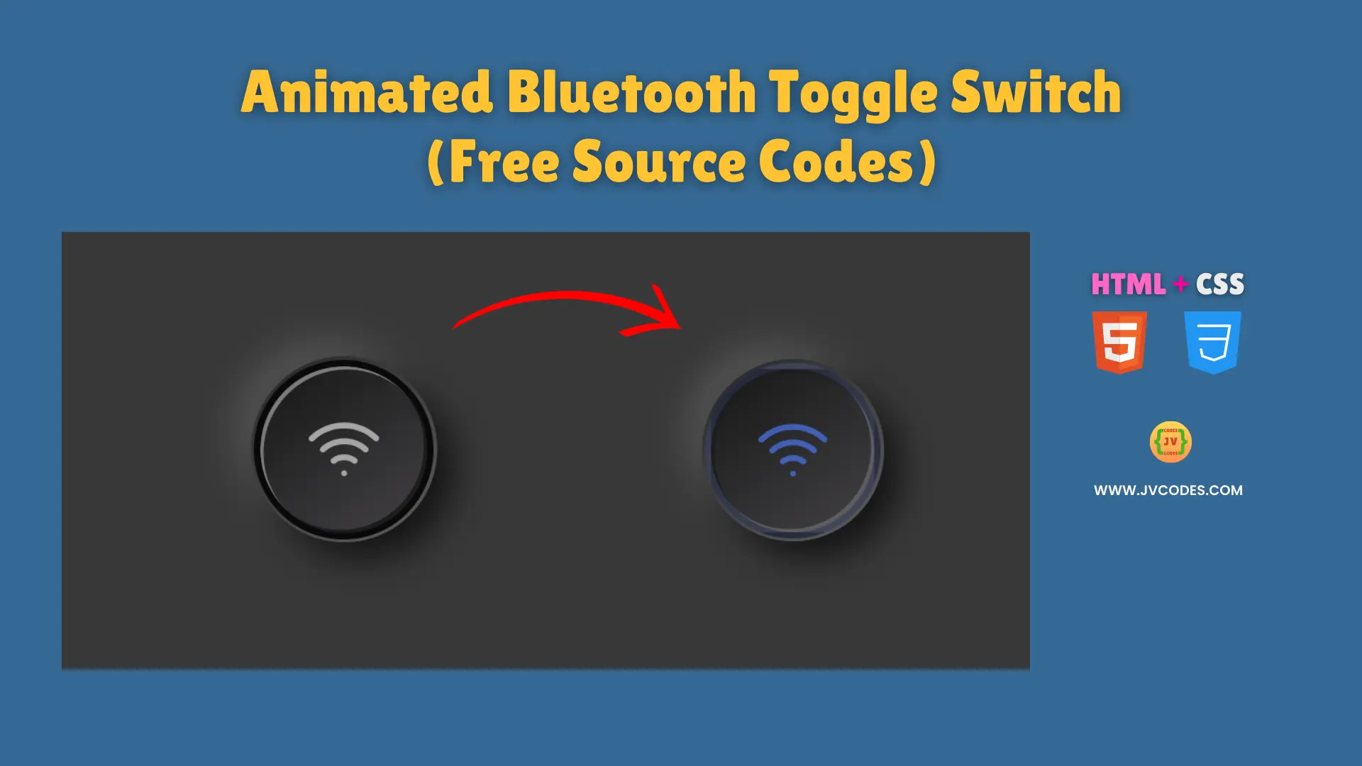
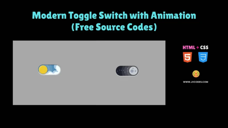
Animated Bluetooth Toggle Switch Using HTML and CSS (Free Source Code)
The Animated Bluetooth Toggle Switch Using HTML and CSS represents an interactive component which enhances websites with modern design and user-friendly functionality.
This toggle switch includes smooth animations which replicate the appearance of a Bluetooth button to give users an easy to use on/off functionality. You will obtain free source code from me which follows good programming standards thus enabling easy implementation of this feature within your project.
GitHub Source: Animated Bluetooth Toggle Switch
Features
- Neumorphic Design: Delivers a realistic 3D effect with smooth gradients and shadows.
- Smooth Animation: Provides fluid transitions that enhance user interaction.
- Responsive Layout: Adapts perfectly across desktops, tablets, and mobile devices.
- Customizable Style: Easily modify colors, sizes, and effects to match your site’s theme.
Technologies Used
- HTML (Hypertext Markup Language)
- CSS (Cascading Style Sheets)
Recommended for You
- Download Button with Progress Animation
- Smooth Slide On/Off Text-Based Toggle Switch
- Simple Green Slider Toggle Switch
- Responsive 3D Toggle Switch
- Animated Robot Toggle Switch
Video Tutorial

Steps to Build Bluetooth Toggle Switch
The creation of the Animated Bluetooth Toggle Switch using both HTML and CSS maintains a straightforward process. Insert the provided HTML text into webpages then place CSS code content within your stylesheet. You can edit the style using the available CSS variables after pasting the code.
HTML
Here is the HTML code for your index.html file:
<!DOCTYPE html>
<!-- Developed by Shokat Javed available at www.jvcodes.com -->
<html lang="en">
<head>
    <meta charset="UTF-8">
    <meta name="viewport" content="width=device-width, initial-scale=1.0">
    <title>Animated Bluetooth Toggle Switch - JV Codes</title>
    <link rel="stylesheet" href="style.css">
</head>
<body>
<div class="container">
  <input id="checkbox" type="checkbox">
   <label class="button" for="checkbox">
    <span class="icon">
     <svg viewBox="0 0 24 24" fill="" xmlns="http://www.w3.org/2000/svg"><g id="SVGRepo_bgCarrier" stroke-width="0"></g><g id="SVGRepo_tracerCarrier" stroke-linecap="round" stroke-linejoin="round"></g><g id="SVGRepo_iconCarrier"> <path d="M17.35 12.7901C17.1686 12.7907 16.9935 12.7229 16.86 12.6001C15.5322 11.411 13.8124 10.7534 12.03 10.7534C10.2476 10.7534 8.52779 11.411 7.19999 12.6001C7.12649 12.6658 7.04075 12.7164 6.94767 12.749C6.85459 12.7816 6.756 12.7955 6.65755 12.7899C6.55909 12.7843 6.4627 12.7594 6.37389 12.7165C6.28508 12.6736 6.2056 12.6137 6.13999 12.5401C6.0109 12.3892 5.94595 12.1939 5.95904 11.9958C5.97212 11.7977 6.06219 11.6126 6.20999 11.4801C7.80752 10.0423 9.88072 9.2467 12.03 9.2467C14.1793 9.2467 16.2525 10.0423 17.85 11.4801C17.9978 11.6126 18.0879 11.7977 18.1009 11.9958C18.114 12.1939 18.0491 12.3892 17.92 12.5401C17.8469 12.6181 17.7586 12.6806 17.6606 12.7236C17.5627 12.7665 17.457 12.7892 17.35 12.7901Z" fill=""></path> <path d="M20 10C19.811 9.99907 19.6292 9.92777 19.49 9.80002C17.4685 7.87306 14.7828 6.79812 11.99 6.79812C9.19719 6.79812 6.51153 7.87306 4.48999 9.80002C4.42116 9.88186 4.33563 9.94804 4.23912 9.99411C4.14262 10.0402 4.03738 10.0651 3.93046 10.0672C3.82354 10.0692 3.71742 10.0484 3.61921 10.0061C3.521 9.96375 3.43298 9.90092 3.36105 9.82179C3.28911 9.74267 3.23493 9.64907 3.20214 9.54729C3.16934 9.4455 3.15869 9.33788 3.17091 9.23164C3.18312 9.1254 3.21791 9.023 3.27294 8.93131C3.32798 8.83962 3.40198 8.76076 3.48999 8.70002C5.78577 6.52533 8.82774 5.31329 11.99 5.31329C15.1522 5.31329 18.1942 6.52533 20.49 8.70002C20.5994 8.80134 20.6761 8.93298 20.7103 9.07811C20.7446 9.22324 20.7348 9.37527 20.6822 9.5148C20.6296 9.65433 20.5366 9.77502 20.4151 9.86145C20.2936 9.94787 20.1491 9.99612 20 10Z" fill=""></path> <path d="M9.38 15.64C9.26356 15.64 9.14873 15.6129 9.04459 15.5608C8.94044 15.5088 8.84986 15.4332 8.78 15.34C8.7196 15.2617 8.67551 15.1721 8.65032 15.0765C8.62513 14.9809 8.61936 14.8812 8.63334 14.7834C8.64732 14.6855 8.68078 14.5914 8.73173 14.5067C8.78268 14.4219 8.8501 14.3483 8.93 14.29C9.81277 13.6145 10.8934 13.2485 12.005 13.2485C13.1166 13.2485 14.1972 13.6145 15.08 14.29C15.1588 14.3491 15.2252 14.4232 15.2754 14.5079C15.3255 14.5926 15.3585 14.6865 15.3725 14.784C15.3864 14.8815 15.381 14.9807 15.3565 15.0762C15.3321 15.1716 15.2891 15.2612 15.23 15.34C15.1091 15.497 14.9316 15.6005 14.7355 15.6285C14.5394 15.6565 14.34 15.6068 14.18 15.49C13.5548 15.014 12.7908 14.7561 12.005 14.7561C11.2192 14.7561 10.4551 15.014 9.83 15.49C9.69921 15.5855 9.54193 15.6379 9.38 15.64Z" fill=""></path> <path d="M12 18.75C11.8011 18.75 11.6103 18.671 11.4697 18.5303C11.329 18.3897 11.25 18.1989 11.25 18C11.25 17.8011 11.329 17.6103 11.4697 17.4697C11.6103 17.329 11.8011 17.25 12 17.25C12.1989 17.25 12.3897 17.329 12.5303 17.4697C12.671 17.6103 12.75 17.8011 12.75 18C12.75 18.1989 12.671 18.3897 12.5303 18.5303C12.3897 18.671 12.1989 18.75 12 18.75Z" fill=""></path> </g></svg>
   </span>
   </label>
</div>
</body>
</html>
CSS
Here is the complete code for style.css file to style the Toggle Switch:
body {
    margin: 0;
    display: flex;
    justify-content: center;
    align-items: center;
    min-height: 100vh;
    background-color: #383838;
  }

.container {
  width: 7em;
  height: 7em;
  position: relative;
}

.button {
  position: absolute;
  width: 100%;
  height: 100%;
  border-radius: 50%;
  border: 4px solid #090909;
  background-color: transparent;
  background-image: linear-gradient(145deg, #171717, #444245);
  box-sizing: border-box;
  box-shadow: inset 2px 2px 0 #7d7c7e, inset -2px -2px 0px #1c1c1c;
  display: flex;
  align-items: center;
  justify-content: center;
}

.container input {
  display: none;
}

.button::before {
  position: absolute;
  content: "";
  width: 7.25em;
  height: 7.25em;
  border-radius: inherit;
  background-color: transparent;
  background-image: linear-gradient(145deg, #262626, #606060);
  z-index: -1;
  box-shadow: 11px 11px 22px #141414, -11px -11px 22px #525252;
}

.button .icon {
  width: 60px;
  height: 60px;
  display: inline-block;
}

.button .icon svg {
  height: 100%;
  width: 100%;
  fill: #a5a5a5;
}

.container  input:checked + .button {
  box-shadow: inset -2px -2px 0 #5e5e5e,inset 2px 2px 0 #1c1c1c;
  border: 4px solid rgba(77, 124, 255, 0.281);
  animation: animeBorder .3s linear alternate-reverse infinite;
}

.container input:checked + .button .icon svg {
  fill: rgb(77, 124, 255);
  animation: animeFill .3s linear alternate-reverse infinite;
}

@keyframes animeFill {
  to {
    fill: rgba(77, 124, 255, 0.642);
  }
}

@keyframes animeBorder {
  to {
    border-color: rgba(77, 124, 255, 0.137);
  }
}
Download Source Code
The complete source code of Animated Bluetooth Toggle Switch can be obtained for free through the download button below. The code availability does not impose copyright restrictions so it can be used by anyone for personal or commercial needs.
Conclusion
Use this code on your websites to enhance user experience and give your design a modern, dynamic flair.
Remember to credit JV Source Codes by linking back, subscribe for more free resources, and if you have any questions or encounter any issues, please leave a comment—I will be happy to reply.
