Animated Gear Loader Using HTML and CSS (Free Source Code)
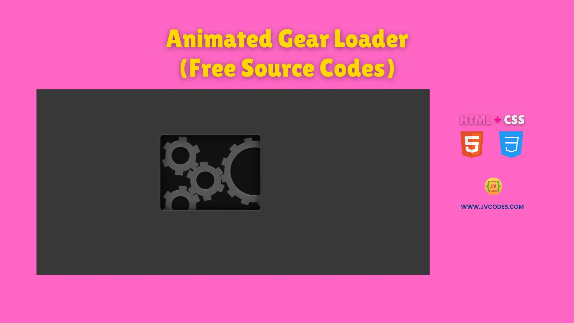
An animated gear loader using HTML and CSS serves as an attractive solution for displaying waiting durations or progress status on webpages.
Users see multiple rotating gears that display different spinning speeds to create a mechanical animation. You will receive this free code implementation which follows good programming rules to enable both beginner and expert developers for integration.
The loader functions as an essential element that suits application to UI elements and web components within your project needs.
GitHub Source: Animated Gear Loader
Features of Animated Gear Loader
- Realistic Gear Motion: Each gear moves circularly through forward and backward rotations which generates an animated effect.
- Customizable Speed: This interface element allows users to modify the speed of rotation which gives them full control over matching their site design preferences.
- Lightweight Code: This loader exists solely in HTML and CSS which maintains quick page loading times and smooth execution.
- Easy Integration: This structure fits junior coding projects because implementation sets up quickly without complex configuration steps.
Technologies Used
- HTML (Hypertext Markup Language)
- CSS (Cascading Style Sheets)
Recommended for You
- Smooth Ripple Effect Loader
- 3D Cube Loader
- Animated Multi-Color Text Loader
- Animated Hamster Loading Wheel
- Modern 3D Biometric Toggle Switch
Video Tutorial

Steps to Build Website Loader
Build this loader by placing the HTML code on your webpage while adding the CSS code in your stylesheet. Set the rotation duration and modify the gear dimensions until the loader appears exactly as you designed it for your site. You should use this approach as your preferred method since it executes quickly and works well for all website sizes from minimal personal websites to complex platforms.
HTML
Here is the HTML code for your index.html file:
<!DOCTYPE html>
<!-- Developed by Shokat Javed available at www.jvcodes.com -->
<html lang="en">
<head>
    <meta charset="UTF-8">
    <meta name="viewport" content="width=device-width, initial-scale=1.0">
    <title>Modern 3D Biometric Toggle Switch - JV Codes</title>
    <link rel="stylesheet" href="style.css">
</head>
<body>

<div class="gearbox">
    <div class="overlay"></div>
      <div class="gear one">
        <div class="gear-inner">
          <div class="bar"></div>
          <div class="bar"></div>
          <div class="bar"></div>
        </div>
      </div>
      <div class="gear two">
        <div class="gear-inner">
          <div class="bar"></div>
          <div class="bar"></div>
          <div class="bar"></div>
        </div>
      </div>
      <div class="gear three">
        <div class="gear-inner">
          <div class="bar"></div>
          <div class="bar"></div>
          <div class="bar"></div>
        </div>
      </div>
      <div class="gear four large">
        <div class="gear-inner">
          <div class="bar"></div>
          <div class="bar"></div>
          <div class="bar"></div>
          <div class="bar"></div>
          <div class="bar"></div>
          <div class="bar"></div>
        </div>
      </div>
    </div>

</body>
</html>
CSS
Here is the complete code for style.css file to style the loader:
body {
    margin: 0;
    display: flex;
    justify-content: center;
    align-items: center;
    min-height: 100vh;
    background-color: #383838;
  }
/* From Uiverse.io by Nawsome */
@keyframes clockwise {
  0% {
    transform: rotate(0deg);
  }

  100% {
    transform: rotate(360deg);
  }
}

@keyframes counter-clockwise {
  0% {
    transform: rotate(0deg);
  }

  100% {
    transform: rotate(-360deg);
  }
}

.gearbox {
  background: #111;
  height: 150px;
  width: 200px;
  position: relative;
  border: none;
  overflow: hidden;
  border-radius: 6px;
  box-shadow: 0px 0px 0px 1px rgba(255, 255, 255, 0.1);
}

.gearbox .overlay {
  border-radius: 6px;
  content: "";
  position: absolute;
  top: 0;
  left: 0;
  width: 100%;
  height: 100%;
  z-index: 10;
  box-shadow: inset 0px 0px 20px black;
  transition: background 0.2s;
}

.gearbox .overlay {
  background: transparent;
}

.gear {
  position: absolute;
  height: 60px;
  width: 60px;
  box-shadow: 0px -1px 0px 0px #888888, 0px 1px 0px 0px black;
  border-radius: 30px;
}

.gear.large {
  height: 120px;
  width: 120px;
  border-radius: 60px;
}

.gear.large:after {
  height: 96px;
  width: 96px;
  border-radius: 48px;
  margin-left: -48px;
  margin-top: -48px;
}

.gear.one {
  top: 12px;
  left: 10px;
}

.gear.two {
  top: 61px;
  left: 60px;
}

.gear.three {
  top: 110px;
  left: 10px;
}

.gear.four {
  top: 13px;
  left: 128px;
}

.gear:after {
  content: "";
  position: absolute;
  height: 36px;
  width: 36px;
  border-radius: 36px;
  background: #111;
  top: 50%;
  left: 50%;
  margin-left: -18px;
  margin-top: -18px;
  z-index: 3;
  box-shadow: 0px 0px 10px rgba(255, 255, 255, 0.1), inset 0px 0px 10px rgba(0, 0, 0, 0.1), inset 0px 2px 0px 0px #090909, inset 0px -1px 0px 0px #888888;
}

.gear-inner {
  position: relative;
  height: 100%;
  width: 100%;
  background: #555;
  border-radius: 30px;
  border: 1px solid rgba(255, 255, 255, 0.1);
}

.large .gear-inner {
  border-radius: 60px;
}

.gear.one .gear-inner {
  animation: counter-clockwise 3s infinite linear;
}

.gear.two .gear-inner {
  animation: clockwise 3s infinite linear;
}

.gear.three .gear-inner {
  animation: counter-clockwise 3s infinite linear;
}

.gear.four .gear-inner {
  animation: counter-clockwise 6s infinite linear;
}

.gear-inner .bar {
  background: #555;
  height: 16px;
  width: 76px;
  position: absolute;
  left: 50%;
  margin-left: -38px;
  top: 50%;
  margin-top: -8px;
  border-radius: 2px;
  border-left: 1px solid rgba(255, 255, 255, 0.1);
  border-right: 1px solid rgba(255, 255, 255, 0.1);
}

.large .gear-inner .bar {
  margin-left: -68px;
  width: 136px;
}

.gear-inner .bar:nth-child(2) {
  transform: rotate(60deg);
}

.gear-inner .bar:nth-child(3) {
  transform: rotate(120deg);
}

.gear-inner .bar:nth-child(4) {
  transform: rotate(90deg);
}

.gear-inner .bar:nth-child(5) {
  transform: rotate(30deg);
}

.gear-inner .bar:nth-child(6) {
  transform: rotate(150deg);
}
Download Source Code
Users can obtain this source code without copyright restrictions from the provided download button. The code is ready to be adjusted for personal use or commercial purposes.
Conclusion
This code will enhance website loading speed and create a futuristic mechanical look for your site interface. Using this code allows both performance improvement and creative portfolio showcase that attracts potential clients.
You should include a link back to JV Source Codes while subscription benefits our YouTube channel and you are welcome to adopt more of our collection which includes UI elements, forms, cards, galleries, menus, footer and hero section.
All comments regarding questions or technical problems will get responses from me.