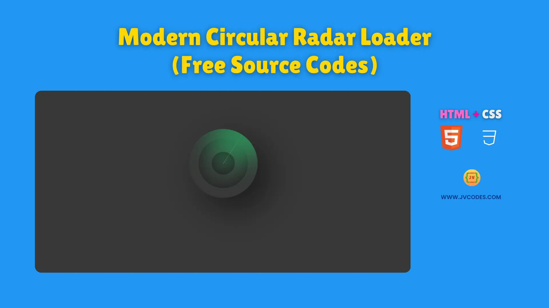
Modern Circular Radar Loader Using HTML and CSS (Free Source Code)
Modern Circular Radar Loader Using HTML and CSS is a beautiful and dynamic loading animation that would stand out your website.
Using the examples of my project, I would be able to give you the free source code, and it’s written according to good programming practices, so that it will be easy for coding both for beginners or for advanced developers.
This loader simulates the rotating radar sweep which gives a futuristic look and smooth user experience. In addition, it fits with other UI elements, web components, and Open Source UI libraries you may also be using.
GitHub Source:
Features of Modern Circular Radar Loader
- Responsive Design: Maintains its shape and style across different screen sizes.
- Smooth Rotating Effect: The radar-like sweep glides seamlessly in a circular motion.
- Lightweight Code: Built with only HTML and CSS for fast loading.
- Easy Customization: Adjust color, size, or rotation speed with simple CSS edits.
Technologies Used
- HTML (Hypertext Markup Language)
- CSS (Cascading Style Sheets)
Recommended for You
- Animated Gear Loader
- Smooth Ripple Effect Loader
- 3D Cube Loader
- Animated Multi-Color Text Loader
- Animated Hamster Loading Wheel
Video Tutorial

Steps to Build Website Loader
In order to do this, you will need to copy the HTML code into your webpage and the CSS into your stylesheet. After that, change the animation duration or colors how you would like it. For beginners, it is quite straightforward method that allows you quickly integrate the loader, which is extremely beneficial for coding projects and other website components too.
HTML
Here is the HTML code for your index.html file:
<!DOCTYPE html>
<!-- Developed by Shokat Javed available at www.jvcodes.com -->
<html lang="en">
<head>
    <meta charset="UTF-8">
    <meta name="viewport" content="width=device-width, initial-scale=1.0">
    <title>Modern Circular Radar Loader - JV Codes</title>
    <link rel="stylesheet" href="style.css">
</head>
<body>
<div class="loader">
    <span></span>
</div>
</body>
</html>
CSS
Here is the complete code for style.css file to style the loader:
body {
    margin: 0;
    display: flex;
    justify-content: center;
    align-items: center;
    min-height: 100vh;
    background-color: #383838;
  }
.loader {
  position: relative;
  width: 150px;
  height: 150px;
  background: transparent;
  border-radius: 50%;
  box-shadow: 25px 25px 75px rgba(0,0,0,0.55);
  border: 1px solid #333;
  display: flex;
  align-items: center;
  justify-content: center;
  overflow: hidden;
}

.loader::before {
  content: '';
  position: absolute;
  inset: 20px;
  background: transparent;
  border: 1px dashed#444;
  border-radius: 50%;
  box-shadow: inset -5px -5px 25px rgba(0,0,0,0.25),
  inset 5px 5px 35px rgba(0,0,0,0.25);
}

.loader::after {
  content: '';
  position: absolute;
  width: 50px;
  height: 50px;
  border-radius: 50%;
  border: 1px dashed#444;
  box-shadow: inset -5px -5px 25px rgba(0,0,0,0.25),
  inset 5px 5px 35px rgba(0,0,0,0.25);
}

.loader span {
  position: absolute;
  top: 50%;
  left: 50%;
  width: 50%;
  height: 100%;
  background: transparent;
  transform-origin: top left;
  animation: radar81 2s linear infinite;
  border-top: 1px dashed #fff;
}

.loader span::before {
  content: '';
  position: absolute;
  top: 0;
  left: 0;
  width: 100%;
  height: 100%;
  background: seagreen;
  transform-origin: top left;
  transform: rotate(-55deg);
  filter: blur(30px) drop-shadow(20px 20px 20px seagreen);
}

@keyframes radar81 {
  0% {
    transform: rotate(0deg);
  }

  100% {
    transform: rotate(360deg);
  }
}
Download Source Code
The source code can be downloaded from the button below without any copyright restrictions. You are free to use is in personal or commercial projects.
Conclusion
Use this code in your websites to enrich user engagement and give your interface a sleek, modern vibe.
Remember to credit JV Source Codes by linking back, subscribe to our YouTube channel, and explore our other UI elements, forms, cards, galleries, menus, footer, and hero section. If you have any questions or issues, please leave a comment—I will be happy to reply.