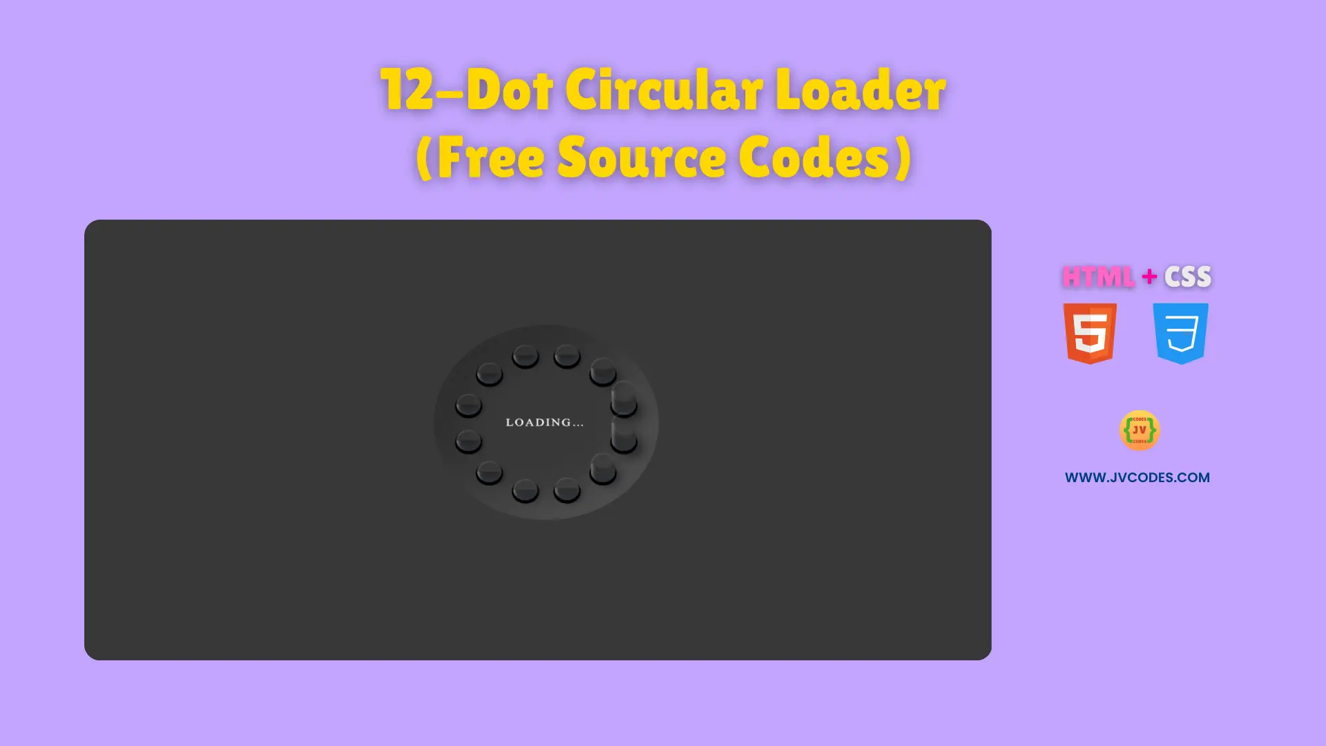
12-Dot Circular Loader Using HTML and CSS (Free Source Code)
The 12-Dot Circular Loader Using HTML and CSS creates an attractive modern animation that holds viewers interest throughout content loading time.
The next section contains free code that follows good programming standards to help you implement the code into your projects without difficulty. The loading option fits various beginner developer projects and visual web elements because of its flexible abilities and design appeal.
The component suits multiple types of Open-Source UI libraries and user interface elements providing development flexibility to both beginner and experienced programmers.
GitHub Source: 12-Dot Circular Loader
Features of 12-Dot Circular Loader
- Easy Customization: You can change dot colors, speeds, or sizes to match your site’s design and style.
- Smooth Rotation: Twelve dots rotate in a circular path, creating a continuous and pleasant motion.
- Lightweight Code: Only HTML and CSS are used, ensuring quick loading times and minimal maintenance.
- Responsive Layout: The loader maintains its shape and movement across different screen sizes and devices.
Technologies Used
- HTML (Hypertext Markup Language)
- CSS (Cascading Style Sheets)
Recommended for You
- Modern Circular Radar Loader
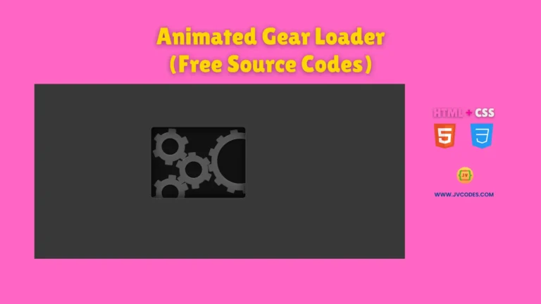
- Animated Gear Loader
- Smooth Ripple Effect Loader
- 3D Cube Loader
- Animated Multi-Color Text Loader
Video Tutorial

Steps to Build Website Loader
The process requires two steps which consist of pasting the HTML code into your webpage followed by adding the CSS code to your stylesheet. Adjust the loader’s dot color scheme and speed through modifications to matching CSS attributes. The quick implementation process coupled with its efficiency enables you to build an elegant site feature without wasting your time.
HTML
Here is the HTML code for your index.html file:
<!DOCTYPE html>
<!-- Developed by Shokat Javed available at www.jvcodes.com -->
<html lang="en">
<head>
    <meta charset="UTF-8">
    <meta name="viewport" content="width=device-width, initial-scale=1.0">
    <title>12-Dot Circular Loader - JV Codes</title>
    <link rel="stylesheet" href="style.css">
</head>
<body>
<div class="pl">
	<div class="pl__dot"></div>
	<div class="pl__dot"></div>
	<div class="pl__dot"></div>
	<div class="pl__dot"></div>
	<div class="pl__dot"></div>
	<div class="pl__dot"></div>
	<div class="pl__dot"></div>
	<div class="pl__dot"></div>
	<div class="pl__dot"></div>
	<div class="pl__dot"></div>
	<div class="pl__dot"></div>
	<div class="pl__dot"></div>
	<div class="pl__text">Loading…</div>
</div>
</body>
</html>
CSS
Here is the complete code for style.css file to style the loader:
body {
    margin: 0;
    display: flex;
    justify-content: center;
    align-items: center;
    min-height: 100vh;
    background-color: #383838;
  }
.pl {
  box-shadow: 2em 0 2em rgba(0, 0, 0, 0.2) inset, -2em 0 2em rgba(255, 255, 255, 0.1) inset;
  display: flex;
  justify-content: center;
  align-items: center;
  position: relative;
  letter-spacing: 0.1em;
  text-transform: uppercase;
  transform: rotateX(30deg) rotateZ(45deg);
  width: 14em;
  height: 14em;
  color: white;
}

.pl, .pl__dot {
  border-radius: 50%;
}

.pl__dot {
  animation-name: shadow724;
  box-shadow: 0.1em 0.1em 0 0.1em black, 0.3em 0 0.3em rgba(0, 0, 0, 0.5);
  top: calc(50% - 0.75em);
  left: calc(50% - 0.75em);
  width: 1.5em;
  height: 1.5em;
}

.pl__dot, .pl__dot:before, .pl__dot:after {
  animation-duration: 2s;
  animation-iteration-count: infinite;
  position: absolute;
}

.pl__dot:before, .pl__dot:after {
  content: "";
  display: block;
  left: 0;
  width: inherit;
  transition: background-color var(--trans-dur);
}

.pl__dot:before {
  animation-name: pushInOut1724;
  background-color: var(--bg);
  border-radius: inherit;
  box-shadow: 0.05em 0 0.1em rgba(255, 255, 255, 0.2) inset;
  height: inherit;
  z-index: 1;
}

.pl__dot:after {
  animation-name: pushInOut2724;
  background-color: var(--primary1);
  border-radius: 0.75em;
  box-shadow: 0.1em 0.3em 0.2em rgba(255, 255, 255, 0.4) inset, 0 -0.4em 0.2em #2e3138 inset, 0 -1em 0.25em rgba(0, 0, 0, 0.3) inset;
  bottom: 0;
  clip-path: polygon(0 75%, 100% 75%, 100% 100%, 0 100%);
  height: 3em;
  transform: rotate(-45deg);
  transform-origin: 50% 2.25em;
}

.pl__dot:nth-child(1) {
  transform: rotate(0deg) translateX(5em) rotate(0deg);
  z-index: 5;
}

.pl__dot:nth-child(1), .pl__dot:nth-child(1):before, .pl__dot:nth-child(1):after {
  animation-delay: 0s;
}

.pl__dot:nth-child(2) {
  transform: rotate(-30deg) translateX(5em) rotate(30deg);
  z-index: 4;
}

.pl__dot:nth-child(2), .pl__dot:nth-child(2):before, .pl__dot:nth-child(2):after {
  animation-delay: -0.1666666667s;
}

.pl__dot:nth-child(3) {
  transform: rotate(-60deg) translateX(5em) rotate(60deg);
  z-index: 3;
}

.pl__dot:nth-child(3), .pl__dot:nth-child(3):before, .pl__dot:nth-child(3):after {
  animation-delay: -0.3333333333s;
}

.pl__dot:nth-child(4) {
  transform: rotate(-90deg) translateX(5em) rotate(90deg);
  z-index: 2;
}

.pl__dot:nth-child(4), .pl__dot:nth-child(4):before, .pl__dot:nth-child(4):after {
  animation-delay: -0.5s;
}

.pl__dot:nth-child(5) {
  transform: rotate(-120deg) translateX(5em) rotate(120deg);
  z-index: 1;
}

.pl__dot:nth-child(5), .pl__dot:nth-child(5):before, .pl__dot:nth-child(5):after {
  animation-delay: -0.6666666667s;
}

.pl__dot:nth-child(6) {
  transform: rotate(-150deg) translateX(5em) rotate(150deg);
  z-index: 1;
}

.pl__dot:nth-child(6), .pl__dot:nth-child(6):before, .pl__dot:nth-child(6):after {
  animation-delay: -0.8333333333s;
}

.pl__dot:nth-child(7) {
  transform: rotate(-180deg) translateX(5em) rotate(180deg);
  z-index: 2;
}

.pl__dot:nth-child(7), .pl__dot:nth-child(7):before, .pl__dot:nth-child(7):after {
  animation-delay: -1s;
}

.pl__dot:nth-child(8) {
  transform: rotate(-210deg) translateX(5em) rotate(210deg);
  z-index: 3;
}

.pl__dot:nth-child(8), .pl__dot:nth-child(8):before, .pl__dot:nth-child(8):after {
  animation-delay: -1.1666666667s;
}

.pl__dot:nth-child(9) {
  transform: rotate(-240deg) translateX(5em) rotate(240deg);
  z-index: 4;
}

.pl__dot:nth-child(9), .pl__dot:nth-child(9):before, .pl__dot:nth-child(9):after {
  animation-delay: -1.3333333333s;
}

.pl__dot:nth-child(10) {
  transform: rotate(-270deg) translateX(5em) rotate(270deg);
  z-index: 5;
}

.pl__dot:nth-child(10), .pl__dot:nth-child(10):before, .pl__dot:nth-child(10):after {
  animation-delay: -1.5s;
}

.pl__dot:nth-child(11) {
  transform: rotate(-300deg) translateX(5em) rotate(300deg);
  z-index: 6;
}

.pl__dot:nth-child(11), .pl__dot:nth-child(11):before, .pl__dot:nth-child(11):after {
  animation-delay: -1.6666666667s;
}

.pl__dot:nth-child(12) {
  transform: rotate(-330deg) translateX(5em) rotate(330deg);
  z-index: 6;
}

.pl__dot:nth-child(12), .pl__dot:nth-child(12):before, .pl__dot:nth-child(12):after {
  animation-delay: -1.8333333333s;
}

.pl__text {
  font-size: 0.75em;
  max-width: 5rem;
  position: relative;
  text-shadow: 0 0 0.1em var(--fg-t);
  transform: rotateZ(-45deg);
}

/* Animations */
@keyframes shadow724 {
  from {
    animation-timing-function: ease-in;
    box-shadow: 0.1em 0.1em 0 0.1em black, 0.3em 0 0.3em rgba(0, 0, 0, 0.3);
  }

  25% {
    animation-timing-function: ease-out;
    box-shadow: 0.1em 0.1em 0 0.1em black, 0.8em 0 0.8em rgba(0, 0, 0, 0.5);
  }

  50%, to {
    box-shadow: 0.1em 0.1em 0 0.1em black, 0.3em 0 0.3em rgba(0, 0, 0, 0.3);
  }
}

@keyframes pushInOut1724 {
  from {
    animation-timing-function: ease-in;
    background-color: var(--bg);
    transform: translate(0, 0);
  }

  25% {
    animation-timing-function: ease-out;
    background-color: var(--primary2);
    transform: translate(-71%, -71%);
  }

  50%, to {
    background-color: var(--bg);
    transform: translate(0, 0);
  }
}

@keyframes pushInOut2724 {
  from {
    animation-timing-function: ease-in;
    background-color: var(--bg);
    clip-path: polygon(0 75%, 100% 75%, 100% 100%, 0 100%);
  }

  25% {
    animation-timing-function: ease-out;
    background-color: var(--primary1);
    clip-path: polygon(0 25%, 100% 25%, 100% 100%, 0 100%);
  }

  50%, to {
    background-color: var(--bg);
    clip-path: polygon(0 75%, 100% 75%, 100% 100%, 0 100%);
  }
}
Download Source Code
Users can access the source code through the download button containing no copyright limitations. You can freely modify and use this code either for personal or commercial projects.
Conclusion
Your websites will benefit from this code to catch visitor attention while demonstrating your ability at making interactive loading screens together with keeping users engaged. Your portfolio receives increased value through this code and shows your competence in creating functional designs.
Add a link to JV Source Codes for credit while subscribing to our YouTube channel and checking out our additional UI elements, forms, cards, galleries, menus, footer and hero section. You can reach me through comments for questions or problems since I will respond promptly to address them.

