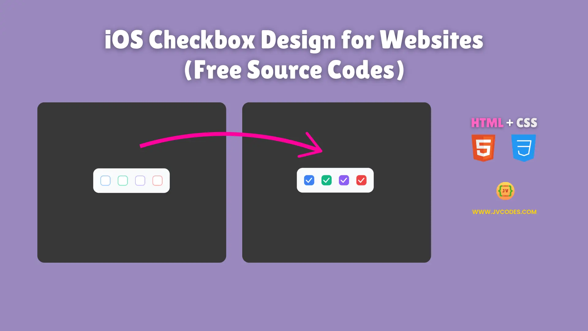
iOS Checkbox Design for Websites Using HTML and CSS (Free Source Code)
UI elements in web design such as check boxes are indeed essential components, in that they provide a means for the users to work with the forms and settings.
Today, I want to share with you a free source code of iOS style checkbox that is both visually appealing and functional. This code is perfectly optimized for modern ones and follows best coding practices.
If you are doing any kind of UI coding as an open source project then this beautiful thing will definitely go in the favour of your site.
GitHub Source: iOS Checkbox Design for Websites
Features of iOS Checkbox Design for Websites
- Fully Responsive: Adapts to different screen sizes for mobile and desktop views.
- Smooth Animation: The checkbox includes a bounce effect when clicked.
- Multiple Color Options: Available in blue, green, purple, and red variations.
- Hover and Active Effects: Enhances user experience with smooth transitions.
Technologies Used
- HTML (Hypertext Markup Language)
- CSS (Cascading Style Sheets)
Recommended for You
- Neumorphic Round Checkbox
- Animated Heart Checkbox
- Stylish Lock Icon Checkbox
- Interactive Burger Menu Checkbox
- Multi-Ring Circular Loader
Steps to Build Website Checkbox
Copy and paste the provided HTML and CSS code into your project to integrate this iOS-style checkbox. You have flexibility on colors, animations and sizes to match your website theme. It is lightweight without JavaScript, easy to use for a coding project for juniors or something beginner.
HTML
Here is the HTML code for your index.html file:
<!DOCTYPE html>
<!-- Developed by Shokat Javed available at www.jvcodes.com -->
<html lang="en">
<head>
    <meta charset="UTF-8">
    <meta name="viewport" content="width=device-width, initial-scale=1.0">
    <title>Modern 3D Biometric Toggle Switch - JV Codes</title>
    <link rel="stylesheet" href="style.css">
</head>
<body>
    <div class="checkbox-container">
        <label class="ios-checkbox blue">
          <input type="checkbox" />
          <div class="checkbox-wrapper">
            <div class="checkbox-bg"></div>
            <svg fill="none" viewBox="0 0 24 24" class="checkbox-icon">
              <path
                stroke-linejoin="round"
                stroke-linecap="round"
                stroke-width="3"
                stroke="currentColor"
                d="M4 12L10 18L20 6"
                class="check-path"
              ></path>
            </svg>
          </div>
        </label>

        <label class="ios-checkbox green">
          <input type="checkbox" />
          <div class="checkbox-wrapper">
            <div class="checkbox-bg"></div>
            <svg fill="none" viewBox="0 0 24 24" class="checkbox-icon">
              <path
                stroke-linejoin="round"
                stroke-linecap="round"
                stroke-width="3"
                stroke="currentColor"
                d="M4 12L10 18L20 6"
                class="check-path"
              ></path>
            </svg>
          </div>
        </label>

        <label class="ios-checkbox purple">
          <input type="checkbox" />
          <div class="checkbox-wrapper">
            <div class="checkbox-bg"></div>
            <svg fill="none" viewBox="0 0 24 24" class="checkbox-icon">
              <path
                stroke-linejoin="round"
                stroke-linecap="round"
                stroke-width="3"
                stroke="currentColor"
                d="M4 12L10 18L20 6"
                class="check-path"
              ></path>
            </svg>
          </div>
        </label>
        <label class="ios-checkbox red">
          <input type="checkbox" />
          <div class="checkbox-wrapper">
            <div class="checkbox-bg"></div>
            <svg fill="none" viewBox="0 0 24 24" class="checkbox-icon">
              <path
                stroke-linejoin="round"
                stroke-linecap="round"
                stroke-width="3"
                stroke="currentColor"
                d="M4 12L10 18L20 6"
                class="check-path"
              ></path>
            </svg>
          </div>
        </label>
      </div>

</body>
</html>
CSS
Here is the complete code for style.css file to style the checkbox:
body {
    margin: 0;
    display: flex;
    justify-content: center;
    align-items: center;
    min-height: 100vh;
    background-color: #383838;
  }
  .checkbox-container {
    display: flex;
    gap: 20px;
    padding: 20px;
    background: #f8fafc;
    border-radius: 16px;
    box-shadow:
      0 4px 6px -1px rgba(0, 0, 0, 0.1),
      0 2px 4px -2px rgba(0, 0, 0, 0.05);
  }

  .ios-checkbox {
    --checkbox-size: 28px;
    --checkbox-color: #3b82f6;
    --checkbox-bg: #dbeafe;
    --checkbox-border: #93c5fd;

    position: relative;
    display: inline-block;
    cursor: pointer;
    user-select: none;
    -webkit-tap-highlight-color: transparent;
  }

  .ios-checkbox input {
    display: none;
  }

  .checkbox-wrapper {
    position: relative;
    width: var(--checkbox-size);
    height: var(--checkbox-size);
    border-radius: 8px;
    transition: transform 0.2s ease;
  }

  .checkbox-bg {
    position: absolute;
    inset: 0;
    border-radius: 8px;
    border: 2px solid var(--checkbox-border);
    background: white;
    transition: all 0.2s ease;
  }

  .checkbox-icon {
    position: absolute;
    inset: 0;
    margin: auto;
    width: 80%;
    height: 80%;
    color: white;
    transform: scale(0);
    transition: all 0.2s ease;
  }

  .check-path {
    stroke-dasharray: 40;
    stroke-dashoffset: 40;
    transition: stroke-dashoffset 0.3s ease 0.1s;
  }

  /* Checked State */
  .ios-checkbox input:checked + .checkbox-wrapper .checkbox-bg {
    background: var(--checkbox-color);
    border-color: var(--checkbox-color);
  }

  .ios-checkbox input:checked + .checkbox-wrapper .checkbox-icon {
    transform: scale(1);
  }

  .ios-checkbox input:checked + .checkbox-wrapper .check-path {
    stroke-dashoffset: 0;
  }

  /* Hover Effects */
  .ios-checkbox:hover .checkbox-wrapper {
    transform: scale(1.05);
  }

  /* Active Animation */
  .ios-checkbox:active .checkbox-wrapper {
    transform: scale(0.95);
  }

  /* Focus Styles */
  .ios-checkbox input:focus + .checkbox-wrapper .checkbox-bg {
    box-shadow: 0 0 0 4px var(--checkbox-bg);
  }

  /* Color Themes */
  .ios-checkbox.blue {
    --checkbox-color: #3b82f6;
    --checkbox-bg: #dbeafe;
    --checkbox-border: #93c5fd;
  }

  .ios-checkbox.green {
    --checkbox-color: #10b981;
    --checkbox-bg: #d1fae5;
    --checkbox-border: #6ee7b7;
  }

  .ios-checkbox.purple {
    --checkbox-color: #8b5cf6;
    --checkbox-bg: #ede9fe;
    --checkbox-border: #c4b5fd;
  }

  .ios-checkbox.red {
    --checkbox-color: #ef4444;
    --checkbox-bg: #fee2e2;
    --checkbox-border: #fca5a5;
  }

  /* Animation */
  @keyframes bounce {
    0%,
    100% {
      transform: scale(1);
    }
    50% {
      transform: scale(1.1);
    }
  }

  .ios-checkbox input:checked + .checkbox-wrapper {
    animation: bounce 0.3s cubic-bezier(0.4, 0, 0.2, 1);
  }
Download Source Code
This source code can be downloaded without copyright restrictions below. It is free to modify and use in your web components or coding for beginners projects.
Conclusion
This iOS checkbox design can be used in your website user interface elements to increase the shine of your projects. This is a good addition to your portfolio.
Link back to this page to give credit to JV Source Codes. For additional tutorials visit our YouTube channel. Go further and check out our other UI components such as forms, cards, galleries, menus, footer and hero section.