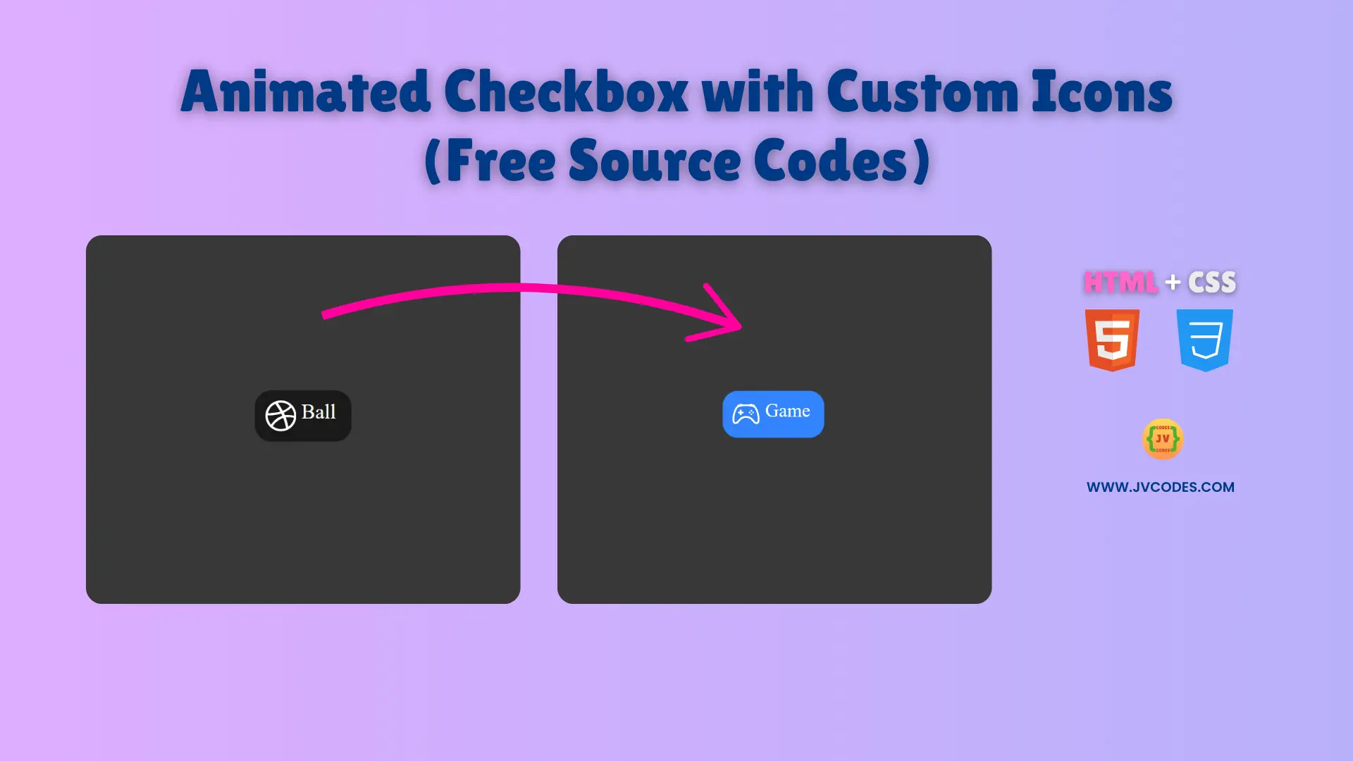
Animated Checkbox with Custom Icons Using HTML and CSS (Free Source Code)
Adding personality to forms is easy with Animated Checkbox with Custom Icons—a playful yet functional UI element that elevates user interactions.
This article presents free source code for creating an Animation-enabled Checkbox that features Custom Icons. The code follows good programming standards so developers can easily understand everything.
GitHub Source: Animated Checkbox with Custom Icons
Features of Animated Checkbox with Custom Icons
- Beginner-Friendly: Ideal for coding projects for juniors and coding for beginners.
- Smooth Animation: The checkbox transitions seamlessly when clicked.
- Custom Icons: Icons change dynamically when toggling the checkbox.
- Lightweight Code: Optimized HTML and CSS ensure fast performance.
Technologies Used
- HTML (Hypertext Markup Language)
- CSS (Cascading Style Sheets)
Recommended for You
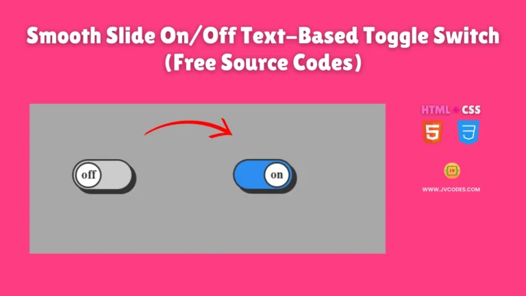
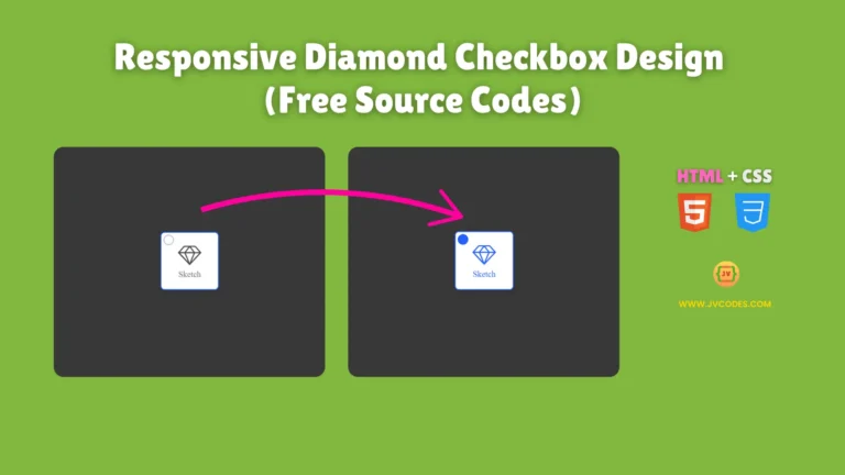
- Modern Skeuomorphic Checkboxes
- Responsive Diamond Checkbox Design
- iOS Checkbox Design for Websites
- Neumorphic Round Checkbox
- Animated Heart Checkbox
Steps to Build Website Checkbox
The implementation process of the Animated Checkbox with Custom Icons Using HTML and CSS involves pasting the HTML and CSS code directly into your project. The web component functions independently to add checkbox functionality across all forms and settings pages. The open-source UI element delivers modern design principles to produce a clean professional interface.
HTML
Here is the HTML code for your index.html file:
<!DOCTYPE html>
<!-- Developed by Shokat Javed available at www.jvcodes.com -->
<html lang="en">
<head>
    <meta charset="UTF-8">
    <meta name="viewport" content="width=device-width, initial-scale=1.0">
    <title>Animated Checkbox with Custom Icons - JV Codes</title>
    <link rel="stylesheet" href="style.css">
</head>
<body>
    <label class="container">
        <input type="checkbox" />
        <div class="checkmark">
          <svg xmlns="http://www.w3.org/2000/svg" class="icon No" viewBox="0 0 16 16">
            <path
              fill-rule="evenodd"
              d="M8 0C3.584 0 0 3.584 0 8s3.584 8 8 8c4.408 0 8-3.584 8-8s-3.592-8-8-8zm5.284 3.688a6.802 6.802 0 0 1 1.545 4.251c-.226-.043-2.482-.503-4.755-.217-.052-.112-.096-.234-.148-.355-.139-.33-.295-.668-.451-.99 2.516-1.023 3.662-2.498 3.81-2.69zM8 1.18c1.735 0 3.323.65 4.53 1.718-.122.174-1.155 1.553-3.584 2.464-1.12-2.056-2.36-3.74-2.551-4A6.95 6.95 0 0 1 8 1.18zm-2.907.642A43.123 43.123 0 0 1 7.627 5.77c-3.193.85-6.013.833-6.317.833a6.865 6.865 0 0 1 3.783-4.78zM1.163 8.01V7.8c.295.01 3.61.053 7.02-.971.199.381.381.772.555 1.162l-.27.078c-3.522 1.137-5.396 4.243-5.553 4.504a6.817 6.817 0 0 1-1.752-4.564zM8 14.837a6.785 6.785 0 0 1-4.19-1.44c.12-.252 1.509-2.924 5.361-4.269.018-.009.026-.009.044-.017a28.246 28.246 0 0 1 1.457 5.18A6.722 6.722 0 0 1 8 14.837zm3.81-1.171c-.07-.417-.435-2.412-1.328-4.868 2.143-.338 4.017.217 4.251.295a6.774 6.774 0 0 1-2.924 4.573z"
            ></path>
          </svg>
          <p class="No name">Ball</p>
          <svg
            viewBox="0 0 16 16"
            class="icon Yes"
            xmlns="http://www.w3.org/2000/svg"
          >
            <path
              d="M11.5 6.027a.5.5 0 1 1-1 0 .5.5 0 0 1 1 0zm-1.5 1.5a.5.5 0 1 0 0-1 .5.5 0 0 0 0 1zm2.5-.5a.5.5 0 1 1-1 0 .5.5 0 0 1 1 0zm-1.5 1.5a.5.5 0 1 0 0-1 .5.5 0 0 0 0 1zm-6.5-3h1v1h1v1h-1v1h-1v-1h-1v-1h1v-1z"
            ></path>
            <path
              d="M3.051 3.26a.5.5 0 0 1 .354-.613l1.932-.518a.5.5 0 0 1 .62.39c.655-.079 1.35-.117 2.043-.117.72 0 1.443.041 2.12.126a.5.5 0 0 1 .622-.399l1.932.518a.5.5 0 0 1 .306.729c.14.09.266.19.373.297.408.408.78 1.05 1.095 1.772.32.733.599 1.591.805 2.466.206.875.34 1.78.364 2.606.024.816-.059 1.602-.328 2.21a1.42 1.42 0 0 1-1.445.83c-.636-.067-1.115-.394-1.513-.773-.245-.232-.496-.526-.739-.808-.126-.148-.25-.292-.368-.423-.728-.804-1.597-1.527-3.224-1.527-1.627 0-2.496.723-3.224 1.527-.119.131-.242.275-.368.423-.243.282-.494.575-.739.808-.398.38-.877.706-1.513.773a1.42 1.42 0 0 1-1.445-.83c-.27-.608-.352-1.395-.329-2.21.024-.826.16-1.73.365-2.606.206-.875.486-1.733.805-2.466.315-.722.687-1.364 1.094-1.772a2.34 2.34 0 0 1 .433-.335.504.504 0 0 1-.028-.079zm2.036.412c-.877.185-1.469.443-1.733.708-.276.276-.587.783-.885 1.465a13.748 13.748 0 0 0-.748 2.295 12.351 12.351 0 0 0-.339 2.406c-.022.755.062 1.368.243 1.776a.42.42 0 0 0 .426.24c.327-.034.61-.199.929-.502.212-.202.4-.423.615-.674.133-.156.276-.323.44-.504C4.861 9.969 5.978 9.027 8 9.027s3.139.942 3.965 1.855c.164.181.307.348.44.504.214.251.403.472.615.674.318.303.601.468.929.503a.42.42 0 0 0 .426-.241c.18-.408.265-1.02.243-1.776a12.354 12.354 0 0 0-.339-2.406 13.753 13.753 0 0 0-.748-2.295c-.298-.682-.61-1.19-.885-1.465-.264-.265-.856-.523-1.733-.708-.85-.179-1.877-.27-2.913-.27-1.036 0-2.063.091-2.913.27z"
            ></path>
          </svg>
          <p class="Yes name">Game</p>
        </div>
      </label>

</body>
</html>
CSS
Here is the complete code for style.css file to style the checkbox:
body {
    margin: 0;
    display: flex;
    justify-content: center;
    align-items: center;
    min-height: 100vh;
    background-color: #383838;
  }
  .container {
    --UnChacked-color: hsl(0, 0%, 10%);
    --chacked-color: hsl(216, 100%, 60%);
    --font-color: white;
    --chacked-font-color: var(--font-color);
    --icon-size: 1.5em;
    --anim-time: 0.2s;
    --anim-scale: 0.1;
    --base-radius: 0.8em;
  }

  .container {
    display: flex;
    align-items: center;
    position: relative;
    cursor: pointer;
    font-size: 20px;
    user-select: none;
    fill: var(--font-color);
    color: var(--font-color);
  }

  /* Hide the default checkbox */
  .container input {
    display: none;
  }

  /* Base custom checkbox */
  .checkmark {
    background: var(--UnChacked-color);
    border-radius: var(--base-radius);

    display: flex;
    padding: 0.5em;
  }
  .icon {
    width: var(--icon-size);
    height: auto;
    filter: drop-shadow(0px 2px var(--base-radius) rgba(0, 0, 0, 0.25));
  }
  .name {
    margin: 0 0.25em;
  }
  .Yes {
    width: 0;
  }
  .name.Yes {
    display: none;
  }

  /* action custom checkbox */
  .container:hover .checkmark,
  .container:hover .icon,
  .container:hover .name {
    transform: scale(calc(1 + var(--anim-scale)));
  }

  .container:active .checkmark,
  .container:active .icon,
  .container:active .name {
    transform: scale(calc(1 - var(--anim-scale) / 2));
    border-radius: calc(var(--base-radius) * 2);
  }
  .checkmark::before {
    content: "";
    opacity: 0.5;
    transform: scale(1);
    border-radius: var(--base-radius);
    position: absolute;
    box-sizing: border-box;
    left: 0;
    top: 0;
    height: 100%;
    width: 100%;
  }
  .checkmark:hover:before {
    background-color: hsla(0, 0%, 50%, 0.2);
  }
  .container input:checked + .checkmark:before {
    animation: boon calc(var(--anim-time)) ease;
    animation-delay: calc(var(--anim-time) / 2);
  }

  /* When the checkbox is checked*/
  .container input:checked + .checkmark {
    --UnChacked-color: var(--chacked-color);
    fill: var(--chacked-font-color);
    color: var(--chacked-font-color);
  }

  .container input:checked ~ .checkmark .No {
    width: 0;
  }
  .container input:checked ~ .checkmark .name.No {
    display: none;
  }

  .container input:checked ~ .checkmark .Yes {
    width: var(--icon-size);
  }
  .container input:checked ~ .checkmark .name.Yes {
    width: auto;
    display: unset;
  }

  /*Animation*/
  .container,
  .checkmark,
  .checkmark:after,
  .icon,
  .checkmark .name {
    transition: all var(--anim-time);
  }

  /*Unuse*/
  @keyframes icon-rot {
    50% {
      transform: rotateZ(180deg) scale(calc(1 - var(--anim-scale)));
      border-radius: 1em;
    }
    to {
      transform: rotate(360deg);
      border-radius: var(--base-radius);
    }
  }
  /*Unuse*/
  @keyframes boo {
    80% {
      transform: scale(1.4);
    }
    99% {
      transform: scale(1.7);
      border: 2px solid var(--UnChacked-color);
    }
    to {
      transform: scale(0);
    }
  }
Download Source Code
The entire animated checkbox source code is available for download at this link. The code is freely available without copyright limitations therefore you can adapt it for any project you need.
Conclusion
This Animated Checkbox with Custom Icons can improve your website or application appearance. Your skills in front-end development become evident through this addition to your portfolio.
You are welcome to use this code with proper acknowledgment to JV Source Codes through a link in your project. The latest tutorial videos are available through our YouTube subscription. Other UI components such as forms, cards, galleries, menus and hero section can be freely explored. Comment below if you have questions since I will definitely respond. 🚀