
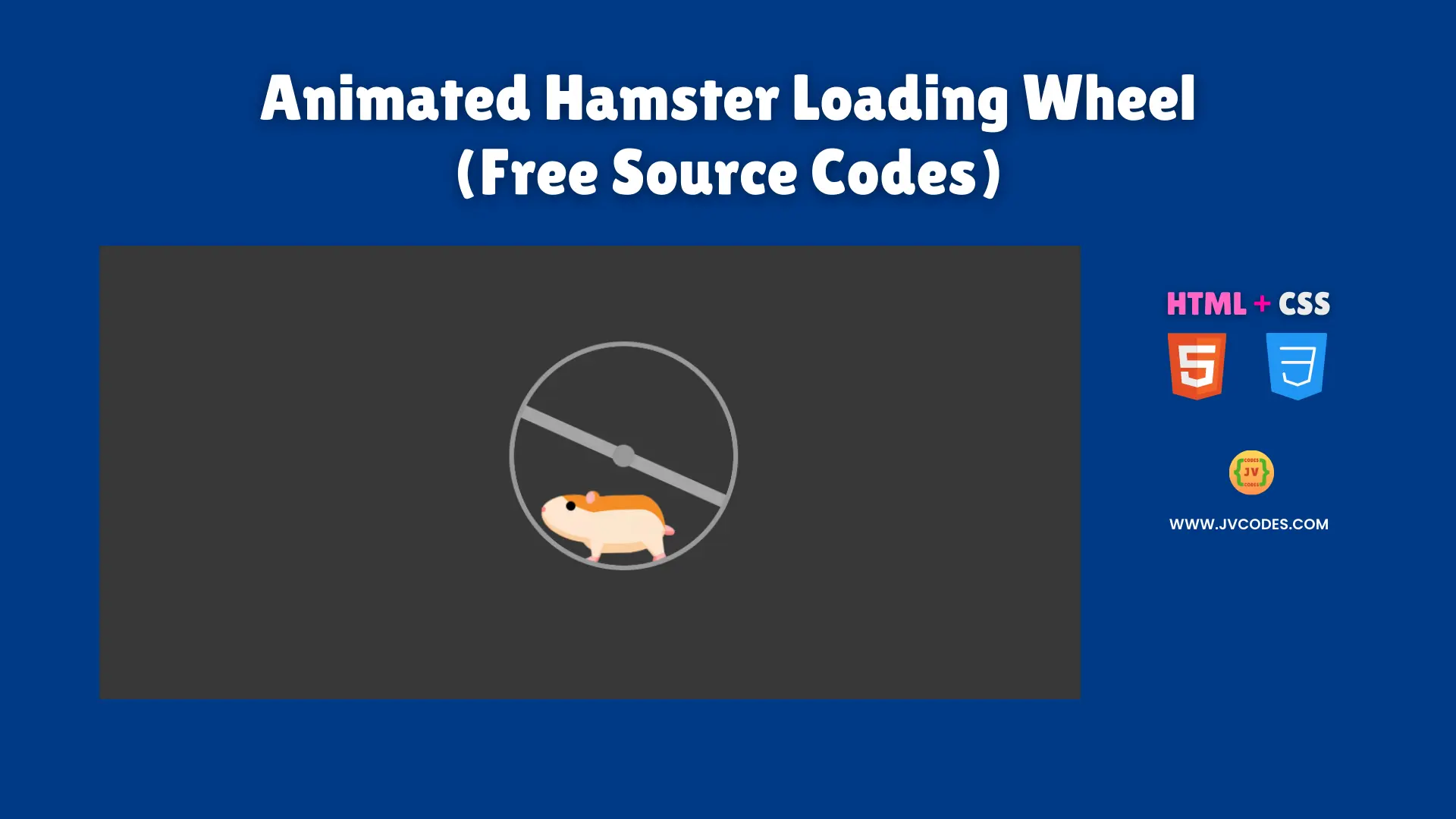
Animated Hamster Loading Wheel Using HTML and CSS (Free Source Code)
In today’s web design world, keeping users hooked is a must. The Animated Hamster Loading Wheel Switch Using HTML and CSS is a fun, eye-catching loading indicator that adds a playful twist to your site.
I’m excited to share free source code for this cute wheel, written with solid programming practices to make it simple and reliable.
GitHub Source: Animated Hamster Loading Wheel
Features
- Smooth Animation: The wheel spins flawlessly, grabbing attention without slowing down your page.
- Customizable Speed: Adjust how fast it spins with just one CSS tweak to fit your site’s vibe.
- Simple Integration: Drop it into any webpage easily, perfect for Open-Source UI and coding beginners.
- Adorable Design: Its hamster theme adds charm, making your UI elements stand out with personality.
Technologies Used
- HTML (Hypertext Markup Language)
- CSS (Cascading Style Sheets)
Recommended for You
- Modern 3D Biometric Toggle Switch
- Interactive Toggle Switch
- Animated Bluetooth Toggle Switch
- Download Button with Progress Animation
- Smooth Slide On/Off Text-Based Toggle Switch
Video Tutorial

Steps to Build Website Loader
Adding the Animated Hamster Loading Wheel Switch Using HTML and CSS to your project is super easy. Just copy the HTML into your webpage where you want it to show, and paste the CSS into your stylesheet.
It’s pure HTML and CSS—no extra tools needed—making it a great pick for coding projects for juniors.
HTML
Here is the HTML code for your index.html file:
<!DOCTYPE html>
<!-- Developed by Shokat Javed available at www.jvcodes.com -->
<html lang="en">
<head>
    <meta charset="UTF-8">
    <meta name="viewport" content="width=device-width, initial-scale=1.0">
    <title>Animated Hamster Loading Wheel - JV Codes</title>
    <link rel="stylesheet" href="style.css">
</head>
<body>
    <div aria-label="Orange and tan hamster running in a metal wheel" role="img" class="wheel-and-hamster">
        <div class="wheel"></div>
        <div class="hamster">
            <div class="hamster__body">
                <div class="hamster__head">
                    <div class="hamster__ear"></div>
                    <div class="hamster__eye"></div>
                    <div class="hamster__nose"></div>
                </div>
                <div class="hamster__limb hamster__limb--fr"></div>
                <div class="hamster__limb hamster__limb--fl"></div>
                <div class="hamster__limb hamster__limb--br"></div>
                <div class="hamster__limb hamster__limb--bl"></div>
                <div class="hamster__tail"></div>
            </div>
        </div>
        <div class="spoke"></div>
    </div>
</body>
</html>
CSS
Here is the complete code for style.css file to style the loader:
body {
    margin: 0;
    display: flex;
    justify-content: center;
    align-items: center;
    min-height: 100vh;
    background-color: #383838;
  }

  .wheel-and-hamster {
    --dur: 1s;
    position: relative;
    width: 12em;
    height: 12em;
    font-size: 14px;
  }

  .wheel,
  .hamster,
  .hamster div,
  .spoke {
    position: absolute;
  }

  .wheel,
  .spoke {
    border-radius: 50%;
    top: 0;
    left: 0;
    width: 100%;
    height: 100%;
  }

  .wheel {
    background: radial-gradient(100% 100% at center,hsla(0,0%,60%,0) 47.8%,hsl(0,0%,60%) 48%);
    z-index: 2;
  }

  .hamster {
    animation: hamster var(--dur) ease-in-out infinite;
    top: 50%;
    left: calc(50% - 3.5em);
    width: 7em;
    height: 3.75em;
    transform: rotate(4deg) translate(-0.8em,1.85em);
    transform-origin: 50% 0;
    z-index: 1;
  }

  .hamster__head {
    animation: hamsterHead var(--dur) ease-in-out infinite;
    background: hsl(30,90%,55%);
    border-radius: 70% 30% 0 100% / 40% 25% 25% 60%;
    box-shadow: 0 -0.25em 0 hsl(30,90%,80%) inset,
      0.75em -1.55em 0 hsl(30,90%,90%) inset;
    top: 0;
    left: -2em;
    width: 2.75em;
    height: 2.5em;
    transform-origin: 100% 50%;
  }

  .hamster__ear {
    animation: hamsterEar var(--dur) ease-in-out infinite;
    background: hsl(0,90%,85%);
    border-radius: 50%;
    box-shadow: -0.25em 0 hsl(30,90%,55%) inset;
    top: -0.25em;
    right: -0.25em;
    width: 0.75em;
    height: 0.75em;
    transform-origin: 50% 75%;
  }

  .hamster__eye {
    animation: hamsterEye var(--dur) linear infinite;
    background-color: hsl(0,0%,0%);
    border-radius: 50%;
    top: 0.375em;
    left: 1.25em;
    width: 0.5em;
    height: 0.5em;
  }

  .hamster__nose {
    background: hsl(0,90%,75%);
    border-radius: 35% 65% 85% 15% / 70% 50% 50% 30%;
    top: 0.75em;
    left: 0;
    width: 0.2em;
    height: 0.25em;
  }

  .hamster__body {
    animation: hamsterBody var(--dur) ease-in-out infinite;
    background: hsl(30,90%,90%);
    border-radius: 50% 30% 50% 30% / 15% 60% 40% 40%;
    box-shadow: 0.1em 0.75em 0 hsl(30,90%,55%) inset,
      0.15em -0.5em 0 hsl(30,90%,80%) inset;
    top: 0.25em;
    left: 2em;
    width: 4.5em;
    height: 3em;
    transform-origin: 17% 50%;
    transform-style: preserve-3d;
  }

  .hamster__limb--fr,
  .hamster__limb--fl {
    clip-path: polygon(0 0,100% 0,70% 80%,60% 100%,0% 100%,40% 80%);
    top: 2em;
    left: 0.5em;
    width: 1em;
    height: 1.5em;
    transform-origin: 50% 0;
  }

  .hamster__limb--fr {
    animation: hamsterFRLimb var(--dur) linear infinite;
    background: linear-gradient(hsl(30,90%,80%) 80%,hsl(0,90%,75%) 80%);
    transform: rotate(15deg) translateZ(-1px);
  }

  .hamster__limb--fl {
    animation: hamsterFLLimb var(--dur) linear infinite;
    background: linear-gradient(hsl(30,90%,90%) 80%,hsl(0,90%,85%) 80%);
    transform: rotate(15deg);
  }

  .hamster__limb--br,
  .hamster__limb--bl {
    border-radius: 0.75em 0.75em 0 0;
    clip-path: polygon(0 0,100% 0,100% 30%,70% 90%,70% 100%,30% 100%,40% 90%,0% 30%);
    top: 1em;
    left: 2.8em;
    width: 1.5em;
    height: 2.5em;
    transform-origin: 50% 30%;
  }

  .hamster__limb--br {
    animation: hamsterBRLimb var(--dur) linear infinite;
    background: linear-gradient(hsl(30,90%,80%) 90%,hsl(0,90%,75%) 90%);
    transform: rotate(-25deg) translateZ(-1px);
  }

  .hamster__limb--bl {
    animation: hamsterBLLimb var(--dur) linear infinite;
    background: linear-gradient(hsl(30,90%,90%) 90%,hsl(0,90%,85%) 90%);
    transform: rotate(-25deg);
  }

  .hamster__tail {
    animation: hamsterTail var(--dur) linear infinite;
    background: hsl(0,90%,85%);
    border-radius: 0.25em 50% 50% 0.25em;
    box-shadow: 0 -0.2em 0 hsl(0,90%,75%) inset;
    top: 1.5em;
    right: -0.5em;
    width: 1em;
    height: 0.5em;
    transform: rotate(30deg) translateZ(-1px);
    transform-origin: 0.25em 0.25em;
  }

  .spoke {
    animation: spoke var(--dur) linear infinite;
    background: radial-gradient(100% 100% at center,hsl(0,0%,60%) 4.8%,hsla(0,0%,60%,0) 5%),
      linear-gradient(hsla(0,0%,55%,0) 46.9%,hsl(0,0%,65%) 47% 52.9%,hsla(0,0%,65%,0) 53%) 50% 50% / 99% 99% no-repeat;
  }

  /* Animations */
  @keyframes hamster {
    from, to {
      transform: rotate(4deg) translate(-0.8em,1.85em);
    }

    50% {
      transform: rotate(0) translate(-0.8em,1.85em);
    }
  }

  @keyframes hamsterHead {
    from, 25%, 50%, 75%, to {
      transform: rotate(0);
    }

    12.5%, 37.5%, 62.5%, 87.5% {
      transform: rotate(8deg);
    }
  }

  @keyframes hamsterEye {
    from, 90%, to {
      transform: scaleY(1);
    }

    95% {
      transform: scaleY(0);
    }
  }

  @keyframes hamsterEar {
    from, 25%, 50%, 75%, to {
      transform: rotate(0);
    }

    12.5%, 37.5%, 62.5%, 87.5% {
      transform: rotate(12deg);
    }
  }

  @keyframes hamsterBody {
    from, 25%, 50%, 75%, to {
      transform: rotate(0);
    }

    12.5%, 37.5%, 62.5%, 87.5% {
      transform: rotate(-2deg);
    }
  }

  @keyframes hamsterFRLimb {
    from, 25%, 50%, 75%, to {
      transform: rotate(50deg) translateZ(-1px);
    }

    12.5%, 37.5%, 62.5%, 87.5% {
      transform: rotate(-30deg) translateZ(-1px);
    }
  }

  @keyframes hamsterFLLimb {
    from, 25%, 50%, 75%, to {
      transform: rotate(-30deg);
    }

    12.5%, 37.5%, 62.5%, 87.5% {
      transform: rotate(50deg);
    }
  }

  @keyframes hamsterBRLimb {
    from, 25%, 50%, 75%, to {
      transform: rotate(-60deg) translateZ(-1px);
    }

    12.5%, 37.5%, 62.5%, 87.5% {
      transform: rotate(20deg) translateZ(-1px);
    }
  }

  @keyframes hamsterBLLimb {
    from, 25%, 50%, 75%, to {
      transform: rotate(20deg);
    }

    12.5%, 37.5%, 62.5%, 87.5% {
      transform: rotate(-60deg);
    }
  }

  @keyframes hamsterTail {
    from, 25%, 50%, 75%, to {
      transform: rotate(30deg) translateZ(-1px);
    }

    12.5%, 37.5%, 62.5%, 87.5% {
      transform: rotate(10deg) translateZ(-1px);
    }
  }

  @keyframes spoke {
    from {
      transform: rotate(0);
    }

    to {
      transform: rotate(-1turn);
    }
  }
Download Source Code
You can grab the full source code for the Animated Hamster Loading Wheel Switch Using HTML and CSS for free! It’s well-commented and ready to download from the button below, with no copyright worries.
Conclusion
Using the Animated Hamster Loading Wheel on your website boosts both function and fun, making it a cool addition to web components that visitors will love. It’s a simple way to lift your portfolio, showing off your knack for creative UI elements.
Please give a shoutout to JV Source Codes by linking back to this page—it helps us keep sharing free goodies. Subscribe to our channel for more coding projects for juniors, and if you hit a snag, drop a comment—I’ll get back to you!

