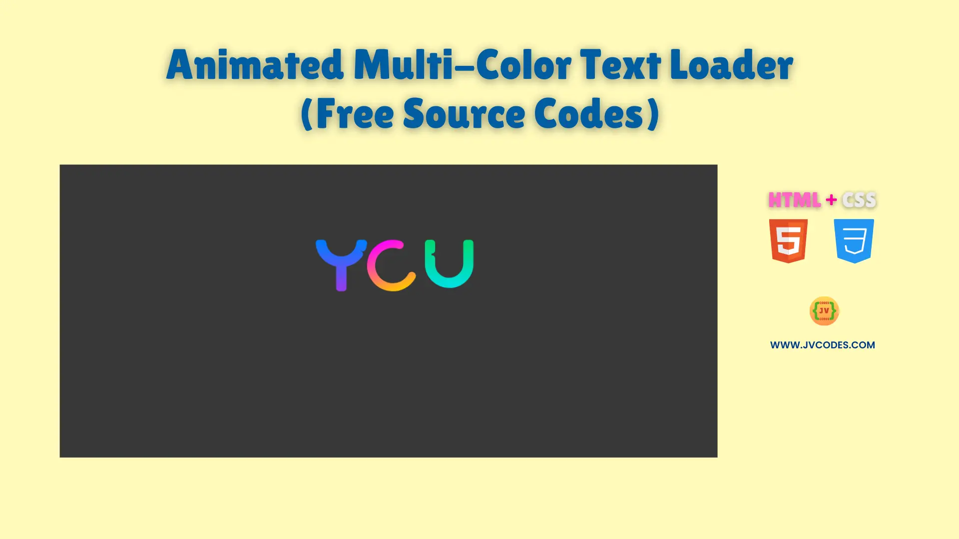
Animated Multi-Color Text Loader Using HTML and CSS (Free Source Code)
The Animated Multi-Color Text Loader Using HTML and CSS creates an exciting waiting experience through spinning letters that keep users occupied until page content loads.
The loader provides an alternative waiting time display that sets itself apart from standard spinners and progress bars.
The source code I provide to you represents the best programming practices to integrate into new projects at no cost. This loader serves both beginner programmers with starting skills and junior development teams with its basic programming design.
GitHub Source:
Features
- Vibrant Color Scheme: The loader displays letters in multiple colors, creating an eye-catching effect.
- Fluid SVG Animations: Smooth transitions give users a visually pleasing experience, making your site feel more modern.
- Lightweight Code: With only HTML and CSS, this loader won’t slow down your page, ensuring fast loading times.
- Easy Integration: You can adapt it quickly to other website components, web components, and UI elements without any hassle.
The Animated Multi-Color Text Loader Using HTML and CSS provides an exceptional addition to any Open-Source UI library.
Technologies Used
- HTML (Hypertext Markup Language)
- CSS (Cascading Style Sheets)
Recommended for You
- Animated Hamster Loading Wheel
- Modern 3D Biometric Toggle Switch
- Interactive Toggle Switch
- Animated Bluetooth Toggle Switch
- Download Button with Progress Animation
Video Tutorial

Steps to Build Website Loader
Building this loader is straightforward. The HTML code can enter a webpage directly while you should place the CSS rules inside your stylesheet. After that you can modify the colors or dimension alongside animation speeds to fulfill your design needs. You can use this method to modify the loader according to your site requirements along with personal blogs and both novice and professional client projects.
HTML
Here is the HTML code for your index.html file:
<!DOCTYPE html>
<!-- Developed by Shokat Javed available at www.jvcodes.com -->
<html lang="en">
<head>
    <meta charset="UTF-8">
    <meta name="viewport" content="width=device-width, initial-scale=1.0">
    <title>Animated Multi-Color Text Loader - JV Codes</title>
    <link rel="stylesheet" href="style.css">
</head>
<body>
<div class="loader">
    <svg height="0" width="0" viewBox="0 0 64 64" class="absolute">
      <defs class="s-xJBuHA073rTt" xmlns="http://www.w3.org/2000/svg">
        <linearGradient class="s-xJBuHA073rTt" gradientUnits="userSpaceOnUse" y2="2" x2="0" y1="62" x1="0" id="b">
          <stop class="s-xJBuHA073rTt" stop-color="#973BED"></stop>
          <stop class="s-xJBuHA073rTt" stop-color="#007CFF" offset="1"></stop>
        </linearGradient>
        <linearGradient class="s-xJBuHA073rTt" gradientUnits="userSpaceOnUse" y2="0" x2="0" y1="64" x1="0" id="c">
          <stop class="s-xJBuHA073rTt" stop-color="#FFC800"></stop>
          <stop class="s-xJBuHA073rTt" stop-color="#F0F" offset="1"></stop>
          <animateTransform repeatCount="indefinite" keySplines=".42,0,.58,1;.42,0,.58,1;.42,0,.58,1;.42,0,.58,1;.42,0,.58,1;.42,0,.58,1;.42,0,.58,1;.42,0,.58,1" keyTimes="0; 0.125; 0.25; 0.375; 0.5; 0.625; 0.75; 0.875; 1" dur="8s" values="0 32 32;-270 32 32;-270 32 32;-540 32 32;-540 32 32;-810 32 32;-810 32 32;-1080 32 32;-1080 32 32" type="rotate" attributeName="gradientTransform"></animateTransform>
        </linearGradient>
        <linearGradient class="s-xJBuHA073rTt" gradientUnits="userSpaceOnUse" y2="2" x2="0" y1="62" x1="0" id="d">
          <stop class="s-xJBuHA073rTt" stop-color="#00E0ED"></stop>
          <stop class="s-xJBuHA073rTt" stop-color="#00DA72" offset="1"></stop>
        </linearGradient>
      </defs>
    </svg>
    <svg xmlns="http://www.w3.org/2000/svg" fill="none" viewBox="0 0 64 64" height="64" width="64" class="inline-block">
      <path stroke-linejoin="round" stroke-linecap="round" stroke-width="8" stroke="url(#b)" d="M 54.722656,3.9726563 A 2.0002,2.0002 0 0 0 54.941406,4 h 5.007813 C 58.955121,17.046124 49.099667,27.677057 36.121094,29.580078 a 2.0002,2.0002 0 0 0 -1.708985,1.978516 V 60 H 29.587891 V 31.558594 A 2.0002,2.0002 0 0 0 27.878906,29.580078 C 14.900333,27.677057 5.0448787,17.046124 4.0507812,4 H 9.28125 c 1.231666,11.63657 10.984383,20.554048 22.6875,20.734375 a 2.0002,2.0002 0 0 0 0.02344,0 c 11.806958,0.04283 21.70649,-9.003371 22.730469,-20.7617187 z" class="dash" id="y" pathLength="360"></path>
    </svg>
    <svg xmlns="http://www.w3.org/2000/svg" fill="none" style="--rotation-duration:0ms; --rotation-direction:normal;" viewBox="0 0 64 64" height="64" width="64" class="inline-block">
      <path stroke-linejoin="round" stroke-linecap="round" stroke-width="10" stroke="url(#c)" d="M 32 32
          m 0 -27
          a 27 27 0 1 1 0 54
          a 27 27 0 1 1 0 -54" class="spin" id="o" pathLength="360"></path>
    </svg>
    <div class="w-2"></div>
    <svg xmlns="http://www.w3.org/2000/svg" fill="none" style="--rotation-duration:0ms; --rotation-direction:normal;" viewBox="0 0 64 64" height="64" width="64" class="inline-block">
      <path stroke-linejoin="round" stroke-linecap="round" stroke-width="8" stroke="url(#d)" d="M 4,4 h 4.6230469 v 25.919922 c -0.00276,11.916203 9.8364941,21.550422 21.7500001,21.296875 11.616666,-0.240651 21.014356,-9.63894 21.253906,-21.25586 a 2.0002,2.0002 0 0 0 0,-0.04102 V 4 H 56.25 v 25.919922 c 0,14.33873 -11.581192,25.919922 -25.919922,25.919922 a 2.0002,2.0002 0 0 0 -0.0293,0 C 15.812309,56.052941 3.998433,44.409961 4,29.919922 Z" class="dash" id="u" pathLength="360"></path>
    </svg>
  </div>

</body>
</html>
CSS
Here is the complete code for style.css file to style the loader:
body {
    margin: 0;
    display: flex;
    justify-content: center;
    align-items: center;
    min-height: 100vh;
    background-color: #383838;
  }
.absolute {
  position: absolute;
}

.inline-block {
  display: inline-block;
}

.loader {
  display: flex;
  margin: 0.25em 0;
}

.w-2 {
  width: 0.5em;
}

.dash {
  animation: dashArray 2s ease-in-out infinite,
    dashOffset 2s linear infinite;
}

.spin {
  animation: spinDashArray 2s ease-in-out infinite,
    spin 8s ease-in-out infinite,
    dashOffset 2s linear infinite;
  transform-origin: center;
}

@keyframes dashArray {
  0% {
    stroke-dasharray: 0 1 359 0;
  }

  50% {
    stroke-dasharray: 0 359 1 0;
  }

  100% {
    stroke-dasharray: 359 1 0 0;
  }
}

@keyframes spinDashArray {
  0% {
    stroke-dasharray: 270 90;
  }

  50% {
    stroke-dasharray: 0 360;
  }

  100% {
    stroke-dasharray: 270 90;
  }
}

@keyframes dashOffset {
  0% {
    stroke-dashoffset: 365;
  }

  100% {
    stroke-dashoffset: 5;
  }
}

@keyframes spin {
  0% {
    rotate: 0deg;
  }

  12.5%,
  25% {
    rotate: 270deg;
  }

  37.5%,
  50% {
    rotate: 540deg;
  }

  62.5%,
  75% {
    rotate: 810deg;
  }

  87.5%,
  100% {
    rotate: 1080deg;
  }
}
Download Source Code
The source code is available for free through the button located below. This animated multi-color text loader does not require copyright privileges thus allowing its use in both personal and commercial sites.
Conclusion
You can add colorful engagement features to your websites through this code during loading periods. The implementation of this code displays your ability to innovate web design which elevates your portfolio.

