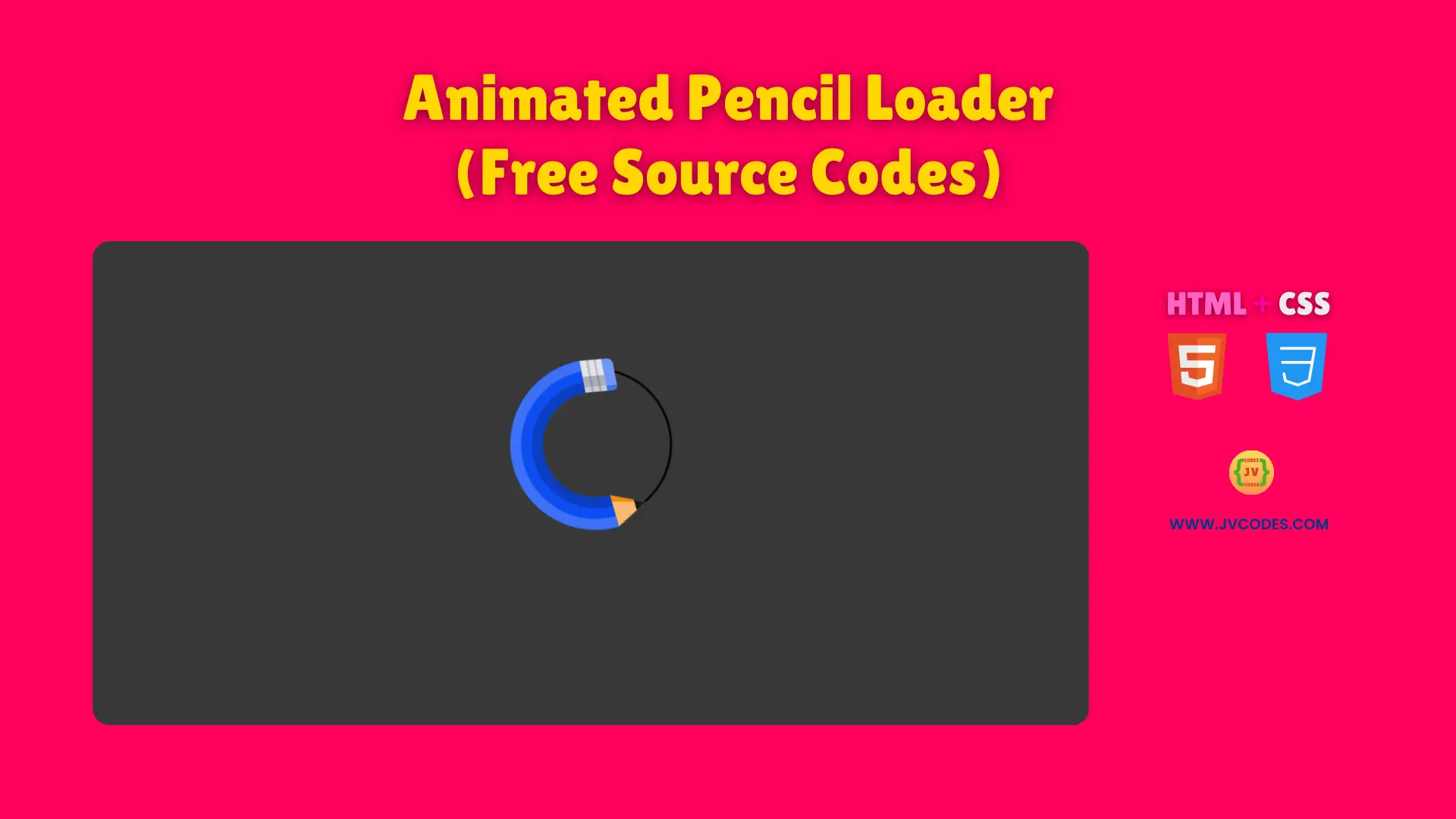
Animated Pencil Loader Using HTML and CSS (Free Source Code)
The Animated Pencil Loader Using HTML and CSS creates an interesting loading interface for website content.
The provided free source code includes good programming practices so you can quickly apply it to your project needs. A pencil-drawing animation suits junior-developed coding projects and beginner-level coding.
GitHub Source: Animated Pencil Loader
Features of Animated Pencil Loader
- Seamless Integration: Fits well into modern Open-Source UI libraries and can be embedded in various designs.
- Realistic Drawing Action: The pencil and stroke animations mimic the act of sketching.
- Lightweight Structure: Uses only HTML and CSS, ensuring quick load times and easy maintenance.
- Customizable Speeds: You can adjust the rotation or stroke animation to suit your website’s pace.
Technologies Used
- HTML (Hypertext Markup Language)
- CSS (Cascading Style Sheets)
Recommended for You
- 12-Dot Circular Loader
- Modern Circular Radar Loader
- Animated Gear Loader
- Smooth Ripple Effect Loader
- 3D Cube Loader
Video Tutorial

Steps to Build Website Loader
Construction of this loader requires pasting the HTML code block into your webpage followed by adding the CSS content into your stylesheet. Customize the visual elements such as colors together with speeds and dimensions according to design requirements. The implementation system allows users to swiftly add this loader to their websites no matter what type of platform they maintain from personal blogs through e-commerce stores to coding tutorial pages.
HTML
Here is the HTML code for your index.html file:
<!DOCTYPE html>
<!-- Developed by Shokat Javed available at www.jvcodes.com -->
<html lang="en">
<head>
    <meta charset="UTF-8">
    <meta name="viewport" content="width=device-width, initial-scale=1.0">
    <title>Animated Pencil Loader - JV Codes</title>
    <link rel="stylesheet" href="style.css">
</head>
<body>
<svg xmlns="http://www.w3.org/2000/svg" height="200px" width="200px" viewBox="0 0 200 200" class="pencil">
	<defs>
		<clipPath id="pencil-eraser">
			<rect height="30" width="30" ry="5" rx="5"></rect>
		</clipPath>
	</defs>
	<circle transform="rotate(-113,100,100)" stroke-linecap="round" stroke-dashoffset="439.82" stroke-dasharray="439.82 439.82" stroke-width="2" stroke="currentColor" fill="none" r="70" class="pencil__stroke"></circle>
	<g transform="translate(100,100)" class="pencil__rotate">
		<g fill="none">
			<circle transform="rotate(-90)" stroke-dashoffset="402" stroke-dasharray="402.12 402.12" stroke-width="30" stroke="hsl(223,90%,50%)" r="64" class="pencil__body1"></circle>
			<circle transform="rotate(-90)" stroke-dashoffset="465" stroke-dasharray="464.96 464.96" stroke-width="10" stroke="hsl(223,90%,60%)" r="74" class="pencil__body2"></circle>
			<circle transform="rotate(-90)" stroke-dashoffset="339" stroke-dasharray="339.29 339.29" stroke-width="10" stroke="hsl(223,90%,40%)" r="54" class="pencil__body3"></circle>
		</g>
		<g transform="rotate(-90) translate(49,0)" class="pencil__eraser">
			<g class="pencil__eraser-skew">
				<rect height="30" width="30" ry="5" rx="5" fill="hsl(223,90%,70%)"></rect>
				<rect clip-path="url(#pencil-eraser)" height="30" width="5" fill="hsl(223,90%,60%)"></rect>
				<rect height="20" width="30" fill="hsl(223,10%,90%)"></rect>
				<rect height="20" width="15" fill="hsl(223,10%,70%)"></rect>
				<rect height="20" width="5" fill="hsl(223,10%,80%)"></rect>
				<rect height="2" width="30" y="6" fill="hsla(223,10%,10%,0.2)"></rect>
				<rect height="2" width="30" y="13" fill="hsla(223,10%,10%,0.2)"></rect>
			</g>
		</g>
		<g transform="rotate(-90) translate(49,-30)" class="pencil__point">
			<polygon points="15 0,30 30,0 30" fill="hsl(33,90%,70%)"></polygon>
			<polygon points="15 0,6 30,0 30" fill="hsl(33,90%,50%)"></polygon>
			<polygon points="15 0,20 10,10 10" fill="hsl(223,10%,10%)"></polygon>
		</g>
	</g>
</svg>
</body>
</html>
CSS
Here is the complete code for style.css file to style the loader:
body {
    margin: 0;
    display: flex;
    justify-content: center;
    align-items: center;
    min-height: 100vh;
    background-color: #383838;
  }
.pencil {
  display: block;
  width: 10em;
  height: 10em;
}

.pencil__body1,
.pencil__body2,
.pencil__body3,
.pencil__eraser,
.pencil__eraser-skew,
.pencil__point,
.pencil__rotate,
.pencil__stroke {
  animation-duration: 3s;
  animation-timing-function: linear;
  animation-iteration-count: infinite;
}

.pencil__body1,
.pencil__body2,
.pencil__body3 {
  transform: rotate(-90deg);
}

.pencil__body1 {
  animation-name: pencilBody1;
}

.pencil__body2 {
  animation-name: pencilBody2;
}

.pencil__body3 {
  animation-name: pencilBody3;
}

.pencil__eraser {
  animation-name: pencilEraser;
  transform: rotate(-90deg) translate(49px,0);
}

.pencil__eraser-skew {
  animation-name: pencilEraserSkew;
  animation-timing-function: ease-in-out;
}

.pencil__point {
  animation-name: pencilPoint;
  transform: rotate(-90deg) translate(49px,-30px);
}

.pencil__rotate {
  animation-name: pencilRotate;
}

.pencil__stroke {
  animation-name: pencilStroke;
  transform: translate(100px,100px) rotate(-113deg);
}

/* Animations */
@keyframes pencilBody1 {
  from,
	to {
    stroke-dashoffset: 351.86;
    transform: rotate(-90deg);
  }

  50% {
    stroke-dashoffset: 150.8;
 /* 3/8 of diameter */
    transform: rotate(-225deg);
  }
}

@keyframes pencilBody2 {
  from,
	to {
    stroke-dashoffset: 406.84;
    transform: rotate(-90deg);
  }

  50% {
    stroke-dashoffset: 174.36;
    transform: rotate(-225deg);
  }
}

@keyframes pencilBody3 {
  from,
	to {
    stroke-dashoffset: 296.88;
    transform: rotate(-90deg);
  }

  50% {
    stroke-dashoffset: 127.23;
    transform: rotate(-225deg);
  }
}

@keyframes pencilEraser {
  from,
	to {
    transform: rotate(-45deg) translate(49px,0);
  }

  50% {
    transform: rotate(0deg) translate(49px,0);
  }
}

@keyframes pencilEraserSkew {
  from,
	32.5%,
	67.5%,
	to {
    transform: skewX(0);
  }

  35%,
	65% {
    transform: skewX(-4deg);
  }

  37.5%,
	62.5% {
    transform: skewX(8deg);
  }

  40%,
	45%,
	50%,
	55%,
	60% {
    transform: skewX(-15deg);
  }

  42.5%,
	47.5%,
	52.5%,
	57.5% {
    transform: skewX(15deg);
  }
}

@keyframes pencilPoint {
  from,
	to {
    transform: rotate(-90deg) translate(49px,-30px);
  }

  50% {
    transform: rotate(-225deg) translate(49px,-30px);
  }
}

@keyframes pencilRotate {
  from {
    transform: translate(100px,100px) rotate(0);
  }

  to {
    transform: translate(100px,100px) rotate(720deg);
  }
}

@keyframes pencilStroke {
  from {
    stroke-dashoffset: 439.82;
    transform: translate(100px,100px) rotate(-113deg);
  }

  50% {
    stroke-dashoffset: 164.93;
    transform: translate(100px,100px) rotate(-113deg);
  }

  75%,
	to {
    stroke-dashoffset: 439.82;
    transform: translate(100px,100px) rotate(112deg);
  }
}
Download Source Code
Simply access the free source code through the provided button that includes no copyright limitations. The code can be adjusted for any professional or commercial use.
Conclusion
Your websites will display a playful sketch-like loading experience through the implementation of this code. The interactive functionality brings an up-to-date presentation style to your portfolio while making a positive visual impact on your potential clients.
You can access free codes from JV Source Codes using proper linkbacks and subscribe to our YouTube channel followed by checking our additional UI elements, forms, cards, galleries, menus, footer and hero section. You can contact me through a comment if any questions or problems occur and I will quickly provide assistance.