Bootstrap Roadmap: Ultimate Guide for Beginners
This article is a simple 20-day Bootstrap roadmap to master Bootstrap from basic to advance. You’ll learn everything—from grids to forms. No stress. Follow this simple plan.
The Bootstrap roadmap uses basic terminology and simple examples to teach users how to create responsive websites. The daily plan will build your skills while you follow them.
Bootstrap blueprint serves students with basic web design knowledge and existing professionals who want to improve their expertise.
This guide presents a step-by-step approach to help you learn Bootstrap effectively.
Here are some other technology roadmaps!
What is Bootstrap?
The Bootstrap framework enables developers to create web pages efficiently. Mark Otto and Jacob Thornton at Twitter designed Bootstrap.
Today, many sites use Bootstrap. This framework gains popularity because it offers free availability and simple implementation.
The framework provides an attractive interface across all devices. This is called responsive web design. In simple terms, your website will work well on phones, tablets, and desktops.
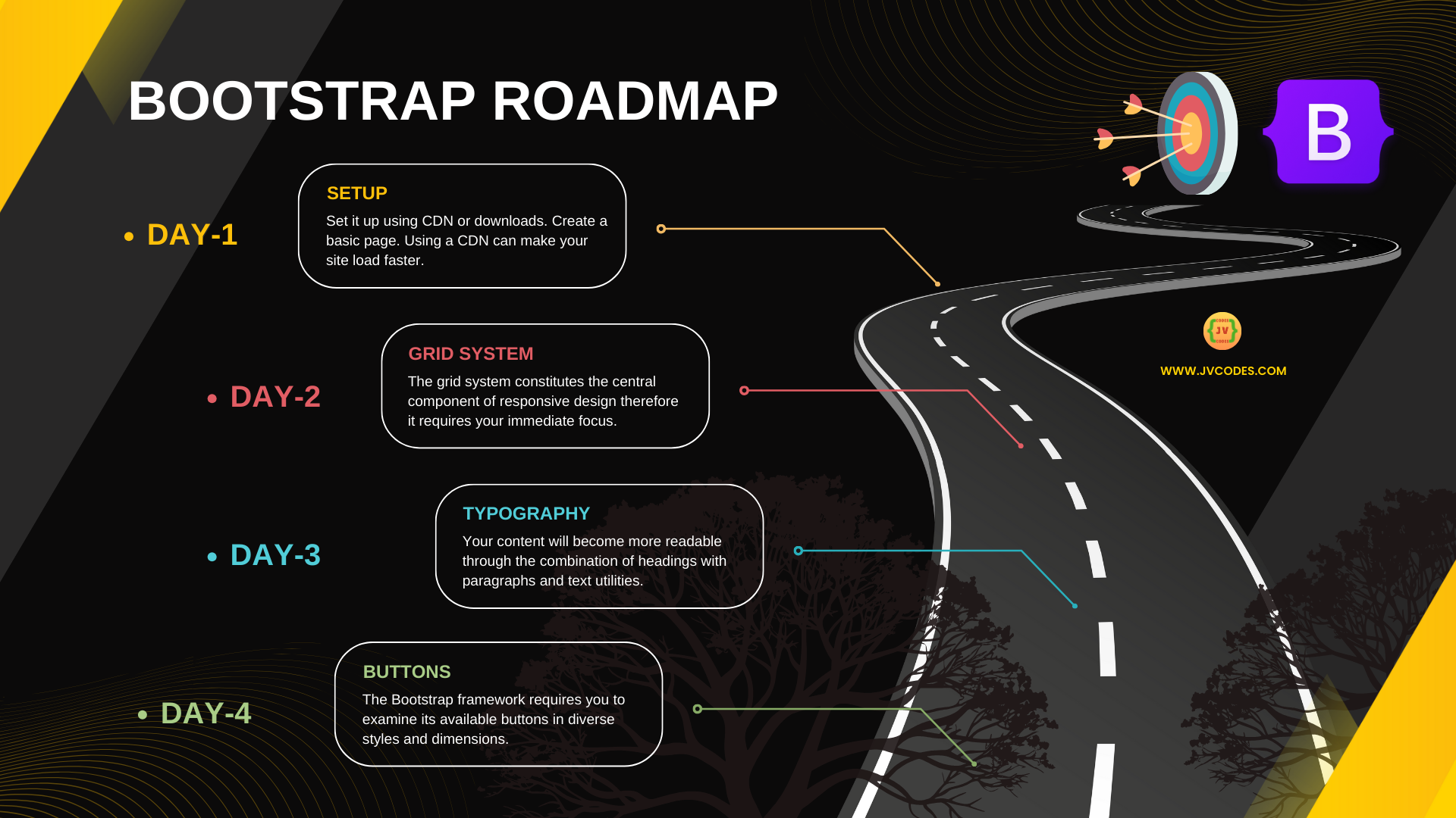
20 Days Bootstrap Roadmap
A step-by-step guide to master Bootstrap in just 20 days. Learn responsive design and build stunning web pages quickly.
Day 1: Introduction & Setup
Learn what Bootstrap does and why it is so popular. Before you start, you need a basic knowledge of HTML, CSS, and JavaScript. Set it up using CDN or downloads. Create a basic page. Using a CDN can make your site load faster.
Here is a simple code snippet:
<!DOCTYPE html>
<html lang="en">
  <head>
    <meta charset="utf-8">
    <meta name="viewport" content="width=device-width, initial-scale=1">
    <link href="https://cdn.jsdelivr.net/npm/bootstrap@5.1.3/dist/css/bootstrap.min.css" rel="stylesheet">
  </head>
  <body>
    <!-- Your content here -->
  </body>
</html>
Day 2: Understanding the Grid System
The grid system constitutes the central component of responsive design; therefore, it requires your immediate focus. You must introduce containers that contain rows filled with columns in your current project. Using this method makes it possible to structure your pages easily.
Day 3: Learning Typography
Master Bootstrap typography components to design text presentation. Your content will become more readable through the combination of headings with paragraphs alongside text utilities. Quality typography will establish an appealing and visually pleasing website.
Day 4: Working with Buttons
The Bootstrap framework requires you to examine its available buttons in diverse styles and dimensions. Your page needs buttons, which you must test during your evaluation sessions. A website requires buttons to enable meaningful interaction between users and the system.
Day 5: Creating Forms
Build forms using Bootstrap classes. A user can build form controls as well as field identifiers and message alerts effortlessly. User interaction with sites heavily relies on forms because they help gather data while enabling site interaction.
Day 6: Managing Images
You will learn how Bootstrap enables users to develop responsive images. The .img-fluid class allows pictures to adapt properly to fit various screens. When you apply this step to your visuals, they will automatically adjust regardless of the device used.
Day 7: Building a Navbar
Base the navigation element on a layout structure that adapts to different screen dimensions. The navbar classes from Bootstrap will help you create menu structures with links. A well-defined navbar becomes a practical tool for users to locate necessary content easily.
Day 8: Using Alerts
The process of showing critical notifications with alerts will be taught during this day. The display of success warnings and error messages requires the proper use of success warning and error message classes. Designers can use alerts to enhance clarity as well as provide feedback on their creations.
Day 9: Crafting Cards
Study how the card element shows information within an orderly presentation. Design cards that incorporate headers as well as images and footers. Small chunks of organized information are possible using cards as an interface tool.
Day 10: Creating Modals
The site requires the implementation of modals as dynamic popup windows. Extra content related to models should be displayed on the page using the models feature. Your website will become more interactive through this feature which also increases user-friendly functionality.
Day 11: Designing Dropdowns
The project team should focus on developing dropdown menus that serve as organizational elements for options and links. Build interactive dropdowns that work on all devices. Dropdowns simplify navigation and save space on your page.
Day 12: Adding Tooltips
Your users will benefit from tooltips since they reveal additional content if elements receive hover interaction. Tooltips display temporary small information messages when users need them. The design of controls provides user support to make websites more easier to use.
Day 13: Implementing Popovers
Master the implementation of popovers, which display information upon user click. Platform users will get additional details from the popovers that lead them through the system. The additional feature enhances website interactivity and dynamism.
Day 14: Creating a Carousel
Develop a carousel system that displays image or content sliding components. The Bootstrap carousel classes provide a solution to build visually interesting slideshows. Several items benefit from being showcased through the effective use of carousels.
Day 15: Using Progress Bars
You should implement progress bars that indicate both progress and loading statuses. Your progress indicators will become easy to understand through simplistic classes. Long tasks appear shorter to users when you use progress bars.
Day 16: Adding Spinners
Users should learn how to integrate spinners for indicating content load states. Spinners provide essential feedback to users during the data retrieval process. Spinners enhance modern design during periods of waiting time on your site.
Day 17: Styling Tables
Learn to style Bootstrap tables through the use of its predefined classes. Craft tables with neat structures that use borders and striping to present data in an organized manner. A table that receives proper design treatment makes your content appear more polished and attractive.
Day 18: Using Badges
Small pieces of key information should be highlighted using badges. Badges are the best choice for displaying counters and status indicators on website pages. Your designs gain visual interest thanks to their ability to bring color and additional particulars.
Day 19: Implementing Pagination
Learn to implement paging functionality when dealing with extensive lists containing numerous items. All page links require optimization for effective performance on different screens throughout devices. The pagination system enables users to browse your content effectively.
Day 20: Final Project & Review
Integrate your completely learned skills to create a single project. Your task includes building an entirely responsive webpage that integrates navbar elements, cards, and forms, plus other components. The final project demonstrates both your skill growth and your self-assurance.
Bootstrap Components
Bootstrap components offer a collection of pre-made, accessible user interface elements that enable fast web page development.
Here is the entire list of Bootstrap components:
- Bootstrap Grid Basic
- Bootstrap Typography
- Bootstrap Tables
- Bootstrap Images
- Bootstrap Jumbotron
- Bootstrap Wells
- Bootstrap Alerts
- Bootstrap Buttons
- Bootstrap Button Groups
- Bootstrap Glyphicons
- Bootstrap Badges/Labels
- Bootstrap Progress Bars
- Bootstrap Pagination
- Bootstrap Pager
- Bootstrap List Groups
- Bootstrap Panels
- Bootstrap Dropdowns
- Bootstrap Collapse
- Bootstrap Tabs/Pills
- Bootstrap Navbar
- Bootstrap Forms
- Bootstrap Inputs
- Bootstrap Inputs 2
- Bootstrap Input Sizing
- Bootstrap Media Objects
- Bootstrap Carousel
- Bootstrap Modal
- Bootstrap Tooltip
- Bootstrap Popover
- Bootstrap Scrollspy
- Bootstrap Affix
- Bootstrap Filters
Final Thoughts
Bootstrap enables developers to convert their ideas directly into functional websites at high speed. In 20 days, you’ll build real projects. Keep practicing. Customize styles to stand out. Check the docs for updates. Ready to start?
By following this roadmap, you will learn to create stunning websites. Regular project practice should be combined with best practice applications. You will develop stunning, responsive websites within a short period. For more tips and advanced methods of Bootstrap,p use its official documentation.
Also, read:
- Getting Started with Bootstrap 5
- Bootstrap 5 Grid System Explained with Easy Examples for Beginners
- Bootstrap 5 Typography Guide with Examples for Beginners
- Bootstrap 5 Images with Examples for Beginners
- Bootstrap 5 Tables Guide for Beginners