Circular Social Media Buttons Layout Using HTML and CSS (Free Source Code)
Social media icons are one of the most important ingredients of modern web design that enable users engage with the brand on multiple channels. Arranging social media buttons in a circle is much more stylish in design and looks relatively perfect for any design.
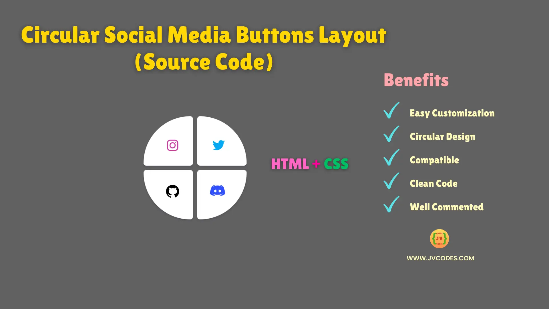
In this article, you will learn on how to create a plain and aesthetically pleasing circular design of the social media buttons in html and css. These form mini circles, four of them in all so that each one holds an icon in a very organised and pleasing format.
GitHub Source: Circular Social Media Buttons
Features
- Circular Layout: There is a clear organization of icons in circular format that contains four sections.
- Responsive Design: The design also responds to the different screen sizes and can be easily used in desktop, tablet or mobile.
- Customizable: Good news is that colors, sizes and icons can be adjusted to the requirements of the website’s design.
- Clean Code: It has clean, semantic HTML and CSS which makes it easier to integrate and make a lot of modifications to a website.
These UI components are designed according to good programming practices!
Technologies Used
- HTML (Hypertext Markup Language)
- CSS (Cascading Style Sheets)
Recommended for You
- Responsive Portfolio Design for Content Writer
- Responsive Portfolio Website Design for Web Developer
- Modern Animated Hero Section
- Hero Section With Video Background
- Hero Section with Content Left
Video Tutorial
HTML
Here is the HTML code for your index.html file:
<!DOCTYPE html>
<!-- Designed by JV Codes at www.jvcodes.com  -->
<html lang="en">
<head>
    <meta charset="UTF-8">
    <meta name="viewport" content="width=device-width, initial-scale=1.0">
    <title>Circular Social Media Buttons Layout</title>
    <link rel="stylesheet" href="style.css">
</head>
<body>
<div class="main">
  <div class="up">
    <button class="card1">
      <svg xmlns="http://www.w3.org/2000/svg" xmlns:xlink="http://www.w3.org/1999/xlink" viewBox="0,0,256,256" width="30px" height="30px" fill-rule="nonzero" class="instagram"><g fill-rule="nonzero" stroke="none" stroke-width="1" stroke-linecap="butt" stroke-linejoin="miter" stroke-miterlimit="10" stroke-dasharray="" stroke-dashoffset="0" font-family="none" font-weight="none" font-size="none" text-anchor="none" style="mix-blend-mode: normal"><g transform="scale(8,8)"><path d="M11.46875,5c-3.55078,0 -6.46875,2.91406 -6.46875,6.46875v9.0625c0,3.55078 2.91406,6.46875 6.46875,6.46875h9.0625c3.55078,0 6.46875,-2.91406 6.46875,-6.46875v-9.0625c0,-3.55078 -2.91406,-6.46875 -6.46875,-6.46875zM11.46875,7h9.0625c2.47266,0 4.46875,1.99609 4.46875,4.46875v9.0625c0,2.47266 -1.99609,4.46875 -4.46875,4.46875h-9.0625c-2.47266,0 -4.46875,-1.99609 -4.46875,-4.46875v-9.0625c0,-2.47266 1.99609,-4.46875 4.46875,-4.46875zM21.90625,9.1875c-0.50391,0 -0.90625,0.40234 -0.90625,0.90625c0,0.50391 0.40234,0.90625 0.90625,0.90625c0.50391,0 0.90625,-0.40234 0.90625,-0.90625c0,-0.50391 -0.40234,-0.90625 -0.90625,-0.90625zM16,10c-3.30078,0 -6,2.69922 -6,6c0,3.30078 2.69922,6 6,6c3.30078,0 6,-2.69922 6,-6c0,-3.30078 -2.69922,-6 -6,-6zM16,12c2.22266,0 4,1.77734 4,4c0,2.22266 -1.77734,4 -4,4c-2.22266,0 -4,-1.77734 -4,-4c0,-2.22266 1.77734,-4 4,-4z"></path></g></g></svg>
    </button>
    <button class="card2">
      <svg xmlns="http://www.w3.org/2000/svg" viewBox="0 0 48 48" width="30px" height="30px" class="twitter"><path d="M42,12.429c-1.323,0.586-2.746,0.977-4.247,1.162c1.526-0.906,2.7-2.351,3.251-4.058c-1.428,0.837-3.01,1.452-4.693,1.776C34.967,9.884,33.05,9,30.926,9c-4.08,0-7.387,3.278-7.387,7.32c0,0.572,0.067,1.129,0.193,1.67c-6.138-0.308-11.582-3.226-15.224-7.654c-0.64,1.082-1,2.349-1,3.686c0,2.541,1.301,4.778,3.285,6.096c-1.211-0.037-2.351-0.374-3.349-0.914c0,0.022,0,0.055,0,0.086c0,3.551,2.547,6.508,5.923,7.181c-0.617,0.169-1.269,0.263-1.941,0.263c-0.477,0-0.942-0.054-1.392-0.135c0.94,2.902,3.667,5.023,6.898,5.086c-2.528,1.96-5.712,3.134-9.174,3.134c-0.598,0-1.183-0.034-1.761-0.104C9.268,36.786,13.152,38,17.321,38c13.585,0,21.017-11.156,21.017-20.834c0-0.317-0.01-0.633-0.025-0.945C39.763,15.197,41.013,13.905,42,12.429"></path></svg>
    </button>
  </div>
  <div class="down">
    <button class="card3">
      <svg xmlns="http://www.w3.org/2000/svg" viewBox="0 0 30 30" width="30px" height="30px" class="github">    <path d="M15,3C8.373,3,3,8.373,3,15c0,5.623,3.872,10.328,9.092,11.63C12.036,26.468,12,26.28,12,26.047v-2.051 c-0.487,0-1.303,0-1.508,0c-0.821,0-1.551-0.353-1.905-1.009c-0.393-0.729-0.461-1.844-1.435-2.526 c-0.289-0.227-0.069-0.486,0.264-0.451c0.615,0.174,1.125,0.596,1.605,1.222c0.478,0.627,0.703,0.769,1.596,0.769 c0.433,0,1.081-0.025,1.691-0.121c0.328-0.833,0.895-1.6,1.588-1.962c-3.996-0.411-5.903-2.399-5.903-5.098 c0-1.162,0.495-2.286,1.336-3.233C9.053,10.647,8.706,8.73,9.435,8c1.798,0,2.885,1.166,3.146,1.481C13.477,9.174,14.461,9,15.495,9 c1.036,0,2.024,0.174,2.922,0.483C18.675,9.17,19.763,8,21.565,8c0.732,0.731,0.381,2.656,0.102,3.594 c0.836,0.945,1.328,2.066,1.328,3.226c0,2.697-1.904,4.684-5.894,5.097C18.199,20.49,19,22.1,19,23.313v2.734 c0,0.104-0.023,0.179-0.035,0.268C23.641,24.676,27,20.236,27,15C27,8.373,21.627,3,15,3z"></path></svg>
    </button>
    <button class="card4">
      <svg height="30px" width="30px" viewBox="0 0 48 48" xmlns="http://www.w3.org/2000/svg" class="discord"><path d="M40,12c0,0-4.585-3.588-10-4l-0.488,0.976C34.408,10.174,36.654,11.891,39,14c-4.045-2.065-8.039-4-15-4s-10.955,1.935-15,4c2.346-2.109,5.018-4.015,9.488-5.024L18,8c-5.681,0.537-10,4-10,4s-5.121,7.425-6,22c5.162,5.953,13,6,13,6l1.639-2.185C13.857,36.848,10.715,35.121,8,32c3.238,2.45,8.125,5,16,5s12.762-2.55,16-5c-2.715,3.121-5.857,4.848-8.639,5.815L33,40c0,0,7.838-0.047,13-6C45.121,19.425,40,12,40,12z M17.5,30c-1.933,0-3.5-1.791-3.5-4c0-2.209,1.567-4,3.5-4s3.5,1.791,3.5,4C21,28.209,19.433,30,17.5,30z M30.5,30c-1.933,0-3.5-1.791-3.5-4c0-2.209,1.567-4,3.5-4s3.5,1.791,3.5,4C34,28.209,32.433,30,30.5,30z"></path></svg>
    </button>
  </div>
</div>
</body>
</html>
CSS
Here is the complete code for style.css file to style the circular social media buttons:
/* From jvcodes.com */

.main {
    display: flex;
    flex-direction: column;
    gap: 0.5em;
    align-items: center;
    justify-content: center;
    height: 100vh;
    background-color: rgb(97, 97, 97);
  }

  /* Styles for the upper row of buttons */
  .up {
    display: flex;
    flex-direction: row;
    gap: 0.5em;
  }

  /* Styles for the lower row of buttons */
  .down {
    display: flex;
    flex-direction: row;
    gap: 0.5em;
  }

  /* Common styles for individual buttons */
  .card1, .card2, .card3, .card4 {
    width: 90px;
    height: 90px;
    outline: none;
    border: none;
    background: white;
    box-shadow: rgba(50, 50, 93, 0.25) 0px 2px 5px -1px, rgba(0, 0, 0, 0.3) 0px 1px 3px -1px;
    transition: 0.2s ease-in-out;
  }

  /* Specific styles for the Instagram button */
  .card1 {
    border-radius: 90px 5px 5px 5px;
  }
  .instagram {
    margin-top: 1.5em;
    margin-left: 1.2em;
    fill: #cc39a4;
  }

  /* Specific styles for the Twitter button */
  .card2 {
    border-radius: 5px 90px 5px 5px;
  }
  .twitter {
    margin-top: 1.5em;
    margin-left: -0.9em;
    fill: #03A9F4;
  }

  /* Specific styles for the GitHub button */
  .card3 {
    border-radius: 5px 5px 5px 90px;
  }
  .github {
    margin-top: -0.6em;
    margin-left: 1.2em;
  }

  /* Specific styles for the Discord button */
  .card4 {
    border-radius: 5px 5px 90px 5px;
  }
  .discord {
    margin-top: -0.9em;
    margin-left: -1.2em;
    fill: #314ffd;
  }

  /* Hover effects for the Instagram button */
  .card1:hover {
    cursor: pointer;
    scale: 1.1;
    background-color: #cc39a4;
  }
  .card1:hover .instagram {
    fill: white;
  }

  /* Hover effects for the Twitter button */
  .card2:hover {
    cursor: pointer;
    scale: 1.1;
    background-color: #03A9F4;
  }
  .card2:hover .twitter {
    fill: white;
  }

  /* Hover effects for the GitHub button */
  .card3:hover {
    cursor: pointer;
    scale: 1.1;
    background-color: black;
  }
  .card3:hover .github {
    fill: white;
  }

  /* Hover effects for the Discord button */
  .card4:hover {
    cursor: pointer;
    scale: 1.1;
    background-color: #314ffd;
  }
  .card4:hover .discord {
    fill: white;
  }
Download Source Code
There is no copyright issue in using these circular social media buttons in your projects. You may get this set of buttons from the download button below.
Conclusion
When you follow these procedures and apply the free source code, then you can directly integrate this kind of creative and user friendly design into your website.
Stay connected with style—give it a shot right now!

