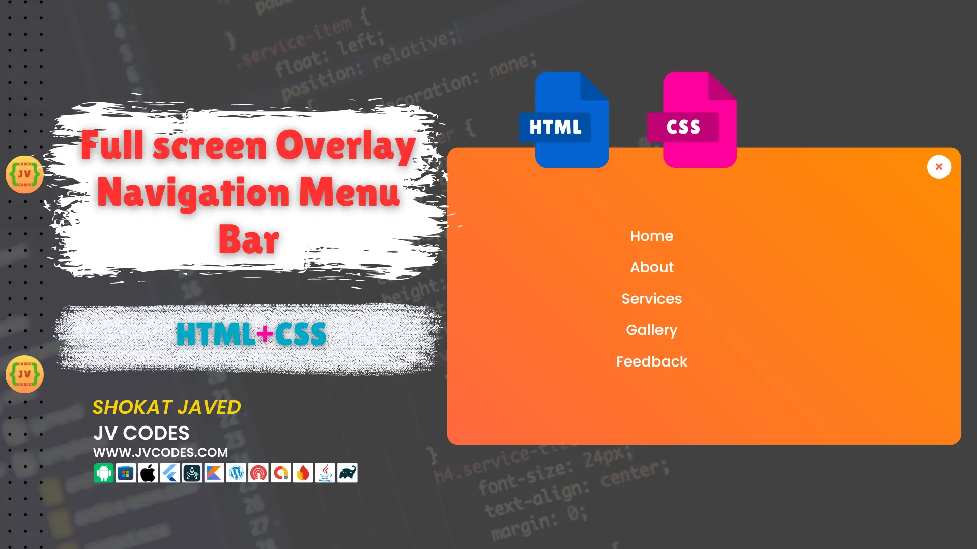
Full screen Overlay Navigation Menu Bar in HTML and CSS
A full-screen overlay navigation menu is one of the trendy and effective methods to improve the usability of your site. It covers the entire area of the screen and has a smooth scroll indicating different sections of a page.
Here in this article, I will give you the source code for free to add a Full Screen Overlay Navigation Menu Bar to your HTML and CSS projects. This kind of navigation menu is simple to apply and it can create professional design to your website.
GitHub Source: Full Screen Overlay Navigation Menu Bar
Features
Here are some key features of this Full Screen Overlay Navigation Menu:
- Easy to Customize: It is extremely easy to integrate, so you can easily modify it according to the specifics of your web site and its design.
- Compatible with All Modern CMS: No matter you’re in WordPress, Joomla, or any other CMS, this navigation bar will blend in perfectly.
- Clean Code: All the codes are fully commented which enable one to go around and modify any specific segment.
Technologies Used
- HTML (Hypertext Markup Language)
- CSS (Cascading Style Sheets)
Video Tutorial

Steps to Build Menu
- Create Project Folder: First of all, create a new folder on your computer which will contain all project files.
- Create index.html: Within the directory for the project, generate an HTML file called index.html to design your home page.
- Create style.css: Design a CSS file with the name style.css to style up your full-screen overlay navigation menu.
- Copy and paste the Code: Copy the given HTML and CSS and paste in relative files.
HTML
Here is the HTML code for your index.html file:
<!DOCTYPE html>
<html lang="en" dir="ltr">
   <head>
      <meta charset="utf-8">
      <title>Fullscreen Overlay Navigation | JV Codes</title>
      <link rel="stylesheet" href="style.css">
      <link rel="stylesheet" href="https://cdnjs.cloudflare.com/ajax/libs/font-awesome/5.15.3/css/all.min.css"/>
   </head>
   <body>
      <input type="checkbox" id="active">
      <label for="active" class="menu-btn"><i class="fas fa-bars"></i></label>
      <div class="wrapper">
         <ul>
            <li><a href="#">Home</a></li>
            <li><a href="#">About</a></li>
            <li><a href="#">Services</a></li>
            <li><a href="#">Gallery</a></li>
            <li><a href="#">Feedback</a></li>
         </ul>
      </div>
      <div class="content">
         <div class="title">
            Fullscreen Overlay Navigation Bar
         </div>
         <p>
            using only HTML & CSS
         </p>
      </div>
   </body>
</html>
CSS
Here is the complete code for style.css file to style the menu:
@import url('https://fonts.googleapis.com/css?family=Poppins:400,500,600,700&display=swap');
*{
  margin: 0;
  padding: 0;
  box-sizing: border-box;
  font-family: 'Poppins', sans-serif;
}
.wrapper{
  position: fixed;
  top: 0;
  left: 0;
  height: 100%;
  width: 100%;
  background: linear-gradient(-135deg, #c850c0, #4158d0);
  /* background: linear-gradient(375deg, #1cc7d0, #2ede98); */
  /* clip-path: circle(25px at calc(0% + 45px) 45px); */
  clip-path: circle(25px at calc(100% - 45px) 45px);
  transition: all 0.3s ease-in-out;
}
#active:checked ~ .wrapper{
  clip-path: circle(75%);
}
.menu-btn{
  position: absolute;
  z-index: 2;
  right: 20px;
  /* left: 20px; */
  top: 20px;
  height: 50px;
  width: 50px;
  text-align: center;
  line-height: 50px;
  border-radius: 50%;
  font-size: 20px;
  color: #fff;
  cursor: pointer;
  background: linear-gradient(-135deg, #c850c0, #4158d0);
  /* background: linear-gradient(375deg, #1cc7d0, #2ede98); */
  transition: all 0.3s ease-in-out;
}
#active:checked ~ .menu-btn{
  background: #fff;
  color: #4158d0;
}
#active:checked ~ .menu-btn i:before{
  content: "\f00d";
}
.wrapper ul{
  position: absolute;
  top: 50%;
  left: 50%;
  transform: translate(-50%, -50%);
  list-style: none;
  text-align: center;
}
.wrapper ul li{
  margin: 15px 0;
}
.wrapper ul li a{
  color: none;
  text-decoration: none;
  font-size: 30px;
  font-weight: 500;
  padding: 5px 30px;
  color: #fff;
  position: relative;
  line-height: 50px;
  transition: all 0.3s ease;
}
.wrapper ul li a:after{
  position: absolute;
  content: "";
  background: #fff;
  width: 100%;
  height: 50px;
  left: 0;
  border-radius: 50px;
  transform: scaleY(0);
  z-index: -1;
  transition: transform 0.3s ease;
}
.wrapper ul li a:hover:after{
  transform: scaleY(1);
}
.wrapper ul li a:hover{
  color: #4158d0;
}
input[type="checkbox"]{
  display: none;
}
.content{
  position: absolute;
  top: 50%;
  left: 50%;
  transform: translate(-50%, -50%);
  z-index: -1;
  text-align: center;
  width: 100%;
  color: #202020;
}
.content .title{
  font-size: 40px;
  font-weight: 700;
}
.content p{
  font-size: 35px;
  font-weight: 600;
}
Download Source Code
From the button below you can download the full source code for this Full Screen Overlay Navigation Menu Bar. There are no limitations in copyrights, and all files, such as HTML and CSS, are included.
Conclusion
The Full Screen Overlay Navigation Menu Bar is great addition to any site, in fact, any site should have it. This code can be used to give more options to users, and of course, do not forget to reference JV Codes to our site. Don’t forget to also follow us on our YouTube channel for more lessons and videos.
In case of any problems, you can use the comment section below and I shall respond within the shortest time possible.