Hero Section With Services Using HTML and CSS
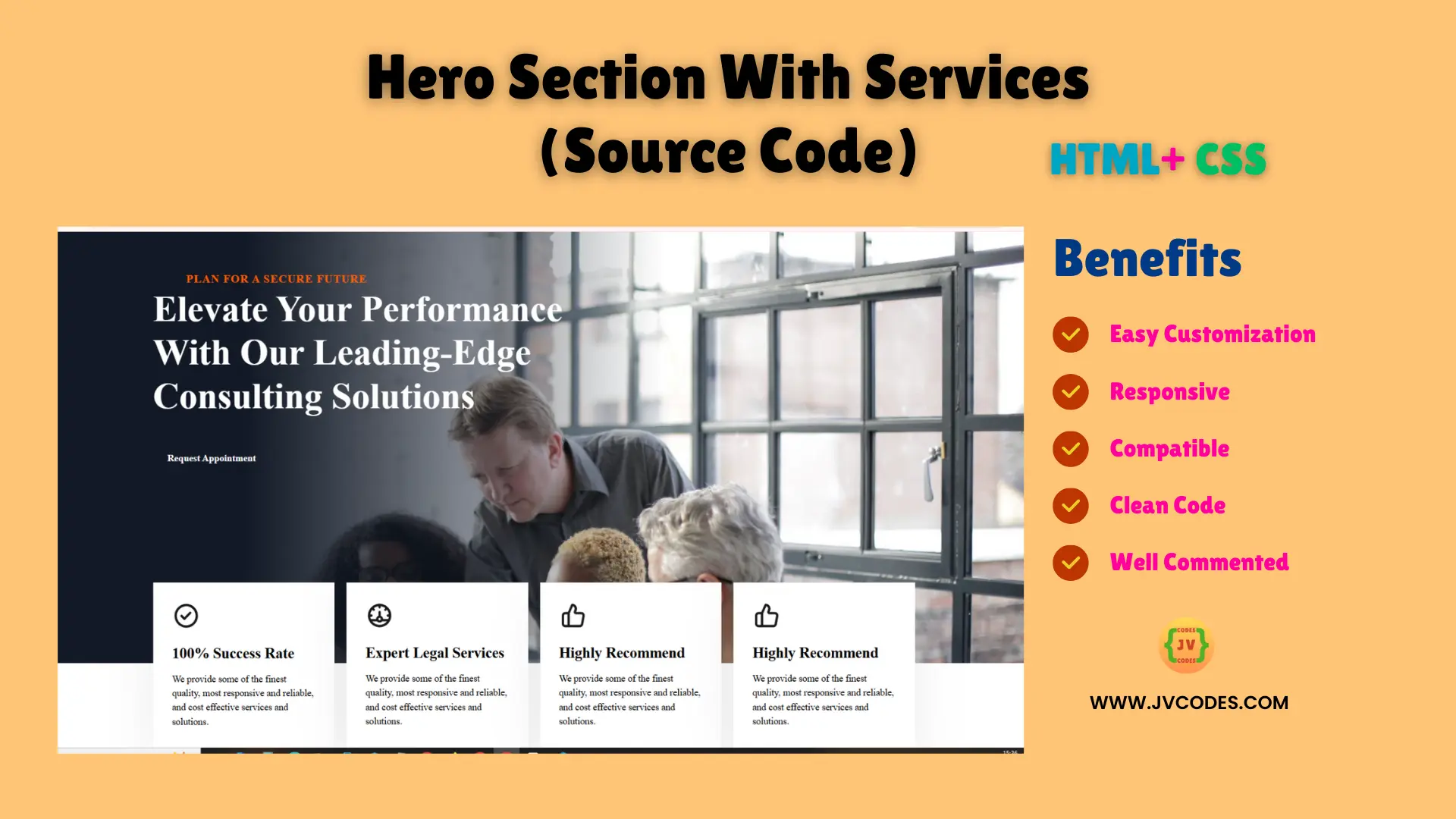
Designing a Hero Section With Services Using HTML and CSS is an important element of a professional website’s design.
The hero section is one of the sections that are located at the top of the website and it is what a user first sees when coming to your site, so it must be impressive. The specific hero section of this website is an example of the design assembled with the necessity to display essential service information.
The best part? Let me tell you that you will be getting the free source code to integrate it without any hassle!
GitHub Source: Hero Section With Services
Features
- Responsive: Appears well suited for viewing on PCs, laptops, tablet and even an iPhone.
- Easy to Customize: It’s very convenient to modify the text, pictures or color as per the requirement.
- Compatibility: It can be used in all current browsers with no problems.
- Clean Code: The operations are well described and commented so that there is no problem in reading and implementing this code.
Technologies Used
- HTML (Hypertext Markup Language)
- CSS (Cascading Style Sheets)
Recommended for You
- Hero Section with Snowfall Effect
- QR Code Scanner or Reader
- QR Code Generator
- Animated Responsive Pricing Table
- 3 Cards Responsive Transparent Pricing Table
Video Tutorial
Steps to Build Responsive Hero Section
- Create Project Folder: So let’s begin by opening a directory where all the files related to the project will be saved.
- Create index.html: Insert an HTML file inside the folder in order to make hero section layout.
- Create style.css: Make a CSS file for the hero section and services.
- Copy & Paste the Code: Copy the code below to apply the design as soon as possible.
HTML
Here is the HTML code for your index.html file:
<!DOCTYPE html>
<!-- Designed by JV Codes at www.jvcodes.com -->
<html lang="en">
<head>
<meta charset="UTF-8">
<meta name="viewport" content="width=device-width, initial-scale=1.0">
<title>Hero Section With Services</title>
<link rel="stylesheet" href="style.css">
</head>
<body>
<section id="hero-1619">
<div class="cs-container">
<div class="cs-content">
<span class="cs-topper">
<svg class="cs-chevron" width="49" height="15" viewBox="0 0 49 15" fill="none" xmlns="http://www.w3.org/2000/svg">
<g opacity="0.7">
<path d="M0.621948 7.49889L6.40262 15L10.343 15L4.56231 7.49889L10.343 -4.2492e-07L6.40262 -2.52681e-07L0.621948 7.49889Z" fill="var(--chevronColor)"/>
<path d="M7.62195 7.49889L13.4026 15L17.343 15L11.5623 7.49889L17.343 -4.2492e-07L13.4026 -2.52681e-07L7.62195 7.49889Z" fill="var(--chevronColor)"/>
<path d="M14.7789 7.49889L20.5596 15L24.5 15L18.7193 7.49889L24.5 -4.2492e-07L20.5596 -2.52681e-07L14.7789 7.49889Z" fill="var(--chevronColor)"/>
<path d="M22.7789 7.49889L28.5596 15L32.5 15L26.7193 7.49889L32.5 -4.2492e-07L28.5596 -2.52681e-07L22.7789 7.49889Z" fill="var(--chevronColor)"/>
<path d="M30.7789 7.49889L36.5596 15L40.5 15L34.7193 7.49889L40.5 -4.2492e-07L36.5596 -2.52681e-07L30.7789 7.49889Z" fill="var(--chevronColor)"/>
<path d="M38.7789 7.49889L44.5596 15L48.5 15L42.7193 7.49889L48.5 -4.2492e-07L44.5596 -2.52681e-07L38.7789 7.49889Z" fill="var(--chevronColor)"/>
</g>
</svg>
<p class="subtitle">Plan for A secure future</p>
<svg class="cs-chevron" width="49" height="15" viewBox="0 0 49 15" fill="none" xmlns="http://www.w3.org/2000/svg">
<g opacity="0.7">
<path d="M48.3781 7.49889L42.5974 15L38.657 15L44.4377 7.49889L38.657 -4.2492e-07L42.5974 -2.52681e-07L48.3781 7.49889Z" fill="var(--chevronColor)"/>
<path d="M41.3781 7.49889L35.5974 15L31.657 15L37.4377 7.49889L31.657 -4.2492e-07L35.5974 -2.52681e-07L41.3781 7.49889Z" fill="var(--chevronColor)"/>
<path d="M34.2211 7.49889L28.4404 15L24.5 15L30.2807 7.49889L24.5 -4.2492e-07L28.4404 -2.52681e-07L34.2211 7.49889Z" fill="var(--chevronColor)"/>
<path d="M26.2211 7.49889L20.4404 15L16.5 15L22.2807 7.49889L16.5 -4.2492e-07L20.4404 -2.52681e-07L26.2211 7.49889Z" fill="var(--chevronColor)"/>
<path d="M18.2211 7.49889L12.4404 15L8.50004 15L14.2807 7.49889L8.50004 -4.2492e-07L12.4404 -2.52681e-07L18.2211 7.49889Z" fill="var(--chevronColor)"/>
<path d="M10.2211 7.49889L4.4404 15L0.500041 15L6.28071 7.49889L0.500042 -4.2492e-07L4.4404 -2.52681e-07L10.2211 7.49889Z" fill="var(--chevronColor)"/>
</g>
</svg>
</span>
<h1 class="cs-title">Elevate Your Performance With Our Leading-Edge Consulting Solutions</h1>
<a href="" class="cs-button-solid">Request Appointment</a>
</div>
<ul class="cs-card-group">
<li class="cs-item">
<img class="cs-icon" loading="lazy" decoding="async" src="https://csimg.nyc3.cdn.digitaloceanspaces.com/Images/Icons/check-circle.svg" alt="icon" width="48" height="48">
<h3 class="cs-h3">100% Success Rate</h3>
<p class="cs-item-text">
We provide some of the finest quality, most responsive and reliable, and cost effective services and solutions.
</p>
</li>
<li class="cs-item">
<img class="cs-icon" loading="lazy" decoding="async" src="https://csimg.nyc3.cdn.digitaloceanspaces.com/Images/Icons/speedometer.svg" alt="icon" width="48" height="48">
<h3 class="cs-h3">Expert Legal Services</h3>
<p class="cs-item-text">
We provide some of the finest quality, most responsive and reliable, and cost effective services and solutions.
</p>
</li>
<li class="cs-item">
<img class="cs-icon" loading="lazy" decoding="async" src="https://csimg.nyc3.cdn.digitaloceanspaces.com/Images/Icons/Like.svg" alt="icon" width="48" height="48">
<h3 class="cs-h3">Highly Recommend</h3>
<p class="cs-item-text">
We provide some of the finest quality, most responsive and reliable, and cost effective services and solutions.
</p>
</li>
</ul>
</div>
<!-- Background Image, there's a background image in the CSS for the parallax effect you'll need to change as well if you swap out our images -->
<picture class="cs-background">
<source media="(max-width: 600px)" srcset="https://csimg.nyc3.cdn.digitaloceanspaces.com/Images/People/meeting7-m.jpeg">
<source media="(min-width: 601px)" srcset="https://csimg.nyc3.cdn.digitaloceanspaces.com/Images/People/meeting7.jpg">
<img decoding="async" src="https://csimg.nyc3.cdn.digitaloceanspaces.com/Images/People/meeting7.jpg" alt="meeting" width="2250" height="1500" aria-hidden="true">
</picture>
</section>
</body>
</html>
CSS
Here is the complete code for style.css file to style this hero section:
body {
    margin: 0;
    padding: 0;
}

*, *:before, *:after {
    box-sizing: border-box;
}

.subtitle {
  font-size: 1.2rem;
    font-weight: 600;
    color: #ff5e00;
    text-transform: uppercase;
    letter-spacing: 0.05em;
    margin: 0;
}

/* Mobile - 360px */
@media only screen and (min-width: 0rem) {
  #hero-1619 {
    padding: var(--sectionPadding);
    /* 200px - 300px - leaving extra space for the navigation */
    padding-top: clamp(12.5rem, 31.95vw, 18.75rem);
    position: relative;
    z-index: 1;
  }
  #hero-1619 .cs-container {
    width: 100%;
    max-width: 80rem;
    margin: auto;
    display: flex;
    justify-content: center;
    align-items: center;
    flex-direction: column;
    /* 60px - 180px */
    gap: clamp(3.75rem, 13vw, 11.25rem);
  }
  #hero-1619 .cs-content {
    /* set text align to left if content needs to be left aligned */
    text-align: left;
    width: 100%;
    max-width: 48.75rem;
    display: flex;
    flex-direction: column;
    /* centers content horizontally, set to flex-start to left align */
    align-items: flex-start;
  }
  #hero-1619 .cs-topper {
    /* 13px - 16px */
    font-size: clamp(0.8125rem, 1.5vw, 1rem);
    line-height: 1.2em;
    font-weight: 700;
    letter-spacing: 0.1em;
    text-align: center;
    text-transform: uppercase;
    margin-bottom: 0.25rem;
    color: var(--primary);
    display: flex;
    justify-content: center;
    align-items: center;
    gap: 0.5rem;
    position: relative;
  }
  #hero-1619 .cs-chevron {
    --chevronColor: var(--primary);
    width: 3rem;
    height: auto;
  }
  #hero-1619 .cs-title {
    /* 39px - 61px */
    font-size: clamp(2.4375rem, 6.4vw, 3.8125rem);
    font-weight: 700;
    line-height: 1.2em;
    text-align: inherit;
    max-width: 100%;
    margin: 0 0 2.5rem 0;
    color: #fff;
    position: relative;
  }
  #hero-1619 .cs-text {
    /* 16px - 20px */
    font-size: clamp(1rem, 1.95vw, 1.25rem);
    line-height: 1.5em;
    text-align: inherit;
    width: 100%;
    /* 464px - 622px */
    max-width: clamp(29rem, 60vw, 38.785rem);
    margin: 0 0 2.5rem 0;
    color: #fff;
  }
  #hero-1619 .cs-button-solid {
    font-size: 1rem;
    /* 46px - 56px */
    line-height: clamp(2.875rem, 5.5vw, 3.5rem);
    text-decoration: none;
    font-weight: 700;
    margin: 0;
    color: #fff;
    padding: 0 1.5rem;
    background-color: var(--primary);
    display: inline-block;
    position: relative;
    z-index: 1;
  }
  #hero-1619 .cs-button-solid:before {
    content: '';
    position: absolute;
    display: block;
    height: 100%;
    width: 0%;
    background: #ff5e00;
    opacity: 1;
    top: 0;
    left: 0;
    z-index: -1;
    transition: width .3s;
  }
  #hero-1619 .cs-button-solid:hover:before {
    width: 100%;
  }
  #hero-1619 .cs-card-group {
    margin: 0;
    padding: 0;
    width: 100%;
    display: grid;
    grid-template-columns: repeat(12, 1fr);
    /* 16px - 20px */
    gap: clamp(1rem, 2.3vw, 1.25rem);
  }
  #hero-1619 .cs-item {
    width: 100%;
    text-align: left;
    list-style: none;
    margin: 0;
    /* 24px - 32px */
    padding: clamp(1.5rem, 3vw, 2rem);
    background-color: #fff;
    box-shadow: 0px 12px 80px 0px rgba(26, 26, 26, 0.08);
    /* prevents padding from affecting height and width */
    box-sizing: border-box;
    grid-column: span 12;
    grid-row: span 1;
    display: flex;
    flex-direction: column;
    align-items: flex-start;
    justify-content: center;
    position: relative;
    z-index: 1;
  }
  #hero-1619 .cs-icon {
    width: 3rem;
    height: auto;
    margin: 0 0 1.5rem 0;
  }
  #hero-1619 .cs-h3 {
    /* 20px - 25px */
    font-size: clamp(1.25rem, 2.5vw, 1.5625rem);
    line-height: 1.2em;
    font-weight: bold;
    text-align: inherit;
    margin: 0 0 1rem 0;
    color: var(--headerColor);
  }
  #hero-1619 .cs-item-text {
    /* 14px - 16px */
    font-size: clamp(0.875rem, 1.5vw, 1rem);
    line-height: 1.5em;
    max-width: 28.125rem;
    margin: 0;
    padding: 0;
    color: var(--bodyTextColor);
  }
  #hero-1619 .cs-background {
    width: 100%;
    height: 55%;
    display: block;
    position: absolute;
    top: 0;
    left: 0;
    z-index: -2;
  }
  #hero-1619 .cs-background:before {
    /* Overlay */
    content: '';
    width: 100%;
    height: 100%;
    background: #111926;
    opacity: .8;
    position: absolute;
    display: block;
    top: 0;
    left: 0;
    z-index: 1;
    /* prevents the cursor from interacting with it */
    pointer-events: none;
  }
  #hero-1619 .cs-background img {
    position: absolute;
    top: 0;
    left: 0;
    height: 100%;
    width: 100%;
    object-fit: cover;
    /* makes the top of the image start at the top of the parent */
    object-position: top;
  }
}
  /* Tablet - 768px */
  @media only screen and (min-width: 48rem) {
    #hero-1619 {
      padding-bottom: 0;
    }
    #hero-1619 .cs-container {
      align-items: flex-start;
    }
    #hero-1619 .cs-content {
      text-align: left;
      margin-left: 0;
      align-items: flex-start;
    }
    #hero-1619 .cs-item {
      grid-column: span 6;
    }
    #hero-1619 .cs-background {
      height: 87%;
    }
    #hero-1619 .cs-background:before {
      background: linear-gradient(90deg, #111926 21.41%, rgba(17, 25, 38, 0.72) 34.98%, rgba(17, 25, 38, 0) 62.53%);
      opacity: 1;
    }
  }
  /* Large Desktop - 1300px */
  @media only screen and (min-width: 81.25rem) {
    #hero-1619 .cs-item {
      grid-column: span 3;
    }
  }
  /* Large Desktop Parallax Effect - 100px */
  @media only screen and (min-width: 100rem) {
    #hero-1619 .cs-background {
      background: url("https://csimg.nyc3.cdn.digitaloceanspaces.com/Images/People/meeting7.jpg");
      background-size: cover;
      background-position: center;
      background-repeat: no-repeat;
      /* creates the parallax effect */
      background-attachment: fixed;
    }
    #hero-1619 .cs-background img {
      display: none;
    }
  }
Download Source Code
The full source code of the Hero Section With Services is available in the button below for download. This code is free from any copyright meaning it can easily be used or modified by you in carrying out projects.
Conclusion
The Hero Section With Services Using HTML and CSS is a valuable component to improving the aesthetic appearance of any website. What it does: Using this source code will make development quicker since all you will be required to do is to modify this source code to meet your particular needs.
You are free to use this design to your projects provided you link back to JV Source Codes. If you have any problems or need some clarifications, feel free to put a comment and I’ll gladly get back to you. Moreover, please, do not forget to subscribe to our channel to get more awesome videos!

