Interactive Toggle Switch Using HTML and CSS (Free Source Code)
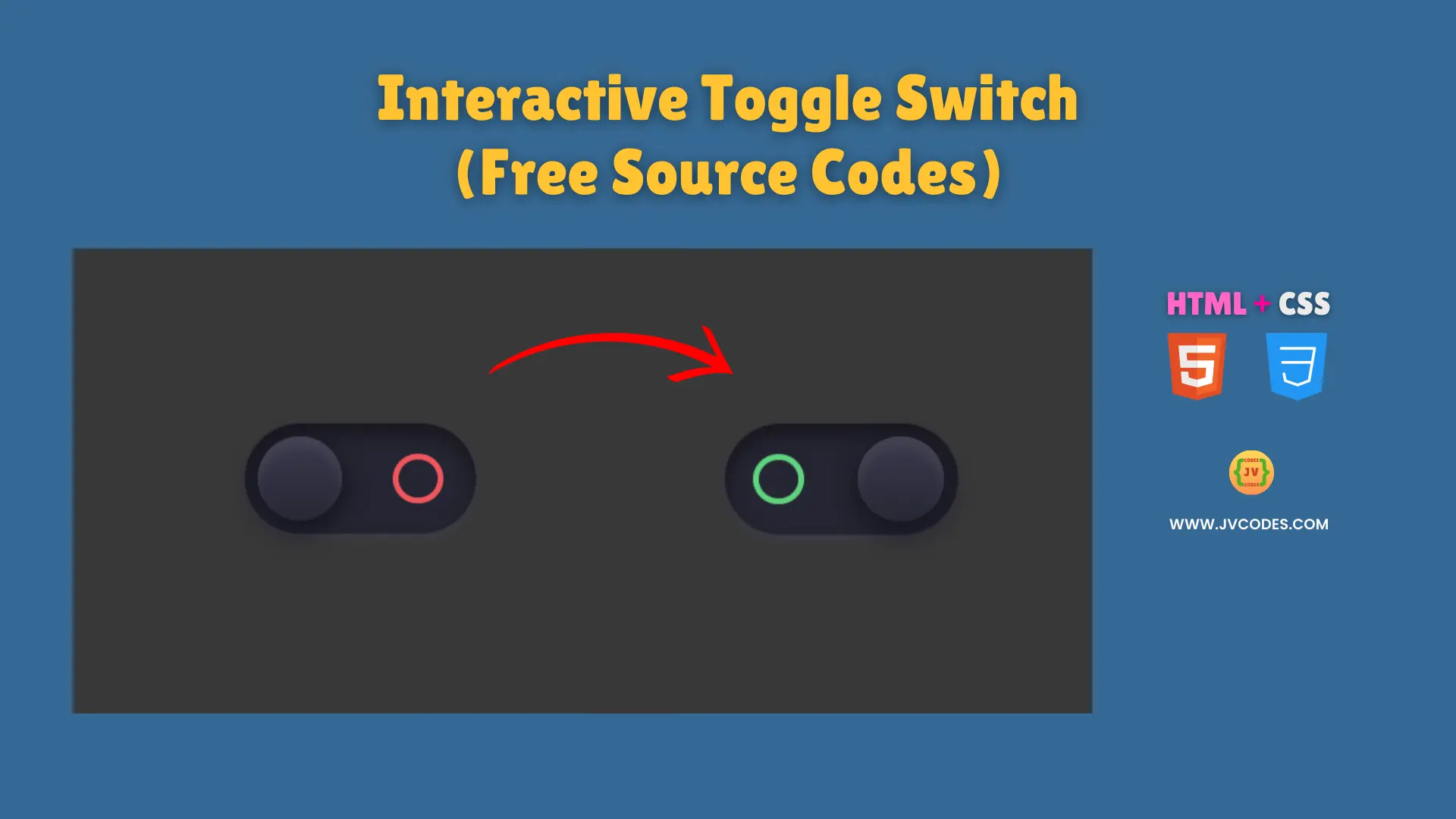
Interactive Toggle Switch Using HTML and CSS is a fun and practical way to add a sleek on/off mechanism to your website.
Users can easily understand and become engaged by the slider button which has smooth transitions for a visual appeal. You will receive free source code with good programming standards which enables you to quickly build this feature for your projects.
GitHub Source: Interactive Toggle Switch
Features
- Smooth Animation: The toggle slides effortlessly between on and off states, creating a refined user experience.
- Modern Design: A sleek and dark-themed appearance with subtle shadows gives it a stylish look.
- Responsive Layout: It adapts perfectly to various screen sizes, maintaining consistent performance on mobile devices.
- Easy Customization: You can quickly change the colors, shapes, or shadows to match your brand’s style.
Technologies Used
- HTML (Hypertext Markup Language)
- CSS (Cascading Style Sheets)
Recommended for You
- Animated Bluetooth Toggle Switch
- Download Button with Progress Animation
- Smooth Slide On/Off Text-Based Toggle Switch
- Simple Green Slider Toggle Switch
- Responsive 3D Toggle Switch
Video Tutorial

Steps to Build Interactive Toggle Switch
You can easily construct your Interactive Toggle Switch by adding the HTML and CSS stylesheet directly to your webpage. You should modify both color and size properties according to your design specifications. The quick implementation method allows you to deploy the toggle switch without requiring complex software libraries or supplementary scripts.
HTML
Here is the HTML code for your index.html file:
<!DOCTYPE html>
<!-- Developed by Shokat Javed available at www.jvcodes.com -->
<html lang="en">
<head>
    <meta charset="UTF-8">
    <meta name="viewport" content="width=device-width, initial-scale=1.0">
    <title>AInteractive Toggle Switch - JV Codes</title>
    <link rel="stylesheet" href="style.css">
</head>
<body>
<label class="switch-button" for="switch">
  <div class="switch-outer">
    <input id="switch" type="checkbox">
    <div class="button">
      <span class="button-toggle"></span>
      <span class="button-indicator"></span>
    </div>
  </div>
</label>
</body>
</html>
CSS
Here is the complete code for style.css file to style the Toggle Switch:
body {
    margin: 0;
    display: flex;
    justify-content: center;
    align-items: center;
    min-height: 100vh;
    background-color: #383838;
  }
/* From Uiverse.io by Admin12121 */
.switch-button {
  display: -webkit-box;
  display: -ms-flexbox;
  display: flex;
  -webkit-box-align: center;
  align-items: center;
  -webkit-box-pack: center;
  justify-content: center;
  justify-content: center;
  margin: auto;
  height: 55px;
}

.switch-button .switch-outer {
  height: 100%;
  background: #252532;
  width: 115px;
  border-radius: 165px;
  -webkit-box-shadow: inset 0px 5px 10px 0px #16151c, 0px 3px 6px -2px #403f4e;
  box-shadow: inset 0px 5px 10px 0px #16151c, 0px 3px 6px -2px #403f4e;
  border: 1px solid #32303e;
  padding: 6px;
  -webkit-box-sizing: border-box;
  box-sizing: border-box;
  cursor: pointer;
  -webkit-tap-highlight-color: transparent;
}

.switch-button .switch-outer input[type="checkbox"] {
  opacity: 0;
  -webkit-appearance: none;
  -moz-appearance: none;
  appearance: none;
  position: absolute;
}

.switch-button .switch-outer .button-toggle {
  height: 42px;
  width: 42px;
  background: -webkit-gradient(
    linear,
    left top,
    left bottom,
    from(#3b3a4e),
    to(#272733)
  );
  background: -o-linear-gradient(#3b3a4e, #272733);
  background: linear-gradient(#3b3a4e, #272733);
  border-radius: 100%;
  -webkit-box-shadow: inset 0px 5px 4px 0px #424151, 0px 4px 15px 0px #0f0e17;
  box-shadow: inset 0px 5px 4px 0px #424151, 0px 4px 15px 0px #0f0e17;
  position: relative;
  z-index: 2;
  -webkit-transition: left 0.3s ease-in;
  -o-transition: left 0.3s ease-in;
  transition: left 0.3s ease-in;
  left: 0;
}

.switch-button
  .switch-outer
  input[type="checkbox"]:checked
  + .button
  .button-toggle {
  left: 58%;
}

.switch-button
  .switch-outer
  input[type="checkbox"]:checked
  + .button
  .button-indicator {
  -webkit-animation: indicator 1s forwards;
  animation: indicator 1s forwards;
}

.switch-button .switch-outer .button {
  width: 100%;
  height: 100%;
  display: -webkit-box;
  display: -ms-flexbox;
  display: flex;
  position: relative;
  -webkit-box-pack: justify;
  justify-content: space-between;
}

.switch-button .switch-outer .button-indicator {
  height: 25px;
  width: 25px;
  top: 50%;
  -webkit-transform: translateY(-50%);
  transform: translateY(-50%);
  border-radius: 50%;
  border: 3px solid #ef565f;
  -webkit-box-sizing: border-box;
  box-sizing: border-box;
  right: 10px;
  position: relative;
}

@-webkit-keyframes indicator {
  30% {
    opacity: 0;
  }

  0% {
    opacity: 1;
  }

  100% {
    opacity: 1;
    border: 3px solid #60d480;
    left: -68%;
  }
}

@keyframes indicator {
  30% {
    opacity: 0;
  }

  0% {
    opacity: 1;
  }

  100% {
    opacity: 1;
    border: 3px solid #60d480;
    left: -68%;
  }
}
Download Source Code
Users can find the open-source code through the provided download button that carries no copyright limitations. You gain complete project flexibility because this codebase functions for commercial and personal projects.
Conclusion
Website users can enhance their interaction by using this code which creates a modern design component. This basic design approach demonstrates your commitment to both design style and operational functionality when serving potential clients.
You can support JV Source Codes by using backlinks and subscribe to more resources.