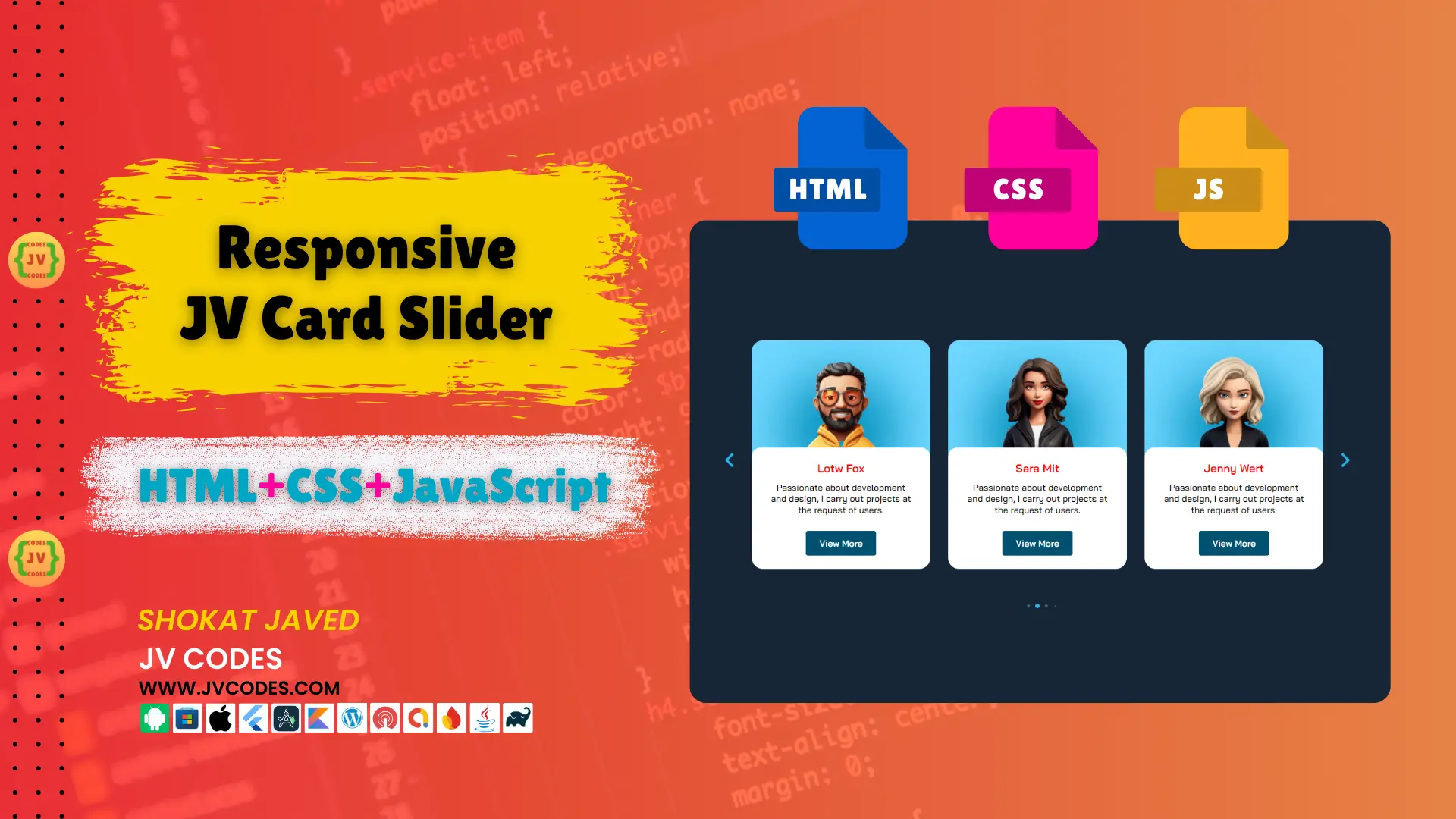
JV Responsive Card Slider in HTML, CSS and JavaScript
In this blog post, I am glad to share with you the free source code to create a JV Responsive Card Slider in HTML, CSS, JS. JV responsive card slider is useful to display multiple cards or images or products in a modern way on websites.
In this article, I am going to explain how developers and designers can implement a responsive card slider that functions flawlessly on all devices.
Features
The following are the different features of JV Responsive Card Slider;
- Fully Responsive Layout: To increase the responsiveness of the site, the slider adapts its size to the screen width and will look good in desktop, tablet and mobile views.
- Smooth Animations: In JV card slider, the smooth transitions and animations have been adopted and this makes the website very attractive to the users.
- Customizable: The style can be easily changed by changing the colors, fonts and others aspects while the content of the cards are also easily changed to match the website.
- CMS Friendly: This slider comes in handy with all today’s popular CMS like WordPress, Joomla or with any customized HTML site.
Technologies Used
To build the JV Responsive Card Slider, the following technologies were used:
- HTML
- CSS
- JavaScript (JS)
Video Preview
Here is a video preview of the JV Responsive Card Slider in operation: It shows how the slider is used, and how it is responsive to the size of the screen in use.
Steps to Build Card
JV Card Slider Responsive design is easy to build through the following steps below.
- For this project, name the project folder as slider-project.
- In the project folder, create an images folder that will be used to store the card images.
- Create an index.html file since the structure of the slider was developed in it.
- Create a style.css file of the slider and the cards that are displayed on the web page.
- Create a script.js, that js file is responsible for handling the slider and also the changes in transitions.
To implement code you may need VS Code Installation.
HTML
Here is the HTML code for your index.html file.
<!DOCTYPE html>
   <html lang="en">
   <head>
      <meta charset="UTF-8">
      <meta name="viewport" content="width=device-width, initial-scale=1.0">
      <link rel="stylesheet" href="https://cdnjs.cloudflare.com/ajax/libs/remixicon/3.5.0/remixicon.css" crossorigin="">
      <link rel="stylesheet" href="swiper-bundle.min.css">
      <link rel="stylesheet" href="styles.css">
      <title>Responsive Card Slider - JV Source Codes</title>
   </head>
   <body>
      <section class="container">
         <div class="card__container swiper">
            <div class="card__content">
               <div class="swiper-wrapper">
                  <article class="card__article swiper-slide">
                     <div class="card__image">
                        <img src="images/avatar-1.png" alt="image" class="card__img">
                        <div class="card__shadow"></div>
                     </div>

                     <div class="card__data">
                        <h3 class="card__name">Kell Dawx</h3>
                        <p class="card__description">
                           Passionate about development and design,
                           I carry out projects at the request of users.
                        </p>

                        <a href="#" class="card__button">View More</a>
                     </div>
                  </article>

                  <article class="card__article swiper-slide">
                     <div class="card__image">
                        <img src="images/avatar-2.png" alt="image" class="card__img">
                        <div class="card__shadow"></div>
                     </div>

                     <div class="card__data">
                        <h3 class="card__name">Lotw Fox</h3>
                        <p class="card__description">
                           Passionate about development and design,
                           I carry out projects at the request of users.
                        </p>

                        <a href="#" class="card__button">View More</a>
                     </div>
                  </article>

                  <article class="card__article swiper-slide">
                     <div class="card__image">
                        <img src="images/avatar-3.png" alt="image" class="card__img">
                        <div class="card__shadow"></div>
                     </div>

                     <div class="card__data">
                        <h3 class="card__name">Sara Mit</h3>
                        <p class="card__description">
                           Passionate about development and design,
                           I carry out projects at the request of users.
                        </p>

                        <a href="#" class="card__button">View More</a>
                     </div>
                  </article>

                  <article class="card__article swiper-slide">
                     <div class="card__image">
                        <img src="images/avatar-4.png" alt="image" class="card__img">
                        <div class="card__shadow"></div>
                     </div>

                     <div class="card__data">
                        <h3 class="card__name">Jenny Wert</h3>
                        <p class="card__description">
                           Passionate about development and design,
                           I carry out projects at the request of users.
                        </p>

                        <a href="#" class="card__button">View More</a>
                     </div>
                  </article>

                  <article class="card__article swiper-slide">
                     <div class="card__image">
                        <img src="images/avatar-5.png" alt="image" class="card__img">
                        <div class="card__shadow"></div>
                     </div>

                     <div class="card__data">
                        <h3 class="card__name">Lexa Kin</h3>
                        <p class="card__description">
                           Passionate about development and design,
                           I carry out projects at the request of users.
                        </p>

                        <a href="#" class="card__button">View More</a>
                     </div>
                  </article>
               </div>
            </div>

            <div class="swiper-button-next">
               <i class="ri-arrow-right-s-line"></i>
            </div>

            <div class="swiper-button-prev">
               <i class="ri-arrow-left-s-line"></i>
            </div>

            <div class="swiper-pagination"></div>
         </div>
      </section>

      <script src="swiper-bundle.min.js"></script>

      <script src="main.js"></script>
   </body>
</html>
CSS
Here is the complete code for style.css file to style the card.
@import url("https://fonts.googleapis.com/css2?family=Bai+Jamjuree:wght@400;500;600&display=swap");

:root {
  --first-color: hsl(197, 100%, 22%);
  --first-color-light: hsl(197, 100%, 72%);
  --first-color-alt: hsl(194, 99%, 37%);
  --second-color: hsl(195, 75%, 52%);
  --dark-color: hsl(212, 40%, 12%);
  --white-color: hsl(0, 0%, 0%);
  --body-color: hsl(212, 42%, 15%);
  --container-color: hsl(0, 0%, 100%);

  --body-font: "Bai Jamjuree", sans-serif;
  --h2-font-size: 1.25rem;
  --normal-font-size: 1rem;
}
* {
  box-sizing: border-box;
  padding: 0;
  margin: 0;
}
body {
  font-family: var(--body-font);
  font-size: var(--normal-font-size);
  background-color: var(--body-color);
  color: var(--white-color);
}
a {
  text-decoration: none;
}
img {
  display: block;
  max-width: 100%;
  height: auto;
}
.container {
  display: flex;
  justify-content: center;
  align-items: center;
  height: 100vh;
}
.card__container {
  padding-block: 5rem;
}
.card__content {
  margin-inline: 1.75rem;
  border-radius: 1.25rem;
  overflow: hidden;
}
.card__article {
  width: 300px;
  border-radius: 1.25rem;
  overflow: hidden;
}
.card__image {
  position: relative;
  background-color: var(--first-color-light);
  padding-top: 1.5rem;
  margin-bottom: -.75rem;
}
.card__data {
  background-color: var(--container-color);
  padding: 1.5rem 2rem;
  border-radius: 1rem;
  text-align: center;
  position: relative;
  z-index: 10;
}
.card__img {
  width: 180px;
  margin: 0 auto;
  position: relative;
  z-index: 5;
}
.card__shadow {
  width: 200px;
  height: 200px;
  background-color: var(--first-color-alt);
  border-radius: 50%;
  position: absolute;
  top: 3.75rem;
  left: 0;
  right: 0;
  margin-inline: auto;
  filter: blur(45px);
}
.card__name {
  font-size: var(--h2-font-size);
  color: red;
  margin-bottom: .75rem;
}
.card__description {
  font-weight: 500;
  margin-bottom: 1.75rem;
}
.card__button {
  display: inline-block;
  background-color: var(--first-color);
  padding: .75rem 1.5rem;
  border-radius: .25rem;
  color: white;
  font-weight: 600;
}
.swiper-button-prev:after,
.swiper-button-next:after {
  content: "";
}
.swiper-button-prev,
.swiper-button-next {
  width: initial;
  height: initial;
  font-size: 3rem;
  color: var(--second-color);
  display: none;
}
.swiper-button-prev {
  left: 0;
}

.swiper-button-next {
  right: 0;
}
.swiper-pagination-bullet {
  background-color: hsl(212, 32%, 40%);
  opacity: 1;
}
.swiper-pagination-bullet-active {
  background-color: var(--second-color);
}
@media screen and (max-width: 320px) {
  .card__data {
    padding: 1rem;
  }
}
@media screen and (min-width: 768px) {
  .card__content {
    margin-inline: 3rem;
  }
  .swiper-button-next,
  .swiper-button-prev {
    display: block;
  }
}
@media screen and (min-width: 1120px) {
  .card__container {
    max-width: 1120px;
  }
  .swiper-button-prev {
    left: -1rem;
  }
  .swiper-button-next {
    right: -1rem;
  }
}
JavaScript
Here is the complete code for script.js file to function the card.
/*=============== SWIPER JS ===============*/
let swiperCards = new Swiper(".card__content", {
  loop: true,
  spaceBetween: 32,
  grabCursor: true,

  pagination: {
    el: ".swiper-pagination",
    clickable: true,
    dynamicBullets: true,
  },

  navigation: {
    nextEl: ".swiper-button-next",
    prevEl: ".swiper-button-prev",
  },

  breakpoints:{
    600: {
      slidesPerView: 2,
    },
    968: {
      slidesPerView: 3,
    },
  },
});
Download Source Code
JV Responsive Card Slider in HTML, CSS, JS is developed and the source code is made freely available to users for implementation. It is not a problem of copyright, so feel free to change the code according to your requirements. These consist of 4 files; HTML, CSS JavaScript, and images within the package.
Conclusion
The JV Responsive Card Slider in HTML, CSS, JS is an efficient and simple solution to showcasing material in a dynamic method. You are welcome to use and modify it in your projects and do not forget to link back to JV Source Codes. Please write your suggestions in the comments section below if you have any!


