Responsive Masonry Image Gallery in HTML and CSS
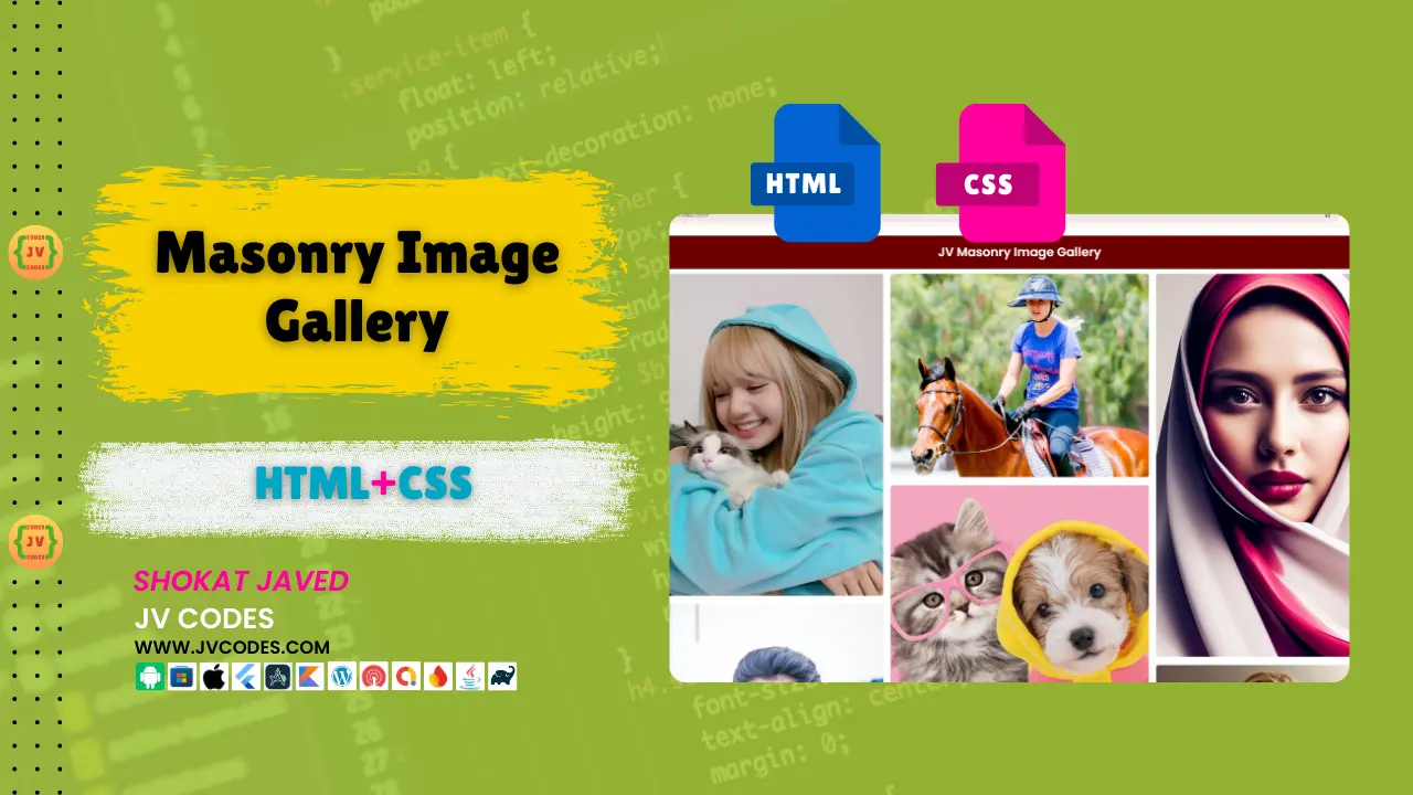
Would you like to present your pictures in an innovative and stylish approach? It would be easy to find a solution in the form of the A Responsive Masonry Image Gallery in HTML, CSS.
This article gives out free source codes to create a masonry image gallery. Whether you are creating an entirely new website, or implementing a new element into your existing site, this tutorial will provide guidance on how best to create an eye-catching and effective gallery.
GitHub Source: Responsive Masonry Image Gallery
I am presenting these codes because I would like web designers to develop beautiful galleries without a lot of effort.
Features
This masonry image gallery is designed for efficiency, flexibility, and compatibility. Here are some of the key features that make it stand out:
- Fully Responsive Design: The gallery adapts to screen size, which makes the images look good on a PC, tablet, and smartphone.
- Masonry Layout: The images are aligned in the pleasant masonry style, meaning that they are displayed in the columns that are placed vertically in the grid but are slightly shifted.
- Easy Customization: It is also very flexible to modify the gallery and add new pictures with different sizes or even to change the overall look of the gallery.
- Compatible with All Modern CMS: This masonry image gallery is fully compatible with any cutting edge CMS, for example, Word Press, Joomla and custom sites done in HTML.
Technologies Used
To achieve this masonry image gallery we have used the following simple web technologies:
- HTML
- CSS
Video Preview
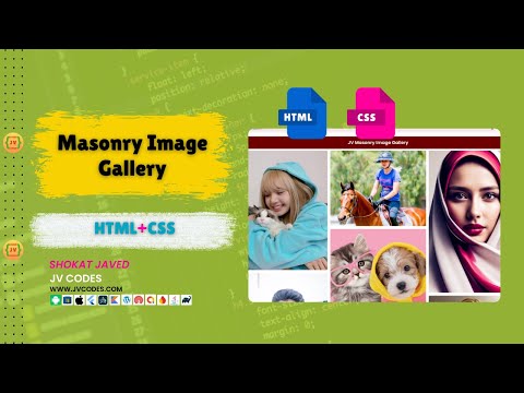
Here is a video demo of how this masonry image gallery looks and functions on a site:
Steps to Build Card
As you saw, developing your Responsive Masonry Image Gallery in HTML and CSS is easy and can take just a few steps.
- Create a Project Folder: Begin by creating a project folder in which you will keep all the project files such as the HTML, CSS or any image file.
- Create an Images Folder: Within your project folder, create a subfolder named images. Into this folder all the images that you are going to share within the gallery should be placed.
- Create index.html: Next, let’s generate an index.html file in your created project directory.
- Create style.css: Within the same directory, write a file named style.css. This is where you will write CSS to style your gallery, the masonry grid, and how it will adapt when screen size changes.
HTML
Here is the HTML code for your index.html file.
<!DOCTYPE html>
<html lang="en">
<head>
    <meta charset="UTF-8">
    <meta name="viewport" content="width=device-width, initial-scale=1.0">
    <title>JV Masonry Image Gallery</title>
    <link rel="stylesheet" href="style.css">
</head>
<body>
    <div class="container">

    <h1 class="title">JV Masonry Image Gallery</h1>

    <div class="image-container">
        <img src="images/image2.jpg" alt="">
        <img src="images/image1.jpg" alt="">
        <img src="images/image10.jpg" alt="">
        <img src="images/image4.jpg" alt="">
        <img src="images/image8.jpg" alt="">
        <img src="images/image6.jpg" alt="">
        <img src="images/image7.jpg" alt="">
        <img src="images/image11.jpg" alt="">
        <img src="images/image9.jpg" alt="">
        <img src="images/image3.jpg" alt="">
        <img src="images/image5.jpg" alt="">
    </div>

</div>
</body>
</html>
CSS
Here is the complete code for style.css file to style the gallery.
@import url('https://fonts.googleapis.com/css2?family=Poppins:wght@100;300;400;500;600&display=swap');

*{
  margin:0; padding:0;
  box-sizing: border-box;
  font-family: 'Poppins', sans-serif;
}

.container{
  max-width: 85%;
  margin:20px auto;
}

.container .title{
  font-size: 25px;
  background-color: #6e0000;
  color:#fff;
  border-radius: 5px;
  margin-bottom: 10px;
  text-align: center;
  padding:15px;
}

.container .image-container{
  columns:3 250px;
  gap:15px;

}

.container .image-container img{
  margin-bottom: 10px;
  border-radius: 5px;
  width: 100%;
}
Download Source Code
This Responsive Masonry Image Gallery in HTML, CSS is completely free and the source code can be downloaded. You are free to use it for personal or commercial purposes without facing copyright issues. The HTML files, CSS, and images are contained in the download package you get when you download the software.
Conclusion
For creative professionals who’re looking to demonstrate some of the personal projects or works online or introduce ones’ portfolios, this gallery can be handy to present photos in rather a simple and sleek manner. Also, it works seamlessly with all primary CMS platforms, which is quickly becoming a massive advantage.
Regarding the provided source code – you can use it on your own website without any restrictions. You just need to give the credit to JV Source Codes by linking back to this post. That helps to popularize and gives a bit of SEO for both sides!
If you faced any problems while executing the code or if you have found any better way to do it, it would be pretty great if you could drop a comment down below. I will reply every question asked and would appreciate it if you could give feedback.
Please do not forget to hit the SUBSCRIBE button on my channel for more great coding tutorials and freebie alert!

