Modern Skeuomorphic Checkboxes Using HTML and CSS (Free Source Code)
Modern Skeuomorphic Checkboxes using HTML and CSS deliver an attractive user interface for form elements on your website.
This code documentation follows best programming standards and it serves as a free resource which facilitates beginner developers to implement stylish checkboxes into their projects.
This design works best for Open-Source UI and web components for creating a smooth user interface experience.
GitHub Source: Modern Skeuomorphic Checkboxes
Features of Modern Skeuomorphic Checkboxes
- Customizable Colors: Easily change the colors to match your website’s theme and style.
- Smooth Animation: The checkboxes have a soft transition effect, making the UI feel more interactive.
- Attractive 3D Look: The skeuomorphic design creates a realistic depth effect for a modern touch.
- Fully Responsive: The checkboxes adapt well to different screen sizes for mobile and desktop users.
Technologies Used
- HTML (Hypertext Markup Language)
- CSS (Cascading Style Sheets)
Recommended for You
- Responsive Diamond Checkbox Design
- iOS Checkbox Design for Websites
- Neumorphic Round Checkbox
- Animated Heart Checkbox
- Stylish Lock Icon Checkbox
Procedure to Build Website Checkbox
The implementation of this code remains straightforward. Add these checkable items to your webpage simply by pasting the included HTML structure code.
Apply the CSS styles to your stylesheet to obtain the modern appearance. The checkboxes maintain excellent performance efficiency because they remain lightweight. Novice programmers together with student developers will find this code simple to understand along with adapt for their coding work.
HTML
Here is the HTML code for your index.html file:
<!DOCTYPE html>
<!-- Developed by Shokat Javed available at www.jvcodes.com -->
<html lang="en">
<head>
<meta charset="UTF-8">
<meta name="viewport" content="width=device-width, initial-scale=1.0">
<title>Modern Skeuomorphic Checkboxes - JV Codes</title>
<link rel="stylesheet" href="style.css">
</head>
<body>
<div class="container">
<label for="checkbox-1">
<input type="checkbox" id="checkbox-1" name="checkbox-1"/>
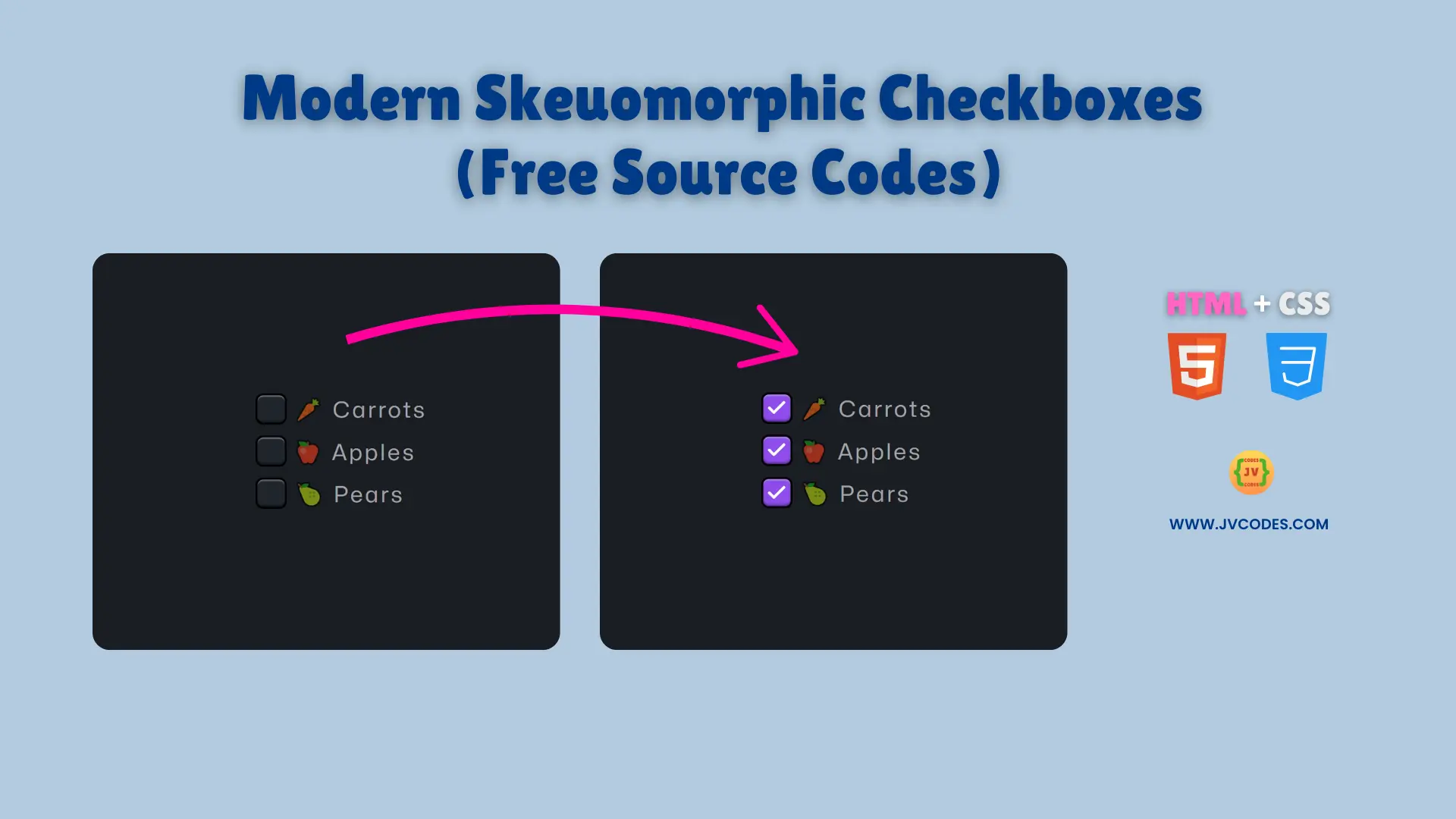
🥕 Carrots
</label>
<label for="checkbox-2">
<input type="checkbox" id="checkbox-2" name="checkbox-2"/>
🍎 Apples
</label>
<label for="checkbox-3">
<input type="checkbox" id="checkbox-3" name="checkbox-3"/>
🍐 Pears
</label>
</div>
</body>
</html>
CSS
Here is the complete code for style.css file to style the checkbox:
  @font-face {
    font-family: "Mona Sans";
    src: url("https://assets.codepen.io/64/Mona-Sans.woff2")
        format("woff2 supports variations"),
      url("https://assets.codepen.io/64/Mona-Sans.woff2")
        format("woff2-variations");
    font-weight: 100 1000;
  }

  @layer properties {
    @property --checkbox-color-hue {
      syntax:'<number>';
      inherits: true;
      initial-value: 0;
    }
    @property --checkbox-color-saturation {
      syntax:'<number>';
      inherits: true;
      initial-value: 0;
    }
    @property --checkbox-color-lightness {
      syntax:'<number>';
      inherits: true;
      initial-value: 0;
    }
    @property --checkbox-color-light-lightness {
       syntax:'<number>';
      inherits: true;
      initial-value: 0;
    }
    @property --icon-opacity {
       syntax:'<number>';
      inherits: true;
      initial-value: 0;
    }
    @property --icon-invert {
       syntax:'<number>';
      inherits: true;
      initial-value: 0;
    }
    @property --icon-size {
       syntax:'<number>';
      inherits: true;
      initial-value: 0;
    }
    @property --negative-shadow-offset {
       syntax:'<number>';
      inherits: true;
      initial-value: 0;
    }
    @property --text-opacity {
       syntax:'<number>';
      inherits: true;
      initial-value: 0;
    }
  }

  :root {
    /* -- Colors: */
    --body-bg-color: hsl(221deg 16% 12%);
    --checkbox-color-hue: 216;
    --checkbox-color-saturation: 17;
    --checkbox-color-lightness: 15;
    --checkbox-color: hsl(
        calc(var(--checkbox-color-hue) * 1deg) /**/
        calc(var(--checkbox-color-saturation) * 1%) /**/
        calc(var(--checkbox-color-lightness) * 1%) /**/
    );
    --checkbox-color-light: rgba(255 255 255 / 32%);
    --checkbox-color-dark: rgba(0 0 0 / 45%);

    /* -- Box */
    --checkbox-border-radius: 24%;
    --checkbox-width: 36;
    --checkbox-height: 36;

    --text-opacity: 0.6;

    --negative-shadow-offset: 500;
    --active-shadow-opacity: 0;

    /* -- icon */
    --icon-check: url("data:image/svg+xml,%3Csvg xmlns='http://www.w3.org/2000/svg' width='24' height='24' fill='none' stroke='white' stroke-linecap='round' stroke-linejoin='round' stroke-width='3' class='feather feather-check'%3E%3Cpath d='M20 6 9 17l-5-5'/%3E%3C/svg%3E");
    --icon-opacity: 0;
    --icon-size: 1;

    /* -- easing */
    --cubic-bezier: cubic-bezier(0.6, -1.2, 0.2, 2.2);

    /* -- misc */
    --debug: 0;
  }

  *,
  *:before,
  *:after {
    box-sizing: border-box;
    /* debug */
    outline: calc(var(--debug) * 1px) dashed red;
  }


  html,
  body {
    width: 100%;
    height: 100%;
    padding: 0;
    margin: 0;
  }

  body {
    background: var(--body-bg-color);
    display: grid;
    place-items: center;
    font-family: "Mona Sans", sans-serif;
  }

  .container {
    display: flex;
    flex-direction: column;
    justify-content: space-between;
    align-items: start;
    grid-gap: .8em;
    transform: scale(1)
  }

  label[for*="checkbox"] {
    cursor: pointer;
    position: relative;
    display: flex;
    align-items: center;
    justify-content: center;
    grid-gap: 8px;

    /* text settings */
    color: rgba(255 255 255 / var(--text-opacity));
    font-size: 1.6em;
    letter-spacing: .1em;
    font-weight: 400;

    transition: --text-opacity .2s ease;

    &:hover {
      --text-opacity: 1;
       &:after {
        --icon-opacity: .50;
        --icon-invert: 100;
        --icon-size: 0.8;
       }

       input[type="checkbox"] {
         --checkbox-color-hue: 216;
         --checkbox-color-saturation: 14;
        --checkbox-color-lightness: 18;
        --checkbox-color: hsl(
          calc(var(--checkbox-color-hue) * 1deg)
          calc(var(--checkbox-color-saturation) * 1%)
          calc(var(--checkbox-color-lightness) * 1%)
        );
      }
    }


    /* label:after */
    &:after {
      content: "";
      display: block;
      position: absolute;
      width: calc(var(--checkbox-width) * 1px);
      height: calc(var(--checkbox-height) * 1px);
      top: 0;
      left: 0;
      background-repeat: no-repeat;
      background-position: center center;
      background-size: 70%;
      border-radius: var(--checkbox-border-radius);
      pointer-events: none;
      background-image: var(--icon-check);
      filter: invert(100%);
      opacity: var(--icon-opacity);
      transform: scale(var(--icon-size));

      /* here I couldn't animate --icon-invert */
      transition: opacity .3s ease, filter .3s ease, transform .3s var(--cubic-bezier);

    }

    &:has(input[type="checkbox"]:checked) {
      &:after {
        --icon-opacity: 1;

        filter: invert(0%);

      }
    }

    /* label input[type="checkbox"] */
    & input[type="checkbox"] {
      appearance: none;
      cursor: pointer;
      margin: 0;
      background: var(--checkbox-color);
      width: calc(var(--checkbox-width) * 1px);
      height: calc(var(--checkbox-height) * 1px);
      border: calc(calc(var(--checkbox-width) / 15) * 1px) solid black;
      border-radius: var(--checkbox-border-radius);
      box-shadow:inset 0 0 calc(calc(var(--checkbox-width) / 10) * 1px) rgba(0 0 0 / calc(var(--active-shadow-opacity))),
          inset 0
          calc(calc(var(--checkbox-width) / 20) * 1px)
          calc(calc(var(--checkbox-width) / 30) * 1px)
          calc(calc(var(--checkbox-width) / var(--negative-shadow-offset)) * -1px)

        var(--checkbox-color-light),
        inset 0 calc(calc(var(--checkbox-width) / 20) * -1px)
          calc(calc(var(--checkbox-width) / 15) * 1px) calc(calc(var(--checkbox-width) / var(--negative-shadow-offset)) * -1px) var(--checkbox-color-dark);
      transition: --checkbox-color-hue .1s ease,
                  --checkbox-color-saturation .1s ease,
                  --checkbox-color-lightness .1s ease,
                  --checkbox-color 0s ease,
                  --negative-shadow-offset .2s ease;


      &:active,
      &:checked {
        --checkbox-color-hue: 264;
        --checkbox-color-saturation: 56;
        --checkbox-color-lightness: 49;
        --checkbox-color: hsl(
          calc(var(--checkbox-color-hue) * 1deg) /**/
          calc(var(--checkbox-color-saturation) * 1%) /**/
          calc(var(--checkbox-color-lightness) * 1%) /**/
        );
      }

      &:checked {
          --checkbox-color-hue: 265;
          --checkbox-color-saturation: 80;
          --checkbox-color-lightness: 61;
          --checkbox-color: hsl(
            calc(var(--checkbox-color-hue) * 1deg)
            calc(var(--checkbox-color-saturation) * 1%)
            calc(var(--checkbox-color-lightness) * 1%)
          );
       }
    }


    &:active {
      --active-shadow-opacity: 0.8;
      &:after {
        --icon-size: 0.7;
      }

      & input[type="checkbox"] {
        --negative-shadow-offset: 0;
      }
    }
  }
Download Source Code
You can access this Modern Skeuomorphic Checkboxes through the provided download button with no copyright limitations. This code is ready for your project development with full customization capabilities.
Conclusion
Use this code in your websites to improve UI elements and make your forms more engaging. It’s a great way to enhance your coding portfolio.
Say thanks to JV Source Codes for providing this resource! If you use it, consider linking back to support their work.
Our YouTube channel offers multiple UI elements including forms, cards, menus, footers, galleries and hero sections. Subscribe now to access them.