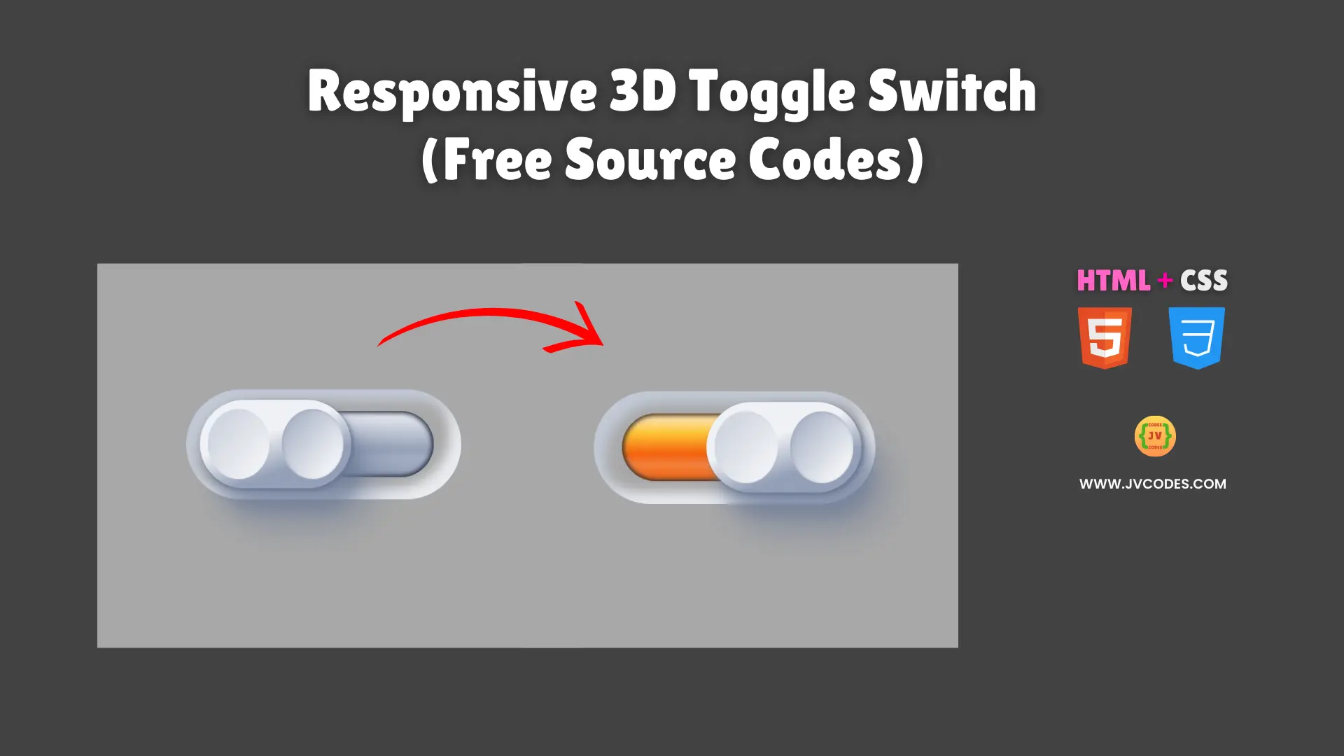
Responsive 3D Toggle Switch Using HTML and CSS (Free Source Code)
Responsive 3D Toggle Switch Using HTML and CSS is a visually appealing component that adds depth and interactivity to your web projects.
The toggle switch is a smooth sliding motion with real shadows making it unique compared to the ordinary toggle switches. What I’m going to give you is free source code which has been written in good programming style so you can fit it on your website without any problems.
Not only does it look great, this unique toggle switch also works perfectly on all the devices, delivering an excellent user experience. You can customize the Responsive 3D Toggle Switch Using HTML and CSS according to the color, size and general look and feel in accordance with your own design requirements.
GitHub Source: Responsive 3D Toggle Switch
Features
- Realistic Shadows: Enjoy a convincing 3D look, thanks to carefully placed shadows and highlights.
- Smooth Animation: The switch slides gracefully between on and off states, creating a pleasing visual effect.
- Fully Responsive: It adapts to any screen size, ensuring it looks great on both desktop and mobile devices.
- Customizable Appearance: You can modify the hue, width, and other CSS variables to match your website’s theme.
Technologies Used
- HTML (Hypertext Markup Language)
- CSS (Cascading Style Sheets)
Recommended for You
- Simple Green Slider Toggle Switch
- Animated Robot Toggle Switch
- Retro-Style Power Toggle Switch
- Modern Toggle Switch with Sun & Moon Animation
- Hero Section with Snowfall Effect
Video Tutorial

Steps to Build Toggle Switch
Constructing this toggle is straightforward. You just copy and paste the HTML code inside of your webpage and then the CSS code on your StyleSheet. To get the color scheme you want, change the values of the variables in such ways as –hue or –accent-hue. The approach is friendly and it makes the process easy as you can just weight in the switch in without learning complicated frameworks.
HTML
Here is the HTML code for your index.html file:
<!DOCTYPE html>
<!-- Developed by Shokat Javed available at www.jvcodes.com -->
<html lang="en">
<head>
    <meta charset="UTF-8">
    <meta name="viewport" content="width=device-width, initial-scale=1.0">
    <title>Responsive 3D Toggle Switch - JV Codes</title>
    <link rel="stylesheet" href="style.css">
</head>
<body>
  <div class="container">
    <label class="switch">
      <input class="togglesw" type="checkbox" checked="">
      <div class="indicator left"></div>
      <div class="indicator right"></div>
      <div class="button"></div>
    </label>
    </div>
</body>
</html>
CSS
Here is the complete code for style.css file to style the Toggle Switch:
body {
    margin: 0;
    display: flex;
    justify-content: center;
    align-items: center;
    min-height: 100vh;
    background-color: #a8a8a8;
  }

  .container {
    display: flex;
    align-items: center;
    justify-content: center;
    --hue: 220deg;
    --width: 15rem;
    --accent-hue: 22deg;
    --duration: 0.6s;
    --easing: cubic-bezier(1, 0, 1, 1);
  }

  .togglesw {
    display: none;
  }

  .switch {
    --shadow-offset: calc(var(--width) / 20);
    position: relative;
    cursor: pointer;
    display: flex;
    align-items: center;
    width: var(--width);
    height: calc(var(--width) / 2.5);
    border-radius: var(--width);
    box-shadow: inset 10px 10px 10px hsl(var(--hue) 20% 80%),
      inset -10px -10px 10px hsl(var(--hue) 20% 93%);
  }

  .indicator {
    content: '';
    position: absolute;
    width: 40%;
    height: 60%;
    transition: all var(--duration) var(--easing);
    box-shadow: inset 0 0 2px hsl(var(--hue) 20% 15% / 60%),
      inset 0 0 3px 2px hsl(var(--hue) 20% 15% / 60%),
      inset 0 0 5px 2px hsl(var(--hue) 20% 45% / 60%);
  }

  .indicator.left {
    --hue: var(--accent-hue);
    overflow: hidden;
    left: 10%;
    border-radius: 100px 0 0 100px;
    background: linear-gradient(180deg, hsl(calc(var(--accent-hue) + 20deg) 95% 80%) 10%, hsl(calc(var(--accent-hue) + 20deg) 100% 60%) 30%, hsl(var(--accent-hue) 90% 50%) 60%, hsl(var(--accent-hue) 90% 60%) 75%, hsl(var(--accent-hue) 90% 50%));
  }

  .indicator.left::after {
    content: '';
    position: absolute;
    opacity: 0.6;
    width: 100%;
    height: 100%;
  }

  .indicator.right {
    right: 10%;
    border-radius: 0 100px 100px 0;
    background-image: linear-gradient(180deg, hsl(var(--hue) 20% 95%), hsl(var(--hue) 20% 65%) 60%, hsl(var(--hue) 20% 70%) 70%, hsl(var(--hue) 20% 65%));
  }

  .button {
    position: absolute;
    z-index: 1;
    width: 55%;
    height: 80%;
    left: 5%;
    border-radius: 100px;
    background-image: linear-gradient(160deg, hsl(var(--hue) 20% 95%) 40%, hsl(var(--hue) 20% 65%) 70%);
    transition: all var(--duration) var(--easing);
    box-shadow: 2px 2px 3px hsl(var(--hue) 18% 50% / 80%),
      2px 2px 6px hsl(var(--hue) 18% 50% / 40%),
      10px 20px 10px hsl(var(--hue) 18% 50% / 40%),
      20px 30px 30px hsl(var(--hue) 18% 50% / 60%);
  }

  .button::before,
  .button::after {
    content: '';
    position: absolute;
    top: 10%;
    width: 41%;
    height: 80%;
    border-radius: 100%;
  }

  .button::before {
    left: 5%;
    box-shadow: inset 1px 1px 2px hsl(var(--hue) 20% 85%);
    background-image: linear-gradient(-50deg, hsl(var(--hue) 20% 95%) 20%, hsl(var(--hue) 20% 85%) 80%);
  }

  .button::after {
    right: 5%;
    box-shadow: inset 1px 1px 3px hsl(var(--hue) 20% 70%);
    background-image: linear-gradient(-50deg, hsl(var(--hue) 20% 95%) 20%, hsl(var(--hue) 20% 75%) 80%);
  }

  .togglesw:checked ~ .button {
    left: 40%;
  }

  .togglesw:not(:checked) ~ .indicator.left,
  .togglesw:checked ~ .indicator.right {
    box-shadow: inset 0 0 5px hsl(var(--hue) 20% 15% / 100%),
      inset 20px 20px 10px hsl(var(--hue) 20% 15% / 100%),
      inset 20px 20px 15px hsl(var(--hue) 20% 45% / 100%);
  }
Download Source Code
The source code of which you can download without copyright from the button below. You are free to use, modify or share it under MIT License for personal or professional projects.
Conclusion
Use this code in your websites to bring an eye-catching element that can uplift your portfolio and impress clients.
Remember to credit JV Source Codes by linking back, and be sure to subscribe to the channel for more free resources. If you have any issues or questions, please leave a comment, and I will happily reply.