Responsive Simple Website Footer Section Using HTML and CSS (Free Source Code)
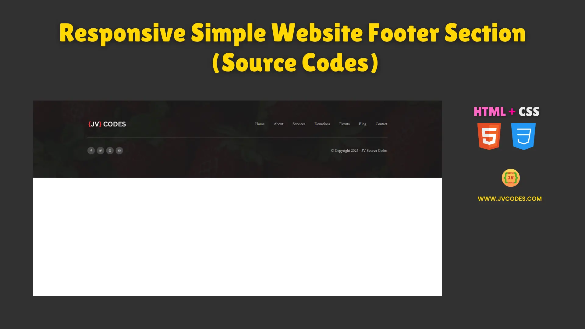
A simple webpage with a website footer section is crucial to designing an appropriate responsive website. Here it is showing the important links, copyright details and social networking site icons in traditional and neat look.
Let me give you the free source code for this footer section below as it has well-programmed and highly responsible to any device.
GitHub Source: Website Footer Section
What is a footer on a website?
A footer on a website is a section usually placed at the footer part of a given webpage. Often it includes company name or website, logos, contact information, site map, social media buttons, and legal notices. Footers facilitate easy website navigation by directing visitors to important areas of the site such as the Privacy Policy, the Terms of Service, About Us, and Contact Us among others.
A good footer also contributes of course to the functionality, and it adds more credibility to the website. It makes a provision for the availability of important information not to interfere with the content information. Most modern footers also contain links to subscribe to our email list, company logos or a call to action button to add an additional level of interaction.
Furthermore, footers have a feature of improving site’s rank in a search engine through SEO (Search Engine Optimization). They give internal links that enhance the site’s flow and indexing. A responsive footer allows the website to be as efficient on smaller as on larger displays, which is why such an element must be present in virtually any professionally-designed site.
Features
- Fully Responsive: The footer has responsive design with pixel perfect pictures and looks the same on any devises.
- Modern Design: A clean coordinated look suitable for business type sites that help improve on your home page appearance.
- Easy to Customize: You can change colors and fonts to the preferable ones, arrange the potential elements in relation to the brand style.
- Social Media Integration: Contains Social Media icons with hover effects to help with traffic engagement.
Technologies Used
- HTML (Hypertext Markup Language)
- CSS (Cascading Style Sheets)
Recommended for You
- Responsive Portfolio Website Design for Web Developer
- Responsive Portfolio Design for Content Writer
- Neomorphic Portfolio Design for Android App Developers
Video Tutorial
Steps to Build Website Footer Section
Next, simply copy and paste this HTML and CSS code into HTML and CSS templates of your project. It is easy to structure and can be changed depending on any developments that may be of importance in the future. You can also easily change the styles to your website theme if you wish that too.
HTML
Here is the HTML code for your index.html file:
<!DOCTYPE html>
<!-- Designed by JV Codes at www.jvcodes.com -->
<html lang="en">
<head>
    <meta charset="UTF-8">
    <meta name="viewport" content="width=device-width, initial-scale=1.0">
    <title>Simple Website Footer Section</title>
    <link rel="stylesheet" href="style.css">
</head>
<body>
    <footer id="footer-section">
        <div class="cs-container">
            <div class="cs-top">
                <a aria-label="go back to home" class="cs-logo" href="">
                    <img class="cs-logo-img" loading="lazy" decoding="async" src="https://jvcodes.com/wp-content/uploads/2024/08/logo.gif" alt="logo" width="168" height="48">
                </a>
                <ul class="cs-ul">
                    <li class="cs-li">
                        <a href="" class="cs-link">Home</a>
                    </li>
                    <li class="cs-li">
                        <a href="" class="cs-link">About</a>
                    </li>
                    <li class="cs-li">
                        <a href="" class="cs-link">Services</a>
                    </li>
                    <li class="cs-li">
                        <a href="" class="cs-link">Donations</a>
                    </li>
                    <li class="cs-li">
                        <a href="" class="cs-link">Events</a>
                    </li>
                    <li class="cs-li">
                        <a href="" class="cs-link">Blog</a>
                    </li>
                    <li class="cs-li">
                        <a href="" class="cs-link">Contact</a>
                    </li>
                </ul>
            </div>
            <div class="cs-bottom">
                <!--Social-->
                <ul class="cs-social">
                    <li class="cs-social-li">
                        <a href="" class="cs-social-link" aria-label="facebook" target="_blank" rel="noopener">
                            <img class="cs-social-icon cs-default" src="https://csimg.nyc3.cdn.digitaloceanspaces.com/Icons/facebook-white.svg" alt="icon" loading="lazy" decoding="async" width="12" height="12" aria-hidden="true">
                        </a>
                    </li>
                    <li class="cs-social-li">
                        <a href="" class="cs-social-link" aria-label="twitter" target="_blank" rel="noopener">
                            <img class="cs-social-icon cs-default" src="https://csimg.nyc3.cdn.digitaloceanspaces.com/Icons/twitter-white.svg" alt="icon" loading="lazy" decoding="async" width="12" height="12" aria-hidden="true">
                        </a>
                    </li>
                    <li class="cs-social-li">
                        <a href="" class="cs-social-link" aria-label="instagram" target="_blank" rel="noopener">
                            <img class="cs-social-icon cs-default" src="https://csimg.nyc3.cdn.digitaloceanspaces.com/Icons/instagram-transparent.svg" alt="icon" loading="lazy" decoding="async" width="12" height="12" aria-hidden="true">
                        </a>
                    </li>
                    <li class="cs-social-li">
                        <a href="" class="cs-social-link" aria-label="twitter" target="_blank" rel="noopener">
                            <img class="cs-social-icon cs-default" src="https://csimg.nyc3.cdn.digitaloceanspaces.com/Icons/youtube-transparent2.svg" alt="icon" loading="lazy" decoding="async" width="12" height="12" aria-hidden="true">
                        </a>
                    </li>
                </ul>
                <span class="cs-copyright">
                    © Copyright 2025 - <a href="https://jvcodes.com/" class="cs-copyright-link">JV Source Codes</a>
                </span>
            </div>
        </div>
        <!--Background-->
        <picture class="cs-background">
            <!--Mobile Image-->
            <source media="(max-width: 600px)" srcset="https://jvcodes.com/wp-content/uploads/2024/09/image-3.webp">
            <!--Tablet and above Image-->
            <source media="(min-width: 601px)" srcset="https://jvcodes.com/wp-content/uploads/2024/09/image-3.webp">
            <img loading="lazy" decoding="async" src="https://jvcodes.com/wp-content/uploads/2024/09/image-3.webp" alt="kids" width="1280" height="568">
        </picture>
    </footer>
</body>
</html>
CSS
Here is the complete code for style.css file to style the footer section:
:root {
  --primary: #ff6a3e;
  --primaryLight: #028eeb;
  --secondary: #028eeb;
  --secondaryLight: #028eeb;
  --headerColor: #1a1a1a;
  --bodyTextColor: #4e4b66;
  --bodyTextColorWhite: #fafbfc;
  --topperFontSize: clamp(0.8125rem, 1.6vw, 1rem);
  --headerFontSize: clamp(1.9375rem, 3.9vw, 3.0625rem);
  --bodyFontSize: 1rem;
  --sectionPadding: clamp(3.75rem, 7.82vw, 6.25rem) 1rem;
}

body {
    margin: 0;
    padding: 0;
  }

*, *:before, *:after {
  box-sizing: border-box;
}

.cs-topper {
    font-size: var(--topperFontSize);
    line-height: 1.2em;
    text-transform: uppercase;
    text-align: inherit;
    letter-spacing: .1em;
    font-weight: 700;
    color: var(--primary);
    margin-bottom: 0.25rem;
    display: block;
  }

.cs-title {
  font-size: var(--headerFontSize);
  font-weight: 900;
  line-height: 1.2em;
  text-align: inherit;
  max-width: 43.75rem;
  margin: 0 0 1rem 0;
  color: var(--headerColor);
  position: relative;
}

.cs-text {
    font-size: var(--bodyFontSize);
    line-height: 1.5em;
    text-align: inherit;
    width: 100%;
    max-width: 40.625rem;
    margin: 0;
    color: var(--bodyTextColor);
  }

/* Mobile - 360px */
@media only screen and (min-width: 0rem) {
  #footer-section {
      padding: var(--sectionPadding);
      position: relative;
      z-index: 1;
  }

  #footer-section .cs-container {
    width: 100%;
    max-width: 80rem;
    margin: auto;
    display: flex;
    flex-direction: column;
    align-items: center;
}
#footer-section .cs-top {
    width: 100%;
    /* 32px - 40px */
    margin-bottom: clamp(2rem, 4vw, 2.5rem);
    padding-bottom: clamp(2rem, 4vw, 2.5rem);
    border-bottom: 1px solid #484848;
    display: flex;
    flex-direction: column;
    align-items: center;
    justify-content: center;
    gap: 2rem;
}
#footer-section .cs-ul {
    margin: 0;
    padding: 0;
    display: flex;
    flex-wrap: wrap;
    align-items: center;
    justify-content: center;
    row-gap: 0.5rem;
    /* 28px - 40px */
    column-gap: clamp(1.75rem, 4vw, 2.5rem);
}
#footer-section .cs-li {
    list-style: none;
}
#footer-section .cs-link {
    /* 14px - 16px */
    font-size: clamp(0.875rem, 1.5vw, 1rem);
    line-height: 1.5em;
    text-decoration: none;
    margin: 0;
    color: #bababa;
    display: block;
    transition: color 0.3s;
}
#footer-section .cs-link:hover {
    color: var(--secondary);
}
#footer-section .cs-logo {
    width: 10.5rem;
    height: auto;
    display: block;
}
#footer-section .cs-logo-img {
    width: 100%;
    height: auto;
    display: block;
}
#footer-section .cs-bottom {
    width: 100%;
    display: flex;
    flex-direction: column;
    align-items: center;
    gap: 1.5rem;
}
#footer-section .cs-social {
    margin: 0;
    padding: 0;
    display: flex;
    justify-content: center;
    align-items: center;
    gap: 0.5rem;
}
#footer-section .cs-social-li {
    list-style: none;
}
#footer-section .cs-social-link {
    width: 2rem;
    height: 2rem;
    background-color: #484848;
    border-radius: 50%;
    display: flex;
    justify-content: center;
    align-items: center;
    transition: background-color 0.3s;
}
#footer-section .cs-social-link:hover {
    background-color: var(--secondary);
}
#footer-section .cs-social-link:hover .cs-social-icon {
    filter: grayscale(1) brightness(0);
    opacity: 1;
}
#footer-section .cs-social-icon {
    width: 0.75rem;
    height: auto;
    display: block;
    opacity: 0.5;
}
#footer-section .cs-copyright {
    font-size: 1rem;
    line-height: 1.5em;
    margin: 0;
    color: #bababa;
    display: block;
}
#footer-section .cs-copyright-link {
    font-size: inherit;
    text-decoration: none;
    color: inherit;
    transition: color 0.3s;
}
#footer-section .cs-copyright-link:hover {
    color: var(--secondary);
}
#footer-section .cs-background {
    width: 100%;
    height: 100%;
    display: block;
    position: absolute;
    top: 0;
    left: 0;
    z-index: -1;
}

  #footer-section .cs-background:before {
      /* background color overlay */
      content: "";
      position: absolute;
      display: block;
      height: 100%;
      width: 100%;
      background: #1a1a1a;
      opacity: 0.96;
      top: 0;
      left: 0;
      z-index: 1;
  }

  #footer-section .cs-background img {
    position: absolute;
    top: 0;
    left: 0;
    height: 100%;
    width: 100%;
    /* Makes img tag act as a background image */
    object-fit: cover;
}
}
/* Tablet - 768px */
@media only screen and (min-width: 48rem) {
  #footer-section .cs-top {
      flex-direction: row;
      justify-content: space-between;
  }
  #footer-section .cs-bottom {
      flex-direction: row;
      justify-content: space-between;
  }
}
Download Source Code
The Responsive Simple Website Footer Section Using HTML and CSS can be downloaded from the button below. There is no worry about copyright when using this particular source code.
Conclusion
You can apply this responsive website footer section to your various websites in order to give them a professional touch.
If this helped you in any way, consider supporting JV Source Codes through backlinks. Finally, click here to subscribe to our channel for more free resources. If you any questions, feel free to leave your comment below and I’ll be glad to assist you in a positive way.

