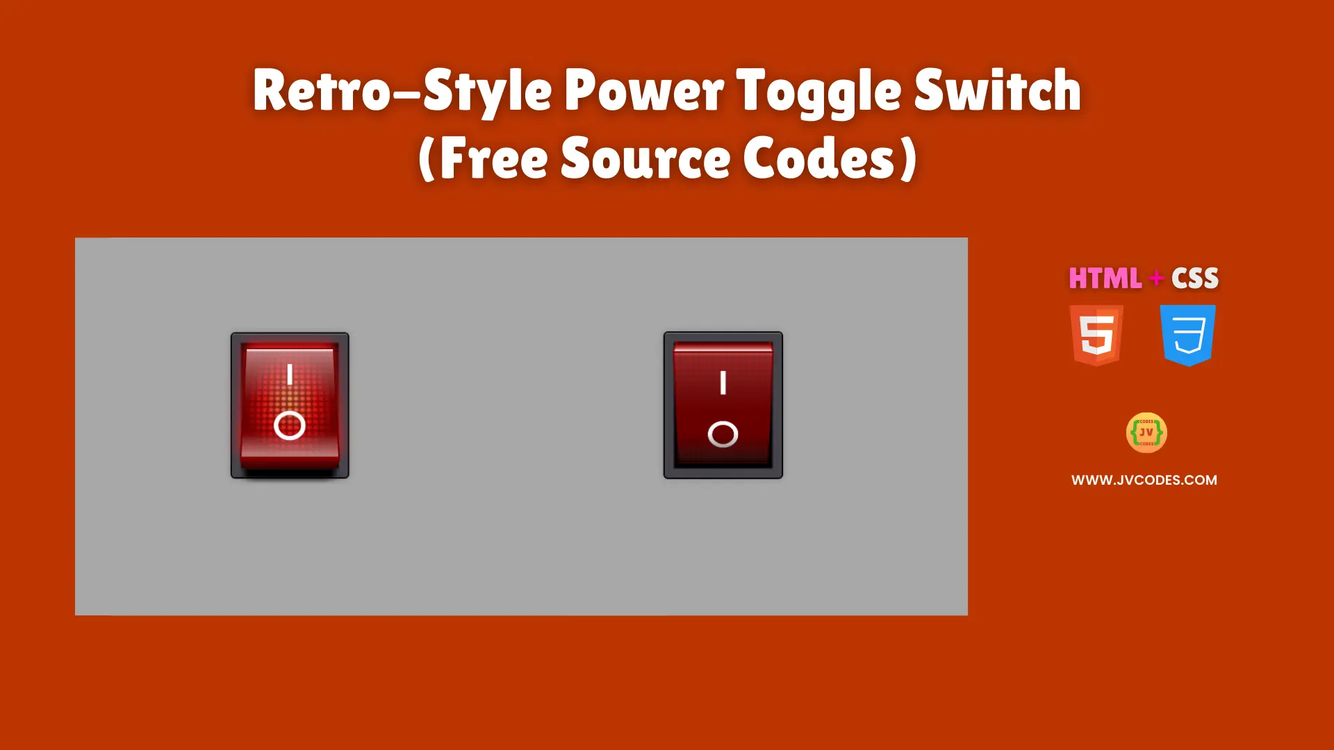
Retro-Style Power Toggle Switch Using HTML and CSS (Free Source Code)
Retro-Style Power Toggle Switch developed with HTML and CSS delivers an old-school feel to modern websites.
The design presents an appearance of vintage power buttons which evoke memories of traditional devices. The source code which follows best programming standards has been developed by me and I will give it to you at no cost so you can tailor it or implement it across your platform.
GitHub Source: Retro-Style Power Toggle Switch
Features
- Classic Look: The switch has a bright red appearance and a metallic finish that feels retro.
- Simple Animation: The toggle changes states smoothly, providing a clear on/off transition.
- Optimized Performance: The code is lightweight, leading to faster loading times and a better user experience.
- Easy Integration: It adapts to different layouts and screen sizes without extra frameworks.
Technologies Used
- HTML (Hypertext Markup Language)
- CSS (Cascading Style Sheets)
Recommended for You
- Modern Toggle Switch with Sun & Moon Animation
- Hero Section with Snowfall Effect
- QR Code Scanner or Reader
- QR Code Generator
- Animated Responsive Pricing Table
Video Tutorial

Steps to Build Toggle Switch
A user can build the Retro-Style Power Toggle Switch by Using HTML and CSS through simple steps that need only two files. You should place your HTML code within your webpage while linking the CSS file from the head section. The adjustment of size, color and background elements according to your website design will finalize the process.
HTML
Here is the HTML code for your index.html file:
<!DOCTYPE html>
<!-- Developed by Shokat Javed available at www.jvcodes.com -->
<html lang="en">
<head>
    <meta charset="UTF-8">
    <meta name="viewport" content="width=device-width, initial-scale=1.0">
    <title>Retro-Style Power Toggle Switch - JV Codes</title>
    <link rel="stylesheet" href="style.css">
</head>
<body>
  <label class="switch">
    <input type="checkbox" checked="checked">
    <div class="button">
      <div class="light"></div>
      <div class="dots"></div>
      <div class="characters"></div>
      <div class="shine"></div>
      <div class="shadow"></div>
    </div>
  </label>
</body>
</html>
CSS
Here is the complete code for style.css file to style the Toggle Switch:
body {
    margin: 0;
    display: flex;
    justify-content: center;
    align-items: center;
    min-height: 100vh;
    background-color: #a8a8a8;
  }

  .switch {
    display: block;
    background-color: rgb(0, 0, 0);
    width: 150px;
    height: 195px;
    box-shadow: 0 0 10px 2px rgba(0, 0, 0, 0.2), 0 0 1px 2px black, inset 0 2px 2px -2px white, inset 0 0 2px 15px #47434c, inset 0 0 2px 22px black;
    border-radius: 5px;
    padding: 20px;
    perspective: 700px;
  }

  .switch input {
    display: none;
  }

  .switch input:checked + .button {
    transform: translateZ(20px) rotateX(25deg);
    box-shadow: 0 -10px 20px #ff1818;
  }

  .switch input:checked + .button .light {
    animation: flicker 0.2s infinite 0.3s;
  }

  .switch input:checked + .button .shine {
    opacity: 1;
  }

  .switch input:checked + .button .shadow {
    opacity: 0;
  }

  .switch .button {
    display: block;
    transition: all 0.3s cubic-bezier(1, 0, 1, 1);
    transform-origin: center center -20px;
    transform: translateZ(20px) rotateX(-25deg);
    transform-style: preserve-3d;
    background-color: #9b0621;
    height: 100%;
    position: relative;
    cursor: pointer;
    background: linear-gradient(#980000 0%, #6f0000 30%, #6f0000 70%, #980000 100%);
    background-repeat: no-repeat;
  }

  .switch .button::before {
    content: "";
    background: linear-gradient(rgba(255, 255, 255, 0.8) 10%, rgba(255, 255, 255, 0.3) 30%, #650000 75%, #320000) 50% 50%/97% 97%, #b10000;
    background-repeat: no-repeat;
    width: 100%;
    height: 50px;
    transform-origin: top;
    transform: rotateX(-90deg);
    position: absolute;
    top: 0;
  }

  .switch .button::after {
    content: "";
    background-image: linear-gradient(#650000, #320000);
    width: 100%;
    height: 50px;
    transform-origin: top;
    transform: translateY(50px) rotateX(-90deg);
    position: absolute;
    bottom: 0;
    box-shadow: 0 50px 8px 0px black, 0 80px 20px 0px rgba(0, 0, 0, 0.5);
  }

  .switch .light {
    opacity: 0;
    animation: light-off 1s;
    position: absolute;
    width: 100%;
    height: 100%;
    background-image: radial-gradient(#ffc97e, #ff1818 40%, transparent 70%);
  }

  .switch .dots {
    position: absolute;
    width: 100%;
    height: 100%;
    background-image: radial-gradient(transparent 30%, rgba(101, 0, 0, 0.7) 70%);
    background-size: 10px 10px;
  }

  .switch .characters {
    position: absolute;
    width: 100%;
    height: 100%;
    background: linear-gradient(white, white) 50% 20%/5% 20%, radial-gradient(circle, transparent 50%, white 52%, white 70%, transparent 72%) 50% 80%/33% 25%;
    background-repeat: no-repeat;
  }

  .switch .shine {
    transition: all 0.3s cubic-bezier(1, 0, 1, 1);
    opacity: 0.3;
    position: absolute;
    width: 100%;
    height: 100%;
    background: linear-gradient(white, transparent 3%) 50% 50%/97% 97%, linear-gradient(rgba(255, 255, 255, 0.5), transparent 50%, transparent 80%, rgba(255, 255, 255, 0.5)) 50% 50%/97% 97%;
    background-repeat: no-repeat;
  }

  .switch .shadow {
    transition: all 0.3s cubic-bezier(1, 0, 1, 1);
    opacity: 1;
    position: absolute;
    width: 100%;
    height: 100%;
    background: linear-gradient(transparent 70%, rgba(0, 0, 0, 0.8));
    background-repeat: no-repeat;
  }

  @keyframes flicker {
    0% {
      opacity: 1;
    }

    80% {
      opacity: 0.8;
    }

    100% {
      opacity: 1;
    }
  }

  @keyframes light-off {
    0% {
      opacity: 1;
    }

    80% {
      opacity: 0;
    }
  }
Download Source Code
The free source code is available for download through the button below without any copyright restrictions. Feel free to edit and redistribute the source code according to your requirements.
Conclusion
The code enables websites to display retro style that serves both to upgrade your portfolio appearance and attract potential clients.
Users can find my source codes on JV Source Codes by using links and they can sign up to get new content updates. You also can reach me through comments related to problems.