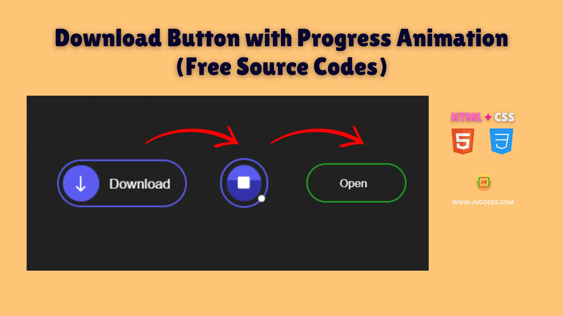
Download Button with Progress Animation Using HTML and CSS (Free Source Code)
An interactive and modern component that shows a clear and engaging download process to your site is Download Button With Progress Animation using HTML and CSS.
This is a button concerned with providing smooth progress animation, so users would see when is a download in progress and when it’s done.
So, I am going to give you free source code written following the proper programming standards and you could simply add this feature to your project without hassles.
GitHub Source: Download Button with Progress Animation
Features
- Smooth Transition: The button animates seamlessly between different states, providing a fluid visual experience.
- Clear Progress Indicator: Users can easily see the progress of the download, ensuring they know exactly when it is complete.
- Responsive Design: The button adapts well to various screen sizes, making it look great on desktops, tablets, and mobile devices.
- Customizable Style: Simple CSS tweaks allow you to adjust colors, sizes, and fonts to perfectly match your website’s theme.
Technologies Used
- HTML (Hypertext Markup Language)
- CSS (Cascading Style Sheets)
Recommended for You
- Smooth Slide On/Off Text-Based Toggle Switch
- Simple Green Slider Toggle Switch
- Responsive 3D Toggle Switch
- Animated Robot Toggle Switch
- Retro-Style Power Toggle Switch
Video Tutorial

Steps to Build Download Button
Building this button is straightforward. All you have to do is copy the HTML code and paste it on your webpage as well as the CSS to your stylesheet. Change the CSS variables to the colors in your design style and brand. With this plug and play solution it is very easy to include the Download Button with Progress Animation Using HTML and CSS in your project without the use of any additional libraries or complex coding practices. It will be easy to use even if you are a beginner or an experienced developer.
HTML
Here is the HTML code for your index.html file:
<!DOCTYPE html>
<!-- Developed by Shokat Javed available at www.jvcodes.com -->
<html lang="en">
<head>
    <meta charset="UTF-8">
    <meta name="viewport" content="width=device-width, initial-scale=1.0">
    <title>Download Button with Progress Animation - JV Codes</title>
    <link rel="stylesheet" href="style.css">
</head>
<body>
  <div class="container">
    <label class="label">
      <input type="checkbox" class="input" />
      <span class="circle"
        ><svg
          class="icon"
          aria-hidden="true"
          xmlns="http://www.w3.org/2000/svg"
          fill="none"
          viewBox="0 0 24 24"
        >
          <path
            stroke="currentColor"
            stroke-linecap="round"
            stroke-linejoin="round"
            stroke-width="1.5"
            d="M12 19V5m0 14-4-4m4 4 4-4"
          ></path>
        </svg>
        <div class="square"></div>
      </span>
      <p class="title">Download</p>
      <p class="title">Open</p>
    </label>
  </div>
</body>
</html>
CSS
Here is the complete code for style.css file to style the download button:
body {
    margin: 0;
    display: flex;
    justify-content: center;
    align-items: center;
    min-height: 100vh;
    background-color: #383838;
  }

.container {
  padding: 0;
  margin: 0;
  box-sizing: border-box;
  font-family: Arial, Helvetica, sans-serif;
  display: flex;
  justify-content: center;
  align-items: center;
}

.label {
  background-color: transparent;
  border: 2px solid rgb(91, 91, 240);
  display: flex;
  align-items: center;
  border-radius: 50px;
  width: 160px;
  cursor: pointer;
  transition: all 0.4s ease;
  padding: 5px;
  position: relative;
}

.label::before {
  content: "";
  position: absolute;
  top: 0;
  bottom: 0;
  left: 0;
  right: 0;
  background-color: #fff;
  width: 8px;
  height: 8px;
  transition: all 0.4s ease;
  border-radius: 100%;
  margin: auto;
  opacity: 0;
  visibility: hidden;
}

.label .input {
  display: none;
}

.label .title {
  font-size: 14px;
  color: #fff;
  transition: all 0.4s ease;
  position: absolute;
  right: 30px;
  bottom: 7px;
  text-align: center;
}

.label .title:last-child {
  opacity: 0;
  visibility: hidden;
}

.label .circle {
  height: 45px;
  width: 45px;
  border-radius: 50%;
  background-color: rgb(91, 91, 240);
  display: flex;
  justify-content: center;
  align-items: center;
  transition: all 0.4s ease;
  position: relative;
  box-shadow: 0 0 0 0 rgb(255, 255, 255);
  overflow: hidden;
}

.label .circle .icon {
  color: #fff;
  width: 30px;
  position: absolute;
  top: 50%;
  left: 50%;
  transform: translate(-50%, -50%);
  transition: all 0.4s ease;
}

.label .circle .square {
  aspect-ratio: 1;
  width: 15px;
  border-radius: 2px;
  background-color: #fff;
  opacity: 0;
  visibility: hidden;
  position: absolute;
  top: 50%;
  left: 50%;
  transform: translate(-50%, -50%);
  transition: all 0.4s ease;
}

.label .circle::before {
  content: "";
  position: absolute;
  left: 0;
  top: 0;
  background-color: #3333a8;
  width: 100%;
  height: 0;
  transition: all 0.4s ease;
}

.label:has(.input:checked) {
  width: 57px;
  animation: installed 0.4s ease 3.5s forwards;
}

.label:has(.input:checked)::before {
  animation: rotate 3s ease-in-out 0.4s forwards;
}

.label .input:checked + .circle {
  animation:
    pulse 1s forwards,
    circleDelete 0.2s ease 3.5s forwards;
  rotate: 180deg;
}

.label .input:checked + .circle::before {
  animation: installing 3s ease-in-out forwards;
}

.label .input:checked + .circle .icon {
  opacity: 0;
  visibility: hidden;
}

.label .input:checked ~ .circle .square {
  opacity: 1;
  visibility: visible;
}

.label .input:checked ~ .title {
  opacity: 0;
  visibility: hidden;
}

.label .input:checked ~ .title:last-child {
  animation: showInstalledMessage 0.4s ease 3.5s forwards;
}

@keyframes pulse {
  0% {
    scale: 0.95;
    box-shadow: 0 0 0 0 rgba(255, 255, 255, 0.7);
  }
  70% {
    scale: 1;
    box-shadow: 0 0 0 16px rgba(255, 255, 255, 0);
  }
  100% {
    scale: 0.95;
    box-shadow: 0 0 0 0 rgba(255, 255, 255, 0);
  }
}

@keyframes installing {
  from {
    height: 0;
  }
  to {
    height: 100%;
  }
}

@keyframes rotate {
  0% {
    transform: rotate(-90deg) translate(27px) rotate(0);
    opacity: 1;
    visibility: visible;
  }
  99% {
    transform: rotate(270deg) translate(27px) rotate(270deg);
    opacity: 1;
    visibility: visible;
  }
  100% {
    opacity: 0;
    visibility: hidden;
  }
}

@keyframes installed {
  100% {
    width: 150px;
    border-color: rgb(35, 174, 35);
  }
}

@keyframes circleDelete {
  100% {
    opacity: 0;
    visibility: hidden;
  }
}

@keyframes showInstalledMessage {
  100% {
    opacity: 1;
    visibility: visible;
    right: 56px;
  }
}
Download Source Code
The button below has a link to download the source code for the Download Button with Progress Animation for free. This code is under no copyright restriction whatsoever so you can use it for your personal or commercial projects with no worries!
Conclusion
And this code can be used on the websites to enhance user interaction and provide a contemporary, dynamic impression to the design.
If you have any questions and you are having trouble with something please leave a comment, I will be happy to respond, I also recommend you to subscribe to more free resources in my channel, remember to credit JV Source Codes by linking back and enjoy.