10 Free Responsive Navigation Bar Menus in HTML CSS & JavaScript
A responsive navigation bar menu is a necessity to any website that intends to support navigation functionality across any web project.
As the users visit websites on their mobile devices, tablets, laptops and desktops the navigation bar must therefore be capable of being compatible with the different screen sizes.
In this article, we listed ten Free Responsive Navigation Bar Menus built using HTML, CSS, and JavaScript. These navigation bars are versatile, and can be used on static pages, and on web applications with dynamic features such as, animation and drop-downs.
List of Responsive Navigation Bar Menus
Here are some of the best responsive navigation bars available:
- Simple Responsive Navigation Menu Bar (HTML + CSS)
- Responsive Drop Down Menu Bar with Sub Menu (HTML + CSS + JavaScript)
- Navigation Bar with Dark and Light Mode (HTML + CSS + JavaScript)
- Sticky Navigation Menu Bar (HTML + CSS + JavaScript)
- Elastic Animation Navigation Menu Bar (HTML + CSS)
- Navigation Bar with Indicator (HTML + CSS + JavaScript)
- Responsive Mega Menu (HTML + CSS + JavaScript)
- Navigation Menu Hover Animation (HTML + CSS)
- Navigation Bar with Page Scroll To Every Section (HTML + CSS)
- Fullscreen Overlay Navigation Menu Bar (HTML + CSS)
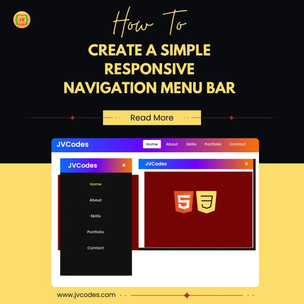
1. Simple Responsive Navigation Menu Bar
The Simple Responsive Navigation Menu Bar is one of the preferable navigation items for projects with basic design. This is a simple HTML/CSS based navigation bar that has a neat and highly structured layout that is flexible to different device resolutions.
This menu changes to a collapsible one on mobile devices, ensuring ease of use once the screen size is relative less. This is a simple way of making sure that all the links are easily clickable, irrespective of where the user is, whether they are operating on a personal computer or a smartphone a tablet.
2. Responsive Drop Down Menu Bar with Sub Menu
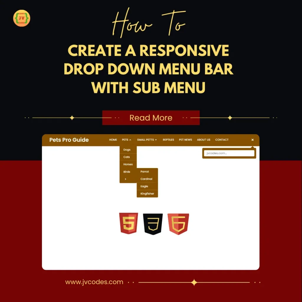
If a website has a higher level of the content hierarchy, then the Responsive Drop Down Menu Bar with Sub Menu seems to be more appropriate. This navbar uses HTML, CSS and Java Scripts in order to enhance the dropdown menus that appear either on hover or click.
This type of menu arrangement is ideal for eCommerce websites, and a blog that has many categories as they will enable users to move from one sub-s section to other sub-section of the site in an easy and compact manner.
3. Navigation Bar with Dark and Light Mode
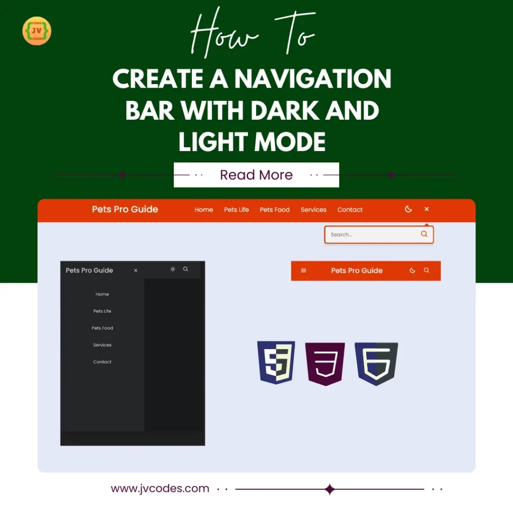
The Navigation Bar with Dark and Light Mode is a versatile and trendy choice appreciated by those who like to switch between the viewing modes. This navbar has been developed using HTML, CSS, and JavaScript. The dark mode feature is becoming widely used, since it is less effect on the eyes in conditions with low lighting.
4. Sticky Navigation Menu Bar
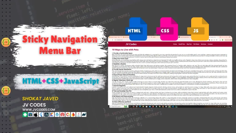
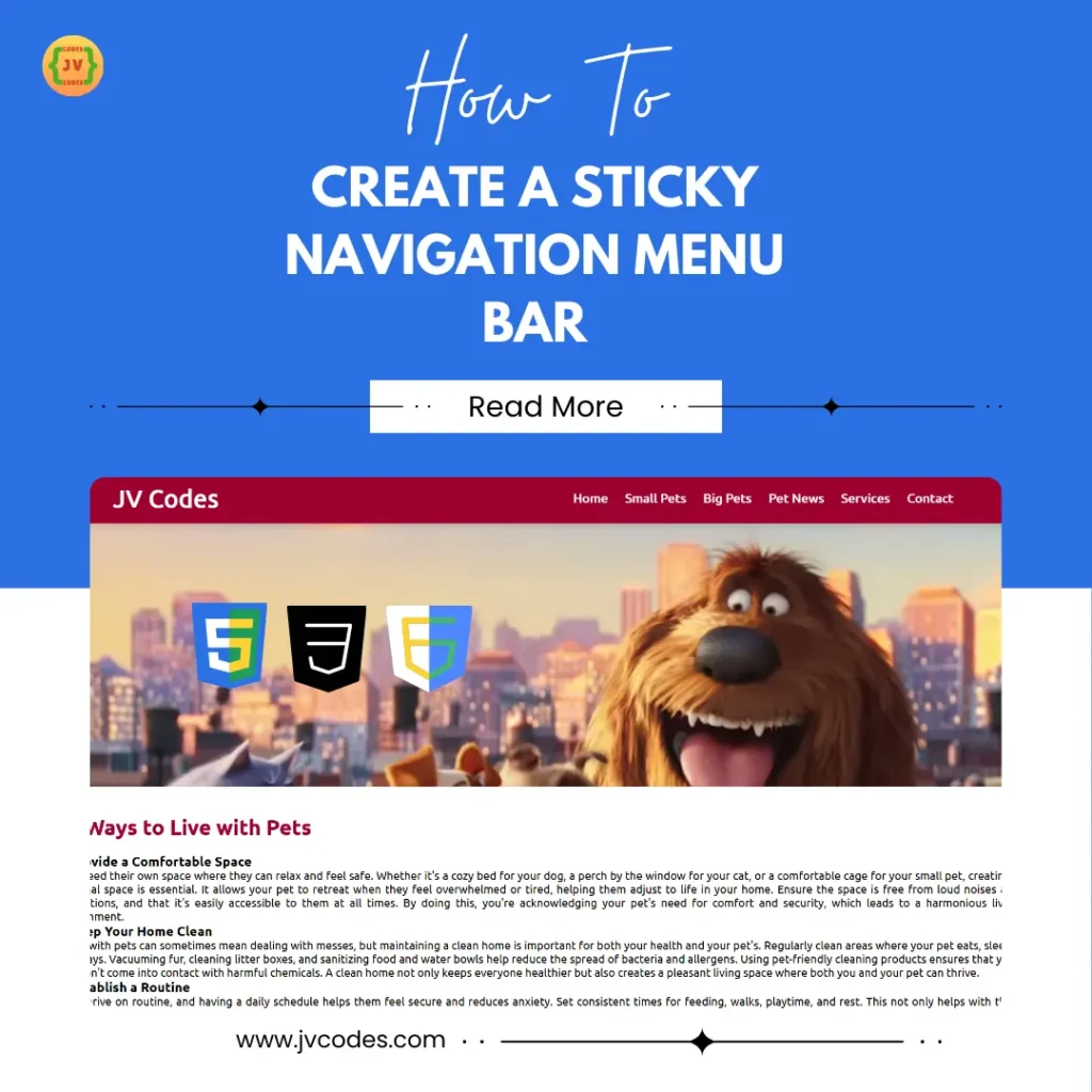
The Sticky Navigation Menu Bar is positioned at the top to remain visible even when the users scroll down the page—they offer quick links to the sections. Designed in HTML, CSS and JavaScript, this navbar stays on the page, so it is appropriate for sites with much content, for instance, when scrolling down. As key navigation links remain visible all the time, the sticky navbar positively impacts UX, mostly on extended web pages.
5. Elastic Animation Navigation Menu Bar
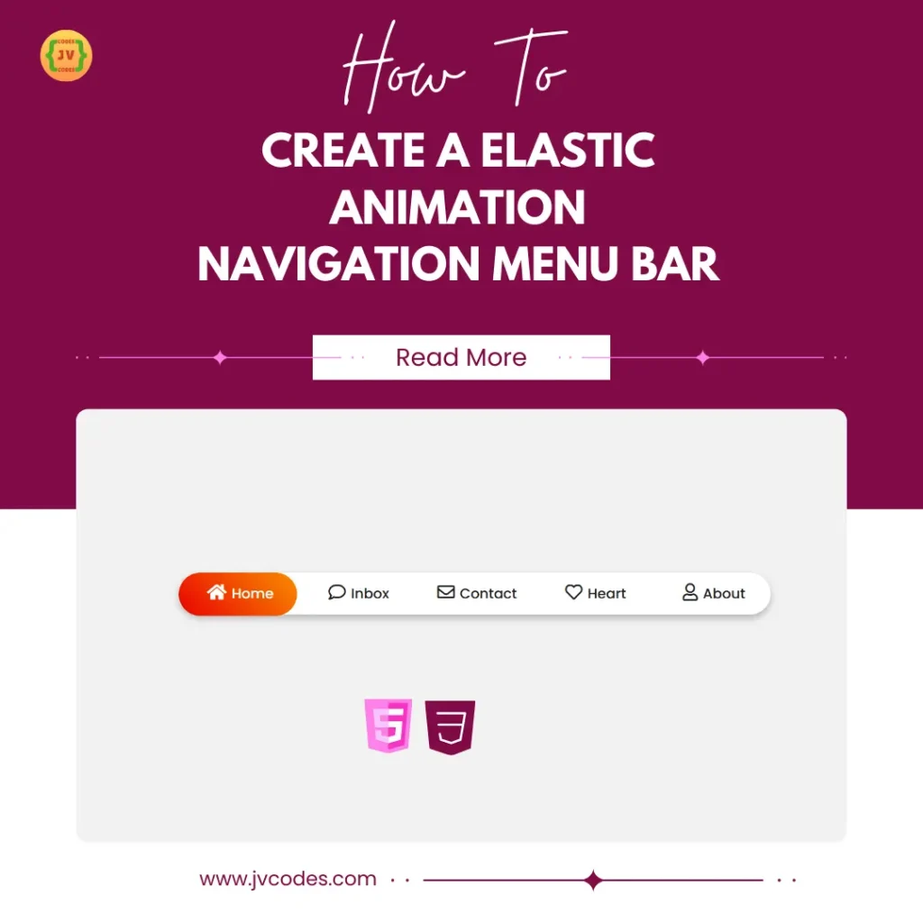
If one wants to make his site come to life the Elastic Animation Navigation Menu Bar is exactly what you are looking for. This navbar is designed using HTML and CSS with round shape and elastic effects on link which bounces or slightly stretches when mouse pointer hovers over a link. This type of menu is perfect for creative and entertainment based websites due to its fun, modern animation.
6. Navigation Bar with Indicator
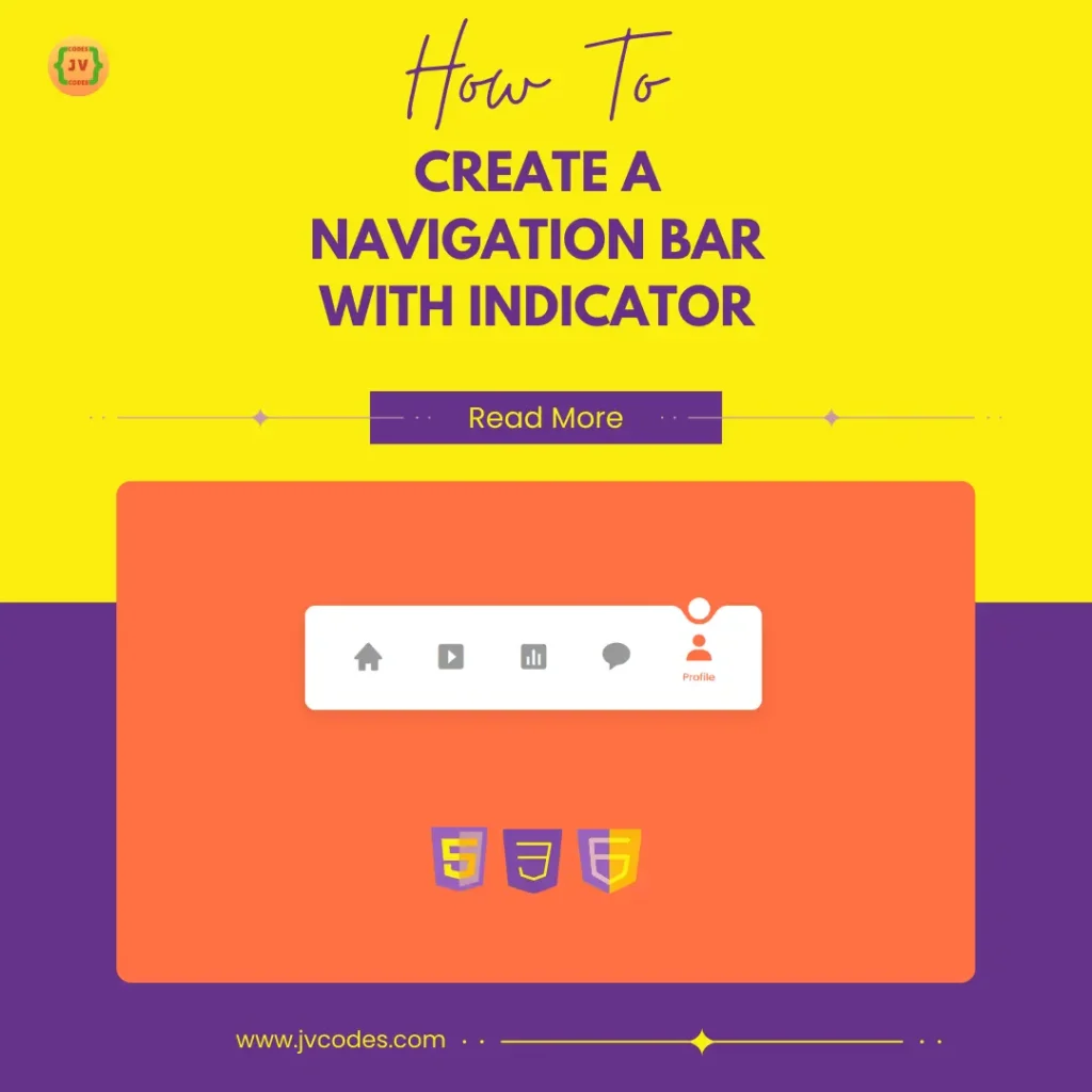
The Navigation Bar with Indicator enables the users to understand their position on the particular web site because the sign of selected section pulses. This navbar is coded with HTML, CSS and JavaScript in order to achieve this simple transition effect when moving to other sections. The presence of the visual cue enables the user to have a sense of context, thus improving the experience of moving from on section of the website to another or from one web page to another.
7. Responsive Mega Menu
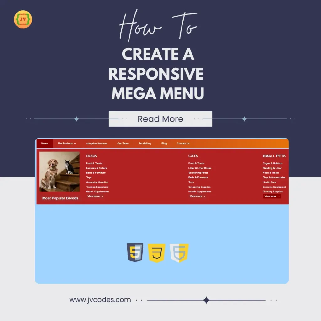
When it comes to mega menu, Responsive Mega Menu is perfect for websites with a lot of content that has to be categorized and linked. It is another HTML, CSS, and JavaScript type of navbar that appears in large and organized structure to show more links when clicked in large grid layout views. It is employed by e-business and news portals to illustrate the site’s categories and subcategories concurrently, thereby affording easy site navigation.
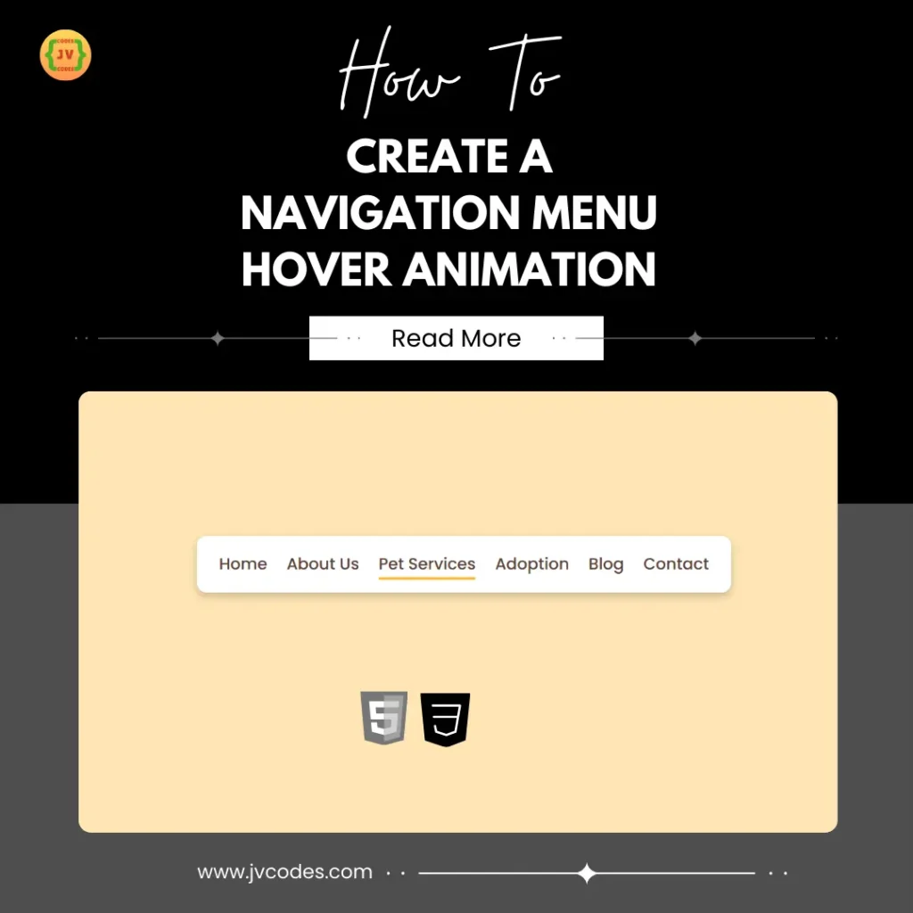
8. Navigation Menu Hover Animation
The Navigation Menu Hover Animation navbar is an easy to use, stylish navbar that comes with animation effects on hover. Designed with HTML and CSS, this navbar has small interactive features including color change, underlining, and sliding effects. This minor but quite beneficial design feature gives some sort of interactivity and sophistication, which will be perfect for personal blogging, portfolios, or agency related sites.
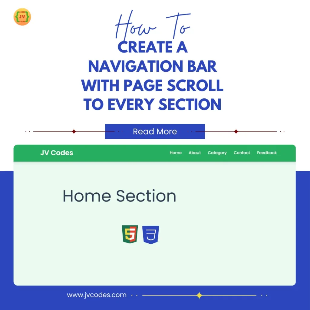
9. Navigation Bar with Page Scroll To Every Section
The Navigation Bar with Page Scroll is an aesthetic solution for building a single-page site. Developed with HTML and CSS, this navbar enables users to scroll smoothly to the section they clicked when using a menu. More commonly known as sticky one page scroll navigation bar, it can be used to ease the transition from one section to another without having to move through other sections or sub pages. It is most useful for, portfolios, landing pages, and product showcases.
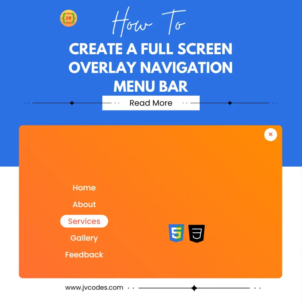
10. Fullscreen Overlay Navigation Menu Bar (HTML + CSS)
Fullscreen Overlay Navigation Menu Bar is has a unique and trendy look, which is ideal for enhancing navigation. indeed, when expanded, this navbar surrounds the full height of the screen with the menu options written in large, easily clickable fonts in the middle part. Usually implemented using HTML and CSS, the horizontal menu bar suits well mobile and app-based websites since it is simple and uncluttered. This is especially useful in the case when website design can continue a distinct appearance.
Conclusion
All these responsive navigation bar menus help improve the usability of the site by presenting users with a logical structure for accessing the website. Therefore, by choosing a design that fits into the structure and the looks of the site, the developers will enhance its accessibility and appeal. These free navigation bars, which are available in HTML, CSS, and JavaScript formats, are important tools for current websites.
Recommended for You
- Neumorphism Side Bar Menu
- Sidebar Menu with Sliding Submenu
- Glassmorphism Sidebar Menu
- Responsive Sidebar Menu with Social Media Buttons
- Responsive Sidebar Menu With Dark and Light Mode

