Simple Responsive Navigation Menu Bar in HTML and CSS
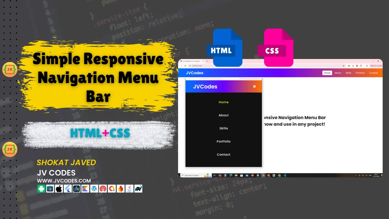
Welcome to this tutorial if you are searching the quick and effective method to understanding how to design a responsive navigation bar on a website. In this article, I’m going to give you a Simple Responsive Navigation Menu Bar in HTML, CSS, for your portfolio project.
GitHub Source: Simple Responsive Navigation Menu Bar
This is a horizontal menu bar specifically developed for all type of screen resolutions and is most suitable for the modern websites. You can use this code both for custom HTML web site and for popular CMS like WordPress.
Features of Simple Responsive Navigation Menu Bar
Here are some of the unique features of the Simple Responsive Navigation Menu Bar:
- Responsive Design: This menu bar works very well on both big screen computers and small scaled mobile screens.
- Cross-browser Compatibility: Integrates seamlessly with all the latest web browsers.
- CMS-friendly: It can be easily integrated with any Content Management System, WordPress, Joomla, Drupal, or any other HTML-based website.
- Customizable: It is very easy to change the style, colors or layout to suit the website design as per the requirement.
This navigation bar looks wonderful and comes with the added bonus of being sleek and efficient so it’s not slowing down your website.
Technologies Used
- HTML (Hypertext Markup Language)
- CSS (Cascading Style Sheets)
Video Tutorial
Steps to Build Menu
It is quite easy to build this Simple Responsive Navigation Menu Bar. You can follow the simple steps below to get your project set up:
- Create Project Folder: Create a folder with name “NavMenuProject” to save files well arranged.
- Create index.html: Now you need to create a new file called index.html . This is the main file you will write the structure for your navigation bar.
- Create style.css: Secondly, create a style.css in the same project directory. This file will include all the details of the styling of your navigation bar including colors, fonts, and space.
- Link CSS to HTML: Remember to link the CSS file to your index.html.
- Copy & Paste the Code: Here’s the source code you can just copy and paste into your index.html and style.css files.
- Save and Test: Make sure to backup your files and the open the index.html file on your browser to view a responsive navigation menu. It’s also possible to test how it works on different screen size simply by changing the size of the Browser window.
HTML
Here is the HTML code for your index.html file:
<!DOCTYPE html>
<!-- JV Source Codes | JVCodes.Com -->
<html lang="en" dir="ltr">

<head>
   <!-- Character encoding declaration for UTF-8 -->
   <meta charset="utf-8">

   <!-- Page title -->
   <title>Simple Responsive Navigation Menu</title>

   <!-- Link to external CSS file -->
   <link rel="stylesheet" href="style.css">

   <!-- Font Awesome library for icons -->
   <link rel="stylesheet" href="https://cdnjs.cloudflare.com/ajax/libs/font-awesome/5.15.3/css/all.min.css" />

   <!-- Ensures proper scaling on mobile devices -->
   <meta name="viewport" content="width=device-width, initial-scale=1.0">
</head>

<body>
   <!-- Navigation bar starts here -->
   <nav>
      <!-- Website logo -->
      <div class="logo">JVCodes</div>

      <!-- Hidden checkbox for toggling the mobile menu -->
      <input type="checkbox" id="click">

      <!-- Label for the checkbox, which is styled as a menu button (hamburger icon) -->
      <label for="click" class="menu-btn">
         <i class="fas fa-bars"></i> <!-- Font Awesome bars icon -->
      </label>

      <!-- Navigation menu items -->
      <ul>
         <!-- Active class for highlighting the current page -->
         <li><a class="active" href="#">Home</a></li>
         <li><a href="#">About</a></li>
         <li><a href="#">Skills</a></li>
         <li><a href="#">Portfolio</a></li>
         <li><a href="#">Contact</a></li>
      </ul>
   </nav>
   <!-- End of navigation bar -->

   <!-- Main content section -->
   <div class="content">
      <!-- Content blocks -->
      <div>Simple Responsive Navigation Menu Bar</div>
      <div>DOWNLOAD now and use in any project!</div>
   </div>
</body>

</html>
CSS
Here is the complete code for style.css file to style the menu:
/* Importing Google Fonts */
@import url('https://fonts.googleapis.com/css?family=Poppins:400,500,600,700&display=swap');

/* Global reset: Remove default margin, padding, and set box-sizing */
* {
  margin: 0;
  padding: 0;
  box-sizing: border-box;
  font-family: 'Poppins', sans-serif; /* Using Poppins font */
}

/* Styling the navigation bar */
nav {
  display: flex;
  height: 80px;
  width: 100%;
  background: linear-gradient(to right, #0072ff, #6c00ff, #ff7300);
  align-items: center;
  justify-content: space-between;
  padding: 0 50px 0 100px;
  flex-wrap: wrap; /* Allow wrapping in smaller screens */
}

/* Logo inside the navigation */
nav .logo {
  color: #fff; /* White text */
  font-size: 35px;
  font-weight: 600;
}

/* Navigation menu (unordered list) */
nav ul {
  display: flex;
  flex-wrap: wrap; /* Allows wrapping for smaller screens */
  list-style: none; /* Removes bullet points */
}

/* Each list item in the navigation */
nav ul li {
  margin: 0 5px;
}

/* Links inside the navigation items */
nav ul li a {
  color: #f2f2f2; /* Light grey text */
  text-decoration: none; /* Removes underline */
  font-size: 18px;
  font-weight: 500;
  padding: 8px 15px; /* Padding around links */
  border-radius: 5px;
  letter-spacing: 1px;
  transition: all 0.3s ease; /* Smooth transition for hover effects */
}

/* Active and hover states for the links */
nav ul li a.active,
nav ul li a:hover {
  color: #111; /* Dark text color on hover/active */
  background: #fff; /* White background */
}

/* Menu button for mobile view (hidden by default) */
nav .menu-btn i {
  color: #fff; /* White icon */
  font-size: 22px;
  cursor: pointer; /* Changes cursor to pointer */
  display: none; /* Hidden initially */
}

/* Hides the checkbox input */
input[type="checkbox"] {
  display: none;
}

/* Media query for screens with max width of 1000px */
@media (max-width: 1000px) {
  nav {
    padding: 0 40px 0 50px; /* Adjusts padding for smaller screens */
  }
}

/* Media query for screens with max width of 920px (Mobile view) */
@media (max-width: 920px) {
  /* Display menu button on smaller screens */
  nav .menu-btn i {
    display: block;
  }

  /* Change menu icon to 'X' when clicked */
  #click:checked ~ .menu-btn i:before {
    content: "\f00d"; /* Unicode for Font Awesome's close icon */
  }

  /* Navigation menu becomes a full-screen vertical menu */
  nav ul {
    position: fixed;
    top: 80px; /* Start below the navigation bar */
    left: -100%; /* Initially hidden */
    background: #111; /* Dark background */
    height: 100vh;
    width: 100%;
    text-align: center;
    display: block;
    transition: all 0.3s ease; /* Smooth slide-in animation */
  }

  /* Slide in the menu when the checkbox is checked */
  #click:checked ~ ul {
    left: 0; /* Menu slides in from the left */
  }

  /* Full-width list items in mobile view */
  nav ul li {
    width: 100%;
    margin: 40px 0; /* Spacing between menu items */
  }

  /* Links expand to full width and animate into view */
  nav ul li a {
    width: 100%;
    margin-left: -100%; /* Hidden initially */
    display: block;
    font-size: 20px;
    transition: 0.4s cubic-bezier(0.68, -0.55, 0.265, 1.55); /* Smoother animation curve */
  }

  /* Links slide into place when the checkbox is checked */
  #click:checked ~ ul li a {
    margin-left: 0;
  }

  /* Hover and active states in mobile view */
  nav ul li a.active,
  nav ul li a:hover {
    background: none; /* Remove background */
    color: rgb(231, 247, 10); /* Bright yellow color on hover */
  }
}

/* Styling for the content below the navigation bar */
.content {
  position: absolute;
  top: 50%;
  left: 50%;
  transform: translate(-50%, -50%); /* Center content */
  text-align: center;
  z-index: -1; /* Ensure it's behind the navigation */
  width: 100%;
  padding: 0 30px;
  color: #1b1b1b; /* Dark text */
}

/* Styling for the content divs */
.content div {
  font-size: 40px; /* Large text */
  font-weight: 700;
}
Download Source Code
Here is the HTML, CSS source code to download for Simple Responsive Navigation Menu Bar from the below button. The code is open source, and you do not have to worry about copyright issues. All the files can be downloaded through the given package.
Conclusion
The Simple Horizontal Navigation Menu Bar is one of the best ways that can improve the user experience. Regardless of whether you are creating a blog for yourself or for your company or an online shop, this navigation bar will come in handy for your projects.
If you use this code, do not forget to give credit to JV Source Codes by using a link to our site. This assists in maintaining the free content we offer in your service. If you need any assistance or experience any problems, please use the comment form below and I will be glad to assist you. Moreover, for more coding lessons and tricks, make sure to subscribe to our channel.

