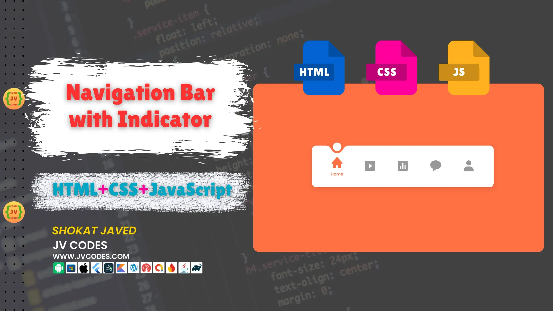
Navigation Bar with Indicator in HTML, CSS and JavaScript
Navigation bar with indicator is one of the user friendly ways of presenting menu options on the website that improves general appearance of the navigation. It includes a bar that changes its position when a user navigates to various parts of the website by clicking on the corresponding menu item.
In this tutorial, I am going to give you free source code which can be implemented in your project very easily even if you have not any programming knowledge.
In this article, you will learn about HTML, CSS, and JavaScript-based Navigation Bar with Indicator, how to apply it in your websites, and where to download the complete codes from.
GitHub Source: Navigation Bar With Indicator
Features
Here are some of the top features of the Navigation Bar with Indicator:
- Clean Code: The script provided is very documented and can be edited based on the preferences of any project.
- Compatible with CMS: This navigation bar integrates perfectly well with all today’s popular CMS platforms such as the WordPress and every other HTML-based custom interfaces.
- Responsive Design: The navigation bar is responsive hence it is compatible with the desktop, tablet, and mobile device interfaces.
These features make this Navigation Bar with Indicator highly useful in cases where one is creating a website from scratch or given the task of improving an existing website.
Technologies Used
- HTML (Hypertext Markup Language)
- CSS (Cascading Style Sheets)
- JS (JavaScript)
Video Tutorial
Steps to Build Menu
- Create Project Folder: At start, create a project folder at the computer and all the files will be stored there.
- Create index.html: This will be the main HTML file where you’ll structure the navigation bar.
- Create style.css: Develop a CSS file in which style the navigation bar and wants to implement the indicator effect.
- Create script.js: This JavaScript file will control the motion of this indicator as people browse through the menu.
- Copy & paste the code: Finally, when you have the above files in place, just copy and paste the following code to make the navigation bar work.
Once you are done these steps, you should have a fully working navigation bar with indicator that you can apply on your projects.
HTML
Here is the HTML code for your index.html file:
<!DOCTYPE html>
<!--
    Navigation Bar with Indicator
    Coding By JV Codes | www.jvcodes.com
-->
<html lang="en">

<head>
    <!-- Meta Tags for Responsive Design and Compatibility -->
    <meta charset="UTF-8">
    <meta http-equiv="X-UA-Compatible" content="IE=edge">
    <meta name="viewport" content="width=device-width, initial-scale=1.0">

    <!-- Page Title -->
    <title>Navigation Bar with Indicator</title>

    <!-- External CSS for Styling -->
    <link rel="stylesheet" href="style.css">

    <!-- Boxicons Icon Library (for icons used in the navigation) -->
    <link href='https://unpkg.com/boxicons@2.1.2/css/boxicons.min.css' rel='stylesheet'>
</head>

<body>
    <!-- Main Navigation Bar -->
    <nav class="nav">
        <!-- Navigation List -->
        <ul class="nav-content">
            <!-- Home Navigation Item -->
            <li class="nav-list">
                <a href="#" class="link-item active">
                    <i class='bx bxs-home link-icon'></i> <!-- Icon -->
                    <span class="link-text">Home</span> <!-- Text for Home -->
                </a>
            </li>

            <!-- Content Navigation Item -->
            <li class="nav-list">
                <a href="#" class="link-item">
                    <i class='bx bxs-caret-right-square link-icon'></i> <!-- Icon -->
                    <span class="link-text">Content</span> <!-- Text for Content -->
                </a>
            </li>

            <!-- Analytics Navigation Item -->
            <li class="nav-list">
                <a href="#" class="link-item">
                    <i class='bx bxs-bar-chart-square link-icon'></i> <!-- Icon -->
                    <span class="link-text">Analytics</span> <!-- Text for Analytics -->
                </a>
            </li>

            <!-- Comments Navigation Item -->
            <li class="nav-list">
                <a href="#" class="link-item">
                    <i class='bx bxs-message-rounded link-icon'></i> <!-- Icon -->
                    <span class="link-text">Comments</span> <!-- Text for Comments -->
                </a>
            </li>

            <!-- Profile Navigation Item -->
            <li class="nav-list">
                <a href="#" class="link-item">
                    <i class='bx bxs-user link-icon'></i> <!-- Icon -->
                    <span class="link-text">Profile</span> <!-- Text for Profile -->
                </a>
            </li>

            <!-- Indicator for Active Navigation Item -->
            <span class="indicator"></span>
        </ul>
    </nav>

    <!-- External JavaScript File (Handles Navigation Behavior) -->
    <script src="script.js"></script>
</body>

</html>
CSS
Here is the complete code for style.css file to style the menu:
/* Importing Google Font 'Poppins' */
@import url('https://fonts.googleapis.com/css2?family=Poppins:wght@300;400;500;600&display=swap');

/* General Reset and Font Styling */
* {
    margin: 0;
    padding: 0;
    box-sizing: border-box;
    font-family: 'Poppins', sans-serif; /* Applying 'Poppins' font throughout the document */
}

/* Body Styling: Full height, centering content, and background color */
body {
    height: 100vh;
    display: flex;
    align-items: center;
    justify-content: center;
    background: #FF7043; /* Updated background to orange */
}

/* Navigation Styling */
nav {
    border-radius: 12px; /* Rounded corners for the nav */
    background: #FFF; /* White background for the navigation bar */
    padding: 0 25px; /* Horizontal padding */
    box-shadow: 0 5px 15px rgba(0, 0, 0, 0.1); /* Adding a subtle shadow for depth */
}

/* Navigation Content: Flexbox layout for the list items */
.nav-content {
    display: flex;
    height: 120px; /* Fixed height for navigation bar */
    align-items: center;
    list-style: none; /* Removing default list styling */
    position: relative;
}

/* Link Item Styling: Flexbox layout for icons and text */
.link-item {
    display: flex;
    justify-content: center;
    align-items: center;
    flex-direction: column; /* Stack icon and text vertically */
    height: 120px;
    width: 95px;
    text-decoration: none; /* Removing underline from links */
    transition: all 0.5s cubic-bezier(0.68, -0.55, 0.265, 1.55); /* Smooth animation for hover effects */
}

/* Active Link Item: Slight upward shift on active item */
.link-item.active {
    transform: translateY(-10px); /* Moves the active item up */
}

/* Icon Styling for the Navigation Links */
.link-icon {
    font-size: 38px;
    color: #999; /* Default grey color for icons */
    transition: all 0.5s cubic-bezier(0.68, -0.55, 0.265, 1.55); /* Smooth animation for icon color */
}

/* Active Icon Color: Orange for active link icon */
.link-item.active .link-icon {
    color: #FF7043; /* Updated to orange */
}

/* Text Styling: Positioned under the icon, initially hidden */
.link-text {
    position: absolute;
    font-size: 12px;
    font-weight: 500;
    color: #FF7043; /* Updated text color to orange */
    opacity: 0; /* Hidden by default */
    transform: translateY(32px); /* Moves the text below the icon */
    transition: all 0.5s cubic-bezier(0.68, -0.55, 0.265, 1.55); /* Smooth animation for text appearance */
}

/* Active Text Visibility: Text becomes visible when the item is active */
.link-item.active .link-text {
    opacity: 1; /* Text becomes visible */
}

/* Indicator Styling: Circular indicator under active link */
.indicator {
    position: absolute;
    top: -14px;
    left: 48px;
    height: 36px;
    width: 36px;
    background-color: #FFF; /* White background for the indicator */
    border: 6px solid #FF7043; /* Updated to orange */
    border-radius: 50%; /* Making the indicator a perfect circle */
    transform: translateX(-50%); /* Centering the indicator */
    transition: all 0.5s cubic-bezier(0.68, -0.55, 0.265, 1.55); /* Smooth animation for indicator movement */
}

/* Indicator Decorative Elements: Before and After pseudo-elements for design */
.indicator::before,
.indicator::after {
    content: '';
    position: absolute;
    bottom: -8px;
    height: 24px;
    width: 19px;
}

/* Left side decoration for the indicator */
.indicator::before {
    left: -22px;
    background-color: #FFF; /* White background to blend with the indicator */
    border-top-right-radius: 25px; /* Rounded corner on the right side */
    box-shadow: 1px -13px #FF7043; /* Updated shadow to orange */
}

/* Right side decoration for the indicator */
.indicator::after {
    right: -22px;
    background-color: #FFF; /* White background to blend with the indicator */
    border-top-left-radius: 25px; /* Rounded corner on the left side */
    box-shadow: -1px -13px #FF7043; /* Updated shadow to orange */
}
JavaScript
Here is the complete code for script.js file to function the menu:
// Select all elements with the class 'link-item'
const linkItems = document.querySelectorAll(".link-item");

// Loop through each link item and add a click event listener
linkItems.forEach((linkItem, index) => {

    // Add an event listener for the click event on each 'link-item'
    linkItem.addEventListener("click", () => {

        // Find the currently active link and remove the 'active' class
        document.querySelector(".active").classList.remove("active");

        // Add the 'active' class to the clicked link item
        linkItem.classList.add("active");

        // Select the indicator element
        const indicator = document.querySelector(".indicator");

        // Calculate the new position of the indicator based on the clicked link index
        // Each link item is 95px wide, and the indicator is initially positioned 48px from the left
        indicator.style.left = `${index * 95 + 48}px`;
    });
});
Download Source Code
You can download a zip file containing the HTML, CSS, and JavaScript along with the entire source code of the Navigation Bar with Indicator using the button below. The code provided is open source, and there are no legal limitations on how the code can be used. It can be used in personal or commercial projects without any restrictions.
Conclusion
The above steps make it easy to integrate this Navigation Bar with Indicator into any website. You are free to use this code in your projects as you make sure to cite JV Source Codes, giving us a backlink.
If you face any problems or have any questions regarding the templates, you can write it in the comments section. I will be glad to assist you and participate in discussions of your questions. I would also like to remind you to subscribe to the channel for more updates.