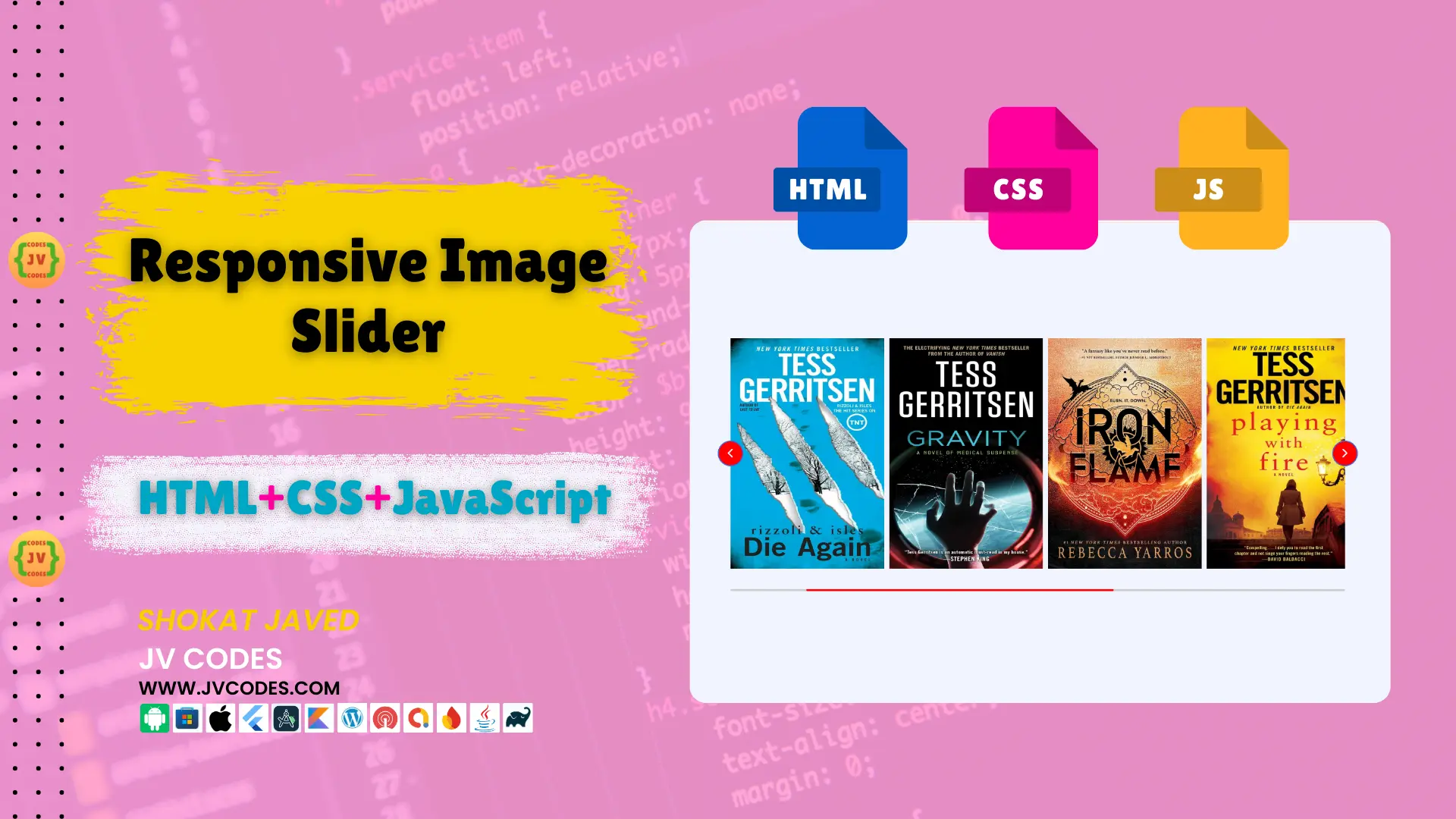
Responsive Image Slider in HTML, CSS and JavaScript
Today’s websites should not only be attractive to look, but also easy to navigate. Another key improvement option that can be used for boosting user experience is the integration of such special features as image sliders.
A Responsive Image Slider in HTML, CSS, JavaScript is a perfect and easy-to-use solution to enhance images in a modern and visually appealing manner and scale images depending on the display.
In this article, I’m going to give you the free source code for this visually appealing responsive image slider and show you how you can add it to your site.
Regardless if you are an experienced developer or being new in the field, this tutorial aims to aid you in creating a professional image slider.
GitHub Source: Responsive Image Slider
Features
The source code for the Responsive Image Slider comes with several powerful features that make it an ideal choice for any website developer.
- Fully Responsive Design: It is fully compatible with the mobile, tablet, and desktop and also, the slider adjust itself to different resolutions.
- Cross-Browser Compatibility: It is also fully compatible with all modern browsers such as Chrome, Firefox, Safari, and Edge.
- Easy Integration: It is quite possible to integrate the slider into any modern Content Management Systems, such as WordPress, Joomla or even the custom HTML-based interfaces.
- Customizable: The code is well written and commented which gives a lot of flexibility to the users to modify it according to their requirements.
Technologies Used
The following technologies are used to build the Responsive Image Slider:
- HTML
- CSS
- JavaScript
Video Preview
Steps to Build Image Slider
Follow these simple steps to design a cool image slider:
- Create a Folder “Image Slider”: Folder that will store all the files required in making the slider.
- Create a Subfolder “Images”: Saves all the images which you intend to display in this folder.
- Create an “index.html” File: This file will contain all the HTML code of the slider.
- Create a “style.css” File: This file will contain all the CSS style that would be needed in the designing of this responsive slider.
- Create a “script.js” File: This file will contain the JavaScript code which has to be implemented for the slider.
To implement code you may need VS Code Installation.
HTML
The HTML code for the Responsive Image Slider is brief and defines the format of the slider.
<!DOCTYPE html>
<!-- JV Source Codes - www.jvcodes.com -->
<html lang="en">
<head>
  <!-- Metadata and Character Encoding -->
  <meta charset="UTF-8" />
  <meta name="viewport" content="width=device-width, initial-scale=1.0" />
  <title>Responsive Image Slider in HTML, CSS, and JavaScript - JV Source Codes</title>

  <!-- Google Fonts for Icons -->
  <link rel="stylesheet" href="https://fonts.googleapis.com/css2?family=Material+Symbols+Rounded:opsz,wght,FILL,GRAD@48,400,0,0" />

  <!-- Custom Stylesheet -->
  <link rel="stylesheet" href="style.css" />

  <!-- Custom Script (Deferred Loading) -->
  <script src="script.js" defer></script>
</head>
<body>
  <!-- Container for Slider -->
  <div class="container">
    <div class="slider-wrapper">
      <!-- Previous Slide Button -->
      <button id="prev-slide" class="slide-button material-symbols-rounded">
        chevron_left
      </button>

      <!-- Image List for Slider -->
      <ul class="image-list">
        <li><img class="image-item" src="images/book1.webp" alt="Book 1" /></li>
        <li><img class="image-item" src="images/book2.webp" alt="Book 2" /></li>
        <li><img class="image-item" src="images/book3.webp" alt="Book 3" /></li>
        <li><img class="image-item" src="images/book4.webp" alt="Book 4" /></li>
        <li><img class="image-item" src="images/book5.webp" alt="Book 5" /></li>
        <li><img class="image-item" src="images/book6.webp" alt="Book 6" /></li>
        <li><img class="image-item" src="images/book7.webp" alt="Book 7" /></li>
        <li><img class="image-item" src="images/book8.webp" alt="Book 8" /></li>
        <li><img class="image-item" src="images/book9.webp" alt="Book 9" /></li>
        <li><img class="image-item" src="images/book10.webp" alt="Book 10" /></li>
        <li><img class="image-item" src="images/book11.webp" alt="Book 11" /></li>
        <li><img class="image-item" src="images/book12.webp" alt="Book 12" /></li>
      </ul>

      <!-- Next Slide Button -->
      <button id="next-slide" class="slide-button material-symbols-rounded">
        chevron_right
      </button>
    </div>

    <!-- Scrollbar for Slider -->
    <div class="slider-scrollbar">
      <div class="scrollbar-track">
        <div class="scrollbar-thumb"></div>
      </div>
    </div>
  </div>
</body>
</html>
CSS
The CSS code formats the slider in such a way that makes it responsive in the various devices. This seems to be the most important part when it comes to the design of this Responsive Image Slider and its responsiveness.
/* Global Reset */
* {
  margin: 0;
  padding: 0;
  box-sizing: border-box;
}

/* Body Styles */
body {
  display: flex;
  align-items: center;
  justify-content: center;
  min-height: 100vh;
  background: #f1f4fd;
}

/* Container Styles */
.container {
  max-width: 1200px;
  width: 95%;
}

/* Slider Wrapper Styles */
.slider-wrapper {
  position: relative;
}

/* Slide Button Styles */
.slider-wrapper .slide-button {
  position: absolute;
  top: 50%;
  height: 50px;
  width: 50px;
  display: flex;
  align-items: center;
  justify-content: center;
  font-size: 2.2rem;
  color: #fff;
  background: red; /* Button background color */
  border: 2px solid royalblue; /* Royal blue border */
  border-radius: 50%; /* Circular button */
  cursor: pointer;
  outline: none;
  z-index: 5;
  transform: translateY(-50%);
}

.slider-wrapper .slide-button:hover {
  background: darkred; /* Darker red on hover */
}

/* Positioning Slide Buttons */
.slider-wrapper .slide-button#prev-slide {
  left: -25px; /* Left side positioning */
  display: flex;
}

.slider-wrapper .slide-button#next-slide {
  right: -25px; /* Right side positioning */
}

/* Image List Styles */
.slider-wrapper .image-list {
  display: grid;
  grid-template-columns: repeat(12, 1fr);
  gap: 10px;
  margin-bottom: 30px;
  overflow-x: auto;
  font-size: 0;
  list-style: none;
  scrollbar-width: none; /* Hide scrollbar in Firefox */
}

.slider-wrapper .image-list::-webkit-scrollbar {
  display: none; /* Hide scrollbar in WebKit browsers */
}

/* Image Item Styles */
.slider-wrapper .image-list .image-item {
  width: 300px;
  height: 450px;
  object-fit: cover;
}

/* Scrollbar Track and Thumb Styles */
.container .slider-scrollbar {
  display: flex;
  align-items: center;
  height: 24px;
  width: 100%;
}

.slider-scrollbar .scrollbar-track {
  background: #ccc;
  width: 100%;
  height: 2px;
  border-radius: 4px;
  position: relative;
}

.slider-scrollbar:hover .scrollbar-track {
  height: 4px; /* Increase track height on hover */
}

.slider-scrollbar .scrollbar-thumb {
  position: absolute;
  top: 0;
  bottom: 0;
  width: 50%;
  background: red; /* Thumb color matches button */
  cursor: grab;
  border-radius: inherit;
}

.slider-scrollbar .scrollbar-thumb:active {
  cursor: grabbing;
  height: 8px; /* Increase thumb height on active */
  top: -2px;
}

.slider-scrollbar .scrollbar-thumb::after {
  content: "";
  position: absolute;
  left: 0;
  right: 0;
  top: -10px;
  bottom: -10px;
}

/* Responsive Styles for Mobile and Tablets */
@media only screen and (max-width: 1023px) {
  .slider-wrapper .slide-button {
    display: none !important; /* Hide slide buttons */
  }

  .slider-wrapper .image-list {
    gap: 10px;
    margin-bottom: 15px;
    scroll-snap-type: x mandatory; /* Snap scrolling */
  }

  .slider-wrapper .image-list .image-item {
    width: 280px;
    height: 380px;
  }

  .slider-scrollbar .scrollbar-thumb {
    width: 20%; /* Adjust thumb size on smaller screens */
  }
}
/* Image Hover Effect */
.slider-wrapper .image-list .image-item {
  width: 300px;
  height: 450px;
  object-fit: cover;
  transition: transform 0.5s ease, filter 0.5s ease; /* Smooth transition */
}

.slider-wrapper .image-list .image-item:hover {
  transform: scale(1.02); /* Slight enlargement */
  filter: grayscale(100%); /* Convert to grayscale */
}
JavaScript
JavaScript code enhances functionality of the Responsive Image Slider by creating the sliding feature and the functionality of interacting with the scrollbar.
const initSlider = () => {
    // Select elements from the DOM
    const imageList = document.querySelector(".slider-wrapper .image-list");
    const slideButtons = document.querySelectorAll(".slider-wrapper .slide-button");
    const sliderScrollbar = document.querySelector(".container .slider-scrollbar");
    const scrollbarThumb = sliderScrollbar.querySelector(".scrollbar-thumb");

    // Calculate maximum scrollable width
    const maxScrollLeft = imageList.scrollWidth - imageList.clientWidth;

    // Handle scrollbar thumb dragging
    scrollbarThumb.addEventListener("mousedown", (e) => {
        const startX = e.clientX;
        const thumbPosition = scrollbarThumb.offsetLeft;
        const maxThumbPosition = sliderScrollbar.getBoundingClientRect().width - scrollbarThumb.offsetWidth;

        // Update thumb position during dragging
        const handleMouseMove = (e) => {
            const deltaX = e.clientX - startX;
            const newThumbPosition = thumbPosition + deltaX;

            // Ensure thumb position stays within bounds
            const boundedPosition = Math.max(0, Math.min(maxThumbPosition, newThumbPosition));
            const scrollPosition = (boundedPosition / maxThumbPosition) * maxScrollLeft;

            // Update thumb position and scroll position
            scrollbarThumb.style.left = `${boundedPosition}px`;
            imageList.scrollLeft = scrollPosition;
        }

        // Remove event listeners when dragging ends
        const handleMouseUp = () => {
            document.removeEventListener("mousemove", handleMouseMove);
            document.removeEventListener("mouseup", handleMouseUp);
        }

        // Add event listeners for dragging
        document.addEventListener("mousemove", handleMouseMove);
        document.addEventListener("mouseup", handleMouseUp);
    });

    // Handle slide button clicks
    slideButtons.forEach(button => {
        button.addEventListener("click", () => {
            const direction = button.id === "prev-slide" ? -1 : 1;

            // Calculate the amount to scroll (2 images at a time)
            const imageWidth = imageList.querySelector('.image-item').offsetWidth + 10; // Adjust for the gap
            const scrollAmount = imageWidth * 2 * direction;

            // Scroll the image list
            imageList.scrollBy({ left: scrollAmount, behavior: "smooth" });
        });
    });

    // Show or hide slide buttons based on scroll position
    const handleSlideButtons = () => {
        slideButtons[0].style.display = imageList.scrollLeft <= 0 ? "none" : "flex";
        slideButtons[1].style.display = imageList.scrollLeft >= maxScrollLeft ? "none" : "flex";
    }

    // Update scrollbar thumb position based on image scroll
    const updateScrollThumbPosition = () => {
        const scrollPosition = imageList.scrollLeft;
        const thumbPosition = (scrollPosition / maxScrollLeft) * (sliderScrollbar.clientWidth - scrollbarThumb.offsetWidth);
        scrollbarThumb.style.left = `${thumbPosition}px`;
    }

    // Add scroll event listener to update scrollbar thumb and slide buttons
    imageList.addEventListener("scroll", () => {
        updateScrollThumbPosition();
        handleSlideButtons();
    });
}

// Initialize slider on window load and resize
window.addEventListener("resize", initSlider);
window.addEventListener("load", initSlider);
Download Source Code
You can download the complete source code for the Responsive Image Slider from the button below. The use of this code is allowed and may be modified in any way without asking for permission or paying royalties for use of the code. All the files and images are provided to you to make the process as convenient as possible.
Conclusion
Responsive Image Slider in HTML, CSS, and JavaScript is an incredibly powerful and easy to use tool, which will be very useful for the design of your site. With this code, you can develop excellent image sliders that are compatible with all devices effortlessly.
You are welcome to use this code in your projects and it is encouraged that you acknowledge and link back to JV Source Codes to the original article. This helps support the creation of additional free resources.
Feel free to leave a comment below if you have any questions, I will respond to you. Please remember to LIKE this video and also SUBSCRIBE to our channel for more tutorials and valuable Assets.


