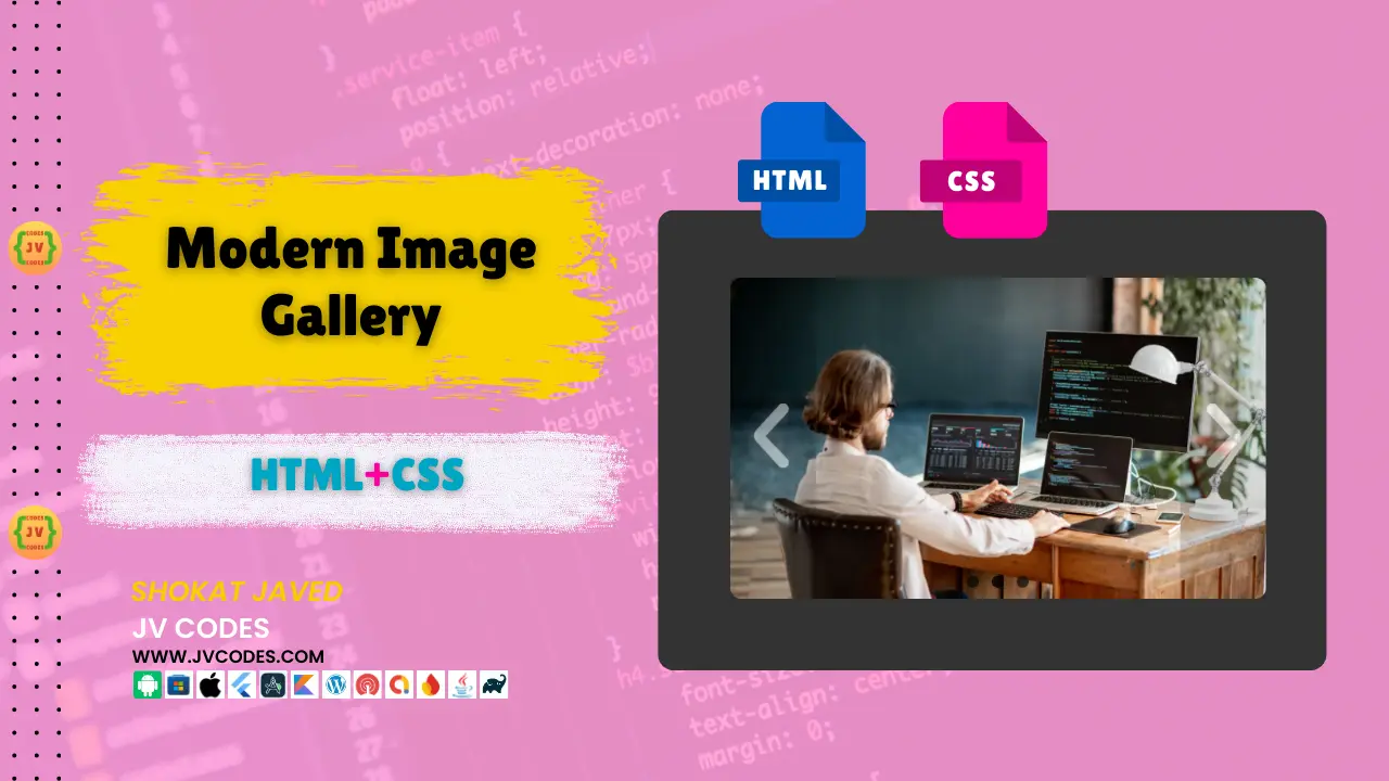
Modern Image Slider in HTML, CSS and JavaScript
Modern Image Slider in HTML and CSS is a form of dynamic graphical user interface that has an added value of beauty and can be added to any website to bring out the best. Here I’ll show you how to create a clean and responsive image slider.
This is why I have developed this simple and free tutorial to help you build a Modern Image Slider. When you read this article to the end, you will have a complete set-up of an image slider that is ready for customization and use in your projects.
GitHub Source: Modern Image Slider
Looking for free source codes for stunning image galleries? Explore these amazing options now!
- 3D Rotating Image Gallery
- Dynamic Image Gallery
- Modern Image Gallery
- Responsive Image Gallery
- Popup Image Gallery
Features
- Responsive Design: The image slider is responsive; therefore, no matter the device whether it is desktop, tablet, or a smartphone, the view is equally great.
- Smooth Transitions: Get the joy of flowing image and smooth motion between slides.
- Customizable: Slider element can be easily styled to fit the look and feel of the site.
- Compatible with Modern CMS: Embed this slider into one of the most used content management systems such as WordPress or into any HTML based website.
Technologies Used
- HTML (Hypertext Markup Language)
- CSS (Cascading Style Sheets)
Video Tutorial
Steps to Build Modern Image Slider
- Create a New Project Folder: The first thing that you definitely have to do is to make a new folder on your computer and save there all the files used for the image slider.
- Create an Images Folder: Within the project folder, create a subdirectory named images to store your image files.
- Create an index.html File: So, the first step is to make a new HTML file with a name “index. html”, and place it in the project folder.
- Create a style.css File: For this purpose, create a new CSS file with the name “style. css” in the project folder.
HTML
Here is the HTML code for your index.html file.
<!DOCTYPE html>
<html lang="en">
<head>
<meta charset="UTF-8">
<meta name="viewport" content="width=device-width, initial-scale=1.0">
<title>JV Codes Image Slider 1</title>
<link rel="stylesheet" href="style.css">
</head>
<body>
<ul class="slides">
<input type="radio" name="radio-btn" id="img-1" checked />
<li class="slide-container">
<div class="slide">
<img src="https://jvcodes.com/wp-content/uploads/2024/08/1.webp" alt="Slide 1">
</div>
<div class="nav">
<label for="img-3" class="prev">‹</label>
<label for="img-2" class="next">›</label>
</div>
</li>
<input type="radio" name="radio-btn" id="img-2" />
<li class="slide-container">
<div class="slide">
<img src="https://jvcodes.com/wp-content/uploads/2024/08/5.webp" alt="Slide 2">
</div>
<div class="nav">
<label for="img-1" class="prev">‹</label>
<label for="img-3" class="next">›</label>
</div>
</li>
<input type="radio" name="radio-btn" id="img-3" />
<li class="slide-container">
<div class="slide">
<img src="https://jvcodes.com/wp-content/uploads/2024/08/7.webp" alt="Slide 3">
</div>
<div class="nav">
<label for="img-2" class="prev">‹</label>
<label for="img-1" class="next">›</label>
</div>
</li>
<li class="nav-dots">
<label for="img-1" class="nav-dot" id="img-dot-1"></label>
<label for="img-2" class="nav-dot" id="img-dot-2"></label>
<label for="img-3" class="nav-dot" id="img-dot-3"></label>
</li>
</ul>
</body>
</html>CSS
Here is the complete code for style.css file to style the slider.
@import url('https://fonts.googleapis.com/css?family=Varela+Round');

    html,
    body {
      background: #333 url('https://codepen.io/images/classy_fabric.png');
      display: flex;
      height: 100vh;
      align-items: center;
      justify-content: center;
    }

    .slides {
      padding: 0;
      width: 500px;
      height: 300px;
      display: block;
      margin: 0 auto;
      position: relative;
    }

    .slides * {
      user-select: none;
      -ms-user-select: none;
      -moz-user-select: none;
      -khtml-user-select: none;
      -webkit-user-select: none;
      -webkit-touch-callout: none;
    }

    .slides input {
      display: none;
    }

    .slide-container {
      display: block;
      border-radius: 10px;
    }

    .slide {
      top: 0;
      opacity: 0;
      width: 500px;
      height: 300px;
      display: block;
      position: absolute;
      transform: scale(0);
      transition: all .7s ease-in-out;
    }

    .slide img {
      width: 100%;
      height: 100%;
      border-radius: 10px;
    }

    .nav label {
      width: 80px;
      height: 100%;
      display: none;
      position: absolute;
      opacity: 0;
      z-index: 9;
      cursor: pointer;
      transition: opacity .2s;
      color: #ffffff;
      font-size: 96pt;
      text-align: center;
      line-height: 280px;
      font-family: "Varela Round", sans-serif;
      background-color: rgba(0, 0, 0, 0.3);
      text-shadow: 0px 0px 15px rgb(119, 119, 119);
    }

    .slide:hover+.nav label {
      opacity: 0.5;
    }

    .nav label:hover {
      opacity: 1;
    }

    .nav .next {
      right: 0;
    }

    input:checked+.slide-container .slide {
      opacity: 1;
      transform: scale(1);
      transition: opacity 1s ease-in-out;
    }

    input:checked+.slide-container .nav label {
      display: block;
    }

    .nav-dots {
      width: 100%;
      bottom: 9px;
      height: 11px;
      display: block;
      position: absolute;
      text-align: center;
    }

    .nav-dots .nav-dot {
      top: -5px;
      width: 11px;
      height: 11px;
      margin: 0 4px;
      position: relative;
      border-radius: 100%;
      display: inline-block;
      background-color: rgba(0, 0, 0, 0.6);
    }

    .nav-dots .nav-dot:hover {
      cursor: pointer;
      background-color: rgba(0, 0, 0, 0.8);
    }

    input#img-1:checked~.nav-dots label#img-dot-1,
    input#img-2:checked~.nav-dots label#img-dot-2,
    input#img-3:checked~.nav-dots label#img-dot-3 {
      background: rgba(0, 0, 0, 0.8);
    }
Download Source Code
If you would like to get the full HTML and CSS source code for this Modern Image Slider, you can download from button below. The code is open source, which means that you don’t require any permission to use the code in your product.
Conclusion
If you follow these steps and edit the code as desired, it is possible to implement a desirable and attractive Modern Image Slider in the framework of HTML and CSS. This slider can be of great use for your website as it grabs an interest very quickly and can improve the overall concept.
Keep JV Source Codes in mind and make sure to link back to this article as a sign of gratitude. In case of any problems or ideas for further development of this tool, kindly use the comments section below.
Here is an other list of 10 Navigation Menu Bars for your web projects!

