Image Comparison Slider in HTML, CSS and JavaScript
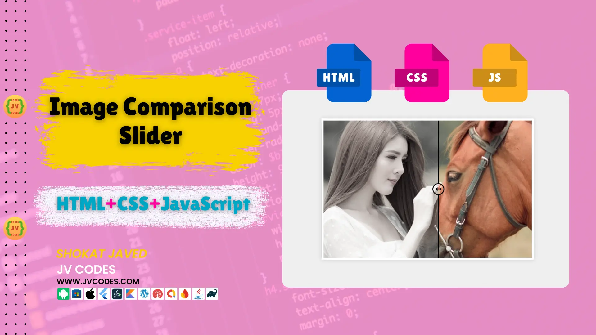
Do you want to implement a feature on your website that will enable someone to compare two images simultaneously? Look no further! So in this article, I will share with you Free Source Codes of an Image Comparison Slider in HTML, CSS, JavaScript.
Here, I found that this slider is good for using the ‘before and after’, product demonstrations and such like. This Image Comparison Slider can be helpful for a developer who has his/her own project or when one develops a website for a client.
As such, I am going to give you detailed descriptions of how to add this feature to your site hassle free in this article.
GitHub Source: Image Comparison Slider
Looking for free source codes for stunning image galleries? Explore these amazing options now!
- 3D Rotating Image Gallery
- Dynamic Image Gallery
- Modern Image Gallery
- Responsive Image Gallery
- Popup Image Gallery
Features
The Image Comparison Slider in HTML, CSS, JavaScript comes with several powerful features:
- Responsive Design: The slider is fully responsive and support all the common devices such as the PCs, tablets, or the mobile phones.
- Cross-Browser Compatibility: It is compatible with most of the leading web browsers, without any compatibility issues.
- Easy Integration: The code is quite basic and can be easily implemented in any content management system such as Word Press, Joomla, and even in HTML based websites.
- Customizable: All the images, sliders, and other aspects of the theme can be easily changed to fit the overall design of the website.
Technologies Used
The Image Comparison Slider is built using the following technologies:
- HTML
- CSS
- JavaScript
Video Guide
Here’s a quick guide of how the Image Comparison Slider works:
Steps to Build Image Slider
Follow these simple steps to build the Image Comparison Slider in HTML, CSS, JavaScript:
- Create a folder: Let’s name it Image Slider.
- Create an images folder: All the images should be stored in this folder.
- Create index.html: This file will possess the HTML code that will define the appearance of the slider.
- Create style.css: This file will hold all the CSS styling for the slider.
- Create script.js: Here will be placed the JavaScript code that will turn the slider.
To implement code you may need VS Code Installation.
HTML
Here is the HTML code for your index.html file.
<!DOCTYPE html>
<!-- Created By JV Source Codes at www.jvcodes.com -->
<html lang="en" dir="ltr">
  <head>
    <meta charset="utf-8">
    <title>Image Comparison Slider | JV Codes</title>
    <!-- Linking to the external CSS file for styling -->
    <link rel="stylesheet" href="style.css">
  </head>
  <body>
    <!-- Main wrapper containing the image comparison slider -->
    <div class="wrapper">
      <!-- Container holding both images -->
      <div class="images">
        <div class="img-1"></div> <!-- First image container -->
        <div class="img-2"></div> <!-- Second image container (overlay) -->
      </div>

      <!-- Slider control for adjusting image comparison -->
      <div class="slider">
        <!-- Drag line indicating the comparison boundary -->
        <div class="drag-line">
          <span></span> <!-- Circular handle for dragging -->
        </div>
        <!-- Range input for controlling the slider -->
        <input type="range" min="0" max="100" value="50">
      </div>
    </div>

    <!-- JavaScript to handle slider functionality -->
    <script src="script.js"></script>

  </body>
</html>
CSS
Here is the complete code for style.css file to style the slider.
/* Reset margin and padding for all elements, and set box-sizing to border-box */
* {
  margin: 0;
  padding: 0;
  box-sizing: border-box;
}

/* Set the grid layout for the HTML and body, centering content and setting background */
html, body {
  display: grid;
  height: 100%;
  place-items: center;
  background: #efefef;
}

/* Wrapper for the image container with specific dimensions and styling */
.wrapper {
  position: relative;
  height: 500px;
  width: 750px;
  overflow: hidden;
  background: #fff;
  border: 7px solid #fff;
  box-shadow: 0px 0px 15px rgba(0, 0, 0, 0.15);
}

/* Container for holding images side by side */
.wrapper .images {
  height: 100%;
  width: 100%;
  display: flex;
}

/* Styling for the first image, covering the entire wrapper */
.wrapper .images .img-1 {
  height: 100%;
  width: 100%;
  background: url("images/pet5.jpg") no-repeat;
  background-size: cover; /* Ensure the image covers the entire area */
}

/* Styling for the second image, positioned on the left half with grayscale filter */
.wrapper .images .img-2 {
  position: absolute;
  height: 100%;
  width: 50%;
  filter: grayscale(80%);
  background: url("images/pet5.jpg") no-repeat;
  background-size: cover; /* Ensure the image covers the entire area */
}

/* Slider container positioned at the top, full width, with high z-index */
.wrapper .slider {
  position: absolute;
  top: 0;
  width: 100%;
  z-index: 99;
}

/* Slider input styling, removing outline and appearance for custom styling */
.wrapper .slider input {
  width: 100%;
  outline: none;
  background: none;
  -webkit-appearance: none; /* Remove default slider appearance in WebKit browsers */
}

/* Custom styling for the slider thumb (draggable element) */
.slider input::-webkit-slider-thumb {
  height: 486px;
  width: 3px;
  background: none;
  -webkit-appearance: none; /* Remove default thumb appearance */
  cursor: col-resize; /* Cursor indicating column resizing */
}

/* Line indicating draggable boundary within the slider */
.slider .drag-line {
  width: 3px;
  height: 486px;
  position: absolute;
  left: 49.85%; /* Center the drag line */
  pointer-events: none; /* Prevent mouse events from affecting this element */
}

/* Top and bottom background sections of the drag line */
.slider .drag-line::before,
.slider .drag-line::after {
  position: absolute;
  content: "";
  width: 100%;
  height: 222px;
  background: #000000;
}

/* Position the top background section */
.slider .drag-line::before {
  top: 0;
}

/* Position the bottom background section */
.slider .drag-line::after {
  bottom: 0;
}

/* Centered circular drag handle */
.slider .drag-line span {
  height: 42px;
  width: 42px;
  border: 3px solid #000000;
  position: absolute;
  top: 50%;
  left: 50%;
  border-radius: 50%;
  transform: translate(-50%, -50%);
}

/* Arrow styling within the drag handle */
.slider .drag-line span::before,
.slider .drag-line span::after {
  position: absolute;
  content: "";
  top: 50%;
  border: 10px solid transparent; /* Arrow base is transparent */
  border-bottom-width: 0px;
  border-right-width: 0px;
  transform: translate(-50%, -50%) rotate(45deg); /* Rotate to form the arrow */
}

/* Left side arrow of the drag handle */
.slider .drag-line span::before {
  left: 40%;
  border-left-color: #000000; /* White arrow on the left */
}

/* Right side arrow of the drag handle */
.slider .drag-line span::after {
  left: 60%;
  border-top-color: #000000; /* White arrow on the right */
}
JavaScript
Here is the JavaScript code:
// Selecting the slider input, second image, and drag line elements
const slider = document.querySelector(".slider input");
const img = document.querySelector(".images .img-2");
const dragLine = document.querySelector(".slider .drag-line");

// Event listener to update image width and drag line position on slider input
slider.oninput = () => {
  let sliderVal = slider.value;
  dragLine.style.left = sliderVal + "%"; // Move drag line
  img.style.width = sliderVal + "%"; // Adjust the width of the second image
}
Download Source Code
You can get the complete source code of image comparison slider in HTML, CSS and JavaScript from the following button. It is an open source and has no restriction on the copyright and it comes with all files and images.
Conclusion
The Image Comparison Slider in HTML, CSS, JavaScript can be applied to any website and it is rather simple to use it. You can implement this slider to enhance the narrative, where your target audience is able to explore more, especially in scenarios where one image is compared to another such as before and after images or product comparisons.
You are welcome to use this code in your projects then ensure that you link back to this page, JV Source Codes. If you have any other question or come across some problem, please leave your comment, I will be glad to assist you. Happy coding!


Great article.
Wohh exactly what I was searching for, appreciate it for posting.
I constantly spent my half an hour to read this web site’s articles or reviews all
the time along with a cup of coffee.
Thanks for finally talking about > Image Comparison Slider
in HTML, CSS and JavaScript – JV Codes 2025 < Liked it!
Thanks
whoah this weblog is excellent i love reading your posts.
Keep up the good work! You already know, a lot of persons are looking around for
this info, you could aid them greatly.
Appreciating the time and energy you put into your website and detailed information you provide.
It’s awesome to come across a blog every once in a
while that isn’t the same outdated rehashed information. Excellent read!
I’ve bookmarked your site and I’m including your RSS
feeds to my Google account.
Rattling good visual appeal on this web site, I’d value it 10.