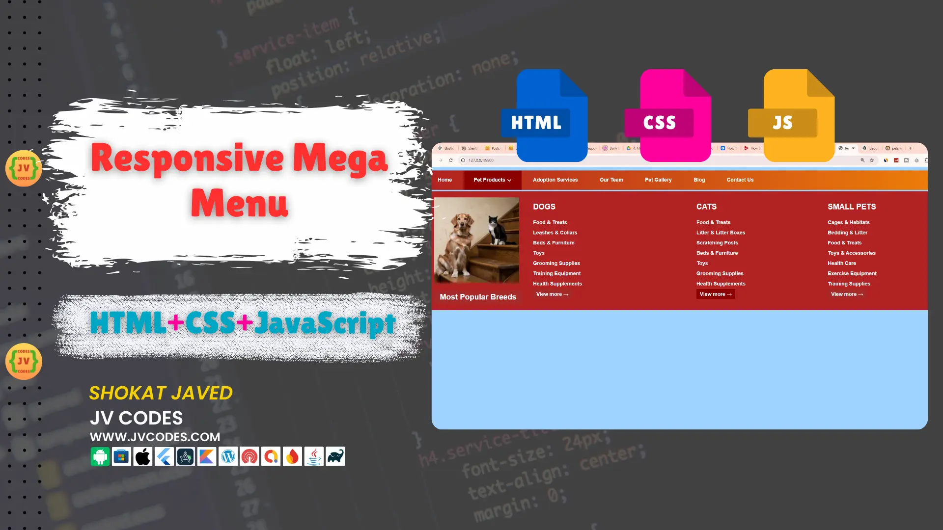
Responsive Mega Menu in HTML, CSS and JavaScript
Responsive Mega Menu in HTML, CSS, JavaScript is the major part of modern web designs. It is useful in the arrangement of large website navigation by breaking it in several rows and ensuring it adapts to desktop, tablets, and mobile screen sizes.
In this guide, I’ll show you how to create a responsive mega menu with clean and well commented code. I’ll be glad to offer you the source code for free, you can use it as you want it, without copyrights.
GitHub Source: Responsive Mega Menu
Features
This Responsive Mega Menu comes with several key features, making it ideal for websites and web applications:
- Compatible with CMS: It is fully compatible with all current popular content management systems.
- Responsive Design: The most outstanding feature of this mega menu is the ability to adapt to various devices and resolutions desktop, tablets, and mobile phones.
- Clean Code: All the code sections are documented and well structured that even novices can make changes in their projects.
Technologies Used
- HTML (Hypertext Markup Language)
- CSS (Cascading Style Sheets)
- JS (JavaScript)
Video Tutorial

Steps to Build Menu
It is easy to build your own Responsive Mega Menu. Here’s a simple step-by-step process to help you get started:
- Create Project Folder: Create a new folder on your computer to contain all the files and subfolders which will be needed late.
- Create Images Folder: In the project folder create a new sub-directory called ‘images’ for icons or images for the menu.
- Create index.html: Create an index.html file that is the structure of the mega menu bar.
- Create style.css: Create a new style.css file for the styling of the mega menu.
- Create script.js: You should write the interactivity of your menu in a script.js file using JavaScript.
- Copy & Paste the Code: After you have all these files, then to finish up your responsive mega menu you need to copy and paste the code below.
HTML
Here is the HTML code for your index.html file:
<!DOCTYPE html>
<html lang="en">

<head>
    <!-- Meta Information -->
    <meta charset="UTF-8">
    <meta name="viewport" content="width=device-width, initial-scale=1.0">
    <title>Responsive Mega Menu</title>

    <!-- Link to External CSS -->
    <link rel="stylesheet" href="style.css">
    <link rel="stylesheet" href="https://cdnjs.cloudflare.com/ajax/libs/font-awesome/6.0.0-beta3/css/all.min.css">
</head>

<body>
    <!-- Header Section -->
    <header>
        <!-- Logo or branding can go here -->
    </header>

    <!-- Mobile Menu Toggle Button -->
    <div class="xs-menu-cont">
        <!-- Button to toggle mobile menu visibility -->
        <a id="menutoggle"><i class="fa fa-align-justify"></i></a>

        <!-- Hidden Mobile Menu (shown when toggle is clicked) -->
        <nav class="xs-menu displaynone">
            <ul>
                <li class="active"><a href="#">Home</a></li>
                <li><a href="#">About Us</a></li>
                <li><a href="#">Adoption Services</a></li>
                <li><a href="#">Our Team</a></li>
                <li><a href="#">Pet Gallery</a></li>
                <li><a href="#">Blog</a></li>
                <li><a href="#">Contact Us</a></li>
            </ul>
        </nav>
    </div>

    <!-- Desktop Menu -->
    <nav class="menu">
        <ul>
            <li class="active"><a href="#">Home</a></li>
            <li class="drop-down">
                <a href="#">Pet Products</a>

                <!-- Mega Menu for Pet Products -->
                <div class="mega-menu fadeIn animated">
                    <!-- First Column: Popular Breeds with Image -->
                    <div class="mm-6column">
                        <span class="left-images">
                            <img src="images/pets.webp" alt="Popular Breeds">
                            <p>Most Popular Breeds</p>
                        </span>

                        <!-- Categories List -->
                        <span class="categories-list">
                            <ul>
                                <span>Dogs</span>
                                <li>Food & Treats</li>
                                <li>Leashes & Collars</li>
                                <li>Beds & Furniture</li>
                                <li>Toys</li>
                                <li>Grooming Supplies</li>
                                <li>Training Equipment</li>
                                <li>Health Supplements</li>
                                <li><a class="mm-view-more" href="#">View more →</a></li>
                            </ul>
                        </span>
                    </div>

                    <!-- Second Column: Cats -->
                    <div class="mm-3column">
                        <span class="categories-list">
                            <ul>
                                <span>Cats</span>
                                <li>Food & Treats</li>
                                <li>Litter & Litter Boxes</li>
                                <li>Scratching Posts</li>
                                <li>Beds & Furniture</li>
                                <li>Toys</li>
                                <li>Grooming Supplies</li>
                                <li>Health Supplements</li>
                                <li><a class="mm-view-more" href="#">View more →</a></li>
                            </ul>
                        </span>
                    </div>

                    <!-- Third Column: Small Pets -->
                    <div class="mm-3column">
                        <span class="categories-list">
                            <ul>
                                <span>Small Pets</span>
                                <li>Cages & Habitats</li>
                                <li>Bedding & Litter</li>
                                <li>Food & Treats</li>
                                <li>Toys & Accessories</li>
                                <li>Health Care</li>
                                <li>Exercise Equipment</li>
                                <li>Training Supplies</li>
                                <li><a class="mm-view-more" href="#">View more →</a></li>
                            </ul>
                        </span>
                    </div>
                </div>
            </li>

            <li><a href="#">Adoption Services</a></li>
            <li><a href="#">Our Team</a></li>
            <li><a href="#">Pet Gallery</a></li>
            <li><a href="#">Blog</a></li>
            <li><a href="#">Contact Us</a></li>
        </ul>
    </nav>

    <!-- jQuery and External JavaScript -->
    <script src="https://ajax.googleapis.com/ajax/libs/jquery/1.11.1/jquery.min.js"></script>
    <script src="script.js"></script>
</body>

</html>
CSS
Here is the complete code for style.css file to style the menu:
/* Global Settings */
body {
    font-family: 'Sintony', sans-serif;
    color: #f5f5dc; /* Light yellow-beige text color */
    font-size: 12px;
    background: #9fd4ff; /* Dark brown background */
    line-height: 1;
}

/* Universal Box-Sizing */
*, *:before, *:after {
    box-sizing: border-box;
}

/* Reset CSS by Eric Meyer (v2.0) */
html, div, span, applet, object, iframe, h1, h2, h3, h4, h5, h6, p, blockquote, pre, a, abbr, acronym, address, big, cite, code, del, dfn, em, img, ins, kbd, q, s, samp, small, strike, strong, sub, sup, tt, var, b, u, i, center, dl, dt, dd, ol, ul, li, fieldset, form, label, legend, table, caption, tbody, tfoot, thead, tr, th, td, article, aside, canvas, details, embed, figure, figcaption, footer, header, hgroup, menu, nav, output, ruby, section, summary, time, mark, audio, video {
    margin: 0;
    padding: 0;
    border: 0;
    font-size: 100%;
    font: inherit;
    vertical-align: baseline;
}

/* HTML5 display-role reset for older browsers */
article, aside, details, figcaption, figure, footer, header, hgroup, menu, nav, section {
    display: block;
}

ol, ul {
    list-style: none;
}

blockquote, q {
    quotes: none;
}

blockquote:before, blockquote:after, q:before, q:after {
    content: '';
    content: none;
}

table {
    border-collapse: collapse;
    border-spacing: 0;
}

/* Header Styles */
header h2 {
    margin: 25px 10px;
    font-size: 28px;
    text-align: center;
    color: #ffeb3b; /* Bright yellow text color */
}

/* Container */
.container {
    margin: 10px auto;
    display: table;
    max-width: 1140px;
    width: 100%;
}

.container:before, .container:after {
    content: "";
    clear: both;
}

/* Navigation Menu */
nav.menu {
    background: linear-gradient(90deg, #b22222, #f18408); /* Gradient from firebrick red to saddle brown */
    position: relative;
    min-height: 45px;
    height: 100%;
}

.menu > ul > li {
    list-style: none;
    display: inline-block;
    color: #fff;
    line-height: 45px;
    font-weight: 600;
}

.menu > ul li a, .xs-menu li a {
    text-decoration: none;
    color: #ffffff; /* Gold text */
    display: block;
    padding: 0px 24px;
}

.menu > ul li a:hover {
    background: #8b0000; /* Dark red background */
    color: #fff;
    transition-duration: 0.3s;
}

.active {
    background: #8b0000 !important;
}

.displaynone {
    display: none;
}

/* Responsive Menu for Small Screens */
.xs-menu-cont {
    display: none;
}

.xs-menu-cont > a {
    background: #d2691e; /* Chocolate background */
    border-radius: 3px;
    padding: 3px 6px;
    display: block;
    border-bottom: 1px solid #8b4513;
    box-shadow: 0 1px 2px #8b4513;
}

.xs-menu-cont > a:hover {
    cursor: pointer;
}

.xs-menu li {
    color: #fff;
    padding: 14px 30px;
    border-bottom: 1px solid #ccc;
    background: #9da52a; /* Brown background */
}

.xs-menu a {
    text-decoration: none;
}

/* Mega Menu */
.mega-menu {
    background: #b22222; /* Firebrick background for mega menu */
    left: 0;
    margin-top: 3px;
    position: absolute;
    width: 100%;
    padding: 15px;
    display: none;
    transition-duration: 0.9s;
}

/* Toggle Icon */
#menutoggle i {
    color: #fff;
    font-size: 33px;
    margin: 0;
    padding: 0;
}

/* Column Layout */
.mm-6column, .mm-3column {
    float: left;
    position: relative;
}

.mm-6column {
    width: 50%;
}

.mm-3column {
    width: 25%;
}

/* Responsive Images */
.responsive-img {
    display: block;
    max-width: 100%;
}

/* Left Aligned Images and Lists */
.left-images {
    margin-right: 25px;
    float: left;
}

.left-categories-list {
    float: left;
}

.categories-list li {
    display: block;
    line-height: normal;
    margin: 0;
    padding: 5px 0;
}

.categories-list li:hover {
    background: inherit !important;
}

/* Left Images Section */
.left-images > p {
    background: #a52a2a; /* Brown background */
    display: block;
    font-size: 18px;
    line-height: normal;
    margin: 0;
    padding: 5px 14px;
}

.categories-list span {
    font-size: 18px;
    padding-bottom: 5px;
    text-transform: uppercase;
}

/* View More Button */
.mm-view-more {
    background: #a52a2a; /* Brown background */
    color: #fff;
    display: inline !important;
    line-height: normal;
    padding: 5px 8px !important;
    margin-top: 10px;
}

.display-on {
    display: block;
    transition-duration: 0.9s;
}

/* Dropdown Arrow */
.drop-down > a:after {
    content: "\f107"; /* Downward arrow icon */
    font-family: "FontAwesome";
    display: inline-block;
    margin-left: 5px;
    font-size: 12px;
    color: #fff;
    vertical-align: middle;
    z-index: 10;
}

/* Media Queries */
@media (max-width: 600px) {
    .menu {
        display: none;
    }

    .xs-menu li a {
        padding: 0px;
    }

    .xs-menu-cont {
        display: block;
    }
}

/* Animations */
.animated {
    -webkit-animation-duration: 1s;
    animation-duration: 1s;
    -webkit-animation-fill-mode: both;
    animation-fill-mode: both;
}

@-webkit-keyframes fadeIn {
    0% {
        opacity: 0;
    }

    100% {
        opacity: 1;
    }
}

@keyframes fadeIn {
    0% {
        opacity: 0;
    }

    100% {
        opacity: 1;
    }
}

.fadeIn {
    -webkit-animation-name: fadeIn;
    animation-name: fadeIn;
}
JavaScript
Here is the complete code for script.js file to function the menu:
$(document).ready(function() {
    // Toggle responsive menu visibility when the menu toggle button is clicked
    $("#menutoggle").click(function() {
        // Toggle the 'displaynone' class on the xs-menu to show/hide it
        $('.xs-menu').toggleClass('displaynone');
    });

    // Add 'active' class to clicked menu item and remove it from others
    $('ul li').click(function(e) {
        e.preventDefault(); // Prevent default action (e.g., link redirection)
        $('li').removeClass('active'); // Remove 'active' class from all list items
        $(this).addClass('active'); // Add 'active' class to the clicked list item
    });

    // Show mega-menu on hover over dropdown
    $(".drop-down").hover(function() {
        $('.mega-menu').addClass('display-on'); // Show mega-menu by adding 'display-on' class
    });

    // Hide mega-menu when the mouse leaves the dropdown area
    $(".drop-down").mouseleave(function() {
        $('.mega-menu').removeClass('display-on'); // Hide mega-menu by removing 'display-on' class
    });
});
Download Source Code
You may download the complete template about Responsive Mega Menu from the below button. It means that you’ll receive all files including HTML, CSS, JavaScript, images, etc., without any copyrights. You can change any of these parts to better meet your requirements.
Conclusion
This Responsive Mega Menu in HTML, CSS, and JavaScript is an ideal template to improve your website’s navigation system. This code is free from copyright means you can use the code in your personal projects and commercial projects.
Do not forget to mention that you are using information from JV Source Codes and it is a good idea to subscribe to the channel. If you face any problem, don’t hesitate to leave a comment below and I will gladly help you out!