Responsive Sidebar Menu with Active Link Using HTML and CSS
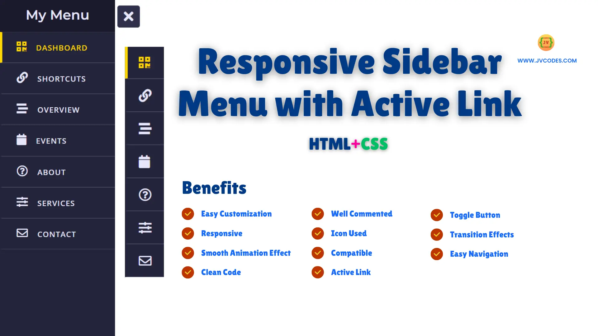
How to create a responsive sidebar menu with an active link effect to fit into today’s web designs? A sidebar menu enables users to explore other parts of a site without removing the main content out of sight. Being responsive, this sidebar suits any screen size, and it is therefore easily navigable on both desktop and mobile devices.
Moreover, having an active link feature means that at all times, the users will be able to have their current page highlighted visibly which will make navigation easier and much more satisfying for the users.
Here I will give you a Free Source Code for Responsive Sidebar Menu with Active Link Using HTML CSS.
GitHub Source: Responsive Sidebar Menu
Features
- Compatibility: This menu structure supports all modern browsers and is optimized for the visual display on different portable devices.
- Clean Code: The code is well commented and very easy to follow even for a person who has little or no knowledge about the programming language.
- Responsive Design: Mobile responsiveness for viewing in desktop and mobile.
- Active Link Highlighting: The current page is displayed with highlight active link color.
- Smooth Transition Effects: It has High fluid animations and swipe for opening & closing.
- Toggle Button: Allows for easy use to open/close the menu.
- Customizable Icons and Text: Provides text support alongside icons to minimize confusion when choosing an option.
Technologies Used
- HTML (Hypertext Markup Language)
- CSS (Cascading Style Sheets)
Recommended for You
- Neumorphism Side Bar Menu
- Sidebar Menu with Sliding Submenu
- Glassmorphism Sidebar Menu
- Responsive Sidebar Menu with Social Media Buttons
- Responsive Sidebar Menu With Dark and Light Mode
Video Tutorial
Steps to Build Sidebar Menu
- Create Project Folder: First of all, you have to organize files so create a new folder where project files will be stored.
- Create index.html: Within your project directory, create an index.html file in which you put the HTML layout for sidebar.
- Create style.css: In the same folder, you should also create style.css file to style and make the sidebar responsive.
- Copy & Paste the Code: In order to set up the sidebar menu copy and paste the source code of index.html and style.css from below.
HTML
Here is the HTML code for your index.html file:
<!DOCTYPE html>
<!-- Created By JV Codes - www.jvcodes.com -->
<html lang="en" dir="ltr">
  <head>
    <meta charset="utf-8">
    <!-- Stylesheet and Font Awesome Icons for Sidebar Menu -->
    <link rel="stylesheet" href="style.css">
    <meta name="viewport" content="width=device-width, initial-scale=1.0">
    <link rel="stylesheet" href="https://cdnjs.cloudflare.com/ajax/libs/font-awesome/5.15.3/css/all.min.css"/>
    <title> Responsive Sidebar Menu with Active Link | JV Codes </title>
</head>
<body>
  <!-- Checkbox for Sidebar Toggle -->
    <input type="checkbox" id="check">
    <label for="check">
      <!-- Icon to Show Menu -->
      <i class="fas fa-bars" id="btn"></i>
      <!-- Icon to Hide Menu -->
      <i class="fas fa-times" id="cancel"></i>
    </label>

    <!-- Sidebar Container -->
    <div class="sidebar">
      <!-- Sidebar Header -->
      <header>My Menu</header>

      <!-- Sidebar Menu Links -->
      <a href="#" class="active">
        <i class="fas fa-qrcode"></i>
        <span>Dashboard</span>
      </a>
      <a href="#">
        <i class="fas fa-link"></i>
        <span>Shortcuts</span>
      </a>
      <a href="#">
        <i class="fas fa-stream"></i>
        <span>Overview</span>
      </a>
      <a href="#">
         <i class="fas fa-calendar"></i>
        <span>Events</span>
      </a>
      <a href="#">
        <i class="far fa-question-circle"></i>
        <span>About</span>
      </a>
      <a href="#">
        <i class="fas fa-sliders-h"></i>
        <span>Services</span>
      </a>
      <a href="#">
        <i class="far fa-envelope"></i>
        <span>Contact</span>
      </a>
</body>
</html>
CSS
Here is the complete code for style.css file to style the sidebar menu:
@import url('https://fonts.googleapis.com/css?family=Montserrat:600|Open+Sans:600&display=swap');

/* Reset and Basic Styling */
* {
  margin: 0;
  padding: 0;
  text-decoration: none;
}

/* Sidebar Container */
.sidebar {
  position: fixed;
  width: 240px;
  left: -240px;
  height: 100%;
  background: #24243a; /* Dark purple-blue */
  transition: all 0.5s ease;
}

/* Sidebar Header */
.sidebar header {
  font-size: 28px;
  color: #E6E6FA; /* Light lavender */
  line-height: 70px;
  text-align: center;
  background: #1a192c; /* Darker shade */
  user-select: none;
  font-family: 'Montserrat', sans-serif;
}

/* Sidebar Links */
.sidebar a {
  display: block;
  height: 65px;
  width: 100%;
  color: #E6E6FA; /* Light lavender */
  line-height: 65px;
  padding-left: 30px;
  box-sizing: border-box;
  border-bottom: 1px solid #4A4A6A; /* Muted divider */
  border-top: 1px solid rgba(255, 255, 255, 0.1);
  border-left: 5px solid transparent;
  font-family: 'Open Sans', sans-serif;
  transition: all 0.5s ease;
}

/* Active and Hover Effect for Links */
a.active, a:hover {
  border-left: 5px solid #FFD700; /* Gold accent */
  color: #FFD700;
}

/* Icons inside Sidebar Links */
.sidebar a i {
  font-size: 23px;
  margin-right: 16px;
}

/* Text Styling for Sidebar Links */
.sidebar a span {
  letter-spacing: 1px;
  text-transform: uppercase;
}

/* Checkbox Toggle for Sidebar */
#check {
  display: none;
}

/* Toggle Button (Open and Close) */
label #btn, label #cancel {
  position: absolute;
  cursor: pointer;
  color: #E6E6FA; /* Light lavender */
  border-radius: 5px;
  border: 1px solid #5A5A7A; /* Darker border */
  margin: 15px 30px;
  font-size: 29px;
  background: #2F2E4A; /* Match header */
  height: 45px;
  width: 45px;
  text-align: center;
  line-height: 45px;
  transition: all 0.5s ease;
}

/* Close Icon Styling */
label #cancel {
  opacity: 0;
  visibility: hidden;
}

/* Sidebar Open State */
#check:checked ~ .sidebar {
  left: 0;
}

/* Toggle Button Transition */
#check:checked ~ label #btn {
  margin-left: 245px;
  opacity: 0;
  visibility: hidden;
}

#check:checked ~ label #cancel {
  margin-left: 245px;
  opacity: 1;
  visibility: visible;
}

/* Sidebar Responsive Adjustments */
@media (max-width: 860px) {
  .sidebar {
    height: auto;
    width: 70px;
    left: 0;
    margin: 100px 0;
  }
  header, #btn, #cancel {
    display: none;
  }
  span {
    position: absolute;
    margin-left: 23px;
    opacity: 0;
    visibility: hidden;
  }
  .sidebar a {
    height: 60px;
  }
  .sidebar a i {
    margin-left: -10px;
  }
  a:hover {
    width: 200px;
    background: inherit;
  }
  .sidebar a:hover span {
    opacity: 1;
    visibility: visible;
  }
}
Download Source Code
From ‘Download Source Code’ button through which you can download this source code. The code is open source and has been release with no copyright so they are freely usable in any other software.
Conclusion
You can apply this Responsive Sidebar Menu with Active Link Using HTML and CSS to enhance the sidebar navigation menu on your websites. Do not forget to credit JV Source Codes and make sure to link this page to your own one.
Don’t forget to subscribe to the channel for more useful code snippets; if you have any questions feel free to post a comment here and I’ll be glad to assist.


