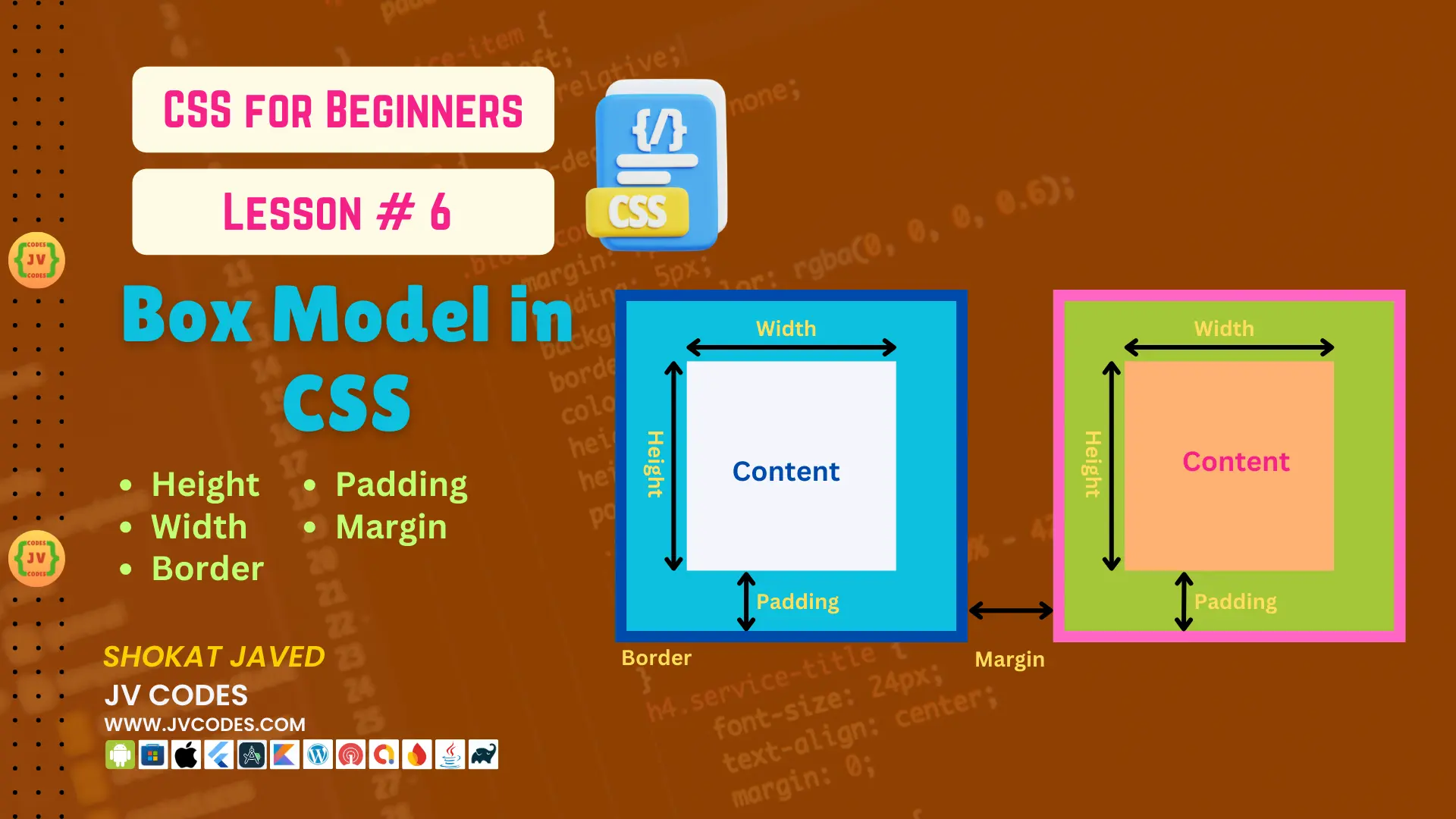
Box Model in CSS | CSS For Beginners | Lesson 6
In CSS, Box Model is an important concept to understand how the size of elements is measured and how space between them is measured on the webpage. All elements in a HTML page are boxes, and CSS Box Model assists in defining the size, borders, padding and margins of those boxes. In this lesson we will look at each of the component of the Box Model and how it affects the positioning of your web page elements.
When you complete this lesson, you’ll know how the height, width, border, padding, and margin properties create the Box Model in CSS and more about the sizing and spacing of elements in CSS.
Want free codes for stunning image sliders? Dive in now!
- Modern Image Slider
- Responsive Image Slider
- Text Overlay Image Slider
- Image Clip Animation Slider
- Image Comparison Slider
What is the CSS Box Model?
The CSS Box Model is a logical model used with the purpose of measuring the amount of space each HTML element occupies. The Box Model consists of four parts:
- Content: The content of the element referring to the actual text or images inside the element.
- Padding: Area between the contact or body of the content and the edge.
- Border: A distance away from the outer edge of the padding of an element that was specified prior to the border of an element.
- Margin: The distance of an element from its boundaries and other elements present in the design.
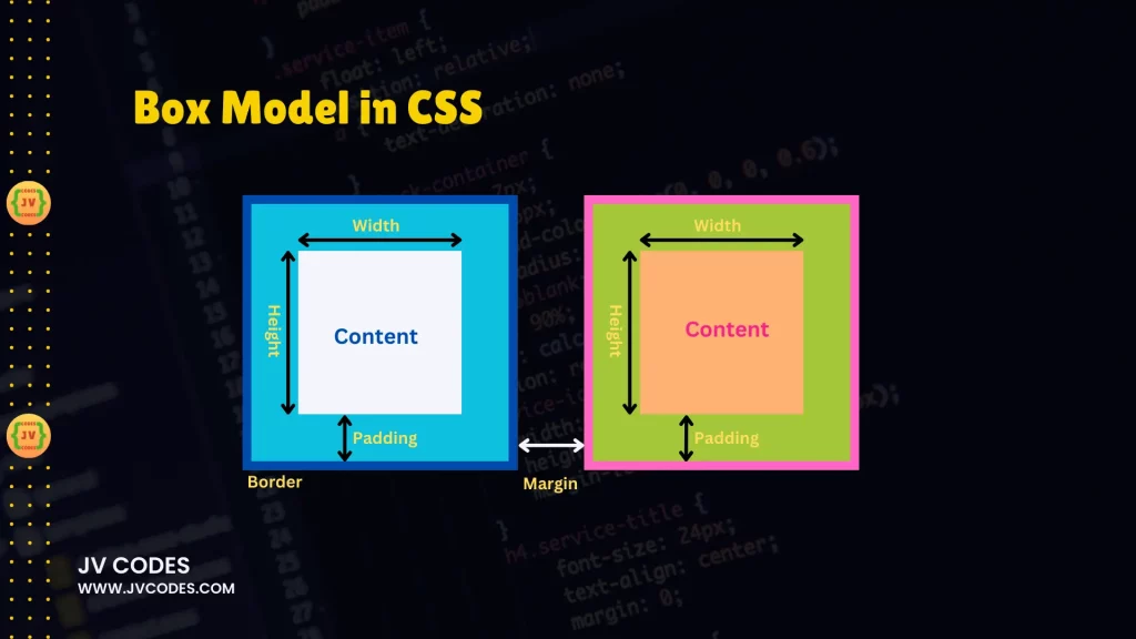
All of these parts have their significant role in defining the appearance of an element on the webpage.
Height and Width in the Box Model
The height and width attributes are used to specify the size of the content area of the box. The content area is the area inside the padding, border, and margin and it is the identifiable space, known to hold text or any other items.
Setting the Width
Height is basically how tall this content area of the box is and width is how wide it is. It does not include padding, border or margin of the HTML elements.
div {
  width: 200px;
}
In this example, the width of the content area is to be 200 pixels. It is important to know that if padding, borders, or margins are put in the total width of an element will be affected.
Setting the Height
Height sets the height of the content area of the box.
div {
  height: 150px;
}
The content will fill up an area of 150 pixel in height. Again, similar to width, padding, border, and margin will add to the overall height.
Border in the Box Model
The border is the line that is drawn around the content and around the padding of the content area of the element. This is especially helpful because it distinguishes the content from other part present on the page. You have the freedom to style your borders in a number of ways; the borders can vary in width, color and type.
Adding a Border
You can control the width, color, and style of the border using the following properties:
- border-width: This determines the size of the border that has to be around the objects.
- border-style: Defines style, which could be line style like ‘solid’, ‘dashed ‘or ‘dotted’.
- border-color: Gets and sets the color of the border.
div {
  width: 200px;
  height: 150px;
  border: 2px solid blue;
}
Here it will be a solid line and blue color of the border and thickness of 2 pixels. This means that the WIDTH of the total element will be 200px+2px (left border) + 2px(Right border) As for the HEIGHT of the total element; it will be 150px + 2px (TOP border) + 2px (bottom border.).
Padding in the Box Model
Padding may be referred to as the space that is between the content and the frame of the element. It offers some spaces between the elements that are contained within a box, hence making it easier to monitor the display of the elements.
For example, padding can make space to views of text and the edges of the box.
Adding Padding
Padding can be applied in all the sides of a box including the top, right, bottom and left sides using the padding property.
div {
  width: 200px;
  height: 150px;
  border: 2px solid blue;
  padding: 10px;
}
In this example, the content in the box will be surrounded by an empty space of 10 pixels of the border. This padding will increase the total size of the element to 200px + 20px (padding on left and right side) for width, and 150px + 20px (padding on top and bottom side) for height.
Padding for Individual Sides
Similarly, you can set the padding for a specific side such as padding-top, padding-right, padding-bottom, and padding-left.
div {
  padding-top: 20px;
  padding-right: 10px;
  padding-bottom: 5px;
  padding-left: 15px;
}
Here, the padding for each side is not equal as it is in the previous examples which give more control in terms of positioning.
Margin in the Box Model
Margin is the space between an element and other elements on a page. Margins assist in establishing space around other items on the page to avoid the content’s overlap.
Adding Margin
The margin property allows you to add margin on all the four sides of the element. You can also set individual sides of the margins.
div {
  width: 200px;
  height: 150px;
  border: 2px solid blue;
  padding: 10px;
  margin: 20px;
}
Here, the element will have a margin of 20px all around. This margin adds space around the element, and this extra space will force elements away from the element.
Margin for Individual Sides
There are also specific properties for setting space above and below the element with margin-top, to the right with margin-right, below with margin-bottom, and to the left with margin-left.
div {
  margin-top: 20px;
  margin-right: 15px;
  margin-bottom: 10px;
  margin-left: 5px;
}
This way, you can have a better control over the distance at the outside of the element.
Conclusion
The CSS Box Model is one of the most important models to be used while designing web layouts of the given web page. The content area is enclosed by padding, border, and margin. Knowing how these four components work will help you manage the spacing and sizing of elements on your page.
- Width and height determine the area that fills the content of the site.
- Borders give the element a physical boundary or frame.
- Padding is used to create space between the content and the layout borders.
- Margins define a distance between the element and other elements located either above, below, on its left or on its right side.
By understanding the Box Model, you will be able to design brilliant and responsive layouts for devices. Play around with the various sorts of padding, borders, and margins to discover how they alter the layouts of your projects, and you’ll be on your way to CSS excellence!
Want free codes for stunning responsive cards? Dive in now!
- Modern Responsive Card
- Glowing Card
- Product Card
- JV Responsive Card Slider
- Product Card With Quick View Popup Effect

