Modern Responsive Card in HTML and CSS
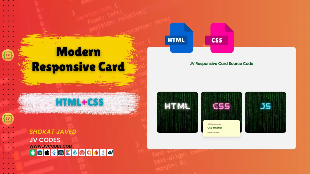
Creating modern, visually appealing designs is essential in today’s web development. As we talk about the design, then the Modern Responsive Card in html css is one of the most widely used items. These cards are versatile, that is why they are suitable for different website and application.
Therefore, in this article, I will present you with the free source codes to develop your own new and modern responsive card. I will guide you on how to build these cards in a very short time and you can use them for WordPress or any other custom HTML based projects.
GitHub Source: Modern Responsive Card
Looking for free source codes for stunning image galleries? Explore these amazing options now!
- 3D Rotating Image Gallery
- Dynamic Image Gallery
- Modern Image Gallery
- Responsive Image Gallery
- Popup Image Gallery
Features
The Modern Responsive Card in HTML has several features that will make it very versatile and essential for any site. Here are some of its key features:
- Fully Responsive: Fully compatible with all the operating systems from Windows and OS X to Android and iOS.
- Lightweight and Fast: Its design was made from as little HTML and CSS as possible in order to load fast.
- Customizable: This feature makes it easy to develop the card according to the colors and fonts of your brand and even the images.
- Compatible with Modern CMS: These cards work with WordPress as well, as with any other custom HTML-based interface.
Technologies Used
The Modern Responsive Card is built using simple, yet powerful technologies:
Video Preview
Here is the preview for card.
Steps to Build Modern Responsive Card
To get started with building the Modern Responsive Card, follow these simple steps:
- Create a Project Folder: Create the project folder name as “Modern Card.”
- Create an Images Folder: In your project directory, make a folder ‘images’ where all of your card’s image will be kept.
- Create index.html: This is where your HTML code will go.
- Create style.css: This file will contain all the styles of your card that include colors, margins and fonts.
To implement code you may need VS Code Installation.
HTML
Here is the HTML code for your index.html file.
<!DOCTYPE html>
<html lang="en">
<head>
    <meta charset="UTF-8">
    <meta name="viewport" content="width=device-width, initial-scale=1.0">
    <link rel="stylesheet" href="styles.css">
    <title>JV Responsive Card - JV Source Codes</title>
</head>
<body>
    <div class="container">
        <h1>JV Responsive Card Source Code</h1>
        <div class="card__container">
            <article class="card__article">
                <img src="images/html.png" alt="image" class="card__img">
                <div class="card__data">
                    <span class="card__description">HTML for Beginners</span>
                    <h2 class="card__title">HTML Tutorial</h2>
                    <a href="https://jvcodes.com/" class="card__button">Free Enrol Now</a>
                </div>
            </article>
            <article class="card__article">
                <img src="images/css.png" alt="image" class="card__img">
                <div class="card__data">
                    <span class="card__description">CSS for Beginners</span>
                    <h2 class="card__title">CSS Tutorial</h2>
                    <a href="https://jvcodes.com/" class="card__button">Free Enrol Now</a>
                </div>
            </article>
            <article class="card__article">
                <img src="images/js.png" alt="image" class="card__img">
                <div class="card__data">
                    <span class="card__description">JS for Beginners</span>
                    <h2 class="card__title">JS Tutorial</h2>
                    <a href="https://jvcodes.com/" class="card__button">Free Enrol Now</a>
                </div>
            </article>
        </div>
    </div>
</body>
</html>
CSS
Here is the complete code for style.css file to style the card.
@import url("https://fonts.googleapis.com/css2?family=Poppins:wght@400;500&display=swap");

* {
  box-sizing: border-box;
  padding: 0;
  margin: 0;
}

body {
  font-family: "Poppins", sans-serif;
  background-color: hsl(0, 0%, 95%);
}

h1 {
  font-size: 2rem;
  font-weight: bold;
  color: hsl(133, 100%, 15%);
  margin-bottom: 2rem;
  text-align:center;
}

img {
  display: block;
  max-width: 100%;
  height: auto;
}

.container {
  display: grid;
  place-items: center;
  margin-inline: 1.5rem;
  padding-block: 5rem;
}

.card__container {
  display: grid;
  row-gap: 3.5rem;
}

.card__article {
  position: relative;
  overflow: hidden;
  border-radius: 1.5rem; /* Ensures the container has rounded corners */
}

.card__img {
  width: 100%;
  height: auto;
  border-radius: 1.5rem; /* Keeps the image rounded */
  transition: transform 0.5s ease-in-out, filter 0.5s ease-in-out, border-radius 0.5s ease-out;
}

.card__img:hover {
  transform: scale(1.03); /* Slight zoom-in effect */
  filter: grayscale(100%);
  border-radius: 1.5rem; /* Keeps the image rounded during hover */
}

.card__data {
  width: 280px;
  background-color: hsl(59, 100%, 91%);
  padding: 1.5rem 2rem;
  box-shadow: 0 8px 24px hsla(0, 0%, 0%, .15);
  border-radius: 1rem;
  position: absolute;
  bottom: -9rem;
  left: 0;
  right: 0;
  margin-inline: auto;
  opacity: 0;
  transition: opacity 1s 1s;
}

.card__description {
  display: block;
  font-size: .813rem;
  margin-bottom: .25rem;
  font-style: italic;
}

.card__title {
  font-size: 1.25rem;
  font-weight: 500;
  color: hsl(133, 100%, 15%);
  font-weight: bold;
  margin-bottom: .75rem;
}

.card__button {
  text-decoration: none;
  font-size: .813rem;
  font-weight: 500;
  color: hsl(0, 0%, 9%);
}

.card__button:hover {
  text-decoration: underline;
  color: rgb(255, 85, 113);
  font-weight: bold;
}

.card__article:hover .card__data {
  animation: show-data 1s forwards;
  opacity: 1;
  transition: opacity .3s;
}

.card__article:hover {
  animation: remove-overflow 2s forwards;
}

.card__article:not(:hover) {
  animation: show-overflow 2s forwards;
}

.card__article:not(:hover) .card__data {
  animation: remove-data 1s forwards;
}

@keyframes show-data {
  50% {
    transform: translateY(-10rem);
  }
  100% {
    transform: translateY(-7rem);
  }
}

@keyframes remove-overflow {
  to {
    overflow: initial;
  }
}

@keyframes remove-data {
  0% {
    transform: translateY(-7rem);
  }
  50% {
    transform: translateY(-10rem);
  }
  100% {
    transform: translateY(.5rem);
  }
}

@keyframes show-overflow {
  0% {
    overflow: initial;
    pointer-events: none;
  }
  50% {
    overflow: hidden;
  }
}

@media screen and (max-width: 340px) {
  .container {
    margin-inline: 1rem;
  }

  .card__data {
    width: 250px;
    padding: 1rem;
  }
}

@media screen and (min-width: 768px) {
  .card__container {
    grid-template-columns: repeat(2, 1fr);
    column-gap: 1.5rem;
  }
}

@media screen and (min-width: 1120px) {
  .container {
    height: 100vh;
  }

  .card__container {
    grid-template-columns: repeat(3, 1fr);
  }

  .card__img {
    width: 348px;
  }

  .card__data {
    width: 316px;
    padding-inline: 2.5rem;
  }
}
Download Source Code
Below is the button where you can download the complete source code of the Modern Responsive Card in HTML CSS format. This means that the code is open source and does not contain copyrights so it can be altered and used in other projects.
Conclusion
The Modern Responsive Card in HTML, CSS is a great tool for the web designers who want to give an improved new look to their websites. It is versatile enough to be used to build personal portfolio, online store, and corporate site and can easily be fit and modified to suit your needs.
You may use this code in your websites and kindly credit JV Source Codes. And finally subscribe to my channel for more web development tutorials.
If you have any queries regarding the use of the card, please leave a comment below this post and I shall reply as soon as I can. Also, please feel free to give suggestions for the improvements of the card – your comments would be more than welcome.


Wow, this modern responsive card design is absolutely brilliant! It’s exactly what I’ve been trying to build for my portfolio. The explanation is super clear and the provided source code makes it incredibly easy to use. Fantastic work, jvcodes!
This modern responsive card design is absolutely fantastic! Exactly what I was looking for.