Responsive Image Gallery in HTML and CSS
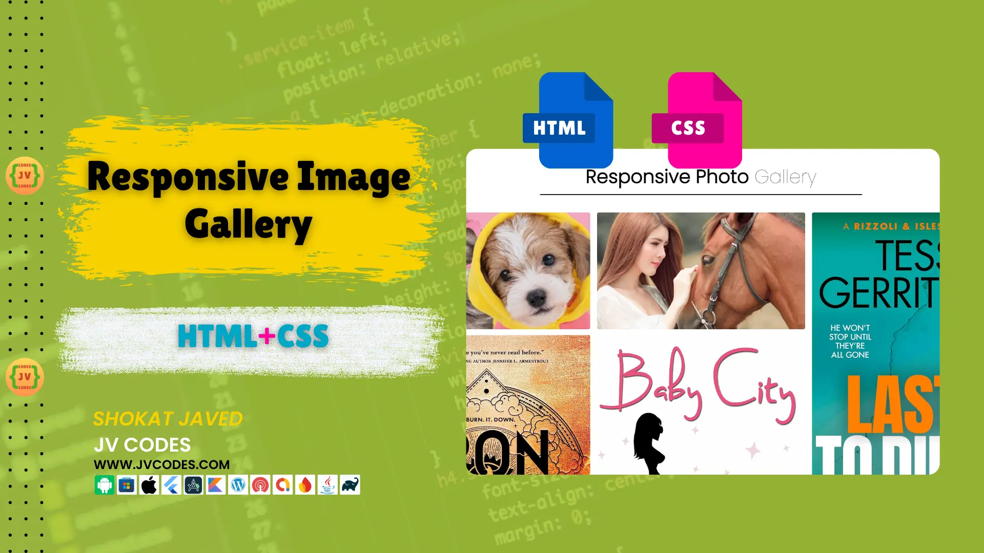
If the image gallery could be effectively implemented into the website, it can greatly improve the usability and visual appeal of a website. That’s why I have written this article on the Responsive Image Gallery in HTML & CSS, to make you understand how it works.
GitHub Source: Responsive Image Gallery
To help you better, here are free source codes for this gallery with great UI adaptability across different screen sizes. This tutorial will be useful for both the newbies and the professional web developers who want to add an elegant and mobile friendly gallery to their site.
Want free codes for stunning image sliders? Dive in now!
- Modern Image Slider
- Responsive Image Slider
- Text Overlay Image Slider
- Image Clip Animation Slider
- Image Comparison Slider
Features
The Responsive Image Gallery in HTML and CSS comes with useful features that make it an ideal choice for any website:
- Responsive Design: There is no difference between the viewing experience when it is displayed on a large screen or the small window of a workspace with multiple windows.
- Hover Effects: The images in the gallery are conveyed with pleasant smooth hover effects like grayscale conversion and a little zoom adding a dynamic spark on the UI.
- Flexible Layout: The gallery has been created using Flexbox where one is able to set the arrangement of images in the layout easily.
- Cross-Browser Compatibility: The gallery is compatible with all major browsers.
Technologies Used
The Responsive Image Gallery in HTML and CSS is built using the following technologies:
- HTML
- CSS
Video Preview
Here is the video preview of image gallery:
Steps to Build Responsive Image Gallery
In HTML and CSS building the Responsive Image Gallery is not a tough task as shown below. Follow these simple steps:
- Create a folder: Let’s name it Image Gallery.
- Create an images folder: Also within that Image Gallery folder, create another folder named images and place your images in this folder.
- Create index.html: It will consist of this HTML structure that will form the gallery of the program.
- Create style.css: This file will contain CSS styles which would be necessary in order to make the gallery to be responsive and stylish.
To implement code you may need VS Code Installation.
HTML
Here is the HTML code for your index.html file.
<!DOCTYPE html>
<html lang="en">
<head>
  <meta charset="UTF-8">
  <meta name="viewport" content="width=device-width, initial-scale=1.0">
  <title>Responsive Image Gallery - JV Codes</title>
  <link rel="stylesheet" type="text/css" href="style.css">
</head>
<body>
  <div class="container">
    <div class="heading">
      <h3>Responsive Photo <span>Gallery</span></h3>
    </div>
    <div class="box">
      <div class="dream">
        <img src="images/image1.jpg" alt="Image 1">
        <img src="images/image2.webp" alt="Image 2">
        <img src="images/image3.webp" alt="Image 3">
        <img src="images/image4.jpg" alt="Image 4">
        <img src="images/image5.jpg" alt="Image 5">
        <img src="images/image6.jpg" alt="Image 6">
      </div>

      <div class="dream">
        <img src="images/image7.jpg" alt="Image 7">
        <img src="images/image8.webp" alt="Image 8">
        <img src="images/image9.jpg" alt="Image 9">
        <img src="images/image10.jpg" alt="Image 10">
        <img src="images/image11.jpg" alt="Image 11">
        <img src="images/image12.jpg" alt="Image 12">
      </div>

      <div class="dream">
        <img src="images/image13.jpg" alt="Image 13">
        <img src="images/image14.jpg" alt="Image 14">
        <img src="images/image15.jpg" alt="Image 15">
        <img src="images/image16.jpg" alt="Image 16">
        <img src="images/image17.jpg" alt="Image 17">
        <img src="images/image18.jpg" alt="Image 18">
      </div>
    </div>
  </div>
</body>
</html>
CSS
Specified CSS code to the Responsive Image Gallery makes gallery amazing on all devices. Here’s the CSS:
@import url('https://fonts.googleapis.com/css2?family=Poppins:wght@100;200;300&display=swap');

/* Global Styles */
* {
  margin: 0;
  padding: 0;
  box-sizing: border-box;
  font-family: 'Poppins', sans-serif;
}

/* Container Styling */
.container {
  display: flex;
  flex-direction: column;
  justify-content: center;
  align-items: center;
  text-align: center;
  margin: 40px 20px 0 20px;
}

/* Heading Styling */
.container .heading {
  width: 50%;
  padding-bottom: 50px;
}

.container .heading h3 {
  font-size: 3.4em;
  font-weight: bolder;
  padding-bottom: 10px;
  border-bottom: 3px solid #222;
}

.container .heading h3 span {
  font-weight: 100;
}

/* Box Layout for Image Columns */
.container .box {
  display: flex;
  flex-wrap: wrap; /* Allows items to wrap to the next line */
  justify-content: space-between;
  width: 100%;
  margin: -10px; /* Adjust for added margins on children */
}

/* Dream Section Styling for Individual Columns */
.container .box .dream {
  flex: 1 1 calc(33.33% - 20px); /* 3 columns layout with equal margins */
  margin: 10px; /* Equal margin on all sides */
}

/* Image Styling */
.container .box .dream img {
  width: 100%;
  border-radius: 5px;
  margin-bottom: 10px; /* Margin below each image */
  transition: transform 0.8s, filter 0.8s; /* Smooth transition for the effect */
}

/* Hover effect for images */
.container .box .dream img:hover {
  filter: grayscale(1);             /* Convert image to grayscale */
  transform: scale(1.01);           /* Slightly enlarge the image */
}

/* Button Styling */
.container .btn {
  margin: 40px 0 70px 0;
  background: #222;
  padding: 15px 40px;
  border-radius: 5px;
  color: #fff;
  font-size: 1.2em;
  text-decoration: none;
  font-weight: bolder;
  letter-spacing: 3px;
}

/* Responsive Design */

/* Tablets (2 columns) */
@media only screen and (max-width: 1024px) {
  .container .box .dream {
    flex: 1 1 calc(50% - 20px); /* Adjust to 2 columns with equal margins */
  }

  .container .heading {
    width: 100%; /* Full-width heading on smaller screens */
  }

  .container .heading h3 {
    font-size: 2.2em; /* Adjust heading size for tablets */
  }
}

/* Mobile (1 column) */
@media only screen and (max-width: 640px) {
  .container .box {
    flex-direction: column; /* Stack columns vertically */
    margin: 0; /* Reset container margin for single column */
  }

  .container .box .dream {
    flex: 1 1 100%; /* Full width for single column */
    margin: 10px 0; /* Vertical margin only */
  }

  .container .heading {
    width: 100%; /* Full-width heading */
  }

  .container .heading h3 {
    font-size: 1.7em; /* Adjust heading size for mobile */
  }
}
Download Source Code
There is free source code for the Responsive Image Gallery available in HTML along with CSS. The code provided here is in the public domain, meaning that you are free to utilize and adapt it as you wish for your own purposes.
Conclusion
Responsive Image Gallery in HTML & CSS is one of the best and easy ways to present images in your website. Following the steps outlined in this guide you’ll be able to incorporate this gallery into your site adding both beauty and functionality to your project.
In case you gained something out of this tutorial, as a form of appreciation feel free to link back to JV Source Codes. For more tutorials, remember to click on the subscribe button, and if you have any suggestions or questions, please leave your comments here as I will gladly get back to you.





This tutorial on building a responsive image gallery is absolutely fantastic! The clear steps and the provided source code make it super easy to follow, even for someone who’s still learning like me. I especially love the hover effects and the flexible Flexbox layout—it really makes a huge difference for modern web design. Thanks so much for sharing these valuable resources, jvcodes!
This is a fantastic guide! Is there a simple way to implement a lightbox effect for clicking on images?