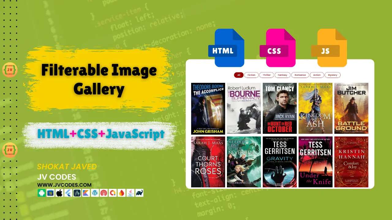
Responsive Filterable Image Gallery in HTML, CSS and JavaScript
In this article, I’m excited to provide you the Responsive Filterable Image Gallery in HTML, CSS, and JavaScript free source codes. This script provides a complete image filtering based on the categories and is really suitable for those who need a simple and searchable gallery in the website.
GitHub Source: Responsive Filterable Image Gallery
This tutorial will assist you in designing the modern appealing gallery that is equally good on all the platforms.
Features
The Filterable Image Gallery comes with several features that make it a fantastic addition to any website. Here are some of the key features:
- Filterable Categories: Users can organize pictures as per category, which makes the content management quite easy and provides the best experience to the user.
- Fully Responsive Design: It is mobile friendly and responsive which means that it can work on different screen sizes and resolutions.
- Smooth Hover Effects: Over images, there are wonderful hover animations giving some interactivity when people navigate through the pictures.
- Compatible with All Modern CMS: This image gallery can be used with any content management system including WordPress, Joomla, and the custom HTML developments.
Technologies Used
The following programming languages and technologies are used to create the Responsive Filterable Image Gallery:
- HTML (Hyper Text Markup Language)
- CSS (Cascading Style Sheets)
- JS (JavaScript)
Video Preview
You can watch a video tutorial for the Responsive Filterable Image Gallery to understand how it’s built and see how the filtering functionality works.
Steps to Build Card
Here are the simple steps to create your own Responsive Image Gallery in HTML:
- Create a Project Folder: The first step is to establish a folder in which all the project data will be stored.
- Create an Images Folder: In the root folder of the project, create a subfolder, ‘images,’ where all the images that are going to appear in the gallery will be stored.
- Create index.html: Open the project folder and then create a new file known as index.html, and will contain the structural design of the picture gallery.
- Create style.css: After that, make a style.css file to style your gallery: layout, for responsive, and hover effects.
- Create script.js: Last of all write the filter code for selecting images of particular category in a script.js file.
Following these steps, you’ll be able to build a fully functional and responsive filterable image gallery that is easy to customize and integrate into any website.
HTML
Here is the HTML code for your index.html file.
<!DOCTYPE html>
<html lang="en">
<head>
  <meta charset="UTF-8">
  <meta name="viewport" content="width=device-width, initial-scale=1.0">
  <title>Filterable Image Gallery | JV Source Codes</title>
    <link rel="stylesheet" href="style.css">
    <script src="https://kit.fontawesome.com/a076d05399.js"></script>
    <link rel="stylesheet" href="https://cdnjs.cloudflare.com/ajax/libs/font-awesome/5.15.4/css/all.min.css">
</head>
<body>
  <div class="wrapper">
    <!-- filter Items -->
    <nav>
      <div class="items">
        <span class="item active" data-name="all">All</span>
        <span class="item" data-name="fiction">Fiction</span>
        <span class="item" data-name="thriller">Thriller</span>
        <span class="item" data-name="fantasy">Fantasy</span>
        <span class="item" data-name="romance">Romance</span>
        <span class="item" data-name="action">Action</span>
        <span class="item" data-name="mystery">Mystery</span>
      </div>
    </nav>
    <!-- filter Images -->
    <div class="gallery">
      <div class="image" data-name="action"><span><img src="images/Action1.jpg" alt=""></span></div>
      <div class="image" data-name="action"><span><img src="images/action2.jpg" alt=""></span></div>
      <div class="image" data-name="action"><span><img src="images/action3.jpg" alt=""></span></div>
      <div class="image" data-name="fantasy"><span><img src="images/fantacy1.webp" alt=""></span></div>
      <div class="image" data-name="fantasy"><span><img src="images/fantasy2.jpg" alt=""></span></div>
      <div class="image" data-name="fantasy"><span><img src="images/fantasy3.webp" alt=""></span></div>
      <div class="image" data-name="fantasy"><span><img src="images/fantasy4.webp" alt=""></span></div>
      <div class="image" data-name="fiction"><span><img src="images/fiction1.webp" alt=""></span></div>
      <div class="image" data-name="fiction"><span><img src="images/fiction2.webp" alt=""></span></div>
      <div class="image" data-name="fiction"><span><img src="images/fiction3.webp" alt=""></span></div>
      <div class="image" data-name="fiction"><span><img src="images/fiction4.webp" alt=""></span></div>
      <div class="image" data-name="fiction"><span><img src="images/fiction5.webp" alt=""></span></div>
      <div class="image" data-name="mystery"><span><img src="images/mystery1.jpg" alt=""></span></div>
      <div class="image" data-name="mystery"><span><img src="images/mystery2.jpg" alt=""></span></div>
      <div class="image" data-name="romance"><span><img src="images/Romance1.webp" alt=""></span></div>
      <div class="image" data-name="thriller"><span><img src="images/thriller1.webp" alt=""></span></div>
    </div>
  </div>
  <!-- fullscreen img preview box -->
  <div class="preview-box">
    <div class="details">
      <span class="title">Image Category: <p></p></span>
      <span class="icon fas fa-times"></span>
    </div>
    <div class="image-box"><img src="" alt=""></div>
  </div>
  <div class="shadow"></div>

  <script src="script.js"></script>
</body>
</html>
CSS
Here is the complete code for style.css file to style the gallery.
@import url('https://fonts.googleapis.com/css2?family=Poppins:wght@200;300;400;500;600;700&display=swap');
*{
  margin: 0;
  padding: 0;
  box-sizing: border-box;
  font-family: 'Poppins', sans-serif;
}
::selection{
  color: #fff;
  background: #007bff;
}
body{
  padding: 10px;
}
.wrapper{
  margin: 100px auto;
  max-width: 1400px;
}
.wrapper nav{
  display: flex;
  justify-content: center;
}
.wrapper .items{
  display: flex;
  max-width: 720px;
  width: 100%;
  justify-content: space-between;
}
.items span{
  padding: 7px 25px;
  font-size: 18px;
  font-weight: 500;
  cursor: pointer;
  color: #970101;
  border-radius: 50px;
  border: 2px solid #970101;
  transition: all 0.3s ease;
  margin: 3px;
}
.items span.active,
.items span:hover{
  color: #fff;
  background: #970101;
}

.gallery{
  display: flex;
  flex-wrap: wrap;
  margin-top: 30px;
}
.gallery .image{
  width: calc(100% / 5);
  padding: 7px;
}
.gallery .image span{
  display: flex;
  width: 100%;
  overflow: hidden;
}
.gallery .image img{
  width: 100%;
  vertical-align: middle;
  transition: all 0.3s ease;
}
.gallery .image:hover img{
  transform: scale(1.1);
}
.gallery .image.hide{
  display: none;
}
.gallery .image.show{
  animation: animate 0.4s ease;
}
@keyframes animate {
  0%{
    transform: scale(0.5);
  }
  100%{
    transform: scale(1);
  }
}

.preview-box{
  position: fixed;
  top: 50%;
  left: 50%;
  transform: translate(-50%, -50%) scale(0.9);
  background: #fff;
  max-width: 700px;
  width: 100%;
  z-index: 5;
  opacity: 0;
  pointer-events: none;
  border-radius: 3px;
  padding: 0 5px 5px 5px;
  box-shadow: 0px 0px 15px rgba(0,0,0,0.2);
}
.preview-box.show{
  opacity: 1;
  pointer-events: auto;
  transform: translate(-50%, -50%) scale(1);
  transition: all 0.3s ease;
}
.preview-box .details{
  padding: 13px 15px 13px 10px;
  display: flex;
  align-items: center;
  justify-content: space-between;
}
.details .title{
  display: flex;
  font-size: 18px;
  font-weight: 400;
}
.details .title p{
  font-weight: 500;
  margin-left: 5px;
}
.details .icon{
  color: #007bff;
  font-style: 22px;
  cursor: pointer;
}
.preview-box .image-box{
  width: 100%;
  display: flex;
}
.image-box img{
  width: 100%;
  border-radius: 0 0 3px 3px;
}
.shadow{
  position: fixed;
  left: 0;
  top: 0;
  height: 100%;
  width: 100%;
  z-index: 2;
  display: none;
  background: rgba(0,0,0,0.4);
}
.shadow.show{
  display: block;
}

@media (max-width: 1000px) {
  .gallery .image{
    width: calc(100% / 3);
  }
}
@media (max-width: 800px) {
  .gallery .image{
    width: calc(100% / 2);
  }
}
@media (max-width: 700px) {
  .wrapper nav .items{
    max-width: 600px;
  }
  nav .items span{
    padding: 7px 15px;
  }
}
@media (max-width: 600px) {
  .wrapper{
    margin: 30px auto;
  }
  .wrapper nav .items{
    flex-wrap: wrap;
    justify-content: center;
  }
  nav .items span{
    margin: 5px;
  }
  .gallery .image{
    width: 100%;
  }
}
JavaScript
Here is the complete code for script.js file to function the filterable gallery.
const filterItem = document.querySelector(".items");
const filterImg = document.querySelectorAll(".gallery .image");

window.onload = ()=>{
  filterItem.onclick = (selectedItem)=>{
    if(selectedItem.target.classList.contains("item")){
      filterItem.querySelector(".active").classList.remove("active");
      selectedItem.target.classList.add("active");
      let filterName = selectedItem.target.getAttribute("data-name");
      filterImg.forEach((image) => {
        let filterImges = image.getAttribute("data-name");
        if((filterImges == filterName) || (filterName == "all")){
          image.classList.remove("hide");
          image.classList.add("show");
        }else{
          image.classList.add("hide");
          image.classList.remove("show");
        }
      });
    }
  }
  for (let i = 0; i < filterImg.length; i++) {
    filterImg[i].setAttribute("onclick", "preview(this)");
  }
}

const previewBox = document.querySelector(".preview-box"),
categoryName = previewBox.querySelector(".title p"),
previewImg = previewBox.querySelector("img"),
closeIcon = previewBox.querySelector(".icon"),
shadow = document.querySelector(".shadow");

function preview(element){

  document.querySelector("body").style.overflow = "hidden";
  let selectedPrevImg = element.querySelector("img").src;
  let selectedImgCategory = element.getAttribute("data-name");
  previewImg.src = selectedPrevImg;
  categoryName.textContent = selectedImgCategory;
  previewBox.classList.add("show");
  shadow.classList.add("show");
  closeIcon.onclick = ()=>{
    previewBox.classList.remove("show");
    shadow.classList.remove("show");
    document.querySelector("body").style.overflow = "auto";
  }
}
Download Source Code
The Filterable Gallery source code can be downloaded from the button below, which you can use without any copyright restrictions. You can get all the HTML, CSS, JavaScript and image files and use them in your projects.
Also Get Full Source Code for Google Drive Direct Download Link Generator Tool
Conclusion
The Responsive Filterable Image Gallery in HTML, CSS, and JavaScript is an excellent solution for showcasing images on your website in a modern and interactive way. One of its strong points has to do with the fact that the gallery layout is versatile, and the filtering by categories makes the search more precise.
You are allowed to use this code on your site and remember to acknowledge JV Source Codes by following the link to this article. If you face any issue or have feedback, use the comments section below and I will be happy to help.
I also would like you to watch my channel to get more tutorials and source code projects. Thank you!

