Infinite Autoplay Slider in HTML and CSS
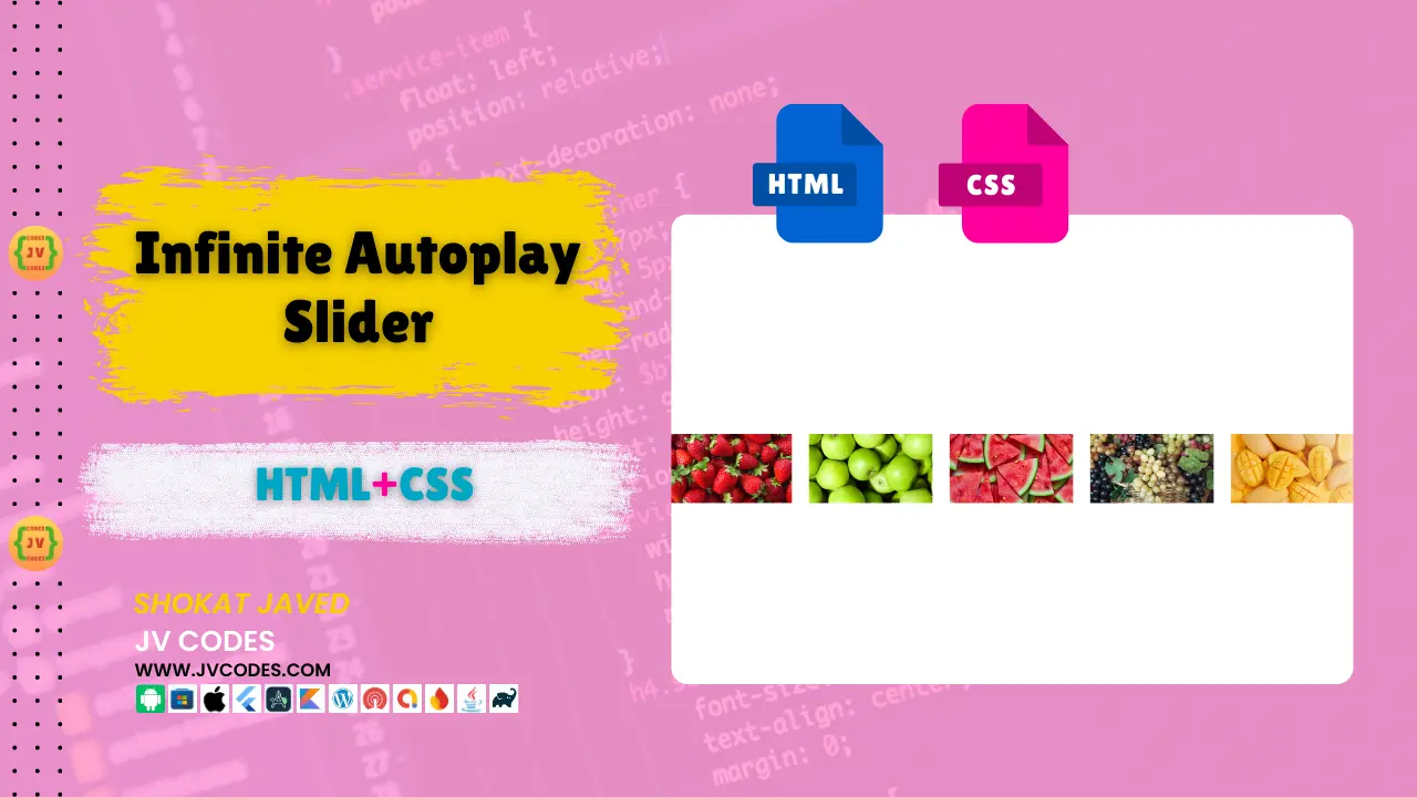
Here in this article, you will come to know about the creation of the Infinite Autoplay Slider in HTML, CSS with free source codes. If you were searching for a smooth and continuous slider which required no input and played in a loop then this is definitely the perfect fix for you.
GitHub Source: Infinite Autoplay Slider
I am writing this article to allow the developers and web designers to use this slider on their sites without licenses or copyrights. Also, it works well across various platforms like WordPress, a custom HTML or another CMS.
It is open-source and can be downloaded from the here free of cost.
Also Check: Smooth Image Slider
Features
Here are some key features:
- Infinite Looping: When in operation, the slider moves from one slide to the other continuously until it gets to the end of the slides; it then jumps to the first slide and starts all over, thereby creating a ‘rolling’ effect.
- Responsive Design: It is fully responsive for the Smartphone, tablets, and PCs’ screens since it changes its option according to the different display sizes.
- Hover Pause: If the user has placed the slider, it stops automatically when the user is hovering on the image and the users has the option to see the images.
- Compatible with All Modern CMS: This slider is smooth to integrate to all the content management systems; WordPress, Joomla, and HTML sites that are created from scratch.
Want free codes for stunning image sliders? Dive in now!
- Modern Image Slider
- Responsive Image Slider
- Text Overlay Image Slider
- Image Clip Animation Slider
- Image Comparison Slider
Technologies Used
- HTML (HyperText Markup Language)
- CSS (Cascading Style Sheets)
Video Preview
Steps to Build Card
Creating the Infinite Autoplay Slider in HTML CSS is easy, and you can achieve this in a few steps.
- Create a Project Folder: Let’s begin and make a new directory in which all the files for the creation of the slider will be located.
- Create an Images Folder: Into this folder, create one sub-folder named ‘images’ this is where we shall upload the images to be used in the slider.
- Create an index.html File: For your development, create an HTML file in your project folder called index.html. This will be the main file for your slider and you need to make changes in this file only When you want to update your website slider.
- Create a style.css File: Next, create a CSS file with the name style.css. Save your stylings in this file for looking your slider professional & responsive.
HTML
Here is the HTML code for your index.html file.
<!DOCTYPE html>
<html lang="en">

<head>
    <!-- Meta Tags for Character Encoding and Responsiveness -->
    <meta charset="UTF-8">
    <meta name="viewport" content="width=device-width, initial-scale=1.0">

    <link rel="stylesheet" href="style.css">

    <!-- Page Title -->
    <title>Infinite Autoplay Slider</title>
</head>

<body>
    <!-- Slider Container -->
    <div class="slider">

        <!-- Slide Track (Container for Slide Items) -->
        <div class="slide-track">

            <!-- First Set of 9 Slides -->
            <div class="slide">
                <img src="./images/image-1.jpg" alt="Slide 1">
            </div>
            <div class="slide">
                <img src="./images/image-2.jpg" alt="Slide 2">
            </div>
            <div class="slide">
                <img src="./images/image-3.jpg" alt="Slide 3">
            </div>
            <div class="slide">
                <img src="./images/image-4.jpg" alt="Slide 4">
            </div>
            <div class="slide">
                <img src="./images/image-5.jpg" alt="Slide 5">
            </div>
            <div class="slide">
                <img src="./images/image-6.jpg" alt="Slide 6">
            </div>
            <div class="slide">
                <img src="./images/image-1.jpg" alt="Slide 7 (Duplicate of Slide 1)">
            </div>
            <div class="slide">
                <img src="./images/image-2.jpg" alt="Slide 8 (Duplicate of Slide 2)">
            </div>
            <div class="slide">
                <img src="./images/image-3.jpg" alt="Slide 9 (Duplicate of Slide 3)">
            </div>

            <!-- Second Set of 9 Slides -->
            <div class="slide">
                <img src="./images/img1.jpg" alt="Slide 10">
            </div>
            <div class="slide">
                <img src="./images/img2.jpg" alt="Slide 11">
            </div>
            <div class="slide">
                <img src="./images/img3.jpg" alt="Slide 12">
            </div>
            <div class="slide">
                <img src="./images/img4.jpg" alt="Slide 13">
            </div>
            <div class="slide">
                <img src="./images/img5.jpg" alt="Slide 14">
            </div>
            <div class="slide">
                <img src="./images/img6.jpg" alt="Slide 15">
            </div>
            <div class="slide">
                <img src="./images/img7.jpg" alt="Slide 16">
            </div>
            <div class="slide">
                <img src="./images/img8.jpg" alt="Slide 17">
            </div>
            <div class="slide">
                <img src="./images/img9.jpg" alt="Slide 18">
            </div>

        </div> <!-- End of Slide Track -->

    </div> <!-- End of Slider Container -->
</body>

</html>
CSS
Here is the complete code for style.css file to style the slider.
/* Body Styling: Center content vertically and horizontally */
body {
    min-height: 100vh; /* Ensures the body takes up the full height of the viewport */
    display: grid; /* Uses grid layout to center content */
    place-items: center; /* Centers content horizontally and vertically */
}

/* Slider Container: Positioned in the center, with hidden overflow to manage the slide track */
.slider {
    height: 250px;
    margin: auto;
    position: relative;
    width: 90%;
    display: grid;
    place-items: center;
    overflow: hidden; /* Hides any overflowing content (from sliding images) */
}

/* Slide Track: Holds all the slides in a horizontal row and applies an infinite scroll animation */
.slide-track {
    display: flex; /* Aligns slides in a row */
    width: calc(250px * 18); /* ⧉Sets the total width based on the number of slides */
    animation: scroll 40s linear infinite; /* Infinite horizontal scroll animation */
}

/* Pause the animation when the user hovers over the slider */
.slide-track:hover {
    animation-play-state: paused; /* Pauses animation on hover */
}

/* Scroll Animation: Moves the slides from right to left */
@keyframes scroll {
    0% {
        transform: translateX(0); /* Initial position */
    }
    100% {
        transform: translateX(calc(-250px * 9)); /* Moves the slides left by 9 slide widths */
    }
}

/* Slide Styling: Ensures consistent slide size and centers the images */
.slide {
    height: 200px;
    width: 250px;
    display: flex;
    align-items: center; /* Centers the image vertically */
    padding: 15px;
    perspective: 100px; /* Adds a 3D perspective for hover effects */
}

/* Image Styling: Ensure images fill the slide, and adds hover effect */
img {
    width: 100%; /* Ensures the image fills the entire slide */
    transition: transform 1s; /* Smooth transition for hover effect */
}

/* Hover Effect: Slight 3D zoom effect on image hover */
img:hover {
    transform: translateZ(20px); /* Moves the image slightly forward */
}

/* Gradient Shadows: Creates gradient overlays on both sides of the slider for a shadow effect */
.slider::before,
.slider::after {
    background: linear-gradient(to right, rgba(255, 255, 255, 1) 0%, rgba(255, 255, 255, 0) 100%);
    content: '';
    height: 100%;
    position: absolute;
    width: 15%;
    z-index: 2; /* Ensures the shadows stay on top of the images */
}

/* Left-side Gradient Shadow */
.slider::before {
    left: 0;
    top: 0;
}

/* Right-side Gradient Shadow (rotated) */
.slider::after {
    right: 0;
    top: 0;
    transform: rotateZ(180deg); /* Rotates the gradient shadow for the right side */
}
Download Source Code
Infinite Autoplay Slider is free and can be downloaded from button below. The zip folder contains the images, html file and css file.
Conclusion
In my opinion, the Infinite Autoplay Slider in HTML, CSS is an extremely useful tool in turning your website visitors’ experience. It’s responsive, modern, and simple, which means that it can be adapted to any website.
You can also use this code in any of your projects without paying anything but make sure to acknowledge JV Source Codes by providing a link to this article.
In case you have any questions or face any problems, feel free to comment below this post and I will gladly help you.
I also encourage you to subscribe to my YouTube channel (JV Codes) for more tutorials and source codes.
Want free codes for stunning responsive cards? Dive in now!
- Modern Responsive Card
- Glowing Card
- Product Card
- JV Responsive Card Slider
- Product Card With Quick View Popup Effect

