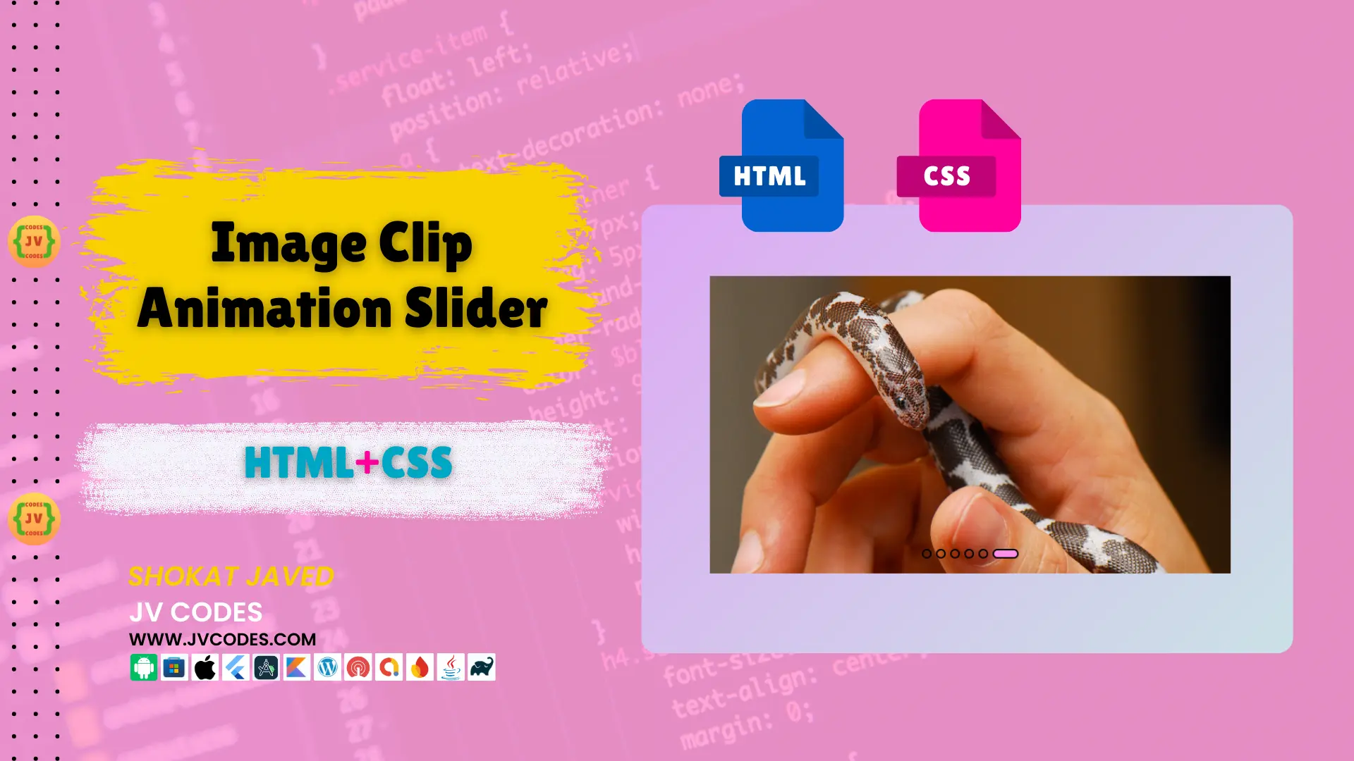
Image Clip Animation Slider in HTML and CSS
Do you have a desire to expand the opportunities of a stylish and dynamic website image slider? Look no further! In this article, we will discuss the Image Clip Animation Slider, using HTML & CSS. This image slider offers the audiences a clipping animation effect to enhance the look of your desired images.
Check out the details and read the further guide to reveal its function, and the ways to optimize the usage of this great slider.
Looking for free source codes for stunning image galleries? Explore these amazing options now!
- 3D Rotating Image Gallery
- Dynamic Image Gallery
- Modern Image Gallery
- Responsive Image Gallery
- Popup Image Gallery
Features
The Image Clip Animation Slider offers several features:
- Clip Animation Effect: Images move from one to the other with a smooth clip animation added to the flare of your website.
- Responsive Design: It smoothly ranges from big screens to small and; therefore, offers the best appearance on both large desktop and small mobile views.
- Easy Integration: Integrates with any modern CMS, WordPress, and any other CMS that uses HTML as the basis of the front-end management interface.
- Simple Setup: Source code can be easily adjusted and it is possible to implement it into the projects rapidly.
Technologies Used
To build the Image Clip Animation Slider, you will use the following technologies:
- HTML
- CSS
Video Preview
Here’s a brief video preview showcasing the Image Clip Animation Slider in HTML, CSS:
Steps to Build Image Slider
It is easy to develop your own Image Clip Animation Slider. Follow these steps to get started:
- Create a Folder: To begin, create a new folder which you will call Image Slider.
- Add an Images Folder: In the folder Image Slider , make another folder images where all the image files are to be stored.
- Create index.html: This file will contain the HTML code of your page that concern the construction of the slider.
- Create style.css: This file will contain the CSS rules that will help to create the looks and the behavior of your slider.
To implement code you may need VS Code Installation.
HTML
Here is the HTML code for your index.html file.
<!DOCTYPE html>
<!-- Source Code from JV Codes -->
<html lang="en" dir="ltr">

  <head>
    <!-- Character encoding for the document -->
    <meta charset="utf-8">
    <!-- Title of the webpage -->
    <title>Image Clip Animation | CodingNepal</title>
    <!-- Linking the external CSS stylesheet -->
    <link rel="stylesheet" href="style.css">
  </head>

  <body>
    <!-- Main container for the image slider -->
    <div class="wrapper">

      <!-- Radio buttons for selecting different images (hidden in the CSS) -->
      <input type="radio" name="slide" id="one" checked>
      <input type="radio" name="slide" id="two">
      <input type="radio" name="slide" id="three">
      <input type="radio" name="slide" id="four">
      <input type="radio" name="slide" id="five">
      <input type="radio" name="slide" id="six">

      <!-- Image containers, each with a different image -->
      <div class="img img-1">
        <img src="images/pet1.jpg" alt="Image 1">
      </div>
      <div class="img img-2">
        <img src="images/pet2.jpg" alt="Image 2">
      </div>
      <div class="img img-3">
        <img src="images/pet3.jpg" alt="Image 3">
      </div>
      <div class="img img-4">
        <img src="images/pet4.jpg" alt="Image 4">
      </div>
      <div class="img img-5">
        <img src="images/pet5.jpg" alt="Image 5">
      </div>
      <div class="img img-6">
        <img src="images/pet6.jpg" alt="Image 6">
      </div>

      <!-- Navigation sliders to switch between images -->
      <div class="sliders">
        <!-- Each label corresponds to a radio button for navigation -->
        <label for="one" class="one"></label>
        <label for="two" class="two"></label>
        <label for="three" class="three"></label>
        <label for="four" class="four"></label>
        <label for="five" class="five"></label>
        <label for="six" class="six"></label>
      </div>

    </div>
  </body>

</html>
CSS
Here is the complete code for style.css file to style the slider.
/* Resetting margin, padding, and setting box-sizing to border-box for all elements */
* {
  margin: 0;
  padding: 0;
  box-sizing: border-box;
}

/* Setting up the body to take full viewport height, center content, and add a gradient background */
body {
  min-height: 100vh;
  display: flex;
  align-items: center;
  justify-content: center;
  background: -webkit-linear-gradient(136deg, rgb(195, 252, 223) 0%, rgb(230, 142, 252) 100%);
}

/* Wrapper container for images */
.wrapper {
  position: relative;
  width: 700px;
  height: 400px;
}

/* General styles for images inside the wrapper */
.wrapper .img {
  position: absolute;
  width: 100%;
  height: 100%;
}

/* Setting up the image properties with transition and initial clip-path */
.wrapper .img img {
  height: 100%;
  width: 100%;
  object-fit: cover;
  clip-path: circle(0% at 0% 100%);
  transition: all 0.7s;
}

/* Radio button logic to apply different clip-paths based on selection */

/* When the first radio button is checked */
#one:checked ~ .img-1 img {
  clip-path: circle(150% at 0% 100%);
}

/* When the second radio button is checked */
#two:checked ~ .img-1 img,
#two:checked ~ .img-2 img {
  clip-path: circle(150% at 0% 100%);
}

/* When the third radio button is checked */
#three:checked ~ .img-1 img,
#three:checked ~ .img-2 img,
#three:checked ~ .img-3 img {
  clip-path: circle(150% at 0% 100%);
}

/* When the fourth radio button is checked */
#four:checked ~ .img-1 img,
#four:checked ~ .img-2 img,
#four:checked ~ .img-3 img,
#four:checked ~ .img-4 img {
  clip-path: circle(150% at 0% 100%);
}

/* When the fifth radio button is checked */
#five:checked ~ .img-1 img,
#five:checked ~ .img-2 img,
#five:checked ~ .img-3 img,
#five:checked ~ .img-4 img,
#five:checked ~ .img-5 img {
  clip-path: circle(150% at 0% 100%);
}

/* When the sixth radio button is checked */
#six:checked ~ .img-1 img,
#six:checked ~ .img-2 img,
#six:checked ~ .img-3 img,
#six:checked ~ .img-4 img,
#six:checked ~ .img-5 img,
#six:checked ~ .img-6 img { /* Missing comma before this line */
  clip-path: circle(150% at 0% 100%);
}

/* Slider controls container */
.wrapper .sliders {
  position: absolute;
  bottom: 20px;
  left: 50%;
  transform: translateX(-50%);
  z-index: 99;
  display: flex;
}

/* Style for individual slider labels (radio button labels) */
.wrapper .sliders label {
  border: 2px solid rgb(0, 0, 0);
  width: 13px;
  height: 13px;
  margin: 0 3px;
  border-radius: 50%;
  cursor: pointer;
  transition: all 0.3s ease;
}

/* Style for the selected slider label */
#one:checked ~ .sliders label.one,
#two:checked ~ .sliders label.two,
#three:checked ~ .sliders label.three,
#four:checked ~ .sliders label.four,
#five:checked ~ .sliders label.five,
#six:checked ~ .sliders label.six { /* Missing comma before this line */
  width: 35px;
  border-radius: 14px;
  background: rgb(252, 142, 234);
}

/* Hover effect for slider labels */
.sliders label:hover {
  background: rgb(252, 142, 234);
}

/* Hide the radio input elements */
input[type="radio"] {
  display: none;
}
Download Source Code
The Image Clip Animation Slider in HTML CSS source code is completely free to download. This includes all the documents which may be required and all the images too. You are free to use this code as you wish and it does not infringe the copyright law. When using this one, all you need to do is download it and then you can start using it on your project.
Conclusion
HTML CSS Image Clip Animation Slider is one of the greatest tools to create very artistic and engaging sliders to high up your site. Just by following the outlined instructions and applying the free source code offered, you can easily integrate it into your site.
If you benefit from this code, share the credit to JV Source Codes and do not forget to subscribe to the channel for more cool contents.
In case of any problem regarding the post, please write a comment, and I shall attend to you as soon as possible. Happy coding!

