Units in CSS | CSS For Beginners | Lesson 5
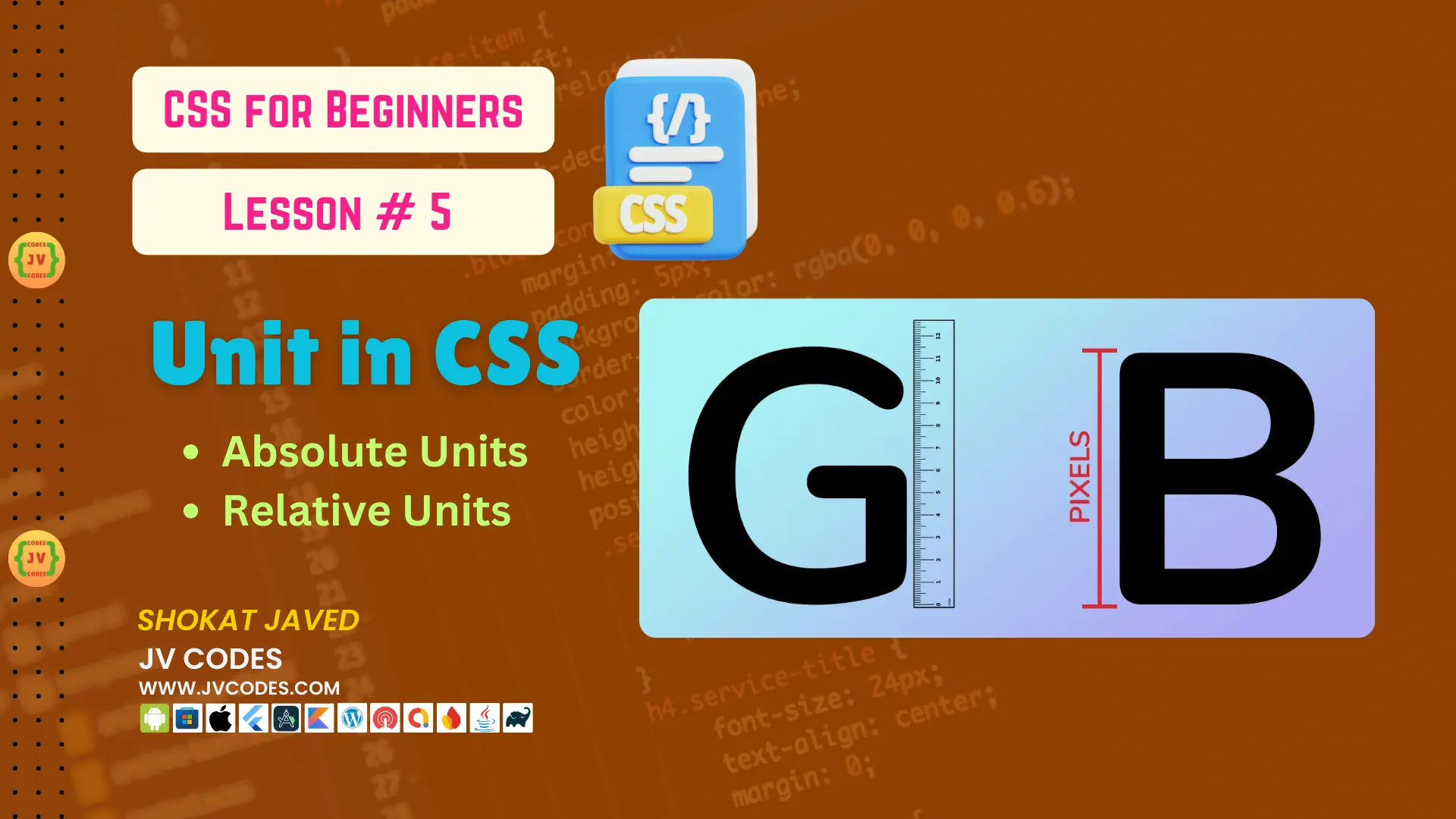
CSS is used in styling the web page, and it is important to understand the units used in order to achieve a responsive and well formatted design layout. In CSS, there are units that are used to measure different things such as width, height, margin, padding, font size and many more. These units define how the elements look like when displayed on various screens and gadgets.
In this lesson, we will discuss CSS units, categorizing them into Absolute and Relative units and showing how they work with examples.
Want free codes for stunning image sliders? Dive in now!
- Modern Image Slider
- Responsive Image Slider
- Text Overlay Image Slider
- Image Clip Animation Slider
- Image Comparison Slider
Types of CSS Units
CSS offers two main types of units:
- Absolute Units
- Relative Units
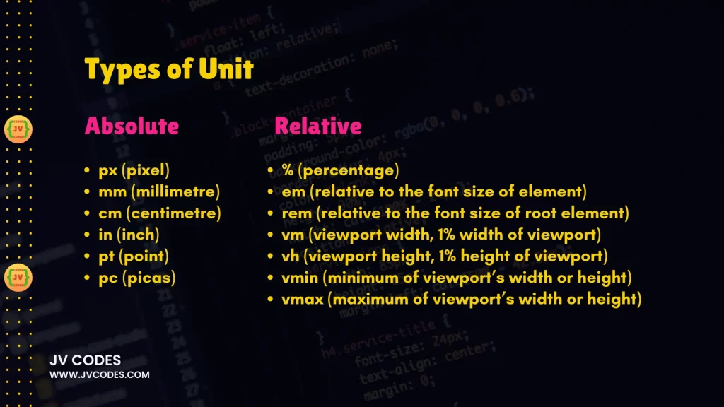
Absolute Units
Absolute units are constant which makes them represent the actual physical size. Unlike other units they do not depend on parent element or screen size and therefore are less useful when it comes to responsive design. But when it comes to defining particular sizes, they do come in handy.
Here are the common absolute units in CSS:
1. px (Pixel)
Pixels are the units most frequently used in CSS. Pixel or px is a small dot on a screen and is used in describing the smallest unit of a screen. Pixels are commonly used in defining the font size, space between the margins and padding.
p {
  font-size: 16px;
  margin: 10px;
}
2. mm (Millimeter)
Millimeter or mm is used in print layouts whenever physical measurements are required. It also measures elements in millimeters.
div {
  height: 30mm;
  width: 50mm;
}
3. cm (Centimeter)
Print-based designs are also measured in centimeter (cm) unit. Measures informants in centimeters and another measures aspects in millimeters.
div {
  height: 10cm;
  width: 15cm;
}
4. in (Inch)
The inch (in) unit is used to measure elements in inches and is widely applied to printed items.
div {
  height: 3in;
  width: 4in;
}
5. pt (Point)
In typography, there is something called a point which is abbreviated as ‘pt’. You can find 72 points in an inch and it is normally applied in relation to fonts on printed materials.
p {
  font-size: 12pt;
}
6. pc (Pica)
A pica (pc) is a measure of typography. Remember one pica equals twelve points. It is not commonly applied in modern Web design but can be helpful in print.
h1 {
  font-size: 5pc;
}
When to Use Absolute Units?
Absolute units are applied where the size of different objects needs to be measured in points as in print media. Pixels can also be used in web design for fine-tuning certain items such as buttons or icons that may require precise measurement. But they are not good for use in responsive design.
Relative Units
Compared to absolute unit types, relative units are relatively more versatile and more suitable for flexible screen size. They enable elements to scale to the size of the parent or the viewport and, as such, are perfect for use in creating the responsive web designs.
Here are the common relative units in CSS:
1. % (Percentage)
The percentage (%) unit is relative to the parent element’s size. This is mostly applied in setting the width, height and also the margin.
div {
  width: 50%;
  height: 100%;
}
2. em (In Relation to the Font size of the Element)
The em unit is relative to the font size of the parent element of the current element. But best of all, if we take the parent element with 16px as the font size, then 1em = 16px. This unit is beneficial when scaling such attributes as padding, margin and font sizes.
p {
  font-size: 2em; /* 2 times the font size of the parent element */
}
3. rem (Relative to the Font Size of Root Element)
The rem unit is relative to the root element, which is often the <html> tag but can be defined in the CSS using the property root. If root font size is defined to be 16px, this mean that 1 rem is equal to 16 pixels. As such, the position of rem is not relative to the font size of the parent element and is thereby more predictable than em.
body {
  font-size: 16px;
}

h1 {
  font-size: 3rem; /* 3 times the root element’s font size */
}
4. vw (Viewport Width)
The viewport width (vw) unit is one that is relative to the size of the viewport. 1vw is equal to 1 percent of the width of the viewport.
div {
  width: 50vw; /* 50% of the viewport's width */
}
5. vh (Viewport Height)
The viewport height (vh) unit is calculated based on the height of the viewport of the screen where the website is being opened. 1vh is equal to 1% of the height of the current viewport available in the web browser application interface.
div {
  height: 50vh; /* 50% of the viewport's height */
}
6. vmin (This refers to Minimum of Viewport’s Width and Height)
The vmin unit is defined with respect to the smaller view port dimension and its size varies with the view-port size. If the viewport has width of 1000px and height of 500px, 1vmin is equal to 5px (1% of the viewport height, which is 500px).
div {
  font-size: 2vmin;
}
7. vmax (The greater of Viewport’s Width or its Height)
The vmax unit relates to viewport’s larger dimension. As shown in Table 10, if the viewport width is 1000px and the height is 500px, 1vmax is equal to 10px that is 1% of the width of the viewport.
div {
  width: 20vmax;
}
When to Use Relative Units?
The relative units are ideal to use when developing websites that should be responsive to the screen size or, the parent element size. Some of the most frequently used units include em and rem for font sizes and margins, as well as vw and vh for full-screen designs.
Conclusion
In web designing it is important to learn the difference between absolute and relative units to measure styles in CSS. Fixed absolute units are applied to layout that is used for the print media while the relative units are most effective when used in a responsive design as they adapt to the screen size. If you are a complete beginner you will be able to create more fluent, open, and well-constructed web sites when you master these units.
It will be helpful to use both absolute and relative units in your projects to familiarize yourself with them. When you have some practice, you will be able to decide which unit is best for your design depending on the context of the design.
Want free codes for stunning responsive cards? Dive in now!
- Modern Responsive Card
- Glowing Card
- Product Card
- JV Responsive Card Slider
- Product Card With Quick View Popup Effect

